The Rapid Elearning Blog

Archive for December, 2017


expectations e-learning

We recently finished our E-learning Roadshows in Europe and the United Kingdom. One of the things I really enjoyed about the trip was riding trains. Where I live in the United States, there aren’t many opportunities for me to ride trains between cities.

One thing that does make me a bit nervous when taking a train ride (especially in new places) is not knowing how to find my way around the station to ensure I don’t miss the train. And it doesn’t help when each station seems to have its own system to manage the schedule boards. I’m sure to the person who rides the train frequently, it all makes sense. But when it’s a new experience, it can be a bit nerve-wracking, especially when pressed for time.

Which gets me to some points that are relevant to e-learning course design.

Set Clear Expectations

Not knowing my way around the train station or even the local language means I’m a bit off balance. And since each station looks different, the experience is different. When I travel, I usually Google map the area and take a virtual walk. This helps me know more about the location and what to expect when I get there. However, this isn’t possible for most train stations around the world.

Thinking about your e-learning course: how is the experience for a new learner? Is there a comfort level when starting the course or is it all new and a bit unsteady? Let people know what they should expect in the course and what is expected of them.

What is going to happen? What are the requirements? What type of experience should be expected?

Provide an Orientation

Often it’s assumed that the user interface or experience is intuitive, but that may not be the case. A person who rides the train every day knows the way around the station and what the signs mean and probably doesn’t even need them. The person who rides a train once in a lifetime looks for signs and probably will need more time to figure them out and how to move around the station.

The same can be said for your e-learning course. Provide an orientation so that the user knows what’s there and when and how to use the resources. It doesn’t mean you need a course on how to take the course but you need to make things familiar and provide a means for people to figure out how things work.

Create a Consistent Experience

Each train station I visited had different types of reader boards and most had their own layouts with icons and not means to discern what they were. It was all a bit confusing and it took more time to find what I needed. At one station, I think it required having an engineering degree to ride the train.

Review your e-learning courses and ensure that how you present content and interactive experiences are consistent. This is especially true if you change the flow of content such as going from a screen of text to an interactive decison-making activity.

The more consistent, the less time you need to explain the course and the more time the learner can spend on the actual learning.

Familiarity is a Key Part of Learning

The goal of the course is generally to teach something. To teach means we need an environment that is conducive to learning. One consideration is how familiar the learning process is to the learner. Do they know what’s going on and what to do?

Familiarity can exist in how the content is structured to the user interface that displays it. For the learner, it’s important to have a level of understanding and know where things fit contextually. Once that’s in place, it’s easier to learn.

As a course developer, I used to complain about not being able to customize my course player. I always wanted to create something new for each course. However, over time I came to realize that there’s a lot of value in a consistent and familiar player. The same can be said for how you structure interactions like tabs and more complex ones like scenarios.

The more uniformity you can add, the better. But I will say that it’s also based on the context of what you’re doing. Not all courses need to look the same or behave the same. However, whatever you choose to do should be consistent and as intuitive as possible. The goal is to help people learn and the method to do that shouldn’t get in the way of learning.

Look at your courses with fresh eyes and try to experience them from the learner’s perspective. Are there any things you’d change?


Events

Free E-Learning Resources

Want to learn more? Check out these articles and free resources in the community.

Here’s a great job board for e-learning, instructional design, and training jobs

Participate in the weekly e-learning challenges to sharpen your skills

Get your free PowerPoint templates and free graphics & stock images.

Lots of cool e-learning examples to check out and find inspiration.

Getting Started? This e-learning 101 series and the free e-books will help.


At a bookstore, you’ll see all sorts of books covering all sorts of content. But one thing you’ll notice is that while they may have different content and even look different they mostly share a similar structure.

What’s in a Book?

What do books have in common?

  • Cover images
  • Title Page
  • Author Information
  • Table Contents
  • Version
  • Chapters
  • Index
  • Appendix

Despite the topic, at some point, the publisher assembles the book and puts it into a structure similar to what’s listed above.

What’s in an E-Learning Course?

E-learning courses are very similar to books. While they cover a range of topics, there are elements that are common to most courses. What are they?

e-learning templates common structure

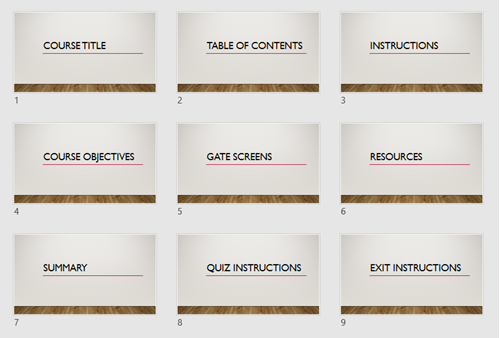
  • Course Title Screen
  • Table of Contents (as a menu)
  • Instructions Screen
  • Course Objectives Screen
  • Section Title Screen
  • Gate Screens
  • Resource Screen
  • Summary Screens
  • Quiz Instructions Screen
  • Exit Instruction Screens

Since you know those screens are in most courses, why not pre-build them and make them part of your starter template? It’s also a great way to work in the company brand without messing with the content screens.

e-learning templates teams in Articulate 360

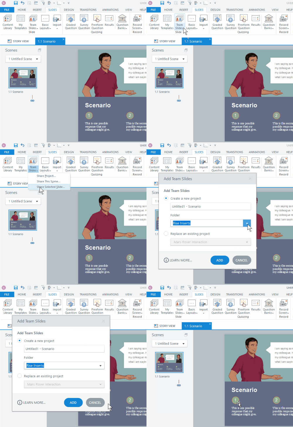
Also, if you’re using Articulate 360, you already have a bunch of templates that have a lot of that structure. So it’s a great starting point and big time-saver. And as an added bonus, if you’re using Articulate 360 Teams you can add those slides to your Teams account and everyone on your organization’s team can access those slides. This is a big time saver and lets you maintain the quality and consistency many organizations require.

What pre-built screens would you add to the list?

Events

Free E-Learning Resources

Want to learn more? Check out these articles and free resources in the community.

Here’s a great job board for e-learning, instructional design, and training jobs

Participate in the weekly e-learning challenges to sharpen your skills

Get your free PowerPoint templates and free graphics & stock images.

Lots of cool e-learning examples to check out and find inspiration.

Getting Started? This e-learning 101 series and the free e-books will help.


e-learning tips

One of the e-learning tips I give at workshops is to be intentional about your e-learning course design and production. Many course developers start with the default settings and then make changes later. However, that could impact the course and cost time and money.

So today, I’m sharing three things you should do before you start working on your e-learning course.

E-Learning Tip: Determine Your Course Size

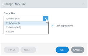
It’s important to determine your course size before you start working on the slide. If you do some work and then change it later, you may skew things on the slides and have to do a lot of adjustments. Also, popular screen sizes today aren’t what they were a few years ago. Computer screens are wider, more pixel dense, and a lot of course developers like to step away from the default player.

e-learning course size settings e-learning tips

Here are a few considerations:

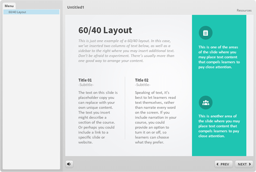
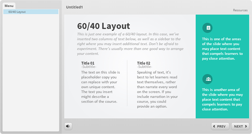
  • By default the course size is a 4:3 aspect ratio set at 720×540 pixels. This is a good aspect ratio and the course can be set to scale with the browser, so pixel width isn’t as big of an issue.  The image below shows the 4:3 aspect ratio with a sidebar menu.

e-learning tips 4x3 aspect ratio

  • You may want to go with 16×9 since most screens are widescreen. And that looks nice on mobile devices in landscape mode. Although newer phones are going to 18:9. The image below shows the 16:9 aspect ratio with a sidebar menu.

e-learning tips 16x9 aspect ration

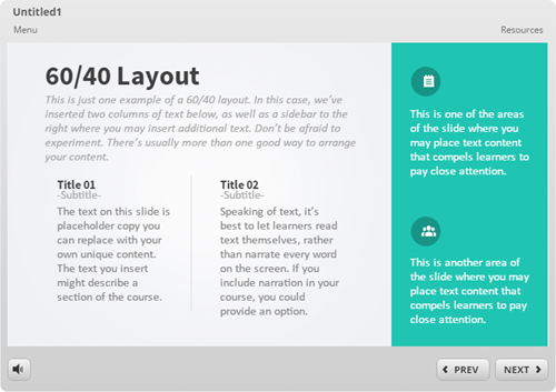
  • Are you using a sidebar menu? If yes, I like the 4:3 aspect ratio. The more squared slide fits nicely with the sidebar. However, if you go with a 16×9 aspect ratio, having the sidebar makes the course look wide. In that case, get rid of the menu, or set it as a drop down from the top. And that’s what I show in the image below. You can see the menu drop down on the player. It’s there, but doesn’t consume screen space.

e-learning tips drop down menu

E-Learning Tip: Determine the Color Scheme & Create Theme Colors

Before you start working on your course make sure to determine the colors you are going to use. There are a few ways to get the right colors for the course:

  • Company brand: many companies have branded colors. Even if you don’t have the official colors, you can go to the website and do a color pick of the main colors used.
  • Single color: find one color and use a color schemer to create other colors.
  • Color picker: I like to pick colors from images inserted on the screen. Or I’ll use the main company color from a logo or official image and then build out my color scheme from there. Here’s a link the color picker I like to use.

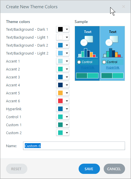
Once you have determined the colors, build a color theme and only use the theme colors in your course. Generally, you have black and white and the six accent colors. There’s no pre-defined use for the accent colors. Basically you get six options. I’d use them consistently, though. For example, accent 1 is the main color. Accent 2 may be the secondary or complimentary color. And you don’t need to have six colors. Some people just use two.

theme colors e-learning tips

If you stick with theme colors you can always change themes and all of the theme colors will change with it. If you don’t, then you have to go through the course slide-by-slide to make color corrections.

E-Learning Tip: Determine the Font Pairs & Create Theme Fonts

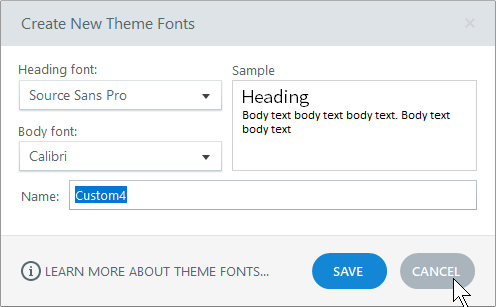
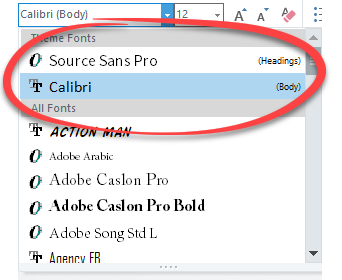
Same as the theme colors, determine your font pair prior to building your course. And then create theme fonts. You’ll have a title font and body font.

When you insert text on the screen, stick with the theme fonts only. Don’t go digging through the font list to find that one cool font. I’ll state it again, when you insert text on the screen, stick with the theme fonts only.

theme fonts e-learning tips

If you need to make changes to your fonts, all you need to do is apply a new theme and the text that uses theme fonts changes in the entire course and on the master slides. However, if you insert text from the font dropdown list, you’ll need to change those fonts individually. That’s why you want to stick with theme fonts.

theme font selection e-learning tips

So there you go, three e-learning tips before you start building your e-learning courses:

  • determine the size of the course
  • create theme colors
  • create theme fonts

Doing those three things up front will save you lots of production time while building your e-learning course.

Events

Free E-Learning Resources

Want to learn more? Check out these articles and free resources in the community.

Here’s a great job board for e-learning, instructional design, and training jobs

Participate in the weekly e-learning challenges to sharpen your skills

Get your free PowerPoint templates and free graphics & stock images.

Lots of cool e-learning examples to check out and find inspiration.

Getting Started? This e-learning 101 series and the free e-books will help.