


[…] post originale di Tom Kuhlmann sul “Rapid E-Learning Blog”. Il post originale è disponibile qui jQuery(document).ready(function($) { […]
Quit Wasting Time Trying to Find the Right Look for Your E-Learning Courses
February 14th, 2012
A while back I shared an example of how to create more engaging course objectives. It’s a great way to get past the bullet list of learning objectives that we often see in courses. I then did a follow up post on how to quickly find images for your elearning courses. The tips in that post are good, but they set up an issue we commonly run into when building courses.
If you look at the images I recommended and the images I used in the course, you’ll see that I didn’t use the images I recommended. I’ll have to admit, I did that to set up this blog post. Let me explain.
Many aren’t intentional when it comes to the visual design of their elearning courses. They usually start with a nice looking template and then as they build the course they’ll add images that represent the content on the screen.
If they have some design skills it’ll look good. But if not, then they end up with a discordant look where the graphics don’t quite match the content. And most likely the graphics won’t quite match the other graphics either.
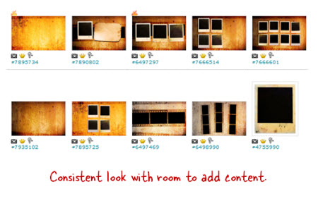
That’s where my earlier tip to find an image pack really works. It lets you get a design for your course that is consistent and polished, and inexpensive.
No Plan Means You Waste Time
But here’s where you may run into some problems. You can waste a lot of time looking for just the right images. But worst of all, you end up letting the images you find drive the course design. That’s not ideal. And that’s kind of what happened to me with my demo.
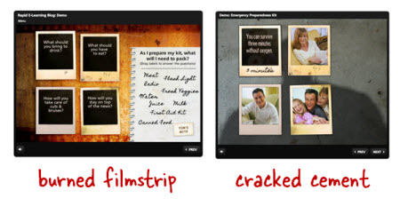
My initial idea for the demo was beyond my resources, so I decided to look for photo frame pictures on istockphotos. This led me to the Polaroid idea, which then led to the image packs that I wrote about. The image packs worked great because for a few dollars I was able to build a series of rich looking screens for my elearning demo.
But, when I added more content to the demo I soon realized that the images (which were made up of burned filmstrips) just didn’t look right with the earthquake content. The look was rich but it didn’t match the earthquake content and seemed out of place.
How to Craft a Visually Immersive Experience
Elearning courses are mostly visual. When you build a course you have to have the right visual look to match your content. I like to think of it as creating a visually immersive experience where you’re trying to place the learner in the same space as the content.
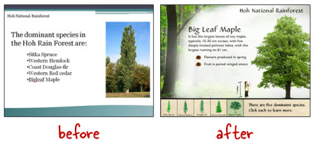
For example, in our workshops we use this demo of the Hoh Rain Forest. The goal is to place the learner in the rain forest so we walk through the process of converting a simple PowerPoint slide to something more immersive.
Going back to the burned filmstrip images, they didn’t work for an earthquake course. When I think earthquake, I think more about damaged buildings. So what I did was swap the burned filmstrip background with a cracked cement image. It works better for the earthquake theme and content.
Visual Design Tips
Here are some quick tips to help build your next course.
- Find inspiration. Going through stock image and template sites is a good way to come up with design ideas. Perhaps you’ll discover a new way to layout your screen elements. Or maybe you’ll find a cool color scheme. Make time to find inspiration. I keep a notebook of links and ideas so when I need something I can look through it for ideas.
- Plan your visual design. Looking for inspiration is something you do outside of the course design. It’s an ongoing discipline. But when you start to build your elearning course, you need to be intentional about the design. It’s not something you do on the fly. Otherwise you waste time and probably won’t end up with the best looking course.
- Image packs from the same artist or style can save time and money. Just like I mentioned in the earlier post, finding image packs will help when it comes to the overall look of your course. But don’t let them drive the design process. Decide what you need before looking for images.
- Create an immersive visual design. Put the learner where the course will be. In the Hoh Rain Forest demo, the goal is to place them in the forest. If you’re building a course on operating room technology, how will that look compared to one on office policies? And how’s that different than teaching something about warehouse safety? Your visual voice speaks to you and forms a mental image consistent with the course topic. Learn to tap into that voice and you can build a look that matches your content.
- Keep it simple. Since most of us aren’t graphic designers it helps to have a few simple rules to keep us from creating a mess. At a minimum find the right type of background that lets you craft a visually immersive screen. Just changing a background can do wonders. Then limit yourself to two fonts. One for the titles and one for the body. Determine your color palette before you start building. You probably only need three or four. Determine how you’ll use them and then be consistent throughout the course. A few simple rules applied with intention go a long way.
There’s a lot more to the visual design process. We actually go into it quite a bit in the workshops I do. I have those listed below. The main point is that before looking for images, determine what you want to find. Otherwise you’ll end up wasting time or letting the pictures you find dictate your course design rather than the content doing that.
Do you have some simple graphic design tips you can share for the elearning developer who’s just getting started? Share them by clicking on the comments link.
Events
- Everyday. Check out the weekly training webinars to learn more about Rise, Storyline, and instructional design.
Free E-Learning Resources
 |
 |
 |
|
Want to learn more? Check out these articles and free resources in the community. |
Here’s a great job board for e-learning, instructional design, and training jobs |
Participate in the weekly e-learning challenges to sharpen your skills |
 |
 |
 |
|
Get your free PowerPoint templates and free graphics & stock images. |
Lots of cool e-learning examples to check out and find inspiration. |
Getting Started? This e-learning 101 series and the free e-books will help. |
30 responses to “Quit Wasting Time Trying to Find the Right Look for Your E-Learning Courses”
[…] Via http://www.articulate.com Valora esto: Me gusta:Me gustaSé el primero en decir que te gusta esta post. […]
I am interested in attending one of your trainings, but Feb through May are never open for my organization. Is there any chance for more opportunities between August and December??
This was such a timely article, I was sitting at my desk….wasting time….because of the look and feel of the e-learn that I am working on today.
Love the site, every click is a learning opportunity!
AMS
For graphics I use creative commons search – I don’t have any money for stock photo – it’s a real savior.
Thanks Tom for great post – I admire your work very much!
What was used for “the process of converting a simple PowerPoint slide to something more immersive”?
Wow — such helpful information! That Hoh Rain Forest template isn’t available for me to crib, is it? I love it… 😀
Tom,
When you say limit yourself to two fonts, one for the titles and one for the body, do you mean font sizes or font styles? Or both? For self-paced courses, what is the maximum font size you recommend for headings and for body text?
Thanks,
Rachel
This is a great presentation on using graphics > http://www.slideshare.net/cmalamed/brain-on-graphics-download
I have the same question of Neal Cross. What did give you the possibility to switch PP to the immersive presentation?
Cheers
*Tip for a new elearning developer*
Look at examples. Whether it’s an online course, a website, or some other form of inspiration, find things that you like and then break it into pieces. Figure out exactly what it is you like about it. Those elements will then find their way into your courses.
I’m also a big fan of keeping design inspiration “journal”. I keep a running word doc on my computer where I paste links and pictures of anything that I like. Most of the time it doesn’t apply to what I’m working on at that moment, but then any time I get stuck or am designing a new course, I will revisit that doc for ideas. It has become one of my most valuable resources.
@Nick Hutchings- thanks for that link. I enjoyed it
@Tom – thank you for another great post. Looking forward to attending your workshop in STL!
Hello Fellow E-Learning Practitioners,
I have a great goto source for those wanting to know a lot about graphic design in a short time.
The author is Robin Williams. Her series the “The Non-Designers Guide to ….” is amazing! They are very easy reads, her writing is fun, and her concepts are truly amazing.
It turned me from a good Instructional Designer into a GREAT designer.
The couple hours of investment in reading her books, could help you look at your courses in a completely different light.
Hope this helps.
~Bradley Pierce
[…] Quit Wasting Time Trying to Find the Right Look for Your E-Learning Courses […]
Can you give some examples of good template sites ?
[…] our elearning workshop we walk through the Hoh Rainforest design makeover. The goal is to craft a visually immersive experience. What can we do to get the person into the rain forest? For us it starts with finding a rain forest […]
[…] Quit Wasting Time Trying to Find the Right Look for Your E-Learning Courses » The Rapid eLearning B… […]
[…] our elearning workshop we walk through the Hoh Rainforest design makeover. The goal is to craft a visually immersive experience. What can we do to get the person into the rain forest? For us it starts with finding a rain forest […]
Leggi la traduzione autorizzata in italiano del post qui:
[…] Quit Wasting Time Trying to Find the Right Look for Your E-Learning Courses […]
I am always ammused with articles targeted toward professionals who are not qualified to perform tasks that are considered part of their role. I was a professional Art Director and Graphic Designer for 20years prior to getting into eLearning. So your article was of no use to me. However, it does make me feel very sympathetic to the plight of many of you. I think your tips may help many. The nagging issue that I am left with is my impression that Instructional Designers and Developers are assumed to be communicators and yet often they woefully unprepared. Maybe it’s just me but I see tons and tons of eLearning that quite simply sucks. Oh it may be instructionaly sound but I feel turned off every time I have to review one of those courses and I imagine that many students are as well.
An aside, re: “That’s a thick laptop”
LOL – I was thinking the same thing! Who manufactured that thing, V-Tech or Fisher-Price?


0
comments