Curiosity Might Have Killed the Cat, But Learners Love It
This guest blog post was written by Articulate VP, Community Tom Kuhlmann. Tom has over 15 years of real-world experience in the training industry. When Tom was our customer, he won the 2007 Articulate Guru Silver Awards, and recently wrote the articles, 5 Myths About Rapid E-Learning, Yes, Rapid E-Learning Can Do Branching, and Click & Read E-learning Courses Don’t Need to Be Boring.
So far in this series, we looked at passive versus active navigation and how to make better click and read courses. Today we’ll look at how screen exploration is used to instigate learner engagement.
First a quick thought.
(Email subscribers: Watch this video.)
In the video, the presenter is teaching people about using the cool new tabletop PC. Suppose you were that person. You made an outline of what you want to say and then you begin to teach the others. As soon as you start to present the information, all of the learners are wowed by the PC. Some start to ask about cost. Others want to touch it and see what happens. Still others start asking a bunch of questions about its use. In the meantime, you’re frustrated because you were going to cover that in your outline anyway, but all of their questions have thrown you off track.
In this scenario, you’re the click and read course. You had outlined the material and planned to go through it in linear fashion. What you’re finding is that once learners are exposed to information, they’re beginning to put it in a context that is most relevant to them and their own needs. Once they establish an interest and relevance, they begin to get curious. This curiosity drives their learning.
By nature, learning and curiosity go hand-in-hand. Why not create an environment that allows the learner to explore?
Below are some very simple examples of navigation that allow for user exploration. Don’t focus on the content as much as the fact that you can build navigation that gives the users more control and allows for them to explore the information on the screen.
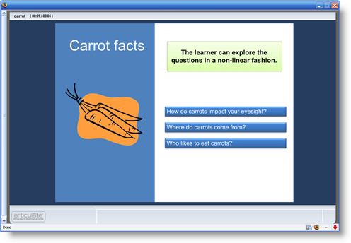
The first example allows the user to click on questions to get feedback. An approach like this is good if you want to do simple assessments. You pose a question. The learner makes a decision. The decision produces unique feedback. At the same time, the learner can see what the feedback would have been for other choices. Many people don’t like traditional questions or quizzes. This is a good way to create a non-threatening assessment during the course that allows the learner to test his knowledge and get appropriate feedback.
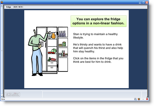
The second example also uses exploratory navigation. In this case, I built it using an image. The user navigates by clicking items in the refrigerator. As you can imagine, the possibilities are endless when it comes to using images rather than text for navigation.
The main point is that the above examples are more than just linear click and read. To create a better learning environment:
- Give the learner more control with the navigation
- Create content that leverages the learner’s curiosity
- Force the learner to make decisions where the choice instigates the navigation
The examples above were created using PowerPoint and Articulate Presenter. It took less than an hour total to build both. As simple as they are, try to replicate them in Flash in 30 to 60 minutes. I’ll add that most of the time was spent looking for graphics and trying to figure out what content to use. Thus, actually to build the demos once I had the content, only took about 10 minutes. That is the power of rapid e-learning!
By design, Articulate Engage interactions allow you to create a non-linear environment. The user can choose where to click and get information. Again, the information can be simple text or sophisticated multimedia. Either way, in minutes you can create a very professional nonlinear environment.
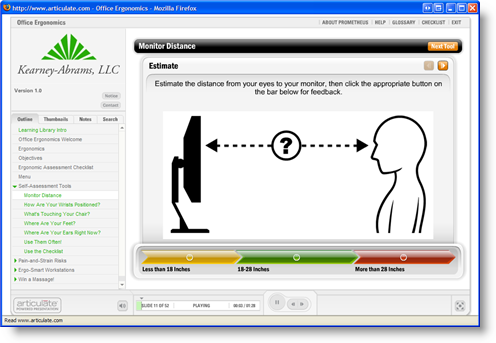
An excellent example of seeing this process in action is by going through the ergonomics course designed by our Gold Medal Articulate Guru winner. They were very creative in how they used the interactions to build nonlinear assessments. Their course is a perfect example of creating user engagement without the need for sophisticated branching interactions.
If you haven’t already done so, click through the course:
Again, the power for those who use rapid e-learning software is that you can create effective and sophisticated courses with no programming skills.
Curiosity is a key part of what motivates our learning. It is to your advantage to leverage the learner’s curiosity. Giving him the opportunity to explore the information on the screen in a manner that he chooses is one way to do this. It’s a win-win. You get to present the information the learner needs to meet the learning objectives, and the learner gains some control over how he accesses the information.
In addition, your organization wins because Articulate Studio Pro empowers you to build a good product at the speed of business—saving you time and money.
In our next post, we’ll look at how to create active interactions using branched navigation. If you’ve done something you’re proud of, feel free to share it. We’re always excited by what the community of users does.
By the way, there’s also a great parody of the tabletop PC on YouTube, which is good for some laughs.

11 responses to “Curiosity Might Have Killed the Cat, But Learners Love It”
Tom,
Great use of “The Rule of Threes” with the text in your examples.
I also liked your simple “color seperated regions” approach to add distinction between sections.
Regards
Shane
Tom,
You stated that you used “PowerPoint and Articulate Presenter” to make the carrot and frig examples (not engage or quiz maker), but how did you make your hotspot graphics?
For the carrot example, did you set up action buttons in PowerPoint for the three carrot buttons that link to other slides? Did you use PowerPoint to create your beveled buttons or import them?
For the frig, I’m assuming that you had your overall graphic and on top of that you placed several transparent rectangle action buttons above to link to the other slides. Am I correct here?
So, for the carrot example you should have 4 total slides and for the frig example you should have 6 total slides, right?
Just curious. Thank you for your time.
Shane
Good questions, Shane. After my next post (where we look at branches), I’ll give more detail on how to do that in PowerPoint.
However, you are basically correct. I used created transparent boxes and used PowerPoint’s hyperlinking.
The carrot demo is one master slide and then one for each option.
The fridge demo is basically the same, only I have more options.
BTW, I stumbled upon your site a while back…pretty slick stuff.
Thanks Tom. We had fun with the Tubes (it’s under new management now, and I’m not a part of it anymore though).
I look forward to your next post. Those examples you did were quite unique examples. I never would have thought to use Articulate in that way.
Rock on.
Shane
My next one is pretty cool…if I say so myself. The examples are simple, but I think that it will open the eyes of a lot of our users and hopefully get them to see PowerPoint and our tools in a new way.
In the Ergonomics example, each sections returns to the menu upon completion. Where can I find information on how to do do that?
Thanks,
Not exactly clear on what you mean by returning to the menu on the ergo module. They did a lot of really cool things in there. Many of the interactions you see in the course were created with Engage. They used the interactions as quick assessment tools. In addition, you can always redirect the users using PowerPoint’s internal hyperlinking, that’s how the fridge and carrot demos were built. Hope that answers your question. If not, tell me what specific part of the course you’re referencing so I can get a better idea of what you mean. Have a great day.
The ergonomic example is great to show non-linear navigation. However, if the learner chooses the last option as their first choice, they’re taken to a survey instead of back to the main menu. It would be great to see the main menu items greyed out after each section is complete, then when all the section have been completed, they get taken to the survey.
Please how was the carrot demo created?
Here’s a link to the carrot ppt file so you can see how it was built.
Thanks Gabe that was REALLY helpful!!!
Comments are closed on this post. Need more help? Post your question in the E-Learning Heroes Discussions.