Ad Giants Uses Clean Imagery to Take Home 2009 Guru Bronze
This is the fifth in a series of entries spotlighting winners and honorable mentions in the 2009 Articulate Guru Awards. In this post, we’ll examine the third of three Bronze winners, Ad Giants.
Guru 2009 Bronze Winner: Ad Giants Product Tour

Let’s begin by taking a look at the presentation:
View the Ad Giants Product Tour
Analysis of the Product Tour Presentation
The Guru Awards courses were judged based on design criteria that highlight the features of Articulate Studio ’09. The underlying content for all submitted courses was not judged for content accuracy.
So let’s take a closer look at this presentation’s features.
Tailored Feedback to Direct Path in Presentation
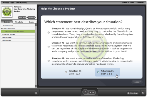
By incorporating a “Help Me Choose” question, this presentation uses Quizmaker ’09 to give users a “quiz” that provides feedback on which path to take. The one-question quiz describes different user profiles, and, based on your selection, recommends which path you should take in the presentation (i.e., which of the company’s products would be best suited to your needs):
Clean Images & Player Design
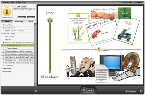
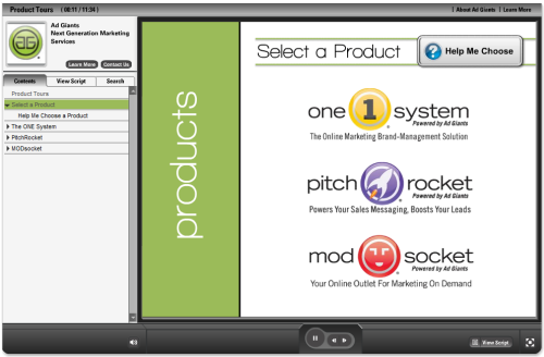
Throughout the presentation, two of the things that really stand out are the clean, simple images and the custom player design, created to match the branding and visual elements. Using the Colorizer in Presenter ’09. you can create a player as unique as your brand.
Creative Screencasting
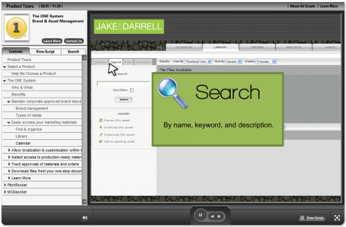
One of the things that’s not so obvious about creating software demos is that you don’t need a screencasting or screen recording tool to create effective software demos. Ad Giants proves that point with an effective use of still screenshots, combined with PowerPoint animations and Presenter ’09 annotations, to highlight software features in its products:
Levels & Branching
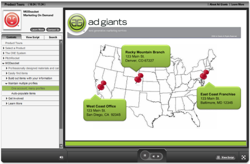
This presentation makes extensive use of the Presenter ’09 levels feature, which allows you to organize your content into sections or chapters. This presentation is rich in content — it describes the features of three different Ad Giants products — and does a good job organizing each set of content into different levels, which you can expand or collapse as you go through the course. Combined with the branching slide at the beginning, where you click to choose the product in which you’re interested, this course demonstrates an effeictve way to organize your slide content:
For leveraging a number of Studio ’09 features, incorporating Engage slide and toolbar interactions, and for creating a nicely designed Product Tours presentation, Ad Giants was awarded Bronze in the 2009 Articulate Guru Awards.
Interview with Heather Beaudoin of Ad Giants
Heather Beaudoin of Ad Giants shared her thoughts about using Articulate Studio ’09 to create this presentation. Read on for the Q&A.
What are your favorite Studio ’09 features?
There are so many! For the learner’s experience, I like using the Spotlight annotation to highlight areas of a software window. I love the redesign of Quizmaker ’09 to allow blank slides, ability to remove the summary screen, and the full design control to make the questions memorable. These changes allow me to use questions for interactivity instead of testing.
From the development perspective, the Preview is a huge timesaver, and the Audio Editor and enhancements to the UI for recording/syncing narration are fantastic. The branching and locking features allow the developer much more control over the learner’s experience.
Why do you use Articulate products?
They’re fantastic — very easy to learn and use, and the support system and community interaction that’s in place is best-in-class. I’ve worked at several small- to medium-sized companies, where you need to wear a lot of hats with minimal resources. Articulate is a no-brainer for companies because it’s not just a training product. I’ve used it to create sales demos, marketing presentations, corporate communications, product & process documentation, as well as interactive eLearning training courses.
Could you please share some insight on your approach to designing your award-winning course?
This is an example of using Articulate to create a marketing presentation about the Ad Giants products. Its objective is for prospective clients to learn “just enough” about a product to get them interested.
Design decisions were about ensuring someone could get the information they need without spending time on information they don’t need. Instead of focusing on product features, I used a lot of graphics and animations to explain the benefits and value of each product. The “Help Me Choose” question helps them identify the product(s) they need so they’re not required to sit through the entire presentation. I kept each product’s demo to around 4 minutes, and made it as fast-paced as possible to maintain the viewer’s interest. I also used a couple Engage interactions to provide additional information without adding to the presentation’s length.
What are your tips for people getting started with Articulate products?
Definitely start with the great resources on Tom Kuhlmann’s Rapid E-Learning Blog. I’ve trained quite a few people on Articulate, and that’s where I always have them start.
For your first couple projects, keep it simple, publish often to see the results, and don’t throw any ideas away. It’s good to see how many different ways you might be able to use a feature (like the Engage interactions). Look at lots of other courses that people have made and save those ideas for when you need them.
To what charitable or educational organization will you be donating your licenses and why?
The National Foundation for Teaching Entrepreneurship: Greater Dallas Office – through entrepreneurship education, the National Foundation for Teaching Entrepreneurship helps young people from low-income communities build skills and unlock their entrepreneurial creativity. NFTE has more than 1,300 active Certified Entrepreneurship Teachers, and is continually improving its innovative entrepreneurship curriculum.
Any final comments?
Don’t be afraid to try something new.
Congratulations once again to Heather and Ad Giants!


1 response to “Ad Giants Uses Clean Imagery to Take Home 2009 Guru Bronze”
Very professional, very good work, a phantastic example to show the possibilities of Articulate’s wonderful tools.
Comments are closed on this post. Need more help? Post your question in the E-Learning Heroes Discussions.