Beautiful Design Gives Joann Swanson 2009 Guru Bronze
This is the fourth in a series of entries spotlighting winners and honorable mentions in the 2009 Articulate Guru Awards. In this post, we’ll examine the second of three Bronze winners, Joann Swanson.
Guru 2009 Bronze Winner: Joann Swanson’s Creative Visualization Presentation

If you haven’t already seen (or heard) it, here’s the presentation:
View Joann Swanson’s Creative Visualization presentation
Analysis of the Creative Visualization Presentation
The Guru Awards courses were judged based on design criteria that highlight the features of Articulate Studio ’09. The underlying content for all submitted courses was not judged for content accuracy.
So let’s take a closer look at this presentation’s features.
Stunning Design & Soothing Audio
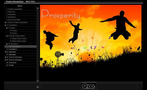
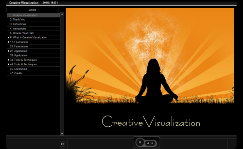
The two elements of this presentation that immediately set it apart from the crowd are its stunning design and soothing audio. From the moment you launch the presentation, you’ll feel relaxed and simultaneously blown away by the stunning visuals.
Slide Animations
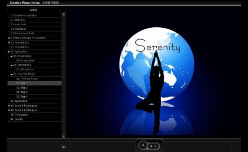
Complementing the striking design of this presentation are effectively implemented PowerPoint slide animations throughout. Joann did a really good job of not overdoing it with the animations, but using just enough of them to make the course lively while delivering her message:
Slide Branching
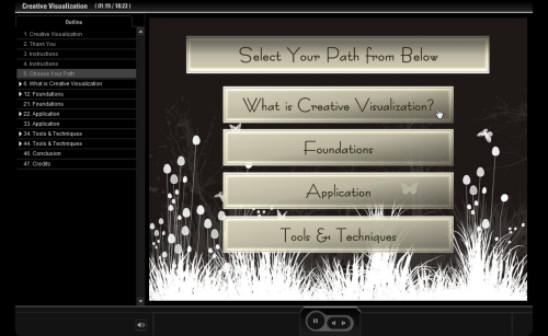
Giving your users the ability to choose their path in your course is a great way to make your content more interactive. Joann does exactly this from the beginning, providing you with a menu of sections within the presentation so that you can decide what section you want to visit first:
Flash Video
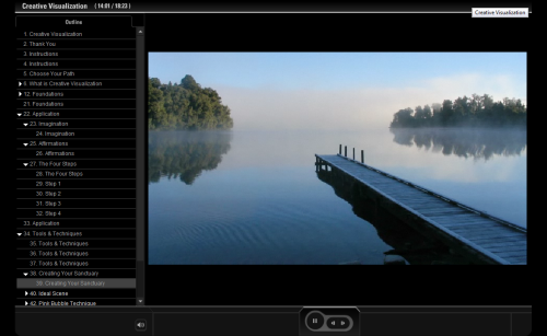
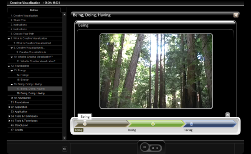
To add subtle effects to the on-screen visuals, Joann added Flash movies that integrate nicely with the rest of the presentation’s design. The first screenshot below shows a lake scene where the water ripples. There are also slides that contain Flash videos — e.g., slide 17 is an Engage Timeline interaction with a few videos incorporated to reinforce the concepts.
Integrated Quizzes
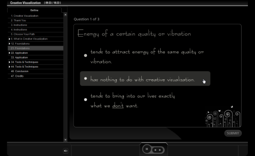
The quizzes in Joann’s presentation are a great example of what’s possible with Quizmaker ’09 when you leverage the Slide View mode. You can design your quizzes to match the design and experience of your course or presentation perfectly — background music, animations, and all.
Quiz Branching & Blank Slide Feature
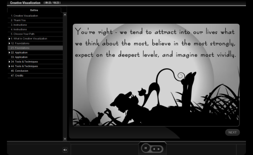
Also of note in Joann’s quizzes are that they effectively leverage quiz branching and the blank slide feature, providing an entire slide of feedback based on your answer.
For leveraging so many Studio ’09 features and creating such visually stunning content, this Creative Visualization presentation was awarded Bronze in the 2009 Articulate Guru Awards.
Interview with Joann Swanson
Joann Swanson shared her thoughts about using Articulate Studio ’09 to create this course. Read on for the Q&A.
What are your favorite Studio ’09 features?
Nearly every tool in Studio ’09 is completely customizable. From control of your color palette to the new slide design feature in Quizmaker, Articulate does a tremendous job in allowing an individual look and feel for everything we do. One of my favorite new features in Studio ’09 is the spotlight annotation in Presenter. This is such a powerful way to draw attention to specific content in your design. Every time I use it in a course, the learner invariably says “Wow!” Branching, both within Presenter and Quizmaker, is incredibly powerful. Combined with PowerPoint’s ability to link within a presentation, this allows us to guide a learner through an activity based on their interaction with the content (for example, learning scenarios). Engage is a wonderful way to build quick and amazing looking content. I think the biggest potential I see for Articulate in the future is the newly adopted Engage community interactions. If Apple’s iPod Apps is any indication, community created Engage interactions will be a huge success!
Why do you use Articulate products?
My use of Articulate started out with my full-time job as an instructional designer at St. Luke’s Medical Center. It is the software they committed to when beginning online course development, so it’s what I learned when I came aboard. Nearly two years later, I am beginning to use Articulate at home in the design of online courses I teach at Boise State University as an adjunct faculty member. When Articulate says “rapid e-learning software tools,” they truly mean it. I can develop a fully functional course in a fraction of the time it would take in Flash or similar.
Could you please share some insight on your approach to designing your award-winning course?
For this submission, I chose a subject I am passionate about. I knew I would be spending a lot of time playing and perfecting, so selecting content that I knew would generate a lot of creative energy was important to me. Honestly, not a lot of extensive storyboarding or planning went into the design. I recorded my narration first because I knew hearing the words out loud would spark my imagination. That’s exactly what happened. As I edited the narration, ideas for the design popped up spontaneously. Because this is an activity geared toward the affective domain, linear design would not have worked for me. By the time I reached what I thought was a workable product, though, I had lost sight of one very important element: navigation. While the player toolbar in Articulate-driven courses is very easy to use, it’s still good to orient your learners to the environment so they get the most out of your course. Having one or two people test your activity before final publication is absolutely essential.
What are your tips for people getting started with Articulate products?
Don’t let the idea of using PowerPoint turn you off! PowerPoint gets some bad press, but really, it’s just a tool like any other. It’s how you paint that blank canvas (slide) that matters and the way Articulate has integrated so beautifully with this application makes creating a beautiful end product quite easy. Articulate provides so much opportunity for originality — inserting Flash content, branching for every slide, providing formatted notes for your narration, publishing your content in nearly any way you can imagine, integrating interactive opportunities for your learner, and much more. By leveraging custom animations in PowerPoint and annotations in Articulate, you can direct your learner’s attention to critical content and entertain them at the same time. It’s easy to create aesthetically pleasing content using PowerPoint and Articulate.
To what charitable or educational organization will you be donating your licenses and why?
Boise State University. This is a product that I can see other instructors at BSU picking up and using quickly. Many online courses are still very much text-based and Articulate’s gentle learning curve provides a great opportunity for instructors to create more interaction quickly and easily.
Any final comments?
Thanks, Articulate, for making the Guru Awards available. This is a great way to showcase the software and what we can do with it as designers and end users. Thank you, too, for your amazing website (especially the user forums and the blogs). I’ve never seen better documentation or received better customer service from any other software company.
Congratulations once again to Joann Swanson!


1 response to “Beautiful Design Gives Joann Swanson 2009 Guru Bronze”
I found the music in this amazing presentation very soothing. I would love to find the artist/s you used in your presentation. Please.
Respectufully,
Felix
Comments are closed on this post. Need more help? Post your question in the E-Learning Heroes Discussions.