Click & Read E-learning Courses Don’t Need to Be Boring
This guest blog post was written by Articulate VP, Community Tom Kuhlmann. Tom has over 15 years of real-world experience in the training industry. When Tom was our customer, he won the 2007 Articulate Guru Silver Awards, and recently wrote the articles, 5 Myths About Rapid E-Learning and Yes, Rapid E-Learning Can Do Branching.
In the previous post, we looked at the difference between passive and active navigation. They both have value based on the needs of the client. In this post, we’ll explore ways to step beyond the linear click and read process and involve the learner’s decision-making.
While there is a place for linear “click and read” courses, the good news is that with Articulate Studio Pro you are not limited to them. You have options to expand the course’s interactivity and make it more than click and read.
Let’s take a quick look at the progression from a standard linear course to one with more active, learner-enabled navigation.
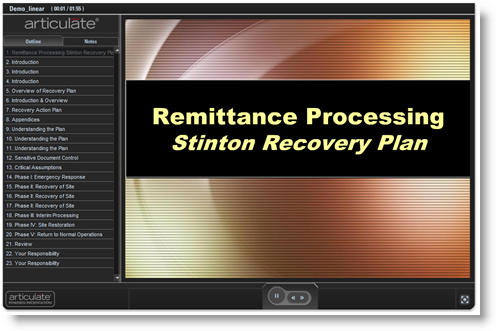
Linear’s not bad, it’s just limited. The link below is an example of a standard linear course. Typically, they are simple click and read. The information is presented and the learner advances.
The benefits to this type of approach are obvious. From an instructional design perspective, it is easy to template the material and produce training courses quickly and at low cost. Customers like this and many times those who take the course prefer the basic navigation to more sophisticated yet time-consuming courses.
While a linear approach is not the most dynamic learning environment, in many cases it is an appropriate means to build your training. This is especially true if you cannot find a good link to performance. There’s no need to waste the learner’s time or your organization’s resources on a fancier training course that most likely will not add any value. Personally, I advocate getting away from bullet point slides, however sometimes time and resource availability dictate this approach. Gabe’s recent post, 7 Quick Tips for Spicing Up Your PowerPoint Design, might give you some good ideas.
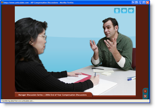
Linear doesn’t have to mean boring. An important thing to remember is that linear navigation doesn’t have be bullet point lines of text. In fact, you can build a linear course that has no text at all. There’s no reason why you cannot insert audio, video, or Flash animations to make the material more visually engaging and probably more effective in transferring some of the information.
Here is a good example of a linear course that doesn’t look like it was created in PowerPoint:
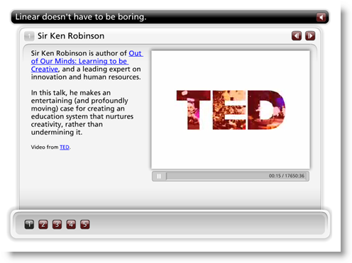
Use multimedia. Look at some of the compelling video clips from the TED conferences. They are equivalent to click and read information in the sense that it is just information presented to the learner with no expectation to make decisions. The difference is that the video clips engage other senses.
I love Sir Ken Robinson’s presentation on learning and creativity. It’s one worth watching. It’s interesting and funny, yet not much more than a talking head for about 20 minutes.
Keep this in mind: If the course is designed well, you can still make an engaging e-learning course … even if you only use linear navigation.
Content that is engaging and relevant to the user is the key to success. If my wife put together a presentation on place setting designs, I can tell you right now that I’d think it was boring. However, if somehow she finally saw the light and put together a course on this century’s best boxers, she’d have my full attention. Unless, of course, the boxers were at Nordstrom’s picking out new place settings.
If you have to create a linear course, then leverage the multimedia technology available to you. For example, instead of having a slide with text, make a simple 1-minute video that explains or shows the same information. Another example is to present the information as a graphic rather than text.
What’s nice about Articulate’s software is that you can integrate all sorts of media … not only that, you can do so rapidly. As a demo, I created a quick Engage interaction to show you how easy it is to use multimedia with our tools to create simple, yet engaging courses. By the way, I built this in about 10 minutes.
One last tip. If you are stuck with linear navigation, then a good resource is Beyond Bullet Points. It will help you think about how you present your information in a new way that is engaging and more memorable for your learner. The author’s blog is also a great resource.
Today we looked at passive navigation that only requires back and forth clicking for the user. For many of you, the reality is that many of your courses are going to be “click and reads.” While it’s not the most dynamic way to deliver e-learning courses, there are still things you can do to make them more engaging than just bullet point text.
In my next post, we’ll explore ways to create screens that allow the user to explore and collect information. I am always excited by the creativity and resourcefulness of our users. Feel free to send links or examples of work that you’ve done with our tools.


7 responses to “Click & Read E-learning Courses Don’t Need to Be Boring”
Fantastic! I knew that Tom would have a big impact. This proves it. Sometimes I can get bogged down in the content and forget about the opportunities to improve my training by thinking differently. This blog example is brilliant in considering flow and navigation in eLearning!
Thanks Tom, look forward to more.
Rick
Thanks Tom for the article. I particularly liked the presentation by fellow Brit, Sir Ken, speaking about the merits of creativity. I guess we should do the same with Articulate. Think creatively and find original ways of using the application… and have fun doing it !
The first time I watched the Robinson video two things stood out to me. First, if the content is engaging, I’m fine watching a talking head. Thus, when I design training, I need to put extra effort into knowing what engages the learner.
Second, a large part of what makes his speech memorable is his humor. However, most training does everything it can to avoid humor for fear of this or that. In some ways our quest to please everybody and cover all the bases has, instead of creating an open community, created a sterile community that has no life.
I totally agree that e-learning doesn’t have to be boring. I work for a company that provides these courses (www.mindleadersuk.com) and have taken some myself. I find them simple to follow and very useful. They ask questions on what you have learnt as you go and this keeps you interested in what you are reading.
Check out our blogs at http://www.mindleadersuk.blogspot.com
Great ideas – thanks.
[…] Kuhlmann has an interesting post here where he some examples to create engaging e-learning stuff using multimedia technology that is […]
[…] Click & Read E-learning Courses Don’t Need to Be Boring […]
Comments are closed on this post. Need more help? Post your question in the E-Learning Heroes Discussions.