How You Can Design Better E-Learning Surveys with Quizmaker
This guest blog entry was written by Stephanie Harnett of ICE Ltd. She’s an Articulate user and an e-learning, presentation, and communications consultant in Alberta, Canada.
Providing learners with an optional evaluation or ‘reactionnaire’ at the end of a course can result in useful insights for e-learning authors, subject matter experts, and the person footing the bill.
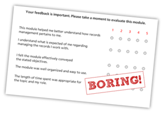
But have you ever noticed that these evaluations always seem to look the same?

I started wondering if evaluations have to be predictable in order to be effective, and if they have to feel like high school in order to be taken seriously.
Why can’t a survey be both engaging and credible? The answer is … IT CAN!
All You Need is Quizmaker and Some Imagination
Quizmaker is an awesome tool for creating evaluations. As Tom noted in his Quizmaker post recently, with some basic knowledge the possibilities are endless. This applies not only to designing cool and effective quiz questions but also for surveys.

Here are some tips to help you spice up your evaluations:
- Carry forward the design elements from your e-learning course. Use similar or complementary colors and layout, so that the survey feels like it belongs with the course.
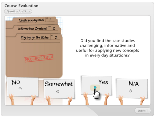
- Where possible, incorporate recognizable elements from the course content into your questions. This helps provide subtle reminders to the learner. For example, in the demo below, the same folder graphics seen in question 5 were also used throughout the presentation in which the survey appeared.
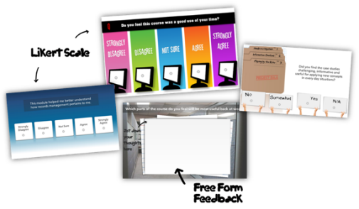
- Avoid packing your survey full of Likert-style questions. Consider breaking Likert questions into separate question slides. You’ll gain the same data but it’s less overwhelming to the learner. The Pick One question type is a good alternative. This will really help avoid the traditional boring survey feel.
- Experiment with animations and timing, just as you would for the content slides that you build in Presenter. This adds unexpected pizzazz with very little effort.
- For any question where the learner needs to take a bit more time to respond, consider using a strong visual background for reinforcement. For example, in the free-response question shown in the demo below, the background’s associated with a future event (back at the office) that the learner is contemplating.
Check Out These Ideas
In the following demo, the first slide is a typical boring Likert scale question. The other questions are examples of how you can build your survey to be more engaging and visually appealing. If you’re interested in building some questions like these, check out the tutorial links at the end of this post.
Great Content Makes for Reliable Data Collection
Though the visual element of a survey is important, credibility is also key. The credibility of data collected depends heavily on how the evaluation was constructed. A poorly constructed evaluation that looks pretty will result in, well, a pretty evaluation and nothing more.
If the evaluation is well-constructed, its data can effectively demonstrate success, help justify e-learning expenditure, and facilitate more e-learning projects. It’s powerful to be able to show a credible track record of outstanding learner reception to your courses.
Here are some tips for building credible evaluations:
First:
- Avoid overburdening learners with too many questions.
- Avoid creating evaluations that are skewed to prompt favorable comments. Choose to seek out honest, thoughtful responses.
Then:
Learn from the pros. There are a number of resources that can offer professional opinions on what it takes to create effective evaluation content. Some that I’ve found helpful are this book and this article. You might also want to explore Kirkpatrick’s evaluation model and critiques related to it.
Quick tip from Gabe: You might also consider hiring a survey expert like Great Brook to help craft your survey questions.
Ready to Create?
Here’s a series of tutorials that walk you through how to create the evaluation questions from the demo above:


4 responses to “How You Can Design Better E-Learning Surveys with Quizmaker”
[…] This post was mentioned on Twitter by Gabe Anderson and Ömer ÖZ, e-Learning Center. e-Learning Center said: How You Can Design Better E-Learning Surveys with Quizmaker http://bit.ly/97ZsRy (via @omeroz) […]
Stephanie – Great tips on carrying over elements of the course into the evaluation. As an advocate for visual appeal in the design of courses, I believe it to be very important not only to capture the learner’s attention immediately, but to hold their attention throughout the course. Many designers (me included) forget that the course evalutaion is still part of the overall experience. Thanks for reminding me!
How do I get a graded exam with a likert scale survey look with only 2 options agree or disagree (I want to change the scale of 1 – 5 to only 2 options Agree or Disagree).
Your suggestions for new way to present surveys was awesome. Thanks. I will definitely put them to use.
Thank you so much for those suggestions, I have already used them. I know the community is looking for more participaters and less of “leechers” I would love to contribute there is just so much that there is to learn before being a useful member.
Thanks again!
Comments are closed on this post. Need more help? Post your question in the E-Learning Heroes Discussions.