10 Visual Design Ideas for Designing Guru-Style E-learning
This guest blog entry was written by Articulate Community Manager David Anderson.
How many times have you watched a movie and thought, “This movie stinks. It’s nothing like the book?” Many times, right?

E-learning coures are a lot like movies. They each have a written and visual component.
Gurus know they can’t rely solely on their content to design award-winning courses. Instead, they treat their instructional and visual design as equal players.
Now let’s look at some ways you can design your next e-learning blockbuster.
Designing custom e-learning themes
The colors, fonts, design elements and layouts we use contribute to your course theme. The goal is to identify the elements that reinforce your content, and then wrap them up into a theme.
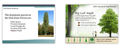
Consider the following two designs and ask yourself “Which one best communicates a course on forests?”
Using design mapping for visual analysis
One way to identify a topic’s visual elements is by using an analysis process similar to that used for task and needs analysis.
Here’s a screencast on using design maps and questions to ask when identifying your topic’s design elements and possible themes.
You can also download the design map template from our forums.
Designing custom slides
You customize the background by bringing together some of the design elements you identified in the design map exercise, and then arranging those elements to create a scene or setting.
Let’s look at the Rain Forest’s design map.
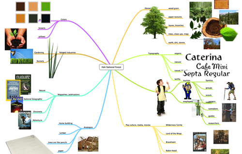
At this point, we have a fairly good idea of the colors, fonts, people and design elements associated with rain forests.
Now we’re ready to pull some of those elements together to create our slide background theme.
Here’s a tutorial that walks through ideas for ways to compose a course background and theme: How to design e-learning templates by breaking down scene elements.
Using what we learned in the design map and scene background lessons, we should have some ideas to play with.
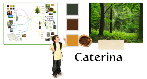
With our identified elements, I have enough to put a simple theme together.
Design Trends
One of the best places for design inspiration is your local magazine rack. Magazines do a great job capturing their audience’s culture and design elements.
View this screencast on Screenr
Here are more great examples inspired by many of today’s pop culture design trends:
- Designing web-comics
- Creating a snapshot focus effect for emphasis
- Removing backgrounds to create themed elements
- Polaroid retro effect
- Advertising masking effect
- Create nifty text and graphic embossed designs in PowerPoint
Content Makeovers
Sometimes it’s all about how we present our learning content. Think about your favorite educational shows like National Geographic, Animal Planet or Discovery. Have you ever seen bullet lists used as teaching tools?
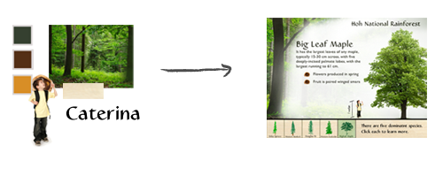
In the Hoh Rainforest example, we moved the bullets for each forest tree type and created buttons out of them that loaded a new slide for each specific tree:

Without modifying the writing or instructional design, we were able to transform a predictable slide into something more aligned with the actual content. Let’s look at some more ways we present existing content in more dynamic and engaging ways.
Soundboards
Soundboards are ideal for breaking up lists, FAQs, best practices, or bullet lists by providing learners another way to interact with their content.
Consider this Best Practices slide from a tire-changing course:
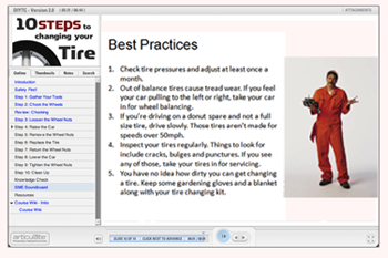
Looks familiar, right?
Look what happens when we apply a soundboard design to let the experts tell us, in their own words, what their favorite best practices are:
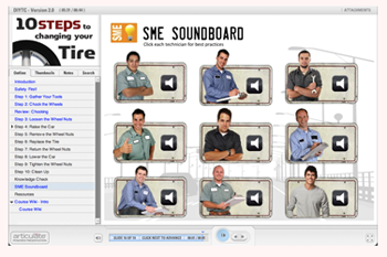
View the SME Soundboard screencast
SME Interviews
One of the most authentic ways to tell a learning story is to let the experts tell it themselves. Similar to the soundboard design, the idea is to design interactions for learners to hear from multiple perspectives.
View this screencast on Screenr
Here are two more screencasts on different ideas for designing SME interview slides:
- How to create simple, interactive scenarios for rapid e-learning
- How to create a photo cube effect in PowerPoint for branching scenarios
Reducing on-screen text
Ask learners what they dislike about e-learning courses and chances are you’ll hear “too much text” or “the narrator read the screen to me.”
Here are a couple ideas for removing on-screen text with visuals. The examples cover storyboarding techniques and image selection techniques.
View this screencast on Screenr
Two more examples for removing on-screen text in your e-learning courses:
Special Effects and Animations
Appropriately used, a special design effect, transition or animation is an effective design technique. The key is to keep them short, infrequent and subtle.
The parallax effect is an example of an animation effect to introduce scenarios or quick knowledge checks.
View this screencast on Screenr
And here are a even more examples of animations and special effects you could try in your courses:
- Parallax effect combined with motion paths
- Pan and zoom
- Zoom in effect
- Creating a Bugs Bunny effect in PowerPoint
- Using gradient fills to create dramatic lighting effects
- PowerPoint masking and composition effects
- Creating silhouettes and graphic elements for e-learning with Wordle
- How to create a photo wall effect in PowerPoint
Quizmaker Makeovers
Your custom designs don’t have to stop with Presenter. It’s just as easy to design custom themes in Quizmaker once you move from Form View to Slide View.
View this screencast on Screenr
To download the source files and view the screencast series, view this community forum thread.
And for even more Quizmaker inspiration, take a look at the following blog posts and screencasts:
- Storytelling in Quizmaker
- Animated feedback boxes
- Vegas flashcards
- Multiple-response questions to simulate questions appearing on one slide
Want More Tips for Building Guru-Quality E-Learning?
If you’re thinking about entering the Guru Awards, stay tuned — we’ll have more tips & advice each day for the rest of this week on the Word of Mouth blog!

6 responses to “10 Visual Design Ideas for Designing Guru-Style E-learning”
[…] This post was mentioned on Twitter by Brian Batt, Laura Jaffrey. Laura Jaffrey said: RT @articulatebrian: RT @Articulate: 10 Visual Design Ideas for Designing Guru-Style E-learning http://bit.ly/d7EkvT […]
David, I love your before/after course example of the Hoa rainforest. Do you mind sharing what tool you used to build the mind map?
Thanks Amanda. I used MindNode Pro (Mac only) and FreeMind (Mac and PC). I like MindNode Pro because it’s more visual than FreeMind, but both products are great.
[…] Build better looking courses. You want your courses to look good and you want the visual design to support the objectives. This post shares 10 visual design tips with a great mindmapping exercise. […]
[…] 10 Visual Design Ideas for Designing Guru-Style E-learning – Articulate – Word of Mouth Blog […]
[…] http://www.articulate.com/blog/10-visual-design-ideas-for-designing-guru-style-e-learning/ This entry was posted in Uncategorized. Bookmark the permalink. ← OOPS – Not Ready for Prime Time Yet […]
Comments are closed on this post. Need more help? Post your question in the E-Learning Heroes Discussions.