Add a Summary to Your Engage Interaction
This guest blog entry was written by Articulate VP of Community Tom Kuhlmann.
Engage ’09 is one of my favorite elearning applications. I like it because it’s so easy to use and the output is really polished. You really don’t have to do that much work and the final product makes you look like a star.
Another reason I like Engage ’09 is its versatility. I can add an interaction to a slide in Presenter ’09. Another option is to add an interaction as a standalone product on a web page or as its own mini course.
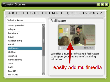
For example, I once built an elearning course for a human resources department. The course included a glossary (which I built in Engage). Later the client wanted to use the glossary on her web site. Easy enough. I published it for the web and she was all set.
She had a great looking glossary for her site and it didn’t require any extra effort. It was also a lot easier building the glossary in Engage than it would have been to build it as a web page. Plus they had the added benefit of easily including multimedia.

A new feature in Engage ’09 is the summary feature. This helps make Engage better as a standalone product, in the same way that the new SCORM capability does. So now Engage gives you more ways to use it.
When you insert the Engage interaction in an elearning course, you can probably choose to forgo a summary screen because it’s in context with other supporting material in the course. However, that’s not the case if you used the interaction by itself on a web page. In that case, having the summary screen really adds some value.
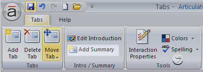
Adding a summary is pretty easy. All you do is click on the “Add Summary” button and it creates a tab for you to enter your information. Like the rest of Engage, you can easily add text, audio, or media files to create a rich user experience.

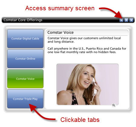
The summary page is only available if you navigate to it using the navigation arrows on the top of the interaction. You won’t see a clickable option. For example, if you have a Tabs Interaction (like the image below), you only see the content via the tabs on the left. To get to the summary (or introduction) screen you need to click on the navigation buttons on top.

You can modify this by using the hyperlinks to those screens. You can learn more about using hyperlinks in this post on using Engage’s new internal hyperlink feature.
In that post I talked about using the links to sort learners. That’s another good example of how to effectively use the summary feature. You can use the interaction itself to present information to new learners and use a hyperlink to direct experienced learners to the summary screen for a condensed version of the information.
Another obvious use of the summary screen is to summarize the course. I know…you probably wouldn’t have thought of that on your own. 🙂 So it works like this:
- Introduction: tell them what you’re going to tell them
- Interaction: tell them
- Summary: tell them what you told them
As you can see, the summary feature is simple and easy to use. It sure is a welcome addition to an already great product.

1 response to “Add a Summary to Your Engage Interaction”
I like the glossary interaction in Engage. However, I do not have enough video footage to compliment each term. Are there many glossary interactions that do not use videos or photos.
Photos would be very time consuming for me. Also, are there currently any Engage Interactions that support a lot of text, besides the Flipbook.
Comments are closed on this post. Need more help? Post your question in the E-Learning Heroes Discussions.