Creative Ways to Enrich Your E-Learning with Toolbar Tabs
This guest blog entry was written by Jade Kelsall, an Articulate user who designs e-learning for Skills@Library at the University of Leeds, UK.
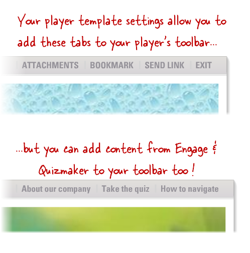
Let’s talk about toolbar tabs. You might already know that by customizing the layout settings on your player template in Articulate Presenter, you can add some standard tabs to the upper edge of your player. But did you know you can also add tabs for your Engage interactions and Quizmaker quizzes on the same toolbar?

This opens up all sorts of options for what you can include in your course. It’s a really flexible way to enrich your e-learning. Learners can click on the tabs anytime during the course to view the content you provide there.I’d like to give you a few creative ideas for how you can use Engage & Quizmaker content in your toolbar tabs. (If you’re not yet familiar with how to add an interaction or quiz as a tab on your player’s toolbar, this tutorial shows how.)
Include a how-to-navigate demo
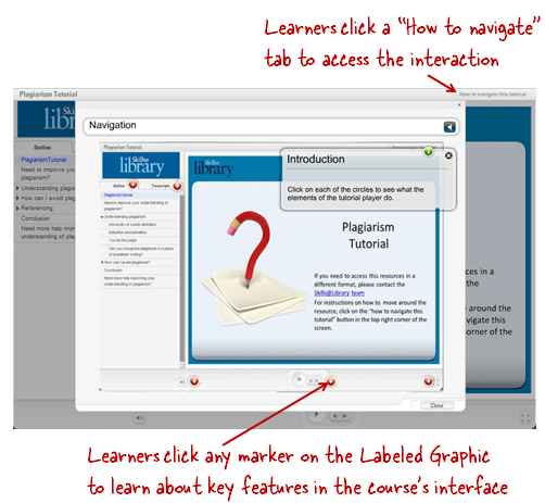
Many developers like to give their users a bit of info on how to navigate the course. Toolbar tabs are a great way to do this. Learners who need the information can access it easily, and those who don’t can bypass it.One approach I’ve used is to create an Engage Labeled Graphic, showing key features on the course’s player. Have a look at the example below. You can get a free copy of this interaction to use or modify for your own courses by visiting my blog. Another idea for adding a how-to-navigate resource is to create a video walk-through of your course with Screenr. You can download the MP4 from the Screenr website and add it to an Engage Media Tour interaction or a blank Quizmaker slide. Then just insert the interaction or quiz as a tab on your player.
Add resources to help your audience find out more
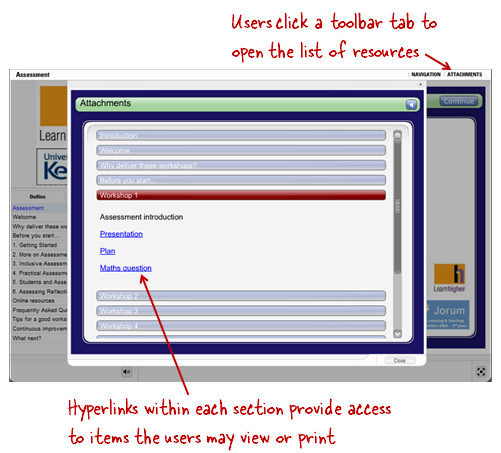
Another good use of a toolbar tab is to provide additional information your learners might want to explore. Though Presenter’s attachments feature can be useful for this, in some courses I find that the list of attachments gets too long to manage, or too difficult to organize. An Engage FAQ interaction can be a neat alternative for providing supplemental info instead.Within the FAQ interaction, you can organize the attachments however you like, and add hyperlinks for specific resources. Then just add the interaction as a toolbar tab on your player. It’s a nice way to make information available in an interactive, easy-to-navigate interface. In the example pictured below, the FAQ interaction contains attachments related to a series of workshops: If you’re interested in learning more about how to use an FAQ interaction in this way, check out this tutorial. As Justin mentions in the tutorial, your attachments will need to be hosted online so that you can link to them from your Engage interaction. Or, you can use relative hyperlinks to make the attachments part of your interaction instead. Here‘s a way to do that.
Use a blank slide to provide company info, links to other courses, and pretty much anything else
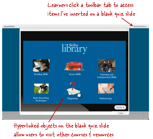
Another way to get creative with the toolbar tabs is to include content that you build in Quizmaker. Quizmaker gives you PowerPoint-like design tools, plus the flexibility of incorporating multimedia elements. And you aren’t limited to just creating quizzes — you can use Quizmaker’s blank slide feature to build any content you want, and then incorporate it into a toolbar tab.For example, in the course pictured below, I used a toolbar tab to provide information about resources related to my course. It contains a blank Quizmaker slide with several hyperlinked images. Users can click on the images to access other e-learning courses and related resources. I’m sure you can think of all kinds of other uses for a blank Quizmaker slide inserted as a tab in your course. How about a supplemental video? Or how about a snazzy animated slide showing your organization’s contact details, which you could then re-use in other courses? There really are no limits to what your tab content can include when you leverage Quizmaker’s blank slide feature.
How will you use toolbar tabs?
So go on – get creating some tabs! I look forward to seeing what other ideas the Articulate Community has for using this flexible technique of adding content to e-learning courses.

22 responses to “Creative Ways to Enrich Your E-Learning with Toolbar Tabs”
Jade:
We use this feature to make any navigation helps or global glossary files accessible for the duration of the individual course.
For Example, “How to Navigate this Course”, “Glossary”, and “About the Author” interactions are added as tabs to the top of each of our courses, as they are not necessary to complete the learning objectives, but offer insight and help.
This is a great tip. Thank you!
I use Toolbar Tabs often to satisfy those SMEs that believe EVERYTHING must be in the course.
By using tabs I can make it optional.
Hi James,
Yes, it can be frustrating to be obligated to include lots of elements which aren’t appropriate for all users. Tabs are a great way of keeping the clutter out of the main body of the course.
Great post Jade. Tabs are a great way to leverage multimedia and linking rather than dropping everything on the slide leve.
Want more info? Yeah, it’s in the tab. Don’t need it? Fine, keep on moving:-)
Tabs are a great way to maintain course pacing while providing the additional support for learners who want or need it.
Great Tips! Question…what is the fount used to replicate handwriting? If memory serves me, I’ve seen this font on other posts, but can’t find any references to what it is called. Is it available to share?
Again, thanks for the tips!
@Lisa – the particular font used in this post is one called skippy sharp; you can find it online at a number of different sites including fonts.com; if you’re looking for free handwriting fonts though, you could check out the ones tom shared on his blog awhile back: http://bit.ly/T9mrL
Jade, liked the ‘How to navigate’ interaction. But would need to tell the learner at the start of the movie where to find it. Not sure whether I would have an animated arrow pointing to the tab (synced with the audio) or if it would open automatically when the learner starts the movie. Does anyone know whether the latter is possible? Or do you have any other suggestions?
Hi Graeme,
How about pointing towards the tab in an introductory audio?
Is there a way to put an “Exit” (or “Close”) link as a toolbar tab?
@training geek
One of the options under the “player templates” dialogue includes having an “exit” tab. Go to player templates => layout => toolbar menu, and ensure that the “exit tab” box is checked
Jade
Wasn’t looking for it there. Thanks!
I’m late to the party but this is a great tip that is coming in handy for a a project I am currently working on. I have a resource that I want learners to have access to in case they run into trouble. I thought I might need to create a ton of duplicate slides to do this but not with the mighty tabs. Thanks again for the tip.
Hey Joe, glad you found it useful!
Jade
How can I include shapes/objects/photos on a single slide that allow the user to click on the shape to display text detail specific to the label on the shape/object/photo and then be returned to the slide to select an additional shape. I believe it is like hyperlinking, but the feel for the user is more seamless. Hope this makes sense. thanks for your recommendations
Hi Terri- please take a look at this screencast, which should help you out. It is about hyperlinking and leveraging duplicate/hidden slides.
Hi,
Is it possible to add a tab like a glossary to a player template?
Mu course has several units clickable via an html index but the glossary is the same in all of them.
Thanks.
[…] Intuitive Toolbar Tabs The judges also liked how Mike incorporated supplemental information in the toolbar tabs of his player. He included three different Engage interactions (a Media Tour, an FAQ, and a Process […]
Hi Jade, I tried inserting a quizmaker quiz using only a blank slide, but my quiz has a submit button in the lower right. Your screen grab shows More. Can I have nothing there? Or just make the submit button invisible and hope no one clicks there?
Hi Sue,
Yes you can make the button invisible, by editing the quiz template colour scheme for your Quizmaker quiz. If you make your buttons transparent, and the text, then the button will be invisible.
Hope that helps!
Jade
I’d like to create a custom Table of Contents using the blank quiz slide approach, rather than using the sidebar TOC. Is there any way to add links within the course (rather than external hyperlinks) to graphics or text on a quiz slide? I can only see a way to add external hyperlinks.
I don’t have access to Screenr as it is blocked by my company, and I’m wondering how to attach/add a hyperlink that contains a document (pdf) within the Tabs engage interactivity.
As of now, I have lots of documents as attachments. I want something different and Tabs seem the perfect fit.
Is the Tab interactivity linked to the attachments?
Thanks,
Julie
Hi Julie,
First, check out this article on hyperlinking:
http://www.articulate.com/blog/get-creative-with-hyperlinking-in-engage-09/
After that, you can add hyperlinks to documents that are in your attachments by using the following link as an example:
data/downloads/myfile.pdf
When you’re on a network that will allow you to view Screenr, check out the step by step guide here:
http://www.screenr.com/83K
Comments are closed on this post. Need more help? Post your question in the E-Learning Heroes Discussions.