Kineo & Clive: 60-Minute Masters for SMEs
If you’ve ever read Clive Shepherd’s blog (and if you haven’t, you really should), then you already know about his 30-minute masters wiki. Building on the concept, Clive teamed with Articulate partner Kineo to launch 60-Minute Masters, billed as such:
This short course provides subject experts and many others with the skills needed to design engaging, rapid e-learning materials for use in the workplace.
I’m delighted to bring you a first look at the course, which just went live this week and leverages some great capabilities of the Articulate suite of software:
To hear the audio version of the course, you’ll need to register (free of charge) at the 60 Minute Masters site.
Regarding their choice in using Articulate tools to create this resource, Kineo’s Managing Partner Steve Rayson said the following:
The great thing about Articulate is that it provides a rapid way of generating SCORM-compliant elearning content. However, a growing issue for many organisations is creating a look and feel which meets their brand guidelines. This means creating a consistent look across the Articulate suite including Engage and Quizmaker. By using the Articulate SDK you can create a consistent user interface and a brand experience to meet the most exacting requirements. At Kineo we have worked with leading brands in areas such as finance and telecoms to develop high quality branded player templates using Articulate SDK.
Even if you don’t have the SDK, you can create custom Engage color schemes, and use the Colors and Effects feature of Quizmaker to build elearning content that matches your brand.
And speaking of wikis like Clive’s, be sure to read Tom’s latest post: 5 Ways Web 2.0 Can Make You a Better E-Learning Designer.


15 responses to “Kineo & Clive: 60-Minute Masters for SMEs”
How do they get the Quiz to look like it is part of presenter template (or is it Engage?). It looks like both the quiz and the engage are published into Articulate. Have they changed the Quiz template with the Articulate SDK og just turned off all the extra in properties in Quizmaker?
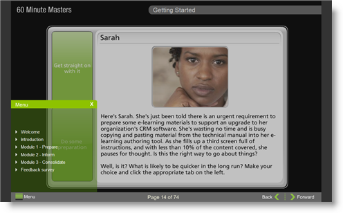
We didn’t change anything in engage or quizmaker. We simply created a player template where the black frame (see image above) sits over all the screens including the engage and quizmaker screens. This gives everything a nice consistent look and feel. You can brand this frame to meet your needs. You just need to size the frame window for the engages and use the same colour engage background. The normal quizmaker edging is still there just hidden by the black frame. Hope this makes sense.
How did you do the menu on the bottom left side?
We used the option to edit the menu in the SDK and set this to just pick up level 1 ie section headings. We went for a sliding menu to maximise the available screen space for the content.
[…] Clive on Learning The man behind the 30-minute masters wiki, Clive Shepherd’s blog provides great insight on trends in the industry — from a UK vantage point across the pond. I also featured Clive’s work in this recent post: Kineo & Clive: 60-Minute Masters for SMEs. […]
Would it be posible for you to share the articulate templete with others?
[…] the Kineo & Clive: 60-Minute Masters for SMEs showed us recently (which I also highlighted as part of the Articulate 101 series), there are a […]
In the comment from Steve Rayson above, he mentions that to create the effect of his presentation, he created a “player template where the black frame sits over the screens including the engage and quizmaker screens.” It sounds like he created some sort of black mask to hide everything but specific sections of the engage and quizmaker published pieces. Does anyone know how to accomplish this using the Articulate player template? Any input would be greatly appreciated.
Hi
Just to clarify you will need the SDK and be able to edit in flash to create a skin. Unfortunately it is not a straightforward task though we can create one for you if that helps. Once you have a skin you just drop it into the published player folder.
You can see another example at http://www.kineo.com/demos/bmc_v04/player.html
In essence we just create a border to hide the bits of engage/quizmaker and make it look consistent. This reads in the headers and page numbers etc.
What are you modifying with the SDK to create the mask?
is there a way to insert a background image in player.html so instead of a solid colour that is defined within the template builder, i can have a repeating image pattern
it’s so cool. Could you pls advise on detail how to make the menu like this?
How did you do the menu on the bottom left side?
I would like to know how to do make the menu appear transparent and on the bottom left too.
I have the SDK but there is nothing else that looks as good as these two demos.
Thanks,
Antony.
With all the palaver of fiddling with constraining templates, multiple players sitting within players, learning to work with the SDK, etc., why not just learn Flash and ActionScript and be doine with it? They have a fiercesome reputation, but they really aren’t all that difficult to master, and once mastered are tremedously liberating.
(I don’t condone snobbery about rapid design tools, but this frames-within-frames-within-frames “vanishing mirrors” syndrome is what more than anything else the professionals dislike about the them.)
Comments are closed on this post. Need more help? Post your question in the E-Learning Heroes Discussions.