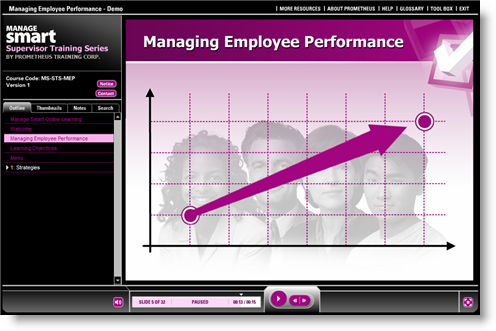
Prometheus: Managing Employee Performance
You may not know Prometheus by name, but many of you know its work: The training company created the Articulate Guru Awards 2007 Gold Winner course on ergonomics, featured on this site, across the Web, and at every industry trade show we’ve attended this year.
Prometheus is back to show its stuff, this time featuring this demo course on Managing Employee Performance. Notice the customized player template, the integrated Flash movie in the introduction, and the use of Engage interactions as tabs for content like “About Prometheus,” “Help,” and “Glossary.”
View Managing Employee Performance Demo
Visit the Community Showcase to see the legendary ergonomics course developed by Prometheus, along with other examples of great content. And, of course, with nearly 41,000 views, the most visited thread in our forums, Examples of Articulate in Action, is chock-full of great examples. It’s also an effective route to sharing your Articulate courses with the world and getting quick feedback from the community.
Finally, be on the lookout early next year for the announcement of our 2nd annual Articulate Guru Awards! In the meantime, you can see all 2007 Guru winners here.


11 responses to “Prometheus: Managing Employee Performance”
Hello – I am a pre-beginner! I really liked the look of the site and the flow of the presentation. Please forgive these dumb questions! Did you make the Manage Smart… your logo? Also how did you get the engage interactions to flow seamlessly with the presentation? Mine stop and load with a different volume level. It does not have the same flow as yours.
Thanks for any input.
Thanks so much for the kind words!
We created a ManageSmart logo as part of our branding for this presentation. We reused it in the custom Flash animation at the opening of the presentation.
We also used custom Flash sequences for some of the other elements of the course, such as the scenario-and-feedback sequences. That’s how we were able to make the series of scenarios flow seamlessly without a break for loading.
We used Engage interactions toward the end of the demo, because it’s such a great way to layer content for users who have different need-do-know levels. We opted to omit the audio in that section of the course.
Helene
Aha! That explains why it flowed so well. Your “manage smart” logo in the player template – did you design that with the black background that fades in one corner? I couldn’t see how to do that in the colorizer in the player template. Great colors for your player – really eye catching.
The background isn’t part of the player template itself. It’s a graphic that we “faded” in Photoshop, then imported.
Congratulations! It’s a very remarkable work!
I have just a few questions: in slide 9, there is a blinking button, with rollover effect: how did you get this?
How did you get interactive quizzes inside your slides? are they captivate flash with the same powerpoint background?
In slide 25, how did you get the windows, opening for each characters by clicking on the photos?
Thanks for any input and help!
Congratulations! It’s a very remarkable work!
I have just a few questions:
-in slide 9, there is a blinking button, with rollover effect: how did you get this?
-How did you get interactive quizzes inside your slides? are they captivate flash with the same powerpoint background?
-In slide 25, how did you get the windows, opening for each characters by clicking on the photos?
Thank for any input and help.
fabio 🙂
Fabio,
The blinking button with rollover, the quiz-like effects, and effects on slide 25 are all custom Flash elements.
We didn’t use any Captivate, it’s just Flash.
Wow, I’ve got to start with studying it!
…so you made a flash file for every dynamic slide, then you embedded it in articulate.
-what is the size of the flash file?
-is the background part of the slide or is it a part of the swf?
-[the last one]as it the same format [4:3]?
Thanks in advance,
fabio
Nice job. What I like is the way the flash and the Presenter content work together. it goes back to the point I made in a recent post that you can build custom content and still leverage the capabilities of the Presenter course.
I really like th way the logo sits in there as well.
Hello there, nice job as usual.
I’ve noticed one thing though, that i dont seem to be able to understand. The “notice” button in the main layout is above the contact button, rather than to its left, where the “bio” button normally is. Can you share how to change its position?
Thank you, and keep up!
The About your company tab – which interaction did you use to create that tab…Thanks.
Comments are closed on this post. Need more help? Post your question in the E-Learning Heroes Discussions.