Warning: Using the Wrong Images Can Confuse Your Learners
November 20th, 2007Studies show that using images and text to represent your ideas is more effective than just using text. The key is choosing the right images because those same studies show that images with no purpose can actually make learning harder.
To lessen the cognitive load and make your content more memorable, it’s important to use images that contribute to the learning experience rather than detract from it.
Here are three things to consider when using images in your elearning courses.
Use Images to Tell a Story
Images are effective because they can hook us emotionally or get us to see things in a new way. Images can connect us to greater ideas and places in time.
Look at the picture below. Even though there’s no text, it tells a story. What does this picture say to you? What story does it tell?

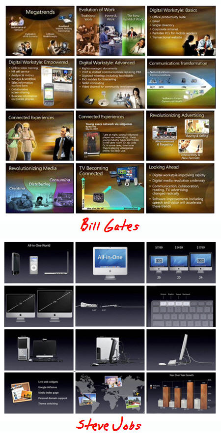
The screens below demonstrate how you can easily convert bullet point text into something that is both visually interesting and memorable.

As you can see, the second image is more interesting and whatever is missing by removing the text can be augmented with narration. The second image is more effective because it is visually memorable, the information is concise, and you can never go wrong with a pug.

These two images come from the "Meet Henry" presentation. Spend some time studying how the designer of the slides used images and minimal text to convey key points of information.
Tell the Learners Why the Image is Relevant
While images are good at sharing information, you do run the risk that what the learner sees is not what you are trying to convey. Without guidance on your part, your learners could interpret the image differently than how you intend.
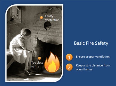
The image of the girl above is from the Great Depression. You can imagine a detailed scenario to embellish the image and create a very moving story. However, the image changes dramatically if I add the following information.

With appropriate guidance, the learner’s attention is focused on key areas and the purpose of the image is clear and contributes to the content.
Avoid Using Images Just for Decoration
A common problem with elearning courses is that we are tempted to put images on the screen to dress it up. The image serves no real purpose other than decoration.
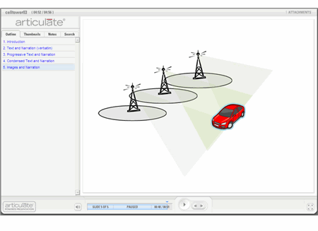
Compare the images below. The first is typical of what we see—bullet point text with a decorative image.

The second is an example of how the image supports the content and helps the learner develop a visual model of the information. If you notice, the text is almost identical. I only made minor modifications by creating a more descriptive title and positioning the text close to its part on the image.

Make your next elearning course more dynamic by using effective graphics. Visualize your screens and use graphics that explain the content. Avoid using graphics to make your screen pretty.
With some practice and intentional design of your graphics, you will create very effective elearning.
*Demo content from Oregon State University and Shane Eubanks.
Events
- Everyday. Check out the weekly training webinars to learn more about Rise, Storyline, and instructional design.
Free E-Learning Resources
 |
 |
 |
|
Want to learn more? Check out these articles and free resources in the community. |
Here’s a great job board for e-learning, instructional design, and training jobs |
Participate in the weekly e-learning challenges to sharpen your skills |
 |
 |
 |
|
Get your free PowerPoint templates and free graphics & stock images. |
Lots of cool e-learning examples to check out and find inspiration. |
Getting Started? This e-learning 101 series and the free e-books will help. |


31
comments