The Rapid Elearning Blog

Archive for January, 2008


The Rapid E-Learning Blog - fuzzy thumb image

It’s a tricky balance working with customers.  They commission the elearning courses, pay the bills, and are the ultimate authority for their elearning projects.  So you have to listen to what they want.

On the other hand, a demanding customer can negatively impact the elearning course by making demands that don’t fit sound instructional design.

I once worked on a project for a group of CPAs.  They wanted to entice young people to consider a career as accounting paraprofessionals.  So we created a number of design treatments that attempted to make the world of accounting seem exciting to young people.

All of the treatments were rejected because of this or that reason.  Mostly, they were too out of the box for the client.  The person who headed the project said, “You know, Tom, I really like these ideas.  The problem is that all of the other people on the board are a little uptight so we should probably not get too wild with these ideas.”

Well sure enough, we didn’t.  We built the project exactly like the customer wanted.  I was inexperienced at the time and catered to our customer’s every demand and ended up with a subpar product.  After viewing the final project, the customer stated that it was kind of flat and boring and not really what he had envisioned.

Now it could have been the subject matter (I don’t know enough accountants to be sure), but my guess is that we spent too much time listening to the client and not enough trusting our expertise.  Had I been more proactive and assertive, we could have had better results.

The challenge is figuring out how to balance satisfying the client, who can sometimes be misinformed, and getting a good elearning course built.

Here’s how you do it.

1. Make a personal commitment to excellence.

The best way to manage your customer relationship is to earn a reputation for doing a good job.  In my wallet, I have a card that I’ve had since I first started working.  It is the essence of how I do my work.  The card states, “Always maintain a ‘service-first’ attitude.  Make it a rule in everything you do to give people more than they expect to get.”

You cannot control anything but yourself and what you do.  If you’re committed to a quality product and helping people, you’ll get through your work (and life) with much more joy and purpose.

2. Leverage your expertise.

Perception is reality.  Regardless of whether you’ve done one project or one hundred, the customer thinks you’re the elearning expert.  Act like it.  Without sounding like a know it all, be prepared to explain your ideas and why they will work for the course.  One of my favorite books is E-Learning and the Science of Instruction because it has some good research-based information that I can easily share with customers who ask to do something that I don’t think will work.

Going back to my CPA project, my problem was my lack of experience working with customers at a higher level.  I was intimidated and not prepared to offer my expertise.  I acted like a beginner and I’m sure that didn’t inspire the customer’s confidence.

3. Be a good listener.

You’re there to help solve a problem.  Listen to the customer’s needs and really focus on a solution that will help the customer.  Ask good questions.  The more you get the customers to talk, the more likely they’ll believe you’re the expert.

My wife once told me two things.  The first is that I should always ask three follow up questions when talking to people.  And the second was something else.  I wasn’t listening.

4. Establish clear milestones and timelines.

One of the biggest time wasters and causes of frustration is lack of communication about the project goals.  Work with the customer to set clear objectives and expectations.  This helps move the project forward.  It also helps keep things from going off track.

Project managers talk a lot about scope creep.  No, not the guy trying to cover halitosis in the cubicle next to you.  Instead, it’s when project demands start to creep outside the scope of the project.  This is common on elearning projects.  Having clear objectives and expectations helps solve this problem.

5. Earn the customer’s attention.

I once heard Dr. Phil tell someone that “the difference between winners and losers is that winners do the things that losers don’t.”  Be prepared.  Be on time.  And most importantly, be proactive.

This is a competitive world and there’s always someone who can do your job better for less money.  Earn a reputation for having all of your stuff in order.  Don’t waste time and don’t wait on the customer before you respond to needs.

I know so many elearning developers that will put work on hold until they get to meet with the customer or get more direction.  It’s almost as if they relish the times when they aren’t in touch so that they can relax.  Take Dr. Phil’s advice, and keep on moving.  Do the little extra things that tell the customers you’re paying attention and committed to their success.

6. Give the customer choices, but not too many.

If you come to the project with only one idea, you open the door to all types of issues.  If you come up with too many ideas, it becomes debilitating, because you’ll spend too much time going through all of the options.

Come prepared with at least three treatments of an idea.  I usually create a straight forward linear course, one focused on content sharing and some interactivity, and then one where I can craft a more real world environment for the learner.

I’ve seen designers build the course treatment they want to do and two others that were so obviously not the right course, that by default the customer always chose the “right” one.

7. Give them the fuzzy thumb.

This is an emergency trick and requires the utmost skill.  I don’t recommend it for amateurs.  In fact, I am a little leery to share it with the public.  Usually I reserve this advice for a quiet corner in a noisy pub…and only in the strictest confidence.  I’m assuming that you won’t share what I’m about to reveal.

People have a tendency to offer input because they want to feel like they contributed.  Many times this input is of no value.  In fact, sometimes it might even derail a project if the customer demands you implement it.

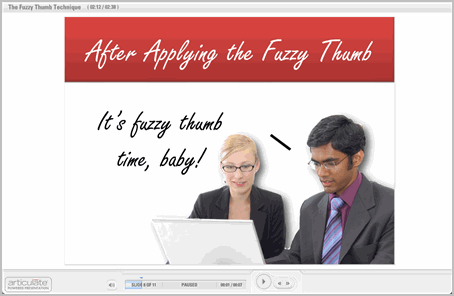
I have a photographer friend who came up with the “fuzzy thumb technique” to counteract this tendency. When he submitted photos to the customer for review, he’d always slip in one with a fuzzy thumb in the image (or some other obvious issue).  It never failed, the customer would focus on the thumb and he’d be able to steer them to the better photos and avoid the customer making demands that hurt the project.

Offer a document with typos, or face an object the wrong way.  Do whatever it takes to draw the attention to an obvious error.  The “fuzzy thumb” allows customers to give feedback and it usually makes them feel good (and sometimes superior) because they spotted an error.  In return, you get to do the project your way with little interference.

I built a quick demo to explain more about the fuzzy thumb technique.  I included some of the PowerPoint animation tips I provided in the previous post to give you some more ideas.

The Rapid E-Learning Blog - managing customer expectations for elearning

Click here to view “Fuzzy Thumb” tutorial.

Note: Be forewarned that this trick takes the skill of a magician and could backfire if not done properly.

These tips will help you do a good job and please your customer.  You’ll no longer have to kowtow to a misinformed or problem client who can put a damper on your desire to build excellent elearning courses.

Stock images from stock.xchng, a great site for free stock photos.

Events

Free E-Learning Resources

Want to learn more? Check out these articles and free resources in the community.

Here’s a great job board for e-learning, instructional design, and training jobs

Participate in the weekly e-learning challenges to sharpen your skills

Get your free PowerPoint templates and free graphics & stock images.

Lots of cool e-learning examples to check out and find inspiration.

Getting Started? This e-learning 101 series and the free e-books will help.


PowerPoint is a very capable animation program.  In fact, I’ve seen some animations that were so advanced I would have thought they were built with advanced animation tools.

In this post, I’ll share three impressive, yet easy-to-do animation techniques that you can use right away in your elearning courses.  Your courses will look nothing like ordinary PowerPoint slides and they’ll be more effective and engaging.

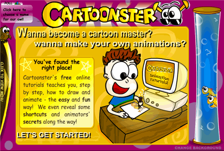
Before you learn to make your own animations in PowerPoint, it’s a good idea to understand some basic animation concepts.  I recommend visiting the Cartoonster site below since it does a nice job of introducing some basic animation concepts.  Most of the concepts that you learn at Cartoonster can be applied in PowerPoint.

The Rapid E-Learning Blog - Cartoonster animation effects

Click on link to visit the Cartoonster site.

Create Key Frames

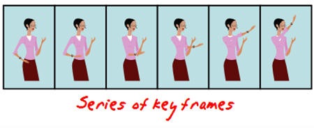
At the most basic level, animation is the cycling of key frames to give the illusion of movement.  Key frames are snapshots of an image at a single point in time. 

The Rapid E-Learning Blog - keyframe animation for PowerPoint

A simple way to see key frames in action is to create them in PowerPoint using the duplicate slides feature.  Here’s how you do it.

  1. Create a slide and add an object.
  2. Insert a duplicate slide by selecting the slide thumbnail and typing CTRL+D.
  3. On the new slide, slightly move the object to a new position.
  4. Repeat until you create the number of images you need.
  5. As you cycle through the slides you’ll see the animation effect.

Motion Path

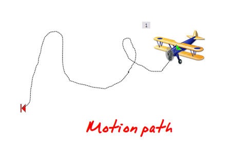
Motion paths allow you to create custom paths for your objects.  This means that you can have your objects go anywhere you want on a screen and follow the path you choose.

The Rapid E-Learning Blog - motion path animation for PowerPoint

Combine motion paths with some of the other animations and you can create a very nice animated sequence that could look like it was created in Flash.

  1. Select your object.
  2. Go to Custom Animation> Add effect.
  3. Select a desired motion path.
  4. Apply the motion path to the object and modify the timing and effect settings.

Flash Once Animation

Many people seem to gravitate towards PowerPoint’s wipe, fly-in, and fade animations.  Those seem to be the most popular.  The Flash Once animation is not that well known.  It’s kind of like the Cinderella of PowerPoint animation, only popular with local exhibitionists.

The Rapid E-Learning Blog - flash once animation

Flash Once does exactly what you think it would do, it flashes once and then it disappears.  What this lets you do is put a series of images together that can appear in sequence and give the illusion of motion.  Here are two ways you can use the Flash Once effect.

Apply Flash Once to your key frame objects.  This allows you to create an animated sequence on one slide.

  1. Create a series of key frame objects.
  2. On each slide, group the object together to make sure it is one object.
  3. Move all of the objects to one slide.
  4. Apply the Flash Once animation. 
  5. Select a custom time to speed up the effect.
  6. Layer the objects based on the desired sequence.
  7. Set to animate after the previous.

Tip:  to cycle through the layered objects, use the tab key.

Use Flash Once instead of the motion path.  Motion path is kind of stiff when you move an object around because the object does not rotate with the path.  With Flash Once, you can move the object over a desired path and have it rotate to follow a more natural movement.

  1. Create an object.
  2. Add Flash Once animation.
  3. Copy and paste the object on screen.
  4. Move the object along a desired path.
  5. Rotate the object as needed.

I made a quick demo with four tutorials to show you some of the ideas I shared in the post.

monkey

Click here to view the animation tutorial.

With some practice, you can create very sophisticated animations in PowerPoint.  I like to take clip art people and then break them apart to have separate body parts.  Then, like Dr. Frankenstein, I can assemble them the way I choose and use the body parts to quickly create animations.

I’ve got some more PowerPoint animation tips to share, but for now, I’ll let you practice these.  I’d love to see what you’re able to do.  If you’re up to the challenge, create some animations and send them my way.  Perhaps, they’ll make it to the blog.

Events

Free E-Learning Resources

Want to learn more? Check out these articles and free resources in the community.

Here’s a great job board for e-learning, instructional design, and training jobs

Participate in the weekly e-learning challenges to sharpen your skills

Get your free PowerPoint templates and free graphics & stock images.

Lots of cool e-learning examples to check out and find inspiration.

Getting Started? This e-learning 101 series and the free e-books will help.


e-learning

Building an e-learning course can be time-consuming and costly.  Because of this you don’t want to waste your resources by making your e-learning course more complex than it needs to be.  Instead, your objective is to create the best e-learning course you can with the limited resources you have.

Identify the Course’s Purpose

The intent of most e-learning courses is to change performance.  However, the type of course that’s usually built focuses on sharing information rather than performance improvements.  This happens because most people focus on delivering content rather than on changing performance.

Your first step is to get your client focused on the real performance goals and then guide them to the right type of intervention.  Sometimes it means they don’t need an e-learning course.  In that case you save time and money by not building the e-learning course.

However, if they still need (or want) an e-learning course, then determine what type of course they need.  By identifying the type of course you are building, it’s easier to determine what resources you can commit.

Understand the Type of Course

 elearn_types

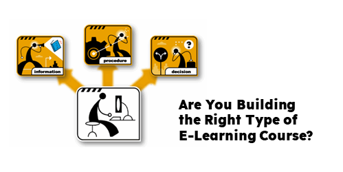
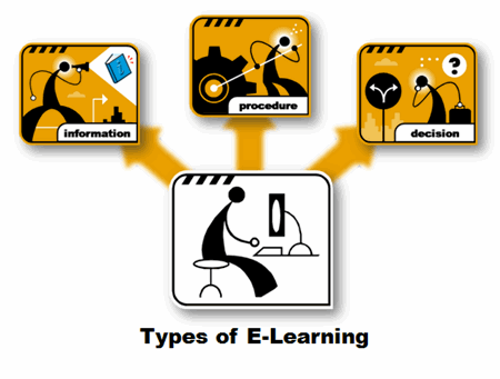
E-learning courses typically focus one of two things: sharing information or changing performance. And, within that framework, there are basically three types of e-learning courses.

  1. Communicate information with no performance expectations.   Information-based courses communicate new information but have no built-in expectations of changed performance.  A good example is a course that highlights new features of a software application.  You learn about the new the features but you aren’t required to do anything with this new information.
  2. Give step-by-step instructions that have specific outcomes.  These courses are focused on procedures and how to do something.  They’re made up of repeatable tasks that are very close to what the learner will do at work.  A good example is showing someone how to complete a worksheet or use software.
  3. Share guidelines to help the learner solve problems.  The most challenging courses to design are those where you teach principles or guidelines versus repeatable steps.  You really have to understand the nuances of the learner’s situation and how the principles can be applied while respecting the fact that each application is somewhat unique.

All three types of courses can be as simple or complex in design as you want to make them.  Keep in mind that the more complex the course is, the more time and effort it will take to build it.

Your best bet is to minimize the complexity and free your resources for the projects that are going to make the most impact.

To build good e-learning courses means that you have to know what type of course you’re building and get the most out of your resources.  Learn to differentiate between information and performance based courses.  Then move your resources to those courses that are going to have the most impact.

Events

Free E-Learning Resources

Want to learn more? Check out these articles and free resources in the community.

Here’s a great job board for e-learning, instructional design, and training jobs

Participate in the weekly e-learning challenges to sharpen your skills

Get your free PowerPoint templates and free graphics & stock images.

Lots of cool e-learning examples to check out and find inspiration.

Getting Started? This e-learning 101 series and the free e-books will help.


2008rat

2007 has been a wild ride.  Five minutes after launching this blog, our servers crashed.  And then five minutes after that I got a few hundred emails telling me that the servers crashed. 

After a few hectic minutes, we got the servers back online.  I answered all of those emails (with the help of a Starbucks Venti Americano).  And, it’s been smooth sailing ever since.

Highlights for 2007

  • You are 14,000 strong.  In less than five months, over 14,000 of you have subscribed to this blog.  Thank you to all who subscribe and participate in the blog.  I appreciate the emails I get and all of the kind comments.  I even appreciate the critics…most of the time. 🙂
  • You have written close to 800 comments.  I enjoy the comments and the many great ideas and links that come from you.  In addition to the comments, each Tuesday after the post goes live, I get a few hundred emails.  This makes for an exciting and busy day, as I try to respond to all of the emails I get.
  • You are global.  My favorite part of the blog is communicating with people from all over the world.  I’ve connected with people from all of the continents, except Antarctica (they’re too cold to build elearning courses).  I’ve even gotten emails from countries that I didn’t know were countries.  Shhh!  Don’t tell my kids.  They still think I’m smart.

And Now for the Top 10…Drum Roll, Please

I assembled my crack team of blog researchers and analysts and we were able to pull together the top ten most popular blog posts of the year.

  1. What Steve Jobs Can Teach You About Designing E-Learning
  2. Warning: Using the Wrong Images Can Confuse Your Learners
  3. 5 Ways Web 2.0 Can Make You a Better E-Learning Designer
  4. What Everybody Ought to Know About Using PowerPoint for E-Learning 
  5. Little Known Ways to Create Your Own Graphics Using PowerPoint
  6. Go Beyond Information Sharing – 5 Ways Your E-Learning Courses Can Create Understanding
  7. Why Course Navigation is Less Important Than You Might Think
  8. Create Engaging E-Learning Courses You Can Be Proud Of
  9. How to Get Your Learners to Remember More
  10. The Secret to Creating Your Own PowerPoint Templates for E-Learning

Tip:  A good way to quickly scan the blog post titles is to click on the archives link on the bottom.

Final Thoughts

It’s no surprise that three of the top ten posts reference PowerPoint.  While it’s fashionable to criticize PowerPoint, many in our industry still use it to build their elearning.  It’s a good tool and easy to use.  In fact, I think it’s still one of the best tools to build elearning, period. 

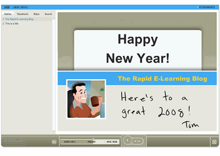
Speaking of PowerPoint, here’s a bonus template to bring in the new year.  The zip file includes the .pot, background images, and the color scheme for those who use Articulate Presenter.

The Rapid E-Learning Blog - demo elearning course

Click here to see the demo template.

Thank you for reading the blog posts, adding your comments, and sending emails.  I truly enjoy hearing from you. Keep the comments coming.  Also, if you have ideas for things you’d like to see me cover in the blog, send them my way.

2008 is going to be a great year! I look forward to what’s coming down the road.  Wait until you see the next generation elearning tools.  They’re pretty slick.

Have a great New Year!

Events

Free E-Learning Resources

Want to learn more? Check out these articles and free resources in the community.

Here’s a great job board for e-learning, instructional design, and training jobs

Participate in the weekly e-learning challenges to sharpen your skills

Get your free PowerPoint templates and free graphics & stock images.

Lots of cool e-learning examples to check out and find inspiration.

Getting Started? This e-learning 101 series and the free e-books will help.