The Rapid Elearning Blog

Archive for March, 2008


 The Rapid E-Learning Blog - motivation

There’s a good chance that if you neglect the information in this post you’ll lose your job.  Want to know why?

You can present a lot of good information in your e-learning courses, but you can’t really control whether a person learns from them.  The learners own what they learn and much of it is determined by their level of motivation.

The good news is that while you can’t make a person learn, you can create an environment that is more conducive to learning.  You do this by tapping into the learner’s motivation.  Your job is to figure out what will motivate your learners and then use that angle to lure them into the course.

Typically, people are motivated when their learning has meaning.  For example, if I know that passing a course will equate to an increase in my income, I am motivated to pass the course.  The same can be said for being motivated by personal safety.

When I was in basic training at the beginning of my military service, I was given one opportunity to throw a live grenade.  I was in Finance and normally they didn’t trust us with much more than a pencil.  Before I got to throw the live grenade, I had to go through a series of practice sessions and safety procedures.  Considering the implications of making a mistake while throwing the grenade, you can be sure that I paid real close attention to what I was being taught.

The odds are that most of your e-learning content doesn’t have life or death implications, so you must be a little more creative at tapping into what will motivate those who take your e-learning courses.

5 Ways to Motivate Your Learners

Reward Your Learners.  People are motivated by rewards.  Figure out what type of reward you can give the learners and then build that into the course.  Sometimes the rewards can be timed challenges or reaching a certain level of achievement.  Other rewards could be actual merchandise, like winning an iPod.  It all depends on the course.

Rewards don’t have to be tangible items.  They can be simple things like affirmation and encouragement.  The main point is to connect with the learners and find a way to have them feel good about some sort of achievement in your course.  The reward is something as simple as being able to test out of the course.

Make Sure Your Course Has Real Value.  Before your learners click on that first button, they want to know if the course has any value or benefit.  The truth is that most people who take e-learning courses don’t see the real benefit and because of that they either aren’t engaged with the course, or they don’t complete it.  If it happens to be a mandatory course, then they’re just trying to figure out how to click through it as fast as possible.  That doesn’t have to be the case.

I used to work at an organization where any time we met with a certain executive, he’d ask about our company’s performance metrics or last quarter’s earnings report.  He wanted to make sure we knew why we were working for him.  Because he had this knack for putting you on the spot, you were more motivated to pay attention to the organization’s goals and performance.

In that case, each e-learning course had meaning and implications to my job.  This also had an additional benefit.  Not only did I have a heighten sense of awareness to previously “boring” information, but I also always felt good (see the first point) when he called me out and I knew the answer.

Help Your Learners Perform Better.  This ties into the previous point.  Your course needs to have value and it needs to be relevant to what your learners do.  People will be motivated to take your course and pay attention as they know it will help them perform better.

Your job is to connect the learner to the course content.  If I’m taking a site safety course, I’m less motivated by clicking a button on a simple assessment than if I’m thrown into a real-life scenario where I am challenged to work through some issues like what I’ll face at work.  This type of approach connects me to the content, more so than screen after screen of bullet point information.

Set Clear Expectations for the Course.  I’m amazed to see my children just click around on the computer screen to get what they want.  On the other hand, I’ve watched adults fearful of clicking a next arrow not sure what will happen.

People tend to be leery of things they don’t understand, or if they’re not sure where they’re going.  However, once they get a sense of what’s going on, they’re more apt to be responsive to the course.

If you want your learners motivated, then an effective way to get them there is to let them know what to expect from the course that you want them to take. This all ties into the points above.  You’re asking the learners to spend some of their valuable time going through your course.  They expect clarity on what they’ll do, why, and what type of outcome to expect.

Along with clear expectations is to make sure that the learner knows how to navigate your course.  I’m not saying that you must create an addendum course on how to click the “next” button.  Instead, what I’m saying is that you don’t want to create a frustrating learning experience because the learner doesn’t know what to do with the course or how to get through it.  One of the best ways to de-motivate your learners is to make your course navigation so confusing that they just leave and never come back.

Tell Them They’re Wrong.  Controversy gets our attention and is a good way to motivate.  Challenge what a person believes, or even tell him he’s wrong, and you’ll see a person motivated to prove you wrong.  Of course, this approach needs to be tempered with common sense.

However, there is a lot of value in challenging people and what they know.  It’s just a matter of knowing how to do it in a manner that is appropriate.  When a person is challenged it puts them at risk and they tend to pay more attention.

Create an environment where they can safely fail or make mistakes and you’ll challenge them and keep them engaged.

These are some basic tips and things to consider when building your courses.  What you can do in your e-learning courses to motivate your learners is dependent on the course and your resources.  However, the main point is that you find the angle that works for your learners and the course you build, and then use it to engage your learner’s motivation.  A motivated learner will learn.

Events

Free E-Learning Resources

Want to learn more? Check out these articles and free resources in the community.

Here’s a great job board for e-learning, instructional design, and training jobs

Participate in the weekly e-learning challenges to sharpen your skills

Get your free PowerPoint templates and free graphics & stock images.

Lots of cool e-learning examples to check out and find inspiration.

Getting Started? This e-learning 101 series and the free e-books will help.


Looks matter.

We all like to think we’re not prejudiced and won’t judge something based solely on its looks.  But the truth is it’s very difficult to ignore the way something looks.  Just go clothes shopping with your teenage daughter and you’ll have the proof.

As I mentioned in an earlier post, I routinely ask people I meet what they think about the elearning courses they take in their organizations.  One of the most common complaints is that the courses look unprofessional and uninviting.  And that equates to a course not worth taking.

The Rapid E-Learning Blog - judging a book by the cover

You’re asking the learners to give up precious time and invest it in your elearning course and before they even start, they feel like it’s a waste of time just because of the way it looks.

Here are some tips that will help you design courses that look good.  Couple that with sound instructional design and you’ll have elearning courses that hook your learners from the start and never let them go. The book links to Amazon produce a small commission.

Understand How to Use Colors

Colors hook us emotionally so it’s important to use colors that look right together and fit the context of your course.  You don’t need to be a color scientist to know what looks good.  Generally, you can tell when you see it, even if you can’t really explain it.  The same goes with your learners.  However, it doesn’t hurt to know the basics about color.  This lets you be proactive and use colors to your advantage.

The Rapid E-Learning Blog - color theory

  • Learn a little about color theory.  If you want some good resources to have on hand, here are two books you might like, The Elements of Color & Understanding Color: An Introduction for Designers.  At a minimum, read through Janet Lynn Ford’s site.  She’s put together a pretty good overview of color theory.  And, it’s free.
  • Coordinate your color schemes. There are a lot of good online tools that help you build matching color schemes for your elearning courses.  I start by picking a color from an image or logo in my course.  Once I have a color, I build a theme around it.  Using the online tools helps me think through the options and build a color coordinated theme.  Check out Kuler and their tutorial for some ideas.  Color Schemer is also a good site and easy to use.

Create a Fresh and Contemporary Design

Each era has its own music and fashion style.  Unless there’s a retro movement, you typically stay away from outdated fashions and pop culture.  In the same way, there are graphic styles that are fresh and contemporary.  And then there are styles that look old and outdated.  In what era does your elearning course belong?  Is the look of your elearning course the equivalent to the leisure suit?

The Rapid E-Learning Blog - nice design ideas

  • Be inspired by others.  The best way to know what designs are fresh and contemporary is to make a habit of looking at them.  I routinely visit ad agency and graphic design sites.  I’ll look at their project portfolios to get ideas about colors and design elements.  I shared some of this in my previous post on creating your own PowerPoint templates.   The more you look at other designs, the more you get a feel for what works and what doesn’t. Do what Patrick Haney and others do–create a collection of inspiring sites and images.  This way you’ll always have a resource for inspiration.
  • Have someone design the look for you.  Hire a freelance graphic designer to design a “look” for your course and then build some of the design elements for your elearning template.  An experienced designer can quickly build boxes, icons, and buttons for you to use in your courses, and it won’t cost you an arm and a leg.

Maintain a Consistent Look and Feel

One of the biggest issues with rapidly authored elearning courses is that they look like they were slapped together in PowerPoint.  There are five different fonts used, the images don’t look like they belong together, and they are of varying quality.  Some are nice and crisp and other are pixilated.  This doesn’t have to be the case.  With some forethought and practice, you can design elearning courses that “look like a million bucks.”

 The Rapid E-Learning Blog - goodbye screen beans

  • Learn about fonts and how they should be usedThinking with Type is a good book if you want to learn more.  I’ve really enjoyed The Non-Designer’s Design Book.  It covers the basics and helps you understand ideas about layout and structuring your information visually.  It also has good before-and-after examples. Here’s a good resource on using too many fonts.
  • Use consistent graphics and design elements.  In the same way your colors are coordinated, you need to coordinate the graphics you use.  Boxes, buttons, and arrows should all look like they are made up of the same style.  Don’t mix and match clip art.  Use the same style of clip art to maintain consistency.  It will make your content look like it all belongs together.  Also, once and for all, throw away the screen beans (unless of course you’re doing an elearning course f
    or Ninjas).
  • Maintain image quality.  Always start with the best image you can and go from there.   To avoid pixelation, don’t scale up small images.  You’re better off not using the image then you are putting a sloppy image on your screen.  You want everything about your course to look top notch.

Not everyone will become a graphic design pro overnight.  In fact, the goal isn’t to be a graphic design pro.  Instead, the goal is to understand basic design principles and then apply them to your elearning courses.

While the course is still dependent on solid instructional design and relevant content, coupling that with good visual design will make your course that much more effective and engaging for your learners.

If you have any tips or tricks, feel free to share them with us via the comments section.

Events

Free E-Learning Resources

Want to learn more? Check out these articles and free resources in the community.

Here’s a great job board for e-learning, instructional design, and training jobs

Participate in the weekly e-learning challenges to sharpen your skills

Get your free PowerPoint templates and free graphics & stock images.

Lots of cool e-learning examples to check out and find inspiration.

Getting Started? This e-learning 101 series and the free e-books will help.


Ever wonder what your learners really think of the courses you build?  We all would like to know.  But are we afraid of the truth?  Can we handle it?

A while back, I was sitting in my second office enjoying a fine Puget Sound Porter and talking shop with some friends.  Not being in the elearning industry, their perspective is a little different than mine.  I was asking about ways to make elearning more meaningful and engaging, and they just kept sharing one example after the other of things they can’t stand about the elearning courses they have to endure at their jobs.

Since then, I’ve made it a habit to ask people what they think about the elearning in their organizations.  What I find interesting is that many of them start with complaints rather than praise.  Some of the issues have to do with the organization and there’s not much that can be done at this end.  However, many of the issues are things that we can address.

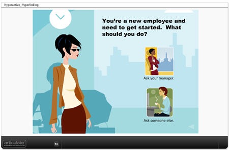
Take a look at this quick mock up.

 The Rapid E-Learning Blog - Hyperactive Hyperlinking Demo

Click here to see demo course.

The reality for many of learners is that they are taking the elearning course because they have to, and not necessarily because they want to.  For them, it’s a matter of getting in and out quickly and then back to work.  This is not a commentary on the quality of the course or its content.  It’s just that many elearning courses are compulsory and the person taking it isn’t motivated by learning the content.

Those people only want to see the essential information, take the required quiz, and get on with their lives.  They don’t want to be held hostage by a course that has them clicking all over the place.  Tell them what they need to know and let them go.

The same is true for the other group of learners who are taking the course because they want to.  While their motivation is different, they also want the course to be focused and a good use of their time.

In the demo above, I highlighted two sources of frustration for your learners.  The first is the continual hyperlinking to additional information which leaves the learners dazed and confused.  The other is using time-wasting branched interactions for obvious and simple information.

How to Avoid Wasting Your Learner’s Time

Don’t waste resources.  The first step is to realize the purpose of the course.  If it’s a compulsory course and really has no impact on the organization, why not just keep it a simple, click-and-read course?  While it’s not the most engaging approach, it probably meets the need and lets the course takers get back to work.

I know, there are some of you in sack cloth and ashes, mourning the demise of sound instructional design; but I’ve been in this industry long enough to know that there a some courses that don’t require a lot of development.  It’s a time and money game.  Spend your resources where you’re going to get the most value.

It’s all about focus.  Many courses tend to offer way too much information and this is what frustrates some learners.  Avoid an information dump.

Each course should have a specific objective.  Then the content you create for the course needs to focus on meeting that objective.  If the content doesn’t contribute to the objective, then it doesn’t need to be in the course.  It doesn’t mean that the content is bad.  It just means that to have the best course and engage your learners, you want to maintain focus on achieving the objectives.  There are other ways to share more detailed information outside of the course.

Is it a course or a reference guide?  A lot of elearning courses could be web pages, or maybe even simple job aids instead of courses.

If you find that you can’t teach your learners without sending them to all sorts of links, then perhaps an elearning course isn’t the right solution.  What might work best is some sort of resource site.  Instead of building a course, build a nice web page with links.

When the last learner leaves, please turn off the lights.  One of the key pitfalls of elearning is that many of the courses, once started, are not completed.  Considering that this is an issue, why create a course that encourages your learners to leave by inserting multiple hyperlinks?

When it comes to the Internet, you know the routine well.  You do a search for adult learning principles and find a link for one site.  Something on that site catches your eye so you click on another link.  Then from there it’s one link after another.  Next thing you know, it’s been an hour and you’ve gone from adult learning principles to the Iceshanty, where you’re looking up tips on ice fishing.

The same will happen with your learners.  If you insert a bunch of hyperlinks, expect them to leave and not return.  You might also want to get them a big freezer to hold all the fish they’ll catch ice fishing.

Leverage Your Rapid E-Learning Software

Here are a couple of ways that you can use your rapid elearning software to change up how you present the information.

Build a course that’s not a course.  Use a simple tool like Engage to share the information rather than using a traditional course framework with a menu and player.  The published file looks nice, they’re easy to build, and you can put them on a web site, embed them in your course, or do both.

I’ve done this a lot in the past with Human Resources training.  They’ll ask for a course, but they really just want to share information.  Using the rapid elearning software, I can quickly build the information module for them.  They’re happy and the learners are happy because that is one less mandated course for them to take.

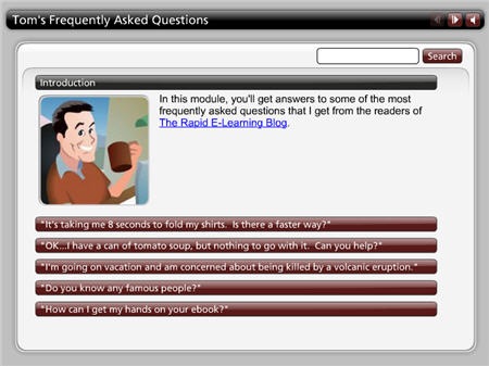
Here’s a simple FAQ interaction that provides some valuable information and could easily be used in lieu of an “official” course.

The Rapid E-Learning Blog - Tom's FAQ

Click here to see the FAQ Interaction.

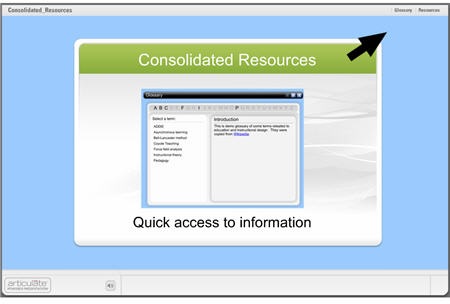
Consolidate your additional resources.  If you do find that you need to augment the information in the course, consolidate the links and put them all in one location.  This lets the learner know there’s a place in the course to access additional information, but the flow of the course doesn’t require that they leave the page to continue.

In the example below, I built a glossary as a drop down tab and added additional information via the attachments tab, which I renamed “Resources.”  Using the interaction as a tab rather than on the slide lets the learner have continual access to the information without having to leave the current screen. In addition, the resources section lets me add hyperlinks or files that the learner can access anytime during the course.

consolidated

Click here to see the demo course.

You’re asking the learners to take their precious time and commit it to your elearning course.  Is what you built a good use of their time?

Build courses that have clear objectives and help the learners reach them.  Also, build courses that are appropriate to the objectives.  Sometimes simple is all you need.  Don’t overbuild your course or add all of the latest bells and whistles because you can.

Take off your elearning hats and think about the courses you have to take.  What approach do you prefer?  What do you find to be frustrating?  Feel free to share your experiences with the rest of us in the comments section.

Events

Free E-Learning Resources

Want to learn more? Check out these articles and free resources in the community.

Here’s a great job board for e-learning, instructional design, and training jobs

Participate in the weekly e-learning challenges to sharpen your skills

Get your free PowerPoint templates and free graphics & stock images.

Lots of cool e-learning examples to check out and find inspiration.

Getting Started? This e-learning 101 series and the free e-books will help.


Tired of delivering boring, click-and-read elearning courses?  Do you want your courses to include engaging scenarios, branching, and real-world decision making?

This post features a presentation I gave at the recent ASTD TechKnowledge conference in San Antonio.  In it, I show you how to quickly create two types of branched scenarios with PowerPoint for use in your rapid elearning courses. 

Create Challenging Scenarios to Engage Your Learners     

Before we get to the how-to presentation, let’s first review the strategy and look at a few examples.

The secret for getting past the click-and-read type of elearning is to figure out how the course content is relevant to the learner.  Once you understand that, you can quickly create scenarios where the learner has to make real-life decisions. 

Once you map out a scenario and pull together your content, building the branching structure in PowerPoint will only take a few minutes.  Since you’re using a rapid elearning tool, you can quickly add all sorts of media to the screens to build dynamic and media-rich learning scenarios.

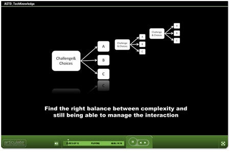
Here are three quick examples of the types of branched scenarios you’ll learn to build in PowerPoint. The first one allows the learner to review the course content and then make a choice.  Once a choice is selected, the learner is directed to another screen with additional choices.

bandage2

Click here to see branched scenario.

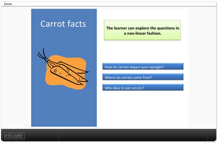
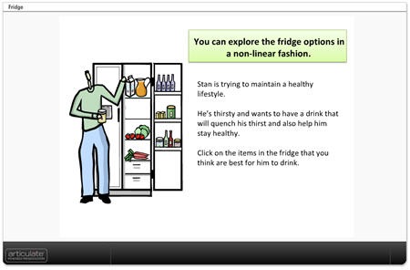
In the Carrot and Fridge scenarios below, the learner makes a choice and gets feedback.  But instead of branching to a different screen, the feedback appears to be on the same screen.  In essence, you create click-enabled hotspots in PowerPoint.  The first example shows how you can create a quick assessment or text-based choices.  The second example is an image with hotspots.

carrots

Click here to see demo.

fridge2

Click here to see the demo.

Click here to download the PowerPoint files to see how they were created.

ASTD TechKnowledge 2008 Presentation

The following is the conference presentation I recently gave live on this subject.  You’ll learn to quickly create simple branched scenarios.  Keep in mind that, while creating the scenarios is relatively easy, with some creativity and forethought they can be quite sophisticated and nuanced learning environments.

The presentation runs about 40 minutes in length so you may want to view it over a few sittings.  However, the bulk of the presentation is made of two how-to sections which can be accessed on slides 10 and 12.

  • Slide 10: How to create branched scenarios (16:17).
  • Slide 12: How to create hotspot scenarios (12:09).

techknow

Click here to view TechKnowledge presentation & tutorials.

Here are some additional tips and best practices.

  • Ideally the navigation is the result of the branches and the learner’s decision-making.  In that case, you can disable the player controls and create your own navigation in the PowerPoint slide using hyperlinks.  If you have a lot of branches, then it might be confusing to the learner to use the player navigation and the branching navigation.
  • On branched interactions, I like to give the learners the ability to go back and start over.  Just create a simple "start over" button on the top of each screen.
  • Simple usually is better.  Balance between immersive scenarios and rapid development.  The more complex you make the course, the more time it will take and the harder it becomes to manage.  If you’re using a rapid elearning tool, don’t lose the "rapid."
  • Pre-build your branches.  I have a number of pre-built branches with place holder boxes.  For example, I have a pre-built 3 decision branch that I saved as 3dec_branch.ppt.  When I want a 3 question branched scenario, I go to "insert slides from" and insert the pre-built slides from the .ppt file.  Then I set the hyperlinks and insert my content.

There was another part of the presentation where I specifically focused on Articulate Quizmaker and Engage.  I’ll do a more detailed overview of using Quizmaker to create branched scenarios in Articulate’s Word of Mouth blog. 

You can find how to create interactive decision-making instructions for Engage in this recent post by Helene Geiger of Prometheus Training Corporation.  There’s even a free graphics template to help you get started.

I look forward to your comments and examples of the scenarios you can create using these techniques.

Events

Free E-Learning Resources

Want to learn more? Check out these articles and free resources in the community.

Here’s a great job board for e-learning, instructional design, and training jobs

Participate in the weekly e-learning challenges to sharpen your skills

Get your free PowerPoint templates and free graphics & stock images.

Lots of cool e-learning examples to check out and find inspiration.

Getting Started? This e-learning 101 series and the free e-books will help.