The Rapid Elearning Blog

Archive for May, 2008


One of my favorite features of some rapid elearning tools is their ability to insert a Web object.  What’s so cool about it is that whatever you can do online or with a Web technology, you can pretty much add to your rapid elearning course.  That’s a lot of power and it’s super easy to do. 

However, I find that inserting Web objects is probably the least used feature in the rapid elearning tools.  So today, I’m going to share 5 things that you need to know about the Web object feature so that you can use it to add even more power and functionality to your elearning courses.

1. Understanding the Web object.

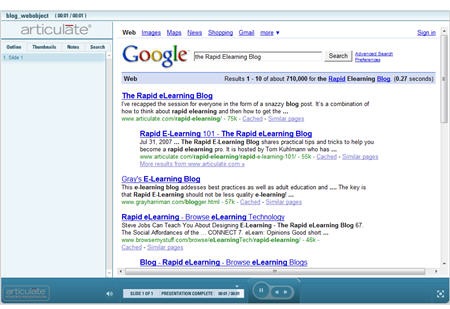
The Web object feature is pretty basic.  You take a Web address and then insert it into your slide.  You have the option of keeping it in the slide or opening outside.  I prefer inside.  Because once people leave the course, they’re like dogs chasing after a rabbit.  No matter how loud you scream, they aren’t coming back.

The image below is an example of an inserted Web object.  See how the Google page just seems to be part of the slide.  What’s amazing is that it’s not a screenshot.  It’s the live site.  That could be any Web site.  Pretty cool, huh?
 The Rapid E-Learning Blog - Google web object  

2.  You’re not limited to just Web addresses.

This is where some of the real power of the Web object comes in.  You can create a HTML page and then insert it from your local drive.  So whatever you put on that page becomes part of your course.

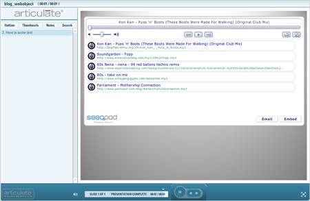
The image below is an example of a music search site that gives me an embed code so that I can add the site’s content to a blog or Web site.  In this case, I just pasted the code into a blank HTML page and saved it to my hard drive as index.html.  Then I inserted it as a Web object. 

There are so many Web applications and sites now that let you embed their content into Web pages.  Why not take advantage of those free resources, if you can?
The Rapid E-Learning Blog - Seeqpod web object

3.  Insert a Web object and then hide it.

That’s right!  Insert it and then hide it.  Now you’re probably scratching your head thinking what’s the point of that.  Well let me tell you.  Whatever you can put on a Web page, you can put it in a Web object.  That means instead of using the Web object as a way to show information, you can use it as trigger or a means to collect information.

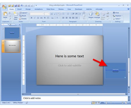
All you do is insert the Web object and then move it off the screen.  The image below shows what it looks like inside PowerPoint.  When you publish the course, the user never sees the Web object.  But when they get to the slide with the Web object in it, whatever you put in that index.html page is activated.  So you can do all sorts of behind-the-scenes stuff if you have the programming skills.
The Rapid E-Learning Blog - Moved web object

At a previous place of employment, we didn’t have a formal LMS so we created a Web object that was placed on the last slide.  When the user reached that slide, the Web object was activated and it sent some information to a Remedy database.  That’s how we tracked the course completion.

This approach to using the Web object requires some programming skill, but it really opens the doors to all sorts of possibilities.

4. Insert your company Intranet.

It seems that a lot of elearning is just rehashing information that’s already available to the learners through the company’s Intranet.  So instead of rehashing what’s already available, just insert the relevant Intranet pages in your course. 

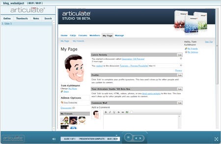
For example, here’s an image of my page on our private beta site.  This could just as easily be your company’s Intranet site.  It’s secure.  Only the people who have access to the network can see the pages.
The Rapid E-Learning Blog - Insert secure intranet site as web object

If you take this approach, you have less course content to manage.  You could build an activity like a scavenger hunt into your course. So instead of dumping info into the laps of your learner, you have them go out and find it.

For example, ask the learner to look up a certain policy and then answer some questions or work through a scenario in the course.  This helps them learn to use the network resources and you don’t have to spend as much time creating the specific content.  Instead, you’re spending your time figuring out how to get them to use the information. 

5. Create top secret hidden pages just for your courses.

I did a project for a human resources group that was always changing certain pieces of information.  It meant we were always updating the course.  To make it easy for everyone, we created a HTML page that blended right into the course.  Then we inserted its link as a Web object.  The page was on the customer’s server.  It wasn’t linked anywhere else and only used for the elearning course so no one would stumble upon it.
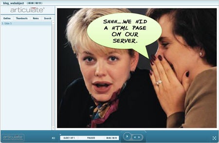
The Rapid E-Learning Blog - Use secret web pages as web objects

Whenever they wanted to make changes, they just updated the HTML page and the course was always up-to-date.  That saved them time because they didn’t need our help.  And it saved us time because we didn’t need to support all of the updates to their content.  And as we all know, saving time is saving money.

Here are some Web objects in action.

I put together a simple demo of some of the ideas I shared in this post*.  Hopefully it gives you some inspiration about how you can use the Web object feature.  I also included the two index.html files I used so you can practice on your own.  Download index.html files.

The Rapid E-Learning Blog - Web object demo

Click here to view the Web object demo.

There are all sorts of ways to leverage the Web object feature in your rapid elearning tool.  In a future post, I’ll show you some of my favorite uses.  I’m interested in ideas you have about how the Web object feature could be used.  Feel free to share them in the comments section.

Note:

*The demo is dependent on sites I have no control over, so it’s possible that those sites are either blocked by your corporate firewall or have download streaming issues.

Events

Free E-Learning Resources

Want to learn more? Check out these articles and free resources in the community.

Here’s a great job board for e-learning, instructional design, and training jobs

Participate in the weekly e-learning challenges to sharpen your skills

Get your free PowerPoint templates and free graphics & stock images.

Lots of cool e-learning examples to check out and find inspiration.

Getting Started? This e-learning 101 series and the free e-books will help.


I’ve done a lot of software training.  Many times the elearning part of the course is to introduce the software and give an overview of its features or basic uses.  I like to call it "show and tell" training.

There are many ways to approach software training.  You can make it as complex or simple as you want.  It really depends on your needs and the software.  I’m not going to go into great detail about how to design software training.  However, I will show you some simple tips and tricks that are effective and generally easy to do.  Using them has saved me a lot of time.

Some Quick Thoughts on Screencasting

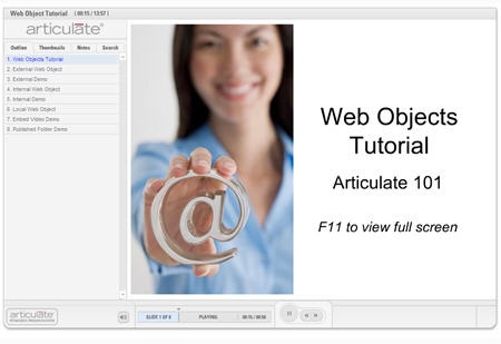
It seems that the default for software training is to do a screencast where you make a movie that shows the mouse movement and walks through the steps.  In fact, I’ve used them in previous posts, when I do my own tutorials.  For example, here’s one I did for the Word of Mouth blog that shows how to insert web objects.

The Rapid E-Learning Blog - Web object tutorial

Click here to view the tutorial.

I love screencasting.  It works great when you want to do some of those "over the shoulder" tutorials that have a lot of complex steps like breaking apart clip art.

However, what I don’t love about screencasting is the time it can take to get it right.  Anyone who has done them knows that there’s a lot that goes into making a good one.  It’s definitely more than just plug and play. 

Besides, I’m a little dimwitted so I always start by trying to wing it.  That doesn’t work well because I end up stopping and starting over again and again.  Some will say, "So what.  You can always edit it out later."  And that gets to my point.  Unless you really plan your screencast well, you end up doing a lot of time-consuming edits later.  This is what I don’t want to do.  And even if you do plan it well, you still end up doing some edits and tweaking.

So here’s what I do: for the more complex "show and tell" courses, I’ll do a screencast.  However, for those where the steps are simple, I’ll avoid a screencast and try a different approach, which I detail below.

The following tips will help you the next time you have to do a "show and tell" elearning course.  It’ll save you time and help keep your file size down.  And for those of you who don’t own screencasting software, you’ll learn some simple ways to mimic the "show and tell" effect.

Keep it Simple

Typically when we focus on software, we show the entire software application.  So we print the entire screen, which might be 1024×768, and then put it on the slide which is only 720×540.   Anytime you alter the original image and make it smaller, you’ll get some image degradation and lose the crispness that you started with.

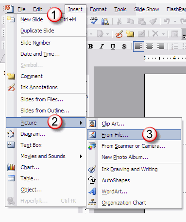
I’ll show some tricks to maintain decent image quality and still effectively teach people to use the software.  For this example, I’ll use the task of inserting a picture into a PowerPoint slide.

Don’t discount text and simple graphics.  It might not be as cool as a movie, but it can be just as effective and whole lot easier to edit.  I don’t need a movie to figure out how to follow the image below.  For simple instructions, this is more than adequate and it only took me about 2 minutes to build this.

The Rapid E-Learning Blog - Make easy to understand graphics instead of a screencast.

You don’t need the whole screen.  A lot of people capture the entire screen and only focus on one small part of it.  You end up with a lot of wasted space and the worst image quality because you have to compress the image to fit it on the slide.  Here are two easy ways to avoid focusing on the entire screen to show just part of it.

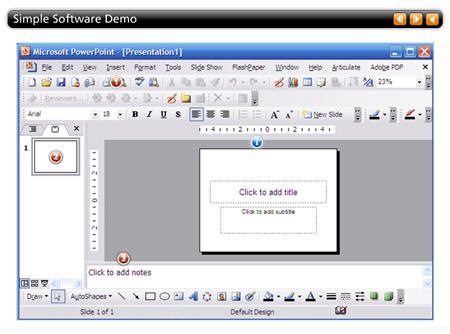
  • Create simple callouts.  Start with a full screen image to establish the overall screen layout and then use call outs to draw attention to certain parts of the screen.
  • Just focus on the area that you want to show.  Your learners aren’t stupid, with a few visual clues (like the numbers in the image above) they can figure out what they’re looking at.  You can spice it up with some simple PowerPoint animation.  Or if your software has an annotations feature, just use those.  They’ll save you a lot of time.

Leverage PowerPoint’s hyperlinking to create a virtual simulation that doesn’t require a screencast.  You’ll get a similar feel but need less time and fewer edits. 

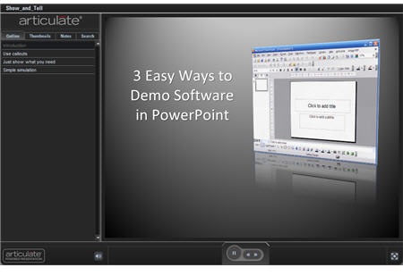
Here’s a quick demo where I show you the various steps in action.  As you can see, they are all viable solutions and can make building your demos a lot easier and take less time.

 The Rapid E-Learning Blog - Three easy ways to do software demos in PowerPoint

Click to see the demo.

How Much Motion Do You Need?

When you break down a show and tell course, a lot of the time is spent watching the mouse move around.  Recording the mouse movement makes your movie longer and increases the file size.  Some people will edit out the unnecessary mouse movement, but that goes back to the issue of extra time spent editing.

I had an IT manager who was always making changes to his software.  Then he’d call me and want my team to redo his demos.  We didn’t have the resources to support him, so what I did was get him some screencasting software and then showed him how to use it.  This way he could make the changes he needed.

While the software worked for him, I was soon getting calls asking how to do this or that with the screencasting software.  His problem was similar to what many of you experience: he wasn’t doing screencasts often enough to develop expert skills.  So it cost him a lot of time and money to get them right.

Since the screencasting software wasn’t the right solution, I got him a copy of Engage.  He was excited because it was easy for him to use and we ended up getting fewer calls.  Usually, he just called to show off what he was doing.  It saved our organization tens of thousands of dollars because we didn’t have to commit our resources to his projects and he was able to self-serve and get his needs met a lot faster.

So, if you’re using Engage, let me show you a few ways to leverage the tool for software demos.  You can use any of the interactions, but I typically use either the labeled graphic or process interactions.  They give the most space and seem to be a good logical fit for software training.

In the demo below, I inserted three labels all using slightly different ways to show parts of the software.  What’s nice with this approach is that you can use a number of ways to teach.  Include only text and images where the steps are simple.  And when you need to show more, inse
rt a screencast if you want.  You’ll be able to keep them smaller and easier to edit.

The Rapid E-Learning Blog - Software demo using Articulate Engage

Click to view demo.

As you can see, there are some effective ways to do demos without spending too much time building screencasts.  It all depends on what you have to do and how much time you have.  I don’t just consider the time it takes to produce.  I also consider how much time it takes to maintain or do future edits.  I find that for most demos the tips above work.  And when they don’t I’ll invest my time in other options.

Feel free to share comments or feedback in the comments section.

Events

Free E-Learning Resources

Want to learn more? Check out these articles and free resources in the community.

Here’s a great job board for e-learning, instructional design, and training jobs

Participate in the weekly e-learning challenges to sharpen your skills

Get your free PowerPoint templates and free graphics & stock images.

Lots of cool e-learning examples to check out and find inspiration.

Getting Started? This e-learning 101 series and the free e-books will help.


One way to save money on your elearning project is to create custom graphics using the clip art that comes with Microsoft PowerPoint.  You do this by ungrouping, editing, and regrouping the clip art.  It’s a technique I use a lot especially when I want to create characters for my elearning scenarios. 

Based on the feedback I’ve gotten from previous posts, there’s a love/hate relationship with clip art.  You love ungrouping it to create the graphics you need.  But, you hate the hassle of working with all of the bits and pieces that are part of the ungrouped clip art.  It takes too much time and causes a lot of frustration.  You can’t sleep, you’ve got irritable bowel syndrome, and you haven’t showered in days! 

If that describes you, then keep on reading.  As I share my tips and tricks on working with grouped clip art, you’ll not only save time building custom images, you’ll also restore the order of your day-to-day existence.  You’ll be happy and so will your family.  So let’s get started.

Some Clip Art Ungroups, Some Doesn’t

The first step in the process is to know when you can and can’t ungroup clip art.  Basically, there are two ways to determine this.  The first option is to whip out your calculator and solve the formula below. 

The Rapid E-Learning Blog - Math calculation for vector images

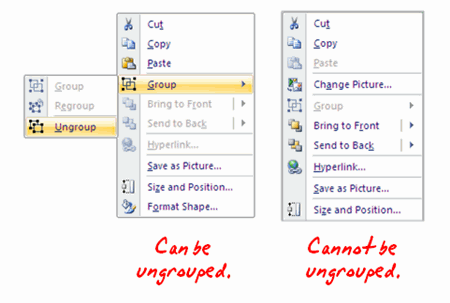
If you don’t happen to have a calculator handy, try this simple shortcut.  Just right click on the clip art.  If you can ungroup it, it will say "ungroup."  If you can’t, then it will be grayed out.  Not being a math whiz, I prefer the second option, myself.

The Rapid E-Learning Blog - How to tell when an image can be ungrouped

Bitmap versus Vector

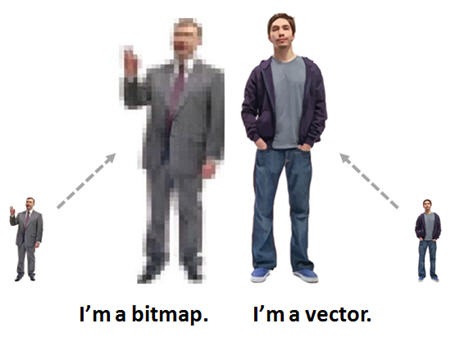
There are a number of image formats and not all images are created equal.  I won’t go into a bunch of detail about the various formats.  Instead I want to highlight what happens when you scale an image by making it larger or smaller.

  The Rapid E-Learning Blog - I'm a bitmap.  I'm a vector.

A bitmap image is made up of a grid of pixels.  When you increase the size, the pixels get bigger.  That’s why you’ll notice the degradation (or pixelation) of the image.

A vector image is different because instead of using a grid of pixels, it uses mathematical equations to render the image.  In a layman’s terms that means you can scale it without losing any of the image’s clarity.

Clip Art Anatomy 101

Most clip art images are made up of vectors.  This makes sense because if you couldn’t scale your clip art, you’d need 20 versions of the image to account for every possible size option.  Scaling one image sure is a lot easier.

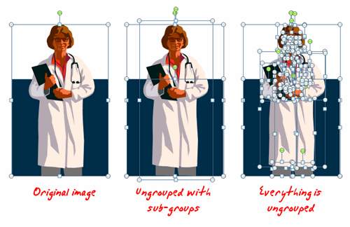
Generally, clip art is a series of grouped images.  Sometimes everything in the image is grouped into one image.  However, it is common that the images are made up of a number of grouped images.  So you can have groups within groups.

If you look at the example below, the first image is the original and everything is grouped together.  The second image is ungrouped but the image is still made up of sub-groups.  That’s why you see fewer boxes.  The third image shows everything ungrouped. 

The Rapid E-Learning Blog - groups with sub-groups

Working with ungrouped images can be a challenge, especially when you first start.  I’ve gotten a lot of emails asking for some tips when working with clip art, so in the following demo, I’ve detailed some of my tips and tricks and best practices.

Here’s what I show you:

  • Quickly select, duplicate, and scale your images
  • Use the grid and guide options to align objects
  • Work with duplicate slides and a scrub area to avoid messing up your real slides
  • How to work with all of the ungrouped objects
  • Save your creations as bitmap or vector images

The Rapid E-Learning Blog - Click to view ungrouping tutorials

Click here to view tutorials.

Here’s one last important point.  When you’re all done, you need to regroup your image.  You’ll find it easier to work with when you need to move it around.  And, if you publish it to Flash, the grouped image will render a lot faster than if it is ungrouped.

The secret when working with grouped clip art is to select areas you want to edit, copy them, and move them away from the main image.  This allows you to quickly make the edits you want to make.  Once you get used to this process and develop your own best practices, it really does become second nature.

Feel free to share ideas or comments by clicking the comments link.

Events

Free E-Learning Resources

Want to learn more? Check out these articles and free resources in the community.

Here’s a great job board for e-learning, instructional design, and training jobs

Participate in the weekly e-learning challenges to sharpen your skills

Get your free PowerPoint templates and free graphics & stock images.

Lots of cool e-learning examples to check out and find inspiration.

Getting Started? This e-learning 101 series and the free e-books will help.