3 Graphic Design Principles for Instructional Design Success
July 29th, 2008Because a large part of elearning involves the learner viewing the screen, it’s critical that the visual elements you choose enhance the learning experience.
Today, I’ll touch on three graphic design principles for instructional designers. They will help you build visuals that support your design and help you build more effective courses.
Use layouts to convey meaning and relationships.
When you place text and graphics on a screen, you can’t assume that the learner automatically understands what it means. Your job is to create relationships and guide the learner’s understanding.
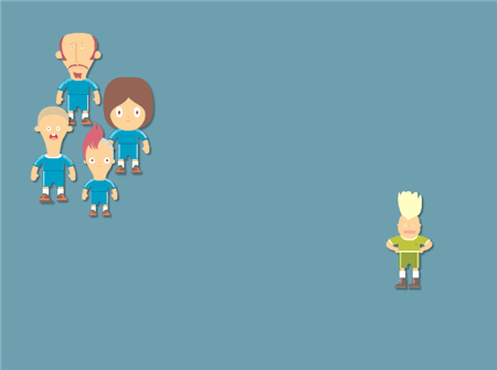
Look at the image below. Without explanation, you’re left to wonder what the relationship is between the characters.

Now, look at the next image. Same characters, only they’re organized better. Because of proximity and spacing, you’re able to imply relationships without even presenting other information. This helps guide the learners with less explanation.
However, the reverse can also be true. Through poor design, you can imply relationships between information on the screen that doesn’t exist.
Use patterns and repetition to organize your content.
Since you’re introducing new ideas, you can assist the learning process by using repetitive elements and patterns. They help organize the content and bring a sense of unity to the course.
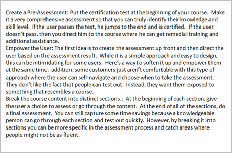
For example, there’s a lot of information in the image below. However, it’s not easy to understand it because it’s all chunked together. I get tired just looking at all of that text and I have no inclination to explore more. In addition, because of the way it’s presented, I don’t know what the information is and what it means to me.
Give the learner visual cues so that they’re able to follow the course content and understand how it all fits together. This is especially true for online courses because people have developed web surfing habits, where they quickly scan the screen for information.
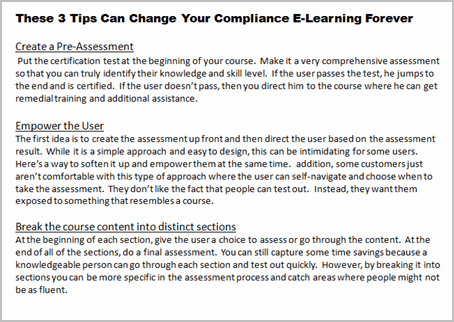
If you look at the image below, you’ll notice that by using some repetitive elements the information is easier to process. In this example, bold headline means title and underlined text represents sections. As you can see, the learner can quickly scan the information and determine where it fits into the scheme of things. By repeating something like the underlined text, the learner intuitively knows that those things are related.
You’re not limited to text. You can also do the same thing with the graphic elements. Whatever you design should help the learner sort the information and create a sense of comfort with knowing how the content on the screen is related to each other and the overall objective of the course.
Use just the right images. No more.
Whether you use text or graphics, all of it needs to support the objectives of the course. If it’s on the screen, then it should contribute and not detract from your course. This includes the visual style, fonts, colors, and symbols. They all contribute to the communication process. Make sure that they’re contributing to your message in the right way.
Suppose you’re watching an elearning course on public parks and you see the image below on the screen. What does that image tell you? If you’re like me, you’re expecting something about the environment or litter in the park.

Without communicating anything else, the image is already starting to tell you something. That’s how you want to use images, symbols, or any other graphics on your screen. You want them to contribute to the course.
On the flip side, there’s a tendency to put decorative images on the screen to fill in blank spots. Or sometimes, the client wants to “jazz things up a bit.” Avoid that. Don’t litter the screen with useless elements. Some studies show that decorative graphics can negatively impact how learners process the information. So you run the risk that you are actually impeding the learning process. Not only that, but like the image above, if the image communicates information and it is not related to the course content, you end up confusing the learner.
You don’t need to be a Photoshop pro or a professional graphic designer. However, to craft an effective elearning course it’s important to understand the principles of graphic design. I touched on a few in this post, but there’s a lot more to learn.
If you’re looking for a good book to get started, I highly recommend The Non-Designer’s Design Book. The book covers the basics of visual design. It has great examples and is easy to get through.
An important part of instructional design is the use and layout of your visual elements. How you design your screen tells your learners where to look and what’s most important. And you want the information on the screen to support the learning objectives of the course.
I’d love to hear your thoughts. Feel free to share them by clicking on the comments link.
Events
- Everyday. Check out the weekly training webinars to learn more about Rise, Storyline, and instructional design.
Free E-Learning Resources
 |
 |
 |
|
Want to learn more? Check out these articles and free resources in the community. |
Here’s a great job board for e-learning, instructional design, and training jobs |
Participate in the weekly e-learning challenges to sharpen your skills |
 |
 |
 |
|
Get your free PowerPoint templates and free graphics & stock images. |
Lots of cool e-learning examples to check out and find inspiration. |
Getting Started? This e-learning 101 series and the free e-books will help. |







50
comments