The Rapid Elearning Blog

Archive for August, 2008


Think of learning and instructional design from the perspective of playing the “I Spy” game.   You say, “I spy with my little eye…a red box.”  And then you wait forever while the other game players look for the red box.  Maybe they find it; maybe they don’t.  In either case, you’re at the whim of the ones looking for the box because you don’t control how they go about looking for it and whether or not they even find it.

Instructional design is like starting with, “I spy a red box over there in the corner under the picture of the sailboat.”  With this type of guidance, you’ve gotten the person to look in just the right spot.  It doesn’t make playing “I Spy” fun, but it makes teaching a lot easier because you’re less dependent on them learning through a more informal process (which has its own benefits but can be more time-consuming).

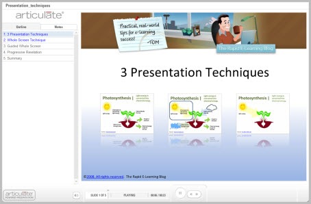
Ultimately, how you structure and present your content impacts how people learn and gain their understanding.  There are a number of approaches that you can take when presenting your course content. For this post, I explain three simple techniques and follow it up with a quick demo.

Show them the big picture and let them see everything in context.

You can present all of the information at one time.  This can help the learners see the overall context and make connections.  It also gives the learners the freedom to explore the screen content and puts them in a position of discovery.

One of the challenges can be that the learner might “see” the information, but might not really be making the right connections.  In essence, it’s like saying, ‘I spy something important.”  And then hoping that the learner knows what it is.

One way to address this is to guide them to look for specific information on the screen.  For example, instead of telling them the information, ask questions that provoke thinking.

What benefits do you see in this approach?

The Rapid E-Learning Blog: Present all screen content at once.

Point out those parts of the screen that are important.

This builds off of the first technique.  You still give the learners all of the information up front.  However, by pointing things out on the screen, you’re able to draw their attention to those things that are more important than others.

It’s the difference between, “I spy some important information,” and “This information is important.”  By directing their attention, you can give them the big picture and still focus on things more specific.  This can be done with simple annotations or animations.

The Rapid E-Learning Blog: Use animations and annotations to present content.

Only show them the information as you get to it.

Don’t distract your learners with information they don’t need.  Instead, use progressive builds to reveal the information on the screen.  Basically, you’re breaking the information into manageable chunks and then giving it to the learners a little at a time.This can be an effective technique if you’re trying to teach something new or complex.

Going back to the “I Spy” game, it’s like saying, “I spy a red box, but it’s in the top left corner of the screen.”  That immediately tells people where to look and they aren’t distracted by things outside that area.

The drawback to this technique is that it can be slow for those who are quick learners or already understand the content.  Thus, they have to wait for you to get to a place where they actually learn something new.

The Rapid E-Learning Blog: Present screen content through progressive revelation.

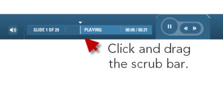
Consider how the user navigates the course.  If I add animations on the screen, I like to free up the navigation so that the learners can go back and forth.  This gives them the power to review the information.  Sometimes the narration can be too slow, or we set automatic animations timed at what we think is an “average” reading speed.  We do this to accommodate the “average” learner, but from my experience, it really accommodates no one.  In fact, you’ll get complaints of “too fast” or “too slow” anyway.  Why not just give the learners the ability to navigate at their pace?
scrub_bar

One of my favorite player features is the scrub bar.  Not all course players have them.  However, when it’s available, I like to drag it back and forth to review the animations or parts of the screen without having to go through the entire screen from the beginning.  One of my biggest pet peeves is a screen with 5 minutes of information and no way to jump to the middle if I want to refer back to some information on that screen.  The scrub bar lets me quickly jump to a specific point of information.

Watch the demo.

I put together a quick tutorial to show you how the simple techniques work.  Click the link below to watch it.

 The Rapid E-Learning Blog: Presentation Techniques Tutorial

Click here to view the demo.

These three techniques are generally neutral with no one being better or worse than the others.  How you use them just depends on your subject matter and the learner’s expertise.  You also need to consider your learning objectives and how you’ll help the learner meet them.

What simple techniques would you use to present information to your learners?  Leave an answer in the comments section.

Events

Free E-Learning Resources

Want to learn more? Check out these articles and free resources in the community.

Here’s a great job board for e-learning, instructional design, and training jobs

Participate in the weekly e-learning challenges to sharpen your skills

Get your free PowerPoint templates and free graphics & stock images.

Lots of cool e-learning examples to check out and find inspiration.

Getting Started? This e-learning 101 series and the free e-books will help.


google

As I was surfing the web, I came across Nicholas Carr’s recent article in which he asks if “Google is making us stupid.”  It’s an interesting read.  He discusses the impact that the Internet has on our reading habits and ultimately on the development of who we are and our ability to think.

I’m not thinking the way I used to think. I can feel it most strongly when I’m reading. Immersing myself in a book or a lengthy article used to be easy. My mind would get caught up in the narrative or the turns of the argument, and I’d spend hours strolling through long stretches of prose.  That’s rarely the case anymore.


Now my concentration often starts to drift after two or three pages. I get fidgety, lose the thread, [and] begin looking for something else to do. I feel as if I’m always dragging my wayward brain back to the text. The deep reading that used to come naturally has become a struggle.

I could have written those words!  I’ve also developed this habit of quickly scanning for key points and moving on.  In fact, just this week my wife got a book on parenting and asked if we could read it together.  The Olympics were on and I’m not a big fan of men’s synchronized diving, so I picked up the book and spent about 15 minutes skimming through it.  That was enough for me.  I got the key points and now I’m ready to go discipline my kids in a new way.  In fact, one of their punishments will be to watch men’s synchronized diving.

So what does this have to do with elearning?

It is clear that users are not reading online in the traditional sense; indeed there are signs that new forms of “reading” are emerging as users “power browse…”

Carr’s article raises some issues that could impact how we design our elearning courses.  Our learners are being conditioned to process online content a certain way.  It impacts how they see, retrieve, and process information. If these reports are correct, and we’re developing a new way of reading (or retrieving information), then this needs to be a consideration as we design our elearning courses.

Here are some points I jotted down as I read the article.  Actually, I had to read it a number of times because I kept skimming through it. 🙂

Accommodate the “power browsing.”

Instructional designers need to consider web surfing habits.  Whether it’s right or wrong, people who are online have been developing habits that they bring to the elearning course.  Design courses to accommodate these power browsing habits.  If you don’t, chances are you’ll lose a connection with the learner which will make the course ineffectual.

Steven Krug’s book,  Don’t Make Me Think: A Common Sense Approach to Web Usability, is an excellent starting point.  He has a lot of good before and after examples that are very relevant to how you’d design your online learning experience.

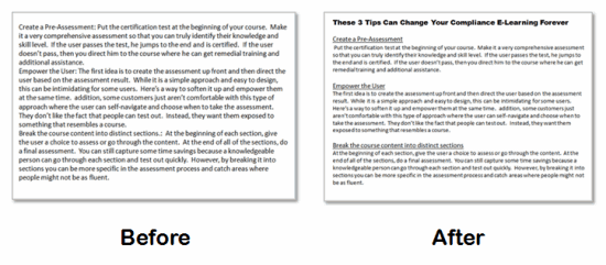
Pull main ideas and critical points into focus.

When people are online, they tend to look at the screen and quickly scan for information.  They’re not changing that habit for your course.  Structure the information so that it is easy to recognize the critical pieces.

I discussed this in a recent post on basic design.  There’s no need to bury important information and force the learner to find it.  Instead make sure the important parts are evident and then build follow up information around it.

The Rapid E-Learning Blog: before and after

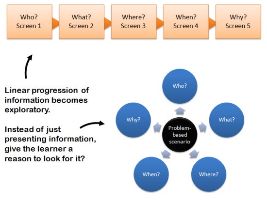
Move from linear to exploratory.

Most elearning courses are focused on a linear presentation of information.  Real learning doesn’t happen when you give the learners information.  Instead it happens when they use it.  So your instructional design needs to become less about presenting information and more about getting the learners to use it.

The Rapid E-Learning Blog: Move from linear information to exploratory.

Free up the way learners navigate the information.  Instead of linear presentation, give them a reason to need your course content, and then the freedom to find what they need.  Based on how you build your course, you’ll be able to assess their understanding and give them the feedback that is appropriate to their needs.

You won’t have to fear that they miss something because you’re not controlling the navigation.  In fact, if you look at the image above, you’ll notice that all of the same information is available to the learner, it’s just not delivered the same way.  The instructional design is not in the information but how YOU design the course for the learners to use it.

Pull the learner into the real world.

The following statement reminded me of a lot of the issues we tend to have with our clients and subject matter experts.

The more pieces of information we can “access” and the faster we can extract their gist, the more productive we become as thinkers.

Too much focus is on the information and not enough on the use of it.  In fact, one of my pet peeves about elearning is that because we can efficiently give people information, we tend to abdicate our responsibility to coach them through using it.  For all of the elearning courses I had to take over the years, I can only recall a handful of follow up conversations with my manager about them.  It’s a lost opportunity to set expectations and build the social relationships that are so critical to our success.

When we read online we tend to become “mere decoders of information.” Our ability to interpret text, to make the rich mental connections that form when we read deeply and without distraction, remains largely disengaged.

It’s time to engage the learners and connect them to the real world.  There are a number of ways that you can blend the content from the online course with learning activities outside of it that are relevant and meaningful to the learning process.  Here are a few ideas:

  • Use case studies or problem-solving scenarios.  At a minimum, build them into your elearning course so that the learner knows how to apply the information to a real-world context.
  • Incorporate the course with real-world discussions.  Instead of solving the case study online, have the learners solve it and then discuss the solution with their peers or managers.  Of course, this depends on the type of course, but it can be very effective.  I used to use it in peer-coaching environments.
  • Create real-world activities.  I’ve built courses with activity journals.  The course would cover certain information and then the learner was required to locate that information at their site and document it.  For example, if part of the environmental policy was to locate and review the site’s emissions log, we
    had the learner actually do that and then report on the finding or use that information elsewhere in the course.

The main point is that just because you do a course online, doesn’t mean you can’t blend the course content with offline activities.

Leverage all forms of media.

Too many elearning courses are dependent on just the text or narration.  If you want your course to be effective, you have to make full use of your tools.  And this doesn’t mean you have to be an expert multimedia programmer or Hollywood producer.

Combining easy-to-use digital technology with rapid elearning software gives you all sorts of capabilities.  You can incorporate graphics, video, audio, interactivity, and web-based technologies.  It really just depends on getting the most out of the tools.

Here’s a list of previous posts that discuss ways you can get the most out of what you do:

There are those who cringe at some of this and equate it to the dumbing down of our courses or learners.  That’s not the case.  It’s just that we have to build elearning courses that connect with the way our learners receive and process information.

For example, if they speak Spanish, we build Spanish courses.  Since our learners are developing a sort of techno-language, we need to build courses that the learners can translate and use.  I’m sure we’ll be reading more about this in the years to come.

I’m interested to hear what you think.  Add your thoughts by clicking on the comments link.

Events

Free E-Learning Resources

Want to learn more? Check out these articles and free resources in the community.

Here’s a great job board for e-learning, instructional design, and training jobs

Participate in the weekly e-learning challenges to sharpen your skills

Get your free PowerPoint templates and free graphics & stock images.

Lots of cool e-learning examples to check out and find inspiration.

Getting Started? This e-learning 101 series and the free e-books will help.


Those who design elearning courses are the bridge between the client who has specific expectations and the learner who has to take the course.  Ideally, the learner has expectations but sometimes they take the course because they have to and not because it’s what they want to do.

Building the bridge for performance-based courses is a little easier.  Because the client has performance expectations, you’re better able to build the learning environment around performance.  So they tend to be more relevant to the learners.  Ultimately, the learner knows that the measure of success isn’t in the course, but instead in improved performance.  So their motivation is a different.

It’s more challenging when you build information-based courses.  I’ve found that the client is almost exclusively focused on the information rather than the learning.  This is where the instructional design comes in.  How do you create a learning process when most of it is focused on information?

The good thing is that motivated learners require less effort on your part.  For example, I was doing a home improvement project and need to learn how to put up crown molding.  I did a search online and found the information I needed.  It was bland information with boring old text, no multimedia, and interactivity.  However, I didn’t mind, because I was motivated to learn.

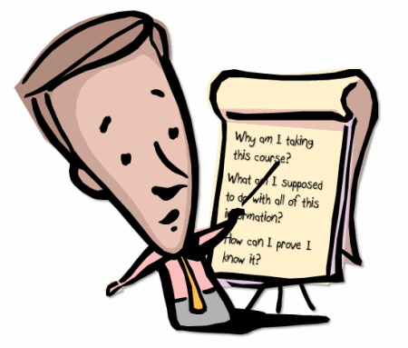
So the key to success is to influence the learner’s motivation.  This works for performance or information-based courses.  To do this, put yourself in the learner’s perspective and answer these three questions.

The Rapid E-Learning Blog: Why am I taking this course?

It’s important to develop learning objectives and then build the course content around meeting those objectives.  This is good.  However, what that usually translates into is a bullet point list of “You will learn this…” type of objectives.

While showing a list of objectives to your learner isn’t bad, what you really want to do is convince the learner that this course is valuable and will make a difference in what they do or know.  When the learners understand that the course has value, their motivation increases.  And motivation translates to a better learning experience.

So when you craft objectives for the course, it’s less about presenting a list and more about getting the learner to perceive value and understand how the course helps them.  That’s why scenarios and case studies are so effective.  They show the learner the course information in a relevant context.  This helps them perceive its value.

The Rapid E-Learning Blog: What am I supposed to do with all of this information?

No one likes to waste time on irrelevant elearning courses.   When people commit their time to a course, they want to know why it’s important and then what they’re expected to do with this new information.

That’s why you build your information around what you expect the learner to do.  Even compliance training is built on a foundation of performance expectations.  You don’t prevent hearing loss because your employees know they need to wear ear plugs.  Instead, you prevent it because your employees are actually wearing the ear plugs.

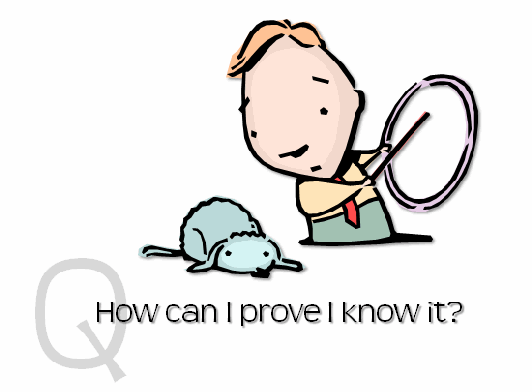
The Rapid E-Learning Blog: How can I prove I know it?

Everything centers on what actions you expect.  When people know what the expectations are, they’re diligent to achieve them.  Let’s go back to the argument in a previous post about why people just click through the course.  The reason they click through is because they perceive that the content is not relevant.  In that case, the only performance expectation they have is to complete the course.  So they are diligent to demonstrate that they can complete the course.  In a sense, because we haven’t answered the first two questions, our course design incents them to click through to completion.  You can prevent this.

  • Make the course relevant to the learner.
  • Help the learner understand how they’ll use the information.
  • Create a way for the learner to prove they understand it.  The closer you can get to how they would apply the information in the real world, the better the learning experience. 

Quiz questions are fine, but the reality is that we rarely have to make multiple choice decisions outside of elearning courses and the occasional Cosmopolitan survey.  Ideally we design a way to measure the learners understanding that is more than selecting correct answers.

I read of a school that was teaching about nutrition.  They could have given a quiz to measure understanding.  Instead, they had the children design a week’s worth of menus for a summer camp.  The menus had to be healthy and they had to explain their choices.  As you can imagine, based on the menus designed, you’d get a better sense of the learner’s understanding than if you just had them select from a list of correct answers.

 The Rapid E-Learning Blog: pointing to three learner questions

I’ve been in this industry long enough to know when and why we make the courses we do.  The reality is that a lot of times the courses are pointless and don’t warrant a lot of extra effort.  In fact, you might actually save the organization money by making them as simple as possible and letting people get back to work.

I also know that it’s a lot easier to make courses centered on the information rather than the learner.  They require less effort and time.  And to get around learner dropout (which can be anywhere from 25% to 50%), we’ll do things like lock the navigation and make courses compulsory.

However, if you really want to bring value to your courses and make them meaningful to your learners, answer these three questions:

  • Why I am taking this course?
  • What am I supposed to do with all of this information?
  • How can I prove I know it?

How would you design your courses to answer these questions?  Share your ideas by clicking the comments link.

Events

Free E-Learning Resources

Want to learn more? Check out these articles and free resources in the community.

Here’s a great job board for e-learning, instructional design, and training jobs

Participate in the weekly e-learning challenges to sharpen your skills

Get your free PowerPoint templates and free graphics & stock images.

Lots of cool e-learning examples to check out and find inspiration.

Getting Started? This e-learning 101 series and the free e-books will help.


Recently, I was talking to a manager who let me know how much he hates the elearning courses he has to take at his company.

“As far as I’m concerned, the people who design these things are elearning fascists.  It’s bad enough that the courses we take are pointless, but the navigation is also locked so we can’t click to advance until the course lets us. I hate that!” 

“But, I have to lock the course.” says the instructional designer.  “If I don’t, the learners will just click the next button and skip to the end.  I want to force them to watch the videos and other content so that they get the information.”

No one likes wasting time and in the process being treated like a child.  However, the organization commits a lot of its resources to the training and they want to make sure that people take the time to learn the information.  They definitely don’t want the employees skipping through information that might be critical to the organization’s success.

So how do we make this a “win-win” for the learner and instructional designer? 

Understand Your Learners

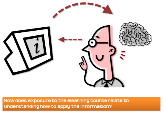
The Rapid E-Learning Blog: How does exposure to the elarning course relate to understanding how to apply the information?

Sometimes we treat people liked they’re scanners.  We think that since they SEE the information that by default an exact duplicate is scanned into their brains that they can reference anytime it’s needed.  That might be the case for Bill Clinton, who’s rumored to have a photographic memory (except under deposition).  But it’s not the case for the rest of us.

Suppose you’re teaching a class on how to make coffee.  While the students are all exposed to the same information, they’re not necessarily focusing on the same things, let alone learning the same. One person might be thinking about ways to roast beans and another wishes he had a cup of coffee right now.  Yet another person is following what you’re saying, but wonders if there’s another way to make coffee.  And someone in the back starts crying because she thought you said “coffin” which reminded her of a recent funeral she attended.

So no matter how well you think you designed the course, each person looks at the content from a slightly different perspective, which creates different understanding.  Courses need to be designed to accommodate the uniqueness of each learner.  And that doesn’t happen by trying to control them.

Free Up the Navigation

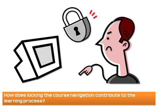
The Rapid E-Learning Blog: How does locking the course navigation contribute to the learning process?

It’s true that a lot of learners just start clicking on the next button until they can leave the course.  So our gut reaction is to lock the navigation and force them to look at all of the content.  But does this really make sense?  

People aren’t scanners.  Even if they did look at all of the content, it doesn’t mean they know it.  Locking the navigation and exposing the learner to information doesn’t make it more understandable.  In fact, it most likely gets the learner to focus on when the slide ends rather than what’s on the slide.   

Frustrated learners don’t learn.  Let’s say you want to learn how to add cells together in Excel.  The first 20 minutes of the course is all about the interface, which you already understand.  However, you notice in the menu that on slide 20 you can learn about “adding cells.” 

So you click on slide 20 and get the message that you can’t access it without looking at all of the previous slides.  Of course, you can’t click through them because some instructional designer thought you needed to learn about interfaces before you can learn to add cells.  And to make matters worse the next button doesn’t appear until the narration is done.  So you end up wasting 20 minutes before you can get the information you need.  How do you feel about the course at that point?

People don’t learn the same things from the same content.  The reason we value collaboration so much at work is that we understand that diversity of thought and varying perspectives help fill gaps and remove blind spots in our thinking.  If we acknowledge that about problem solving at work, then we also need to acknowledge that when crafting elearning courses.  Each person is unique and will approach the course from a unique perspective.  That influences how they understand what you’re trying to teach them.  Shouldn’t the learning experience accommodate the uniqueness of each learner?

Step Away from the Solution and Work on the Problem

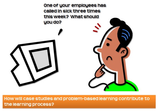
The Rapid E-Learning Blog: How will case studies and problem-based learning contribute to the learning process?

Locking the navigation is a solution to stopping learners from clicking through the course.  However, it doesn’t address why they’re clicking through it in the first place and not focusing on the content.  Instead of locking the navigation, create a course that removes the reason to just click the next button.

Guide the learner through the course, rather than forcing the navigation.  The player navigation is just a way to get from one piece of information to the other.  That’s not instructional design.  Instructional design is about guiding the learners through the course content so that they can learn.

Think of the course like a 400 page reference book that contains all of the information you need to do your job.  Whenever, you have a question you go to the reference manual.  How effective would it be if the reference manual’s page turning was locked and you always had to start at the first page rather than go to the information you need?

Give the learners the freedom to demonstrate their level of understanding.  Now let’s apply that to elearning.  Essentially, the course content is like the reference manual.  The goal isn’t to get them to read all of the content.  Instead, the goal is to get them to DO something.  The content only supports the DOING.

Considering this, don’t design your course to navigate through content.  Instead, create an environment where the learner has to demonstrate understanding of the content by doing something.  By focusing on the desired action rather than the content, the learner’s better prepared to learn.  The content is just a resource to help them gain understanding.  When you lock access to the content, you’re actually hindering the learning process. 

Make the content relevant to the learners.  Instead of just dumping screen after screen of information, present a problem for them to solve.  The problem solving requires them to demonstrate their level of understanding which is what you want to assess.  If they don’t know how to solve the problem, they’ll look for a solution in the content you provide.

Most likely the course exists because the client wants something to be done a certain way.  That means you build your courses around the behaviors or actions you expect from the learners.  Thus, you assess them on those expected outcomes.   Having the learners VIEW information is rarely an effective measure of a successful course.  If it is, you’ll probably be out of a job soon.

If you focus on the desired outcome, that will allow you to unlock the navigat
ion.  It also helps accommodate each learner who will come to the course with different levels of expertise and experiences.  Some will go through the courses in a linear process.  Some like to take a quick look through what the course covers and then go back.  Even others, will look for things they don’t already know.  How they access the information really isn’t that big of a deal because that’s not the objective of the course.

Your ability to measure their understanding will come from the problem solving that you build in the course.  If they know the information, they’ll prove it through the problem you give them.  If they don’t, you’ll know exactly what they’re missing and you can give them feedback specific to their real needs. 

This approach creates courses that are relevant to the learners and you won’t have to worry about them clicking through the course just to get to the end.  Even if they did click through the course, they wouldn’t be able to work through the case studies you give them unless they know the content, which forces them back to the information they don’t already know.

In either case, you have a win-win situation.  You get people to go through the course successfully and have a way to truly assess the learner’s level of understanding.  And the learner has the flexibility to access the information to really learn based on their unique perspective, experience, and current level of understanding.

How would you build a course that frees up the navigation for the learner and still meet your learning objectives.  Share your ideas here.

Events

Free E-Learning Resources

Want to learn more? Check out these articles and free resources in the community.

Here’s a great job board for e-learning, instructional design, and training jobs

Participate in the weekly e-learning challenges to sharpen your skills

Get your free PowerPoint templates and free graphics & stock images.

Lots of cool e-learning examples to check out and find inspiration.

Getting Started? This e-learning 101 series and the free e-books will help.