The Rapid Elearning Blog

Archive for April, 2009


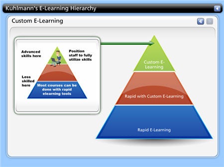
At a recent conference, I was talking to someone about rapid elearning strategies and how to best use the tools they had.  My approach is to start with a rapid elearning tool and the build from there.  It allows me to speed up production and allocate my resources to get the most bang for the buck.  It’s something I outlined in this post on saving time and money when building courses.

The Rapid E-Learning Blog - rapid elearning strategy

Click here to view the demo.

Another way to get the most out of your rapid elearning tools is to step away from the training event mentality.  What happens is that we equate training with learning, and then we create a training event rather than a learning process.  So we have a whole catalog of great courses, but the learning is typically confined to the course and doesn’t offer much support outside of it.  How often do you get reinforcement after taking an elearning course?

I can’t tell you how many times I’ve been sent to training sessions or taken elearning courses that were completely irrelevant to what I did.  And when they weren’t, they offered no follow up or feedback to help me grow after the training session was completed.  It used to annoy me that my manager would assign a course and then never questioned whether or not I learned anything or if the course even had value, let alone how I could start to use what I learned in my work.

2000 Hours to Learn 

Let’s look at a year in the life of a trainee.  The typical work year represents about 2000 hours.  During that year people learn.  In fact, they’re always learning.  You don’t have an on and off button when it comes to learning.  It just happens.  In that sense, we can say, that a person has 2000 available learning hours.

The Rapid E-Learning Blog - 2000 learning hours

So the question when building a training program is how to make the most of the 2000 learning hours.

Training as an Event

Most training and elearning courses are built like events.  You built it and the learner attends it.  If it’s a really great course, it’s relevant and has some good interactivity.  However, it’s usually still a single event, no matter how good the course is.
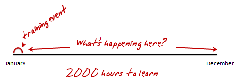
The Rapid E-Learning Blog - training is an event that is only part of the learning process

So you end up with something that looks like the image above.  You have a course and then on a lot of white space.  As you can see, there’s a lot of missed opportunity.  Let’s say you have the world’s best elearning course and it’s 2 hours long.  Two hours out of 2000 doesn’t seem like it would have a lot of impact.  Especially when those two hours are compressed into a single event.  Odds are that without follow up or some sort of reinforcement, what the person learns soon falls to the wayside.

Learning is Always Happening

As Bono says, “I can learn with or without you.”  A person doesn’t learn because we decided to create a course.  The reality for a learner is that learning is always happening.  Sometimes it’s part of a formal process and sometimes it’s not. 

A person’s learning throughout the year will consist of formal courses, interactions with peers, management, and customers.  It’s a continual process of taking in information, making decisions, and getting feedback.  Even the world’s best elearning course can only contribute so much to that process. 
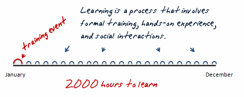
The Rapid E-Learning Blog - learning involves formal training, experiences, and social interactions.

It seems that to craft the best learning experience and really make the training stick, we’d find a way to make the most use of those 2000 hours.

Building Effective Learning

Let’s review a few things about elearning.  First, elearning can be expensive.  Assuming a ballpark figure of about $100 an hour, here are some rough estimates of what an elearning course can cost.  The ratios represent total development and production hours per completed hour of training.  I got the numbers from Bryan Chapman’s research with Brandon Hall.

  • $35,400 – 3rd Party Courseware (354:1)
  • $22,000 – Standard elearning (220:1)
  • $3,300 – PowerPoint-based elearning (33:1)

Obviously these numbers don’t reflect every elearning course or the types of projects you might work on.  In addition, the $100/hour represents one developer. For example, many of those high-end, award winning courses can get well over $500,000 if not more.  However, I’ve been involved in hundreds of elearning projects and can’t recall getting a budget that was anywhere close to that. 

From my experience most elearning courses fall in the $15,000 to $40,000 range.  They can get a lot less expensive with rapid elearning tools.  In either case, they give you some general numbers to work with.

Most of the cost for elearning goes into the development and implementation of the course and leaves little for follow-up.  From the studies I recall that’s about 90% to create the course and usually less than 10% for follow up and post course activities.  So even if you wanted to do more with the 2000 learning hours, you just don’t have the resources. 

This is where rapid elearning presents some interesting opportunities.  Instead of committing your resources on large and limited events, rapid elearning allows you to build a strategy that’s agile and adaptive to change.  You’re able to create just in time training events.
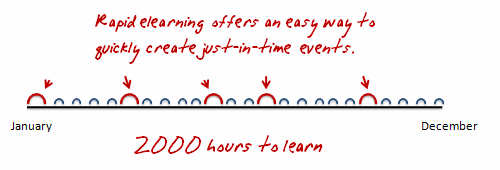
The Rapid E-Learning Blog - rapid elearning is agile and easy to implement

You can create a few milestone courses instead of one
large course.  Then build a series of elearning interventions around them.  Since the software is easier to use and doesn’t require specialized programming skills, the courses can be built by just about anyone, even a monkey.  And because you offer more opportunities for feedback and interactions, you can worry less about designing the “right” type of interactivity in a one shot deal.  This means you can get away with a fewer bells and whistles.

I created a course once where we emailed simple scenarios and case studies to the learners at scheduled intervals.  They’d go through them and discuss the solutions with their managers.  The managers would review their progress and forward the results back to close the loop. 

This worked really well for us.  We were we able to offer some refresher training and follow-up spaced between formal sessions which are good for the learning process.  We also were able to pull the managers into the learning because they were the ones reviewing and giving feedback.  This helped us train the managers on their management skills as well as contribute to developing the relationship between the employee and manager.

Rapid elearning tools make this type of approach very practical.  It’s less likely to work if you’re dependent on a Flash programmer or other multimedia resources.  In addition, many of those follow-up type activities only take a few minutes to build.  I built a real quick demo as an example.

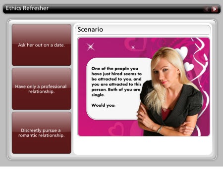
Here I used an Engage tabs interaction to present a simple scenario*.  Because Engage is a form-based product, I can create these in minutes.  This demo took about 15 minutes from start to finish. 

In this example, I used the introduction screen to present a scenario and then used the tabs to offer choices.  The learner clicks on a tab and gets feedback. 

The Rapid E-Learning Blog - rapid elearning example scenaio

Click here to view the demo.

This approach works great.  They require no programming skills.  The scenarios look nice and it’s an effective way of delivering coaching and reinforcement after someone completes and elearning course.  I could easily create a series of 20 interactions like this and deliver them throughout the learning process with minimal time commitment and at a very low cost.  That’s the power of rapid elearning.

Can you imagine building an elearning course and then getting feedback 90 days later that 60% of the learners are still not getting it?  If you followed a more traditional development process it would be hard to pull a team together to make changes to the course and roll it out again.  Especially if your courses were expensive to start with.

I talked to someone who said her company paid $500,000 for three courses.  When you commit that type of money to a course, you’re kind of stuck if you need to make adjustments don’t the road.  And to avoid making adjustments you end up spending all of your time up front developing and implementing the course.  That’s why there’s usually little committed to the post course activity.

However, a rapid elearning solution is flexible and agile.  If you need to do a refresher or reinforcement course or module, you can do so quickly.  This means that you can truly offer a solution at the point of need without pulling in a lot of expensive multimedia developers.

A sound rapid elearning strategy makes sense.  You save time and money.  I’d love to hear how you’re using the rapid elearning courses as part of your learning process.  Feel free to share them by clicking on the comments link.

If you liked this post, you might also find these interesting:

* Ethics sample content from The Ethics Quiz.

Events

Free E-Learning Resources

Want to learn more? Check out these articles and free resources in the community.

Here’s a great job board for e-learning, instructional design, and training jobs

Participate in the weekly e-learning challenges to sharpen your skills

Get your free PowerPoint templates and free graphics & stock images.

Lots of cool e-learning examples to check out and find inspiration.

Getting Started? This e-learning 101 series and the free e-books will help.


Here’s an easy way to add some visual impact to your elearning courses.  Start with an image and then recolor it.  There are all sorts of ways that you can use a colored image in your courses.  For example, the colors can match your organization’s brand. 

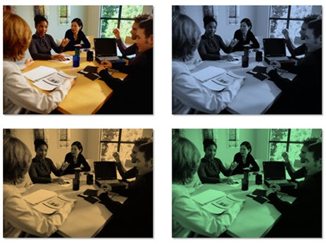
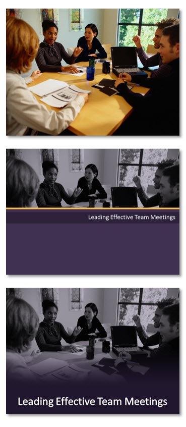
In the example below, you see the original image with three different colors applied.  Each color could represent a different section of the same course.  Another idea is to color the images based on the emotion or feeling that you want them to convey.  They don’t need to be as dramatic as the images below.  The color shift can be subtle.

 The Rapid E-Learning Blog - color image examples

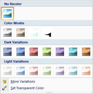
Most graphic editors have an easy way to recolor your images.  If you have PowerPoint 2007, you can do this in just a few mouse clicks using the recolor feature.  You can even use colors that are part of the color themes.  So when you change a theme, all of the colored images are changed as well.

The Rapid E-Learning Blog - color options in PowerPoint 2007

Photos are great because they have a depth and richness that’s not easy to manufacture in clip art or vector images.  In addition, they can convey information without using words.  Coloring the image allows you to leverage the rich texture of the image to create some visual interest. 

Compare the original image with the two examples I made below it.  The original has so much going on that it’s not easy to control where the learner is looking.  By coloring it, you tone that down a bit and gain some control. 

You also have a lot of options in how you can use the colored image.  In the first demo, I use it as a title screen.  I’m able to mute the brightness of the original and still capture the essence of the how the image relates to the content.  The second image uses a rectangle with a gradient fill that matches the overlay color.  Then I made the top part of the gradient transparent.  The good thing is that I was able to do all of that right inside PowerPoint.  Obviously, these are both simple examples, but they give you a sense of what you can do.

The Rapid E-Learning Blog - colorized examples

When we shoot our own photos they typically don’t look as nice as those done by professionals.  There are usually some lighting imperfections or color shifts.  The light source will cause your images to color a certain way.  For example, tungsten lights are yellow; fluorescent lights are green; and daylight is blue.  So when you shoot your own photos without any real lighting considerations you’ll end up with images that are a little off because of the original light source.

Using the coloring technique, you can cover up imperfections in lighting and still use the photos.  It’s a great way to bring "real" people into your courses and not worry about being a professional photographer.

You’re also not limited to using the entire photo.  In the example below, I used a “cutout person” and then colored her. 

The Rapid E-Learning Blog - color cutout characters

You can also do the opposite, where you color the background image and insert the cutout person on top, as I did in the example below.  It just all depends on where you want the learner to focus.

 The Rapid E-Learning Blog - colorize background images

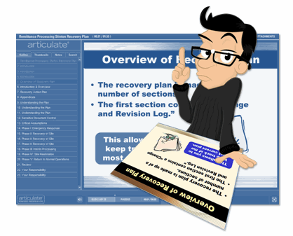
Applying a color to your image is relatively easy to do yet it opens the door to all sorts of creative uses.  For example, in a recent blog post on using your PowerPoint slide notes I customized an image to look like a subject matter expert.  Does this add value as an instructional design consideration?  No.  However, it can make the way you present your information a little more visually interesting.  And this does contribute to your instructional design.

The Rapid E-Learning Blog - colorized example

The only limitation with this technique is your creativity.  How would you apply this idea to your elearning courses?  Feel free to share your thoughts by clicking on the comments link.

If you liked this post, you might also like these:

Events

Free E-Learning Resources

Want to learn more? Check out these articles and free resources in the community.

Here’s a great job board for e-learning, instructional design, and training jobs

Participate in the weekly e-learning challenges to sharpen your skills

Get your free PowerPoint templates and free graphics & stock images.

Lots of cool e-learning examples to check out and find inspiration.

Getting Started? This e-learning 101 series and the free e-books will help.


The difference between effective and ineffective elearning is how you design the learning process.  In this post, I’ll do a quick run through of some ideas centered on instructional design and three things that you want to consider when building your courses.

Focus on meaning and not information

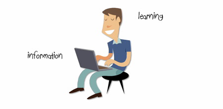
We tend to equate learning with sharing information.  Typically if there’s something we want to change, we think about how to get more information to people.  In fact, most of the elearning courses I see are focused exclusively on sharing information.  While sharing information is part of the learning process, it isn’t THE learning process.

If you’ve been reading this blog for a while, then the following point won’t come as a surprise.  To build better elearning courses, the solution is to focus on the learner and not just the information.  In fact, most disagreements we have with our subject matter experts and clients is usually because they tend to focus more on information and less on learning.

 The Rapid E-Learning Blog - sharing information is not the same as learning

We need to take the information and then package it in a way that allows the learner to use it.  That is when the learning happens.

When I was a young (and thin) video producer, I had to submit my projects for a peer review every Friday.  I wasn’t allowed to explain the intent of the project.  Instead, I had to play the video and then listen to what people got out of it.  One of the goals of this exercise was to see if those watching the videos got the message I intended.  In most cases they didn’t.  Usually, the reason was that my videos were designed for me and not my audience.

Through those peer reviews I learned that my job wasn’t to give people information.  Instead, it was to craft meaning out of the information.  This applies to instructional design, as well.

The e-learning course is just one part of a complex process

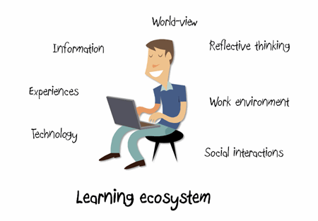
As humans, we’re always in learning mode.  We don’t turn learning on or off.  In a sense, learning is like an ecosystem.  We’re continually influenced by information, our social interactions, and experiences.  These shape who we are and what we know.  And this ultimately determines how we act.

We don’t learn just because someone gives us information or tells us that today we’re in a “course.”  We learn because that’s how we’re wired.  So when we do happen to take a course we fold it into our learning ecosystem and make it part of how we understand the world around us.

The Rapid E-Learning Blog - our courses fit into a larger learning ecosystem 

While we invest a lot of energy in building our elearning courses, those who take them aren’t as vested.  To them, the course only represents one part of a larger process.  How a person learns and builds understanding involves more than just taking a 30 minute elearning course.

Instructional designers are intentional

An instructional designer takes information and presents it to the learners so that they can develop context.  When it’s done right, it can expedite the learning process which can save time and resources.

Here are a few simple examples.  Look at the text below.  It’s information.  But what does it mean?  Is it in reference to a storage bin?  The sport of boxing?  A shape?

The Rapid E-Learning Blog - box

In the example above, the meaning of the information is up to the learner to decide.  But who knows what they’ll come up with?  Since you could have multiple meanings, you end up having to correct perceptions that run counter to what you are trying to teach.

Now, let’s look at the next image.

The Rapid E-Learning Blog - box image and box text

You see an image of a box and the word.  However, you’re not quite sure of the relationship, if there is one.  This again forces the learner to think through the information.  They might or might not see a relationship. And in turn, might draw the wrong types of conclusions.  Just like the first image, if they draw conclusions that are not consistent with what you are trying teach, you’ll have to spend additional time and resources bringing more clarity to the information.

In the image below, because the box and the word are close together, you have an implied relationship.  This brings clarity to the learner.  You don’t need to explain as much because of the way the image is designed.

The Rapid E-Learning Blog - relationship between image and text

When it comes to instructional design, everything you put on the screen serves some purpose.  In the example above, we started with the word “box.” By itself it can mean many things.  Without some intentional design the learner can be distracted by irrelevant information or assumptions.  In some learning environments that might be fine and exactly what you want.  But in many it can be a waste of time and resources.

Adding the image of the box made it a little clearer.  However, the final example with the image and text together brought meaning to the word.  When you design your courses, think less about the information, and more about the relationship the pieces of information have to each other and most importantly to the learner.

While the above examples are simple, they do represent something essential to instructional design.  You take information and present it in such a manner that the learner is able to see its relationship and context.

As an instructional designer, you want to focus on meaning.  How is the information important to the learner?  In what context?  Considering that the elearning course is only one part of the learning process, what other ways can you support that learning happens?  Is there a way to leverage the learner’s already existing learning ecosystem?

Finally, can you expedite the learning process by building the right types of relationships between the pieces of information?  Are you using the right images, text, and multimedia?

These are just a few things to consider when building courses.  The key takeaway is that learning is complex and because you build an elearning course doesn’t mean that learning happens.  It involves an intentional act on your part and a commitment from the learner to apply what is learned.  The better you design the information, the more likely the learner is to commit to using it.

I’d love to hear your thoughts on this.  Feel free to share them by clicking on the comments link.

Also, if you liked this article, you might also find these previous posts useful:

Events

Free E-Learning Resources

Want to learn more? Check out these articles and free resources in the community.

Here’s a great job board for e-learning, instructional design, and training jobs

Participate in the weekly e-learning challenges to sharpen your skills

Get your free PowerPoint templates and free graphics & stock images.

Lots of cool e-learning examples to check out and find inspiration.

Getting Started? This e-learning 101 series and the free e-books will help.


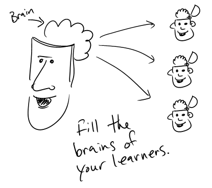
I’m a doodler.  It helps me think.  When I present or talk to people I like to use a whiteboard.  I feel like I’m better able to get my ideas across as I map them out visually.  Not only does this help me express my ideas, it kind of forces me to lay them out in a manner that’s easier to understand.

Dan Roam talks about this in his book The Back of the Napkin: Solving Problems and Selling Ideas with Pictures.  He shares his ideas on how to tell your story visually.  I heard him once summarize his book as “the ability to have someone else grasp what we see in our own minds, in their minds.”

The Rapid E-Learning Blog - full your learner's brain

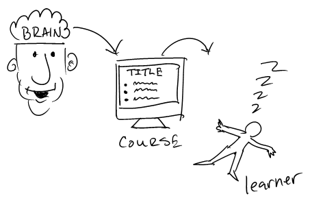
In many ways that’s what we do when we build our elearning courses.  We take information that’s in our minds and then try to package it so that the learner can “see” and use the information.

I get to review a lot of elearning courses and what strikes me is how often the courses are information heavy.  They can get the information out, but many fail at effectively getting the information in.  A lot of that has to do with not knowing how to represent the content visually.

The Rapid E-Learning Blog - how to get information into the brain

Applying Roam’s ideas to your elearning courses helps you structure the content and makes it more visually effective.  To learn more about his ideas, read the book or check out this video of a presentation he gave at the Commonwealth Club.  Of course it would have helped had the videographer actually shot video of what Roam was drawing.

Fortunately, Microsoft also invited him to speak at MIX09 and they did capture his audio and presentation.  As you can see if you watch both, the information makes much more sense when you see it explained visually. 🙂

That’s what I’d like to do.  However, I want to take Roam’s ideas one step further and instead of creating the visuals as static images, make them part of a presentation on a whiteboard and include them in my rapid elearning course.

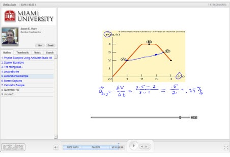
Thanks to Janet Hurn, I was introduced to LectureScribe.  She teaches physics at Miami University and uses it as part of her rapid elearning process.  You can see her demo below.

The Rapid E-Learning Blog - Janet Hurn example

Click here to view the demo.

LectureScribe was developed by Brian C. Dean at Clemson University.  It’s a simple tool that lets you write and capture your whiteboard lectures.  I’d also like to add that the tool is FREE.

The Rapid E-Learning Blog - LectureScribe menu

If you’re interested, Brian has a tutorial on his site that gives you a good overview of how to use the tool’s features.  LectureScribe outputs to Flash (SWF) so that means you can easily add it to a web site or insert it into your own elearning course.

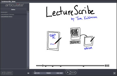
I put together a quick demo where I explain a little more about it.  This lets you see it in action.  In this case, you see the lecture inserted on a slide and I included a couple others and inserted them in a different elearning tool so you can see how they work.

The Rapid E-Learning Blog - LectureScribe demo

Click here to view the LectureScribe Overview.

This is pretty cool application and can be used in a number of ways.   If you teach subjects like math or chemistry, this tool comes in handy.  At a recent conference, I was talking to an engineer who was looking for a way to do something like this and then add the Flash files to an Engage process interaction.  This would work for him.

Since it’s free, it’s also a great tool to give to your learners.  For example, I had my children use it to explain something they learned.  Watching them do that helps me assess their understanding more so than having them take a test.  The cool thing is that if you were a teacher, you could take all of those SWF files from the students and then bring them into your rapid elearning course as a portfolio.  It’s a great way to show parents (or bosses) how well people are learning.

So if you need a whiteboard to share your information and build elearning courses, then LectureScribe is a good way to go.  If you use LectureScribe, I’d love to see some examples.  Also, if you have some ideas of how you could be using this, feel free to share them in the comments section.

Events

Free E-Learning Resources

Want to learn more? Check out these articles and free resources in the community.

Here’s a great job board for e-learning, instructional design, and training jobs

Participate in the weekly e-learning challenges to sharpen your skills

Get your free PowerPoint templates and free graphics & stock images.

Lots of cool e-learning examples to check out and find inspiration.

Getting Started? This e-learning 101 series and the free e-books will help.


Every few years it seems that there’s some hot new trend in the world of training.  Right now it appears that mobile learning is all the rage.  The world of mobile gadgets is converging with an always available wifi network.  This gives us instant access to all sorts of information which fits in well with on-demand training.

Since this part of the industry is so new to many of you, I thought it might be best to hook up with an expert in the industry to learn more.  So I called one of my mentors and a real pioneer in the elearning industry, Dr. Werner Oppelbaumer, to pick his brain.  I asked for his thoughts on mobile learning and where he thinks we should be focusing our attention.

It seems that every year or two the training industry hypes some sort of technology or trend.  Currently, it appears that mobile learning (or m-learning) is the hot thing.  However, we tend to over-promise and under-deliver.  Is this just a fad or is there more to it than that?

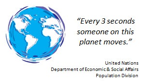
M-learning is not a fad.  We have been doing some very detailed studies and have discovered that many people are mobile.  In fact, every three seconds there is someone on this planet that is moving from one place to the next.

The Rapid E-Learning Blog - Startling statistic from the United Nations

We’re not quite sure how long this trend will last, but it definitely presents some opportunities and challenges for the industry.  At the same time, there is always an element of hype that surrounds these newly discovered trends.

So, considering that mobile learning is not a fad, how do we separate the hype from what’s of real value?

The Rapid E-Learning Blog - Dr. Werner Oppelbaumer answers a question

Good question.  We find that most people are distracted by the sexy technology and lose sight of how ineffective it actually is.  Take something like the iPhone for example.  Considering that the world’s population is approaching 7 billion people, only selling 17 million units can hardly be called a success.

In fact, their sales dropped 24% in the last quarter.  The way I see it, the iPhone is just a fad.  My guess is that this time next year we’ll be talking about some other gadget and the iPhone will probably go the way of the CB radio.

The Rapid E-Learning Blog - Is the iPhone the next CB radio?

We feel the key is to get the most out of all of these technologies without focusing on any one specific one.  For example, all of the mobile devices have things in common, one of which is a small screen.  This presents a problem when trying to push out effective m-learning.

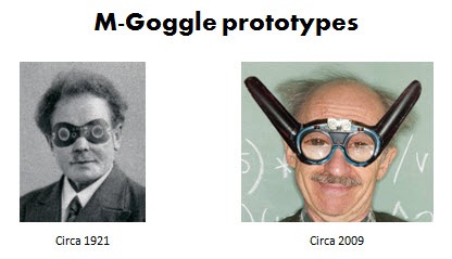
With the small screens you are limited to just a few bullet points.  To remedy this, we’ve developed the m-Goggle which will allow you to magnify the screen’s resolution.  It’s something we’ve been working on since the 1920’s.  We’ve had the solution for years, but had to be patient and let the rest of the industry catch up to us.

The Rapid E-Learning Blog - mGoggles prototype

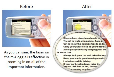
These goggles give you the best of both worlds.  You can leverage the mobile devices that everyone has and still have room for the bullet points that are so critical for effective elearning.  Our studies have also indicated an additional side benefit.  We found that when men wear these goggles while traveling it is much easier for them to communicate to woman that they are single.

The Rapid E-Learning Blog - example of mGoggles in action

The Rapid E-Learning Blog - Tom Kuhlmann asks a question 

What advice would you give someone interested in learning more about this industry and m-learning?

The Rapid E-Learning Blog - Dr. Werner Oppelbaumer answers a question

I always advocate caution.  Don’t get caught up in the fads.  Instead focus on what’s important.  The best way to sort the important stuff from that which is trivial is to look for a letter before the word “learning.”

My motto is, “With a letter, learning’s better!”

For example, “e-learning” means it is important.  The same with “m-learning.”  Remember, if it has no letter, then it’s most likely a waste of time and not worth your energy.

If you can’t find a letter, then the next step is to look for a number.  Something like m-learning 2.0 is really important.  It has a letter and a number.  Be cautious of trends without numbers.  That means they’re not evolving.

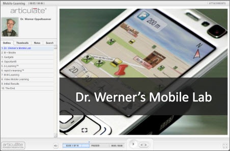
As far as the future of mobile learning, I put together a simple presentation of some of our forward thinking mobile learning technologies.  You are free to share them with the blog readers.  I am excited about where the industry is going and the opportunities it will present to all of us.

The Rapid E-Learning Blog - Dr. Werner Oppelbaumer explains the future of mobile learning

Click here to view Dr. Werner’s Presentation

I want to thank Dr. Oppelbaumer for his insight and sharing his time.  He agreed to monitor this blog post and answer any questions.  Feel free to share comments and questions for Dr. Oppelbaumer in the comments section.  Have a wonderful day!

Events

Free E-Learning Resources

Want to learn more? Check out these articles and free resources in the community.

Here’s a great job board for e-learning, instructional design, and training jobs

Participate in the weekly e-learning challenges to sharpen your skills

Get your free PowerPoint templates and free graphics & stock images.

Lots of cool e-learning examples to check out and find inspiration.

Getting Started? This e-learning 101 series and the free e-books will help.