The Rapid Elearning Blog

Archive for May, 2009


In a previous post, we looked at how you can make your elearning courses more effective and engaging by getting your learners to pull the course content rather than you just pushing it out to them.  A great way to create a pull-type course is build it around problem-solving scenarios.

A scenario can put the course content into a context that is relevant to the learners because they can use the information in a real world setting.  Even if you don’t create a pull-type course, scenarios are still effective in helping your learners.

As always the challenge for many instructional designers is that as you have to work with time and resource constraints.  Many times it’s just a lot easier to build an information-based course than it is to build a scenario.  Scenarios can take more time to develop and not everyone is a Hollywood scriptwriter (not that it means anything considering most of the movies that are released nowadays).

The good news is that pulling together scenarios is not as hard as it might seem.  In today’s post I’ll offer some ideas to help you get started.

1. Focus on the desired result.  What do you expect from the learners after they’re done with the course?  How do you know that they’ve met those expectations?  Many courses aren’t clear in the performance requirements after the course.  Without those expectations it’s hard to build scenarios that are relevant.

The Rapid E-Learning Blog - Focus on the desired result for your elearning course

However, if you can establish the level of understanding that you expect from the learners, you’re able to build scenarios around those expectations.  Most likely you’re not just expecting that they can repeat some facts or that they have a certificate they can tape to their office walls. 

2. Tap into the learner’s motivation.  Most elearning courses are about the information in the course and not how the information is relevant to the learner.  We take a cookie cutter approach to elearning as if all information is equally important to the learners or all learners are equally ignorant of the information.  What you want to do is figure out how to connect the information to the learner.

The Rapid E-Learning Blog - Tap into the learner’s motivation.

That’s where scenarios come in handy.  Good scenarios tap into the motivations of the learner.  What’s in it for the learner?  Why do they need this information?  What do they gain with this information?  Or flip it.  What do they lose if they don’t have this information?  You can still build a course that reaches hundreds of people and at the same time allow each learner to get something a little different out of it.

3. Have the learners do something with the information that you give them.  Many courses are heavy on information and light on measuring understanding.  And when they do attempt to assess the learner, it’s usually a series of simple multiple choice and true/false questions.

By building scenarios where they have to actively make decisions you’re better able to help them transfer the information and make it more meaningful.  You’re also in a better position to assess their real understanding and provide feedback to fill the gaps.
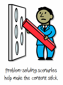
The Rapid E-Learning Blog - Have the learners do something with the information that you give them.

One way to integrate the scenarios with the course is to first present some information and then build scenario-based activities that let the learners practice using it. 

Example:

Today, you’re going to learn how to prevent fires.  In section 1, we’ll look at common fire hazards.  In section 2, we’ll look at ways to avoid those hazards and prevent fires.  Then we’ll practice using this information through some interactive activities.

In the example above, we are going to give them the information first and then build some interactions around it.

4. Have the learners uncover information by challenging their understanding.  Don’t give the learners any upfront information.  Just throw them into the pool so to speak and let them learn to swim.  This is a great way to test their assumptions and possible misunderstanding.


The Rapid E-Learning Blog - Have the learners uncover information by challenging their understanding.  

To make this approach practical you want to build the right type of infrastructure and guidance for the learner to find the information they need to solve the scenario.

Example:

The ACME building just burned to the ground.  You’re a fire inspector and your job is to investigate the fire and prepare a report for the ACME management team. 

In this scenario, you’re not giving them the information upfront.  So what you want to do is have them discover it.  As you design this type of scenario, you need to create a mechanism for them to research and find what they need and a way to give them the feedback they need to progress through the scenario.

5. Keep it simple.  Scenarios don’t need to be overly complicated.  Avoid something like this:

“It was a dark and unusually quiet night when a woman’s distant screams could be heard piercing the quiet that normally sat on the small town like a night time mist.  And just as soon as it started the screams subsided and were replaced with a newborn’s cries.  And so started the life of Mary, the finance manager of Primento…”

Instead, just jump into the scenario.  “Mary the finance manager has to….”
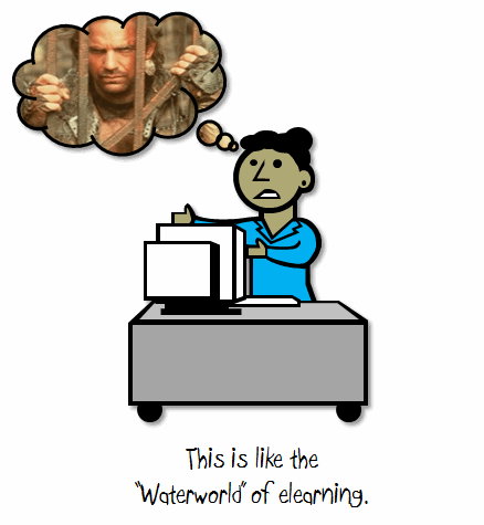
The Rapid E-Learning Blog - Keep it simple.

Another way of simplifying is to pull much of the content out of the course and create job aids or cheat sheets that they can use after the course.  You can use those as the resources that people can explore to solve the scena
rio.  An additional benefit is that you’re able to teach them how to use those aids as part of the course objectives so that they have access to it after the course is complete.

6. Ask learners how the course content is relevant.  Somewhere in the instructional design process you will connect with your learners.  Ask them HOW they’d use the content or WHEN they’d use it?  They’ll give you all sorts of ideas that you can use as fodder for your scenarios.
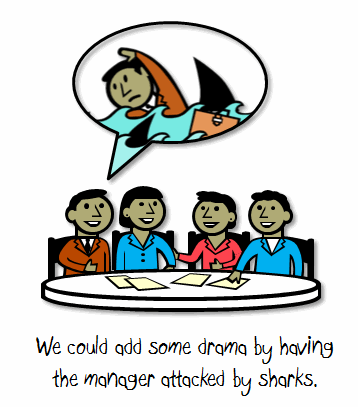
The Rapid E-Learning Blog - Ask learners how the course content is relevant.

You might not want to tell them that you’re building scenarios.  Instead, just ask if they can give you some background on how or when they use the information.  If you tell them you’re building scenarios, they might end up giving you way too much information or get caught up in every possible use case rather than the most obvious.  Also, find out how a new person would use the information versus someone who is more experienced.  In fact, some of your best resources for building your courses are new employees or recent learners.

7. Confirm that the scenarios are accurate and realistic.  Make sure that your customer, subject matter experts, and learners all agree that the content and scenarios are accurate and realistic.  Some other considerations are how they work with the rest of the course and with the various learners.  This is especially true if your courses are available to different ethnic groups or cultures.
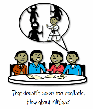
The Rapid E-Learning Blog - Confirm that the scenarios are accurate and realistic.

Sometimes all you need is an information-based course that’s more resource than real learning.  However, if you’re really trying to change behaviors and performance with your elearning courses, then building scenarios and problem-solving activities is a good way to go.

What are some tips and tricks that you’d recommend when building scenarios for your elearning courses?  Feel free to share them by clicking on the comments link.

If you liked this post, here are some others that might interest you:

Events

Free E-Learning Resources

Want to learn more? Check out these articles and free resources in the community.

Here’s a great job board for e-learning, instructional design, and training jobs

Participate in the weekly e-learning challenges to sharpen your skills

Get your free PowerPoint templates and free graphics & stock images.

Lots of cool e-learning examples to check out and find inspiration.

Getting Started? This e-learning 101 series and the free e-books will help.


Here’s the challenge for many of us.  We want to make our courses engaging and interactive, yet sometimes the content or the time pressures of work don’t make that easy.

The default position for many elearning courses is to merely push the information out to the learners.  The end result is that the course is heavy on information and light on interaction.  By changing the way you structure the information, you can quickly build the framework for more engaging and interactive courses.  It’s just a matter of rethinking how you approach the course design.

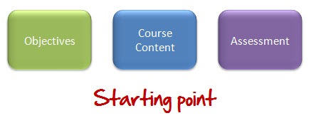
Let’s assume you do all of the front end analysis and you’re ready to build the course.  You have clear learning objectives and all of the information you need to meet those objectives.  You also want to assess the learner’s understanding.  So regardless of which approach you take you basically start with the same content and goals.

The Rapid E-Learning Blog - starting point

The Push Approach

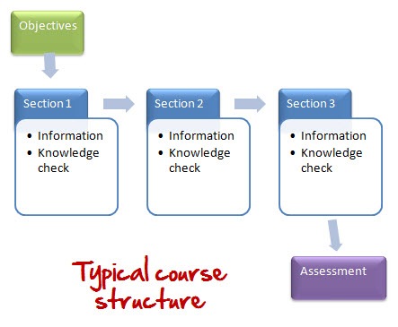
I get to look at a lot of courses.  Generally, they all seem to follow a similar structure.  They start with the objectives, jump into the course content, and then end with a quiz.  Some of them will sprinkle knowledge checks throughout the course content to test the learner’s progress.  So a typical course might look like this:

The Rapid E-Learning Blog - typical course structure

This approach is kind of like how you’d build a product in a factory.  You design something that generally meets the needs of most people.  Then you push it out to all of the learners.

There’s nothing inherently bad about this approach.  Assuming good content design and a product that is visually engaging, this works fine.  This is especially true if all you need is tracked completion and there are no real performance requirements for the course.  And the reality is that’s the case for a lot of elearning, no matter how different you want it to be.  Plus, it’s really easy to build courses this way because you can focus just on the information.

The downside to pushing your content to the learners is that it assumes that all of the information is equally relevant to the learners and meets their learning needs.

The Pull Approach

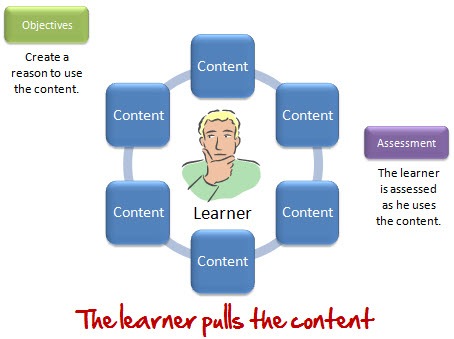
Just like the previous approach, we’ll assume that you have all of the content that the learner needs.  However, in this approach, you’re not focusing on designing the content as much as you are creating reasons to use the content.  What you want to do is get the learner to pull the content he needs.

The Rapid E-Learning Blog - learner pulls information

This allows each learner to have access to the same information, yet the learning experience might be unique to the learner.  So instead of focusing on creating a universal design that pushes the content, you focus on crafting the right types of reasons a person needs to pull the content.  With this approach you can still provide all of the same information.  All you’re doing is changing how the learner gets it.

Here’s a real world example.

A while back I was doing some home remodeling and decided to put up some crown molding.  The problem with crown molding is that it has two surfaces, one on that rests on the ceiling and one that rests on the wall.  This means that it requires a special cut.  Having hung up other types of trim I was used to just cutting simple angles.

Not thinking about the crown molding’s compound angle, I proceeded to cut the molding at a 45° angle (which I learned wasn’t correct when I put the molding up on the ceiling).  I tried to guesstimate the next cut and got that wrong, too.  Now I had wasted two expensive pieces of crown molding and convinced my wife that if stranded on a deserted island she should plan to care for her own survival.

Since I obviously didn’t know how to cut the molding, I went online and did a search for the right technique.  I found one site that had everything you could possible learn about crown molding.  After clicking through pages of information, I finally found what I needed.  Unfortunately, I needed to brush up on calculus to figure out what all of the math symbols were.  I tried another site that in four simple steps showed me how to cut the molding the right way.

Now let’s look at the learning experience.  We’ll consider both sites “courses” on crown molding.  They both addressed how to cut crown molding and they were both built oblivious to me.  The courses were just pushed out on the Internet.

They only became relevant when I had a need and pulled the content to meet my needs.  At that point, my need was to cut crown molding.  So the simple four-step cutting information was all I needed.  It didn’t make the other information less valuable.  It just wasn’t relevant at that time.  However, if my need was to learn more about the styles of crown molding, then the other information would have been more relevant.

How do you get the learners to pull the information?

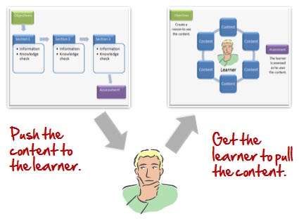
When you push the information out, you spend your time trying to figure out the best way to get it to the learners and make it stick.  On the other hand, when you design the course for the learners to pull the information, you spend your time figuring out how they would use it and then set it up for them to pull the content.

The Rapid E-Learning Blog - are you pushing or pulling

In either case, you work with the same core content, you’re just changing up how you get it to the learners.  And that’s where you want to make the change in the way you approach the course design.  Instead of creating an outline of content, start by asking, “How do we get the learners to pull this information?”

This doesn’t have to be overly complicated.  Well designed case studies or scenarios can create a need for the learners to pull the information.  If I had taken a course on crown molding prior to hanging it up, I probably wouldn’t have remembered the cutting procedures.  However, once I had a need, I was motivated to find the solution and to this day, seven years later, still remember how to cut the molding.

You don’t even need to have big case studies.  You can present some simple questions or problem-solving activities that require a solution.  Essentially, you want to create a need for the information.  Once the learner has a need, then they’re motivated to fulfill it.  And t
hat’s how you get the information to them.

By changing your focus from push to pull, you can share the same information and at the same time create a learning experience that is somewhat unique to the learner.  If you were to use a pull-based course, what are some ways that you can get the information to the learner?

Events

Free E-Learning Resources

Want to learn more? Check out these articles and free resources in the community.

Here’s a great job board for e-learning, instructional design, and training jobs

Participate in the weekly e-learning challenges to sharpen your skills

Get your free PowerPoint templates and free graphics & stock images.

Lots of cool e-learning examples to check out and find inspiration.

Getting Started? This e-learning 101 series and the free e-books will help.


People already use their computers for things like checking email, surfing the web, and sharing the latest news on Facebook.  Since that’s the case, why not design a course structure that mimics how they already use their computers?

I see a lot of elearning courses and I’d say that most of them are linear and almost exclusively focused on sharing information.  They are also usually light on interactivity.  I’m not going to stand on my soapbox and tell you that these courses are the worst thing since not slicing bread.  Because sometimes it’s all you need, or all the customer wants. 

With that said, there’s no reason why you can’t change up how you share the information by mimicking a technology the learner already uses.  So instead of clicking a next button to get to new information, you start inside a page that looks like Outlook and click on an email link to open a new message. Or explore a fake Facebook page to collect information. 

Even if there’s little interactivity, it’s still more interesting than the standard linear course.  On top of that, things like email and Facebook have a personal element to them.  By trying some of the following ideas, you are also able to bring a different perspective to the content and possibly wrap it around a story or something that is both relevant and engaging.  It might also trigger some ways to make the content more interactive for the learner. 

Here are three ideas to whet your appetite.

Mimic an Instant Message Experience

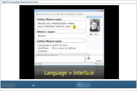
A lot of people use some sort of instant messaging application like Skype, AIM, or Messenger.  Use an instant chat screen to make it look like two or more people are chatting. 

To do this you need to create two or more people who will chat.  They represent different parts of the information. You also need to create a reason for their conversation.  And then make the information that you share conversational.  You can have them click the forward button to advance or add a hyperlink on the actual chat interface.

I did a quick version of this on the blog post about building elearning courses in PowerPoint. The chat section is only a few slides.  Click the play button to advance.

 The Rapid E-Learning Blog - mimic instant message

Click on this link to go right to the Skype slides.

Dig Through Someone’s Email Inbox

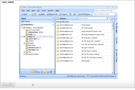
I read an article a couple of years ago about the Internet and new technologies. They interviewed some college students and one of them said that “email is what you did with old people.” So let’s say you have to train some of those old people. Why not create a screen that mimics an Outlook inbox?

Then have the learners click through email messages to collect information. The message titles could match what would have been the slide titles. And in the body of the email you’d present the information.  If you really wanted to make it engaging wrap the emails into some sort of interesting story where each one builds off of the other.

I took that old soap story from the Internet and built a quick prototype to show how something like that could work.  I just added all of the emails to the inbox for you to click through.  In a real course, some would be in the sent box or other folders.  Then I’d create a case study that required the learner to collect information through the emails.  You could even bury links in the body of the emails to provide additional resources and information.

The Rapid E-Learning Blog - mimic an email inbox

Click here to view the Outlook demo.

An Outlook type interface makes progressive storytelling a good approach.  Think of it like a virtual scavenger hunt.  Let the learner dig through someone else’s emails.  You could even add distracters or funny emails to make it a little more interesting.  Of course, if you’re training financial analysts then you’re kind of out of luck because it’s hard to make what they do exciting. 🙂

Create a Facebook Scavenger Hunt

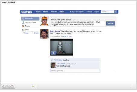
A Facebook screen is kind of cool because of the types of information you find on a Facebook page. There’s the information wall, an inbox, pictures, and a host of files and applications. It’s a great way to integrate all sorts of media and information in your courses.

What I’d do is create some sort of reason the learner needs to click around the screen to collect information. Then assess them based on the information they should have collected. For example, say I was doing a course on workplace violence.  By using a Facebook page I could add more interest than a series of bullet point slides.

I’d start with a story about Kelly Christopher, a disgruntled financial analyst, who attacks a well known blogger that happens to be visiting the analyst’s work location. Everyone is in shock and not sure how such a thing could happen, especially to such a nice blogger.

At this point, you invite the learners to visit Kelly’s Facebook page. As they click through it, they can read about him and get clues as to what triggered his outburst. Then build the assessment or case study around the clues they collected.

The Rapid E-Learning Blog - mimic a social media site

Click here to view the Facebook demo.

So there you have it, three ideas on how you can mimic everyday uses of the computer for your course design.  Essentially you’re creating pages of information and just changing the way the learner navigates it.  So even if you have a standard click and read course, you can still make it a bit more engaging this way.  The novelty itself is more interesting.

If you want to make it more engaging and interactive, create a case study or scavenger hunt type activity where the learner collects information and then has to use that to solve a problem.  This could work in corporate or academic settings.  What would the CEO’s Facebook page look like?  Or, what could a high school student glean from Einstein’s Outlook inbox?

I think you’d agree that this approach is more engaging than just a series o
f click and read slides.  The personal connection and the ability to build a story around your content will help make the information more relevant and probably more interesting.

What are some other ways people interact with their computers that could make for an interesting course design? Feel free to share them by clicking on the comments link.

Events

Free E-Learning Resources

Want to learn more? Check out these articles and free resources in the community.

Here’s a great job board for e-learning, instructional design, and training jobs

Participate in the weekly e-learning challenges to sharpen your skills

Get your free PowerPoint templates and free graphics & stock images.

Lots of cool e-learning examples to check out and find inspiration.

Getting Started? This e-learning 101 series and the free e-books will help.


I get a lot of questions from blog readers who are on a limited budget.  They want to know about free tools that they can use to build their elearning courses.  In this economy, the question probably means more than it did a couple of years ago.

I’m a junky for all of the free stuff online. If there’s a beta program or new software application, I’m quick to sign up and play around with it.  However, just because an application is free or can do something cool doesn’t mean that it’s really practical.  There are many free applications or services that I only end up using a few times.  For one reason or another they just don’t work for me.  So I don’t want to present a list of tools that might not offer any real value to you.

In today’s post, I’ll share with your some of the free tools that I use regularly to help me be more productive.  And if I’m more productive, I’m saving time and money.

1. Pixie

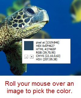
Pixie is a simple color picker.  It gives me the hexadecimal or RGB color codes.  I use it all the time to pull colors from images when I work in PowerPoint.  All you do is open it and then you can pick a color from any part of your computer screen.

The Rapid E-Learning Blog - use Pixie to pick colors

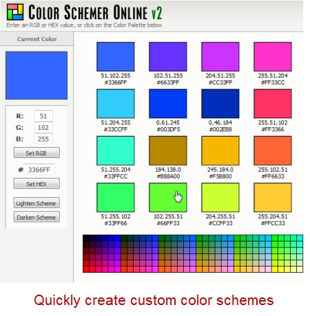
2. Color Schemer

Color Schemer helps you create color schemes.  You start with one color and then by combining a mathematical formula and the input of a panel of shamans, you end up with a complementary color scheme.  For me it kind of goes hand-in-hand with Pixie.  Usually what I do is use Pixie to pick a color from an image (or logo) and then go to the color scheme site to create a color scheme to go with it.

You can also download the software, but that isn’t free.

I also like to use other sites such as Kuler and Color Scheme Designer.  Once I have a color scheme, I can use that throughout my course.  Personally, I find this works well for me since I have slight color distinction problems, which many men have.

The Rapid E-Learning Blog - use Color Schemer to create color schemes

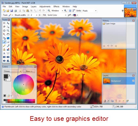
3. Paint.net

Paint.net has really developed into a nice application.  I wasn’t as fond of it initially, but I find that I use it quite a bit now.  The price is great (free) and it does most of what you expect from a graphics editor.

I find that a lot of people buy a more costly graphics editor and then only use it for basic tasks.  So unless you really need to use the power of an application like Photoshop, you might find that you can get away with something like Paint.net.  So why spend all of that extra money?  Especially when you can spend it on a good craft beer.  That’s my motto.  Besides, if you do need more power, there’s always Gimp (another free application).

Here’s a link to some tutorials to help you get started.

The Rapid E-Learning Blog - use Paint.net for simple graphics editing

4. Photo Resizer

Photo Resizer is kind of an interesting tool.  It’s almost magical.  I tend to do a lot of image resizing, especially for the blog.  This tool is perfect for quick resizing of images.  All I do is drag the image (or folder of images) I want resized onto the icon.  Then they get resized to whatever the number is on the application title.  If you want a new size, just change the number.  How easy is that?

The Rapid E-Learning Blog - use Photo Resizer to quickly resize images

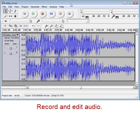
5. Audacity

Audacity is an open source audio editor.  I’ve been using it for a few years now and have never had any problems with it.  It’s easy enough for the basic stuff (which is mostly what I do) and sophisticated enough if you need more.

I usually record my audio directly in the rapid elearning tools.  However, if I have a larger project, then I like to break my production up into chunks and keep my audio separate.

There are also times I like to layer my narration with ambient sound or different effects.  That’s easy to do with Audacity.  When I’m done I just import it into my rapid elearning course.

Click here for Audacity tutorials.

The Rapid E-Learning Blog - use Audacity for audio recording and editing

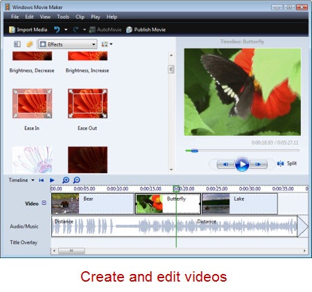
6.  Moviemaker

Movie maker comes with your Windows PC so most likely you already have it on your computer.  It’s an easy-to-use video editor.  I do most of my basic editing with it because it’s on my PC and does most of what I need for my online courses.  There are other free applications, and of course if you use a Mac, you have your own video editor.

In either case, it’s easy to shoot video with a simple digital camera and edit it without a lot of expense.

Click here to view some Movie Maker tutorials.

The Rapid E-Learning Blog - use Movie Maker to edit videos

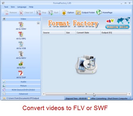
7. Format Factory

Format Factory lets you convert media from one format to another.  I don’t use it as much as I used to now that Articulate’s Studio ‘09 provides a video encoder.  However for those who need to convert media from one format to another, it’s a handy tool.  For rapid elearning converting to the SWF and FLV Flash formats are important and Format Factory supports this.  I mainly use it to convert FLV to other media for easy editing since I can’t find an easy FLV editor.

On a side note, if you are looking for an FLV editor, you might try the RichFLV editor.  I’ve used it with mixed results, but I am sure that it will improve with time and I applaud all of the work Benjamin Doppler puts into the application.  I’m hoping to add it to my list soon.

The Rapid E-Learning Blog - use Format Factory to convert media files

The next two tools don’t really do anything other than let you play media file.  However, I find that since I do use Flash media files quite a bit, the following two applications sure come in handy and make my work that much easier.

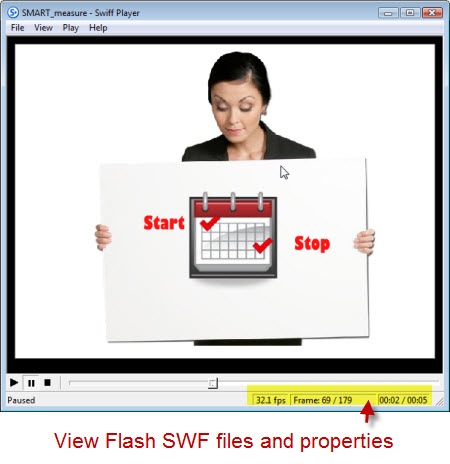
8. SWF Player

SWF Player lets you view Flash SWF files.  Simple as that.  Click on the SWF file and SWF Player lets you see what it is and view the file’s properties.  This is a very handy tool and makes viewing the SWF files on your PC a breeze.

The Rapid E-Learning Blog - use SWF Player to play SWF files

9.  FLV Player

What the SWF Player did for SWF viewing, the FLV Player does for viewing Flash videos in FLV format.  It’s another simple tool, but one that works well.  It’s one of those tools that you don’t notice until you don’t have it.  If you happen to be using the Articulate Video Encoder ‘09, then this is a redundant tool.  But for everyone else, it’s another good one to have.

The Rapid E-Learning Blog - use FLV Player to view FLV files

So there you have it.  Nine tools that I regularly use.  They help me be more productive when I build my rapid elearning courses.  I do want to add that these aren’t necessarily the best of the tools or the only ones available.  They just happen to be the ones I use and am comfortable working with.  I’m sure that you have some that you could add to the list.

Which free tools help you be more productive?  Feel free to share them by clicking on the comments link.

Events

Free E-Learning Resources

Want to learn more? Check out these articles and free resources in the community.

Here’s a great job board for e-learning, instructional design, and training jobs

Participate in the weekly e-learning challenges to sharpen your skills

Get your free PowerPoint templates and free graphics & stock images.

Lots of cool e-learning examples to check out and find inspiration.

Getting Started? This e-learning 101 series and the free e-books will help.