The Rapid Elearning Blog

Archive for October, 2009


project management tip header

Managing elearning projects requires good communication between the instructional designers and subject matter experts.  In most cases, this communication happens via email.  Thus, better email communication ultimately leads to better project management, which most likely means better elearning courses.

At a recent ASTD conference, I ran into Mike Song, the author of The Hamster Revolution.  It’s a book on how to effectively manage emails.  Mike gave me a free copy which I skimmed through on the plane flight home.

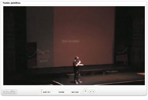
It’s a quick read and very practical, but I’ll have to admit, I kind of ignored it until I saw a funny video on Youtube a couple of weeks ago.  The video is of a presentation at Ignite Boise, one of those fun 5 minutes and 20 slide events.  The title is “You Don’t Know How to Email.”  Check it out.

The Rapid E-Learning Blog - video from the IgniteBoise event

Click here to view the video.

At about the 1:48 mark, Erik introduces his friend Dan and Dan’s emails.  It’s both funny and eye-opening.  After watching the video, I looked through my sent emails and sure enough, there were dozens that began with “Hey…”

I am Dan!  And perhaps you’re Dan, too.

Here’s the deal, if you’re swamped with emails, so are your co-workers, manager, and most important your clients and subject matter experts.  By following some of the tips from the Hamster book, you’ll communicate better, your subject matter experts will be happier, and you’ll do a better job managing your emails.

Use Descriptive Titles in Your Email Subject

In the book, Mike recommends that you use categories to provide context to the email subject line.  Look at the image below.  “Action” is one of his recommended categories.  It alerts the reader that there’s an action item associated to the email.

Outside of the Action category, you can also see that the there’s enough information in the subject line to let the reader know the email’s important and requires a response.  A descriptive subject line communicates clearly and is a lot easier to search, as well.

The Rapid E-Learning Blog - actionable email subject line

Just this tip alone will make your subject matters happy.  But wait, there’s more.

Email is Money

As Erik in the Youtube video said, “Time is money.  Email takes time.  So email is money.”  Everyone’s busy; so you need an easy way to clearly communicate and manage emails.  Below is an example of a typical email.
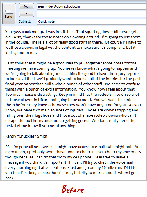
The Rapid E-Learning Blog - email before applying the ABCs

This email is kind of typical of the types of emails we get.  They can be a bit long-winded and pointless.  It’s hard to quickly pull out the important information.  And the action items (if any) are not clearly discerned.

Reviewing the email above, you’ll notice a few key issues:

  • The subject line is not specific so you’re not quite sure if the email is critical or not
  • The formatting of the email makes it hard to quickly scan
  • It’s difficult to identify any action items
  • The key points are not easily found
  • Expectations and next steps are not clear

Break the Body of the Email into Three Sections

As I mentioned earlier, a good email starts with a specific subject line.  This helps the reader know the purpose of the email and what’s expected.  From there, you implement the A-B-C approach which is:

  • Action summary: Think of this like the abstract of the email.  It’s a quick summary of what you expect the reader to do based on the email.
  • Background: This is the body of your email.  Use bullet points or numbers to focus on key points.  It’s an email, not Salinger’s next great novel.
  • Close: This is where you can add incidental notes that might distract at the beginning of the email.  And you can also highlight some expected next steps.

Now let’s compare the email below to the one above.  It’s essentially the same email, only by using the A-B-C approach you’re able to quickly get to the point, focus on what’s important, and identify any expectations or pending actions.
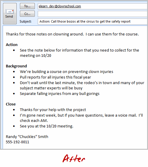
The Rapid E-Learning Blog - email reformmated using the ABCs

I think you’ll agree that the format of the second email makes communicating with your subject matter experts a lot easier.  Odds are that you’ll exchange a lot less email and that your projects will run much better.

So if you’re inbox is overrun with emails, there’s hope.  It just takes a little practice.  You’ll have less email stress and your subject matter experts will love you.  What tips do you have to make managing the emails for your elearning projects easier?

Events

Free E-Learning Resources

Want to learn more? Check out these articles and free resources in the community.

Here’s a great job board for e-learning, instructional design, and training jobs

Participate in the weekly e-learning challenges to sharpen your skills

Get your free PowerPoint templates and free graphics & stock images.

Lots of cool e-learning examples to check out and find inspiration.

Getting Started? This e-learning 101 series and the free e-books will help.


Sometimes we get so busy that we lose sight of the great resources available to us.  It’s not until you pull your head up from your desk and look around that you realize what’s available.  That’s why it’s important to be connected to other people who have similar interests or do similar work.  You’ll learn from them and have access to all sorts of information.  If you think about it, there’s really not much that you know (if anything) that you didn’t learn from someone else or because of someone else.

Last week I was at PowerPoint Live 2009 in Atlanta where I spent some time with people in the PowerPoint community.  The thing that impressed me the most was the power of connecting with others.  I met a few blog readers, many of the PowerPoint MVPs that I’ve followed over the years, and was reminded of a few tips and tricks that I can use in my rapid elearning courses.  I’ll share some of the tips and tricks in some future posts.

Today, I’d like to share a little of what I learned from the PowerPoint community and provide some great resources and tools that will help you do a better job building your elearning courses.

The Community Inspires New Ideas 

  • PowerPoint MVP Glen Millar shared quite a few animation tips.  His session inspired a few ideas that could work well for rapid elearning courses although some of the animations may be a bit too much.  In either case, the session inspired a few ideas, you’ll see them in some future posts.
  • Lesa Snider, Chief Evangelist for iStockphotos, talked about graphic design in your PowerPoint slides.  She has a site with some free Photoshop Elements tutorials and tips.    During her session she was zooming in and out of her application.  This made me consider how I’d do that in Screenr and possibly during my own presentations.  So I found a couple of free screen zooming applications.  You can find links below. 
  • The Twitter stream for the conference was a great way to meet people and to get some additional information about the other sessions. In fact, I had a bunch of people ask for some PowerPoint info so I put together a free blog that contains the Twitter stream for #pptlive, some blog posts, and free PowerPoint tutorials.

Free Software

  • AlacrityPC: allows you to shut down unnecessary services and programs before you run a resource intensive application.  This comes in handy doing screencast tutorials, working with multimedia authoring applications, or freeing resources during conference presentations.  Thanks to Glenn for the tip.
  • ZoomIt (PC): ZoomIt is screen zoom and annotation tool for presentations that include application demonstrations.  Click here to view the ZoomIt demo.
  • OmniDazzle (Mac): a set of fun and useful enhancements that help you highlight certain areas of your screen, create visual effects, and track the location of your mouse pointer.  Click here to view the OmniDazzle demo.

PowerPoint MVPs

One of the best resources to learn more about PowerPoint comes from the MVP sites.  These are people who are noted for helping the community of PowerPoint users.  They have all sorts of tips and tricks.  It’s worth bookmarking their sites.  Here are some of the MVPs I met.  You can find more at the PowerPoint MVP site.

Microsoft PowerPoint Help & Resources

PowerPoint is a versatile tool.  I can think of few applications that have as many diverse uses.  People use it to create presentations, storyboards, elearning, animations, graphics and much more.   The trick in getting the most out of PowerPoint is to tap into the community of resources.

The Microsoft site has all sorts of resources for those who want to learn more about PowerPoint.  There are tips and tricks, tutorials, blog posts, and templates.

The Rapid E-Learning Blog

I’ve also included a few of the posts that I’ve written concerning PowerPoint.

Being around others who share similar interests is inspiring.  First, you always walk away with great information that will help you do a better job.  Most important though is that you feel connected to something bigger.  And it’s this connection that is exciting and keeps you motivated to learn more.

What do you do to stay networked to other elearning developers?  Share your thoughts in the comments section.

Events

Free E-Learning Resources

Want to learn more? Check out these articles and free resources in the community.

Here’s a great job board for e-learning, instructional design, and training jobs

Participate in the weekly e-learning challenges to sharpen your skills

Get your free PowerPoint templates and free graphics & stock images.

Lots of cool e-learning examples to check out and find inspiration.

Getting Started? This e-learning 101 series and the free e-books will help.


A few weeks ago we launched Screenr, a free screencasting application that is easy to use and great for quick tutorials and elearning courses.  I like it because it’s easy for me to quickly answer the many questions I get in the user community and through the blog.  Not only can I answer the questions quickly, but I now can share those same tips with other blog readers and members of the community.

And it’s not just me doing the sharing.  There are many others also sharing their tips and tricks.  In fact, on the Word of Mouth blog, we compiled over 100 rapid elearning tutorials that have been created with Screenr since its launch.  Check them out.

The Rapid E-Learning Blog - 101 Rapid E-Learning Tutorials

Screenr’s pretty easy to use.  However, like any new application, the more you use it the more you learn a few time saving tips and tricks.  Today, I’d like to share some tips and tricks that are going to help you create the best screencasts possible.  While I’m focusing on Screenr, many of these tips are relevant regardless of your screencast application.

Prepare Your Environment

Your success begins before you start recording.  You want good quality audio and the right work flow.  This only comes with preparation.

  • Record the best audio you can by using a good microphone.  You can get a decent microphone for less than $100.  And if you do a lot of recording, it makes sense to invest in a good one.   Here’s an example of two different microphones on the same laptop in the same room:  $30 headset and $72 desktop (with no pop filter or any other type of adjustment).  You’ll notice that the headset microphone doesn’t sound as good.  You also hear the pops of air and movement of the mouthpiece.  That’s why I use a desktop microphone. It just sounds better, which most likely means less editing and retakes.  Plus bad audio is worse than a bad screen.
  • Control the ambient noise.  Turn off the A/C and fans.  Turn off the office machines.  Sometimes you’ll pick up some noise or humming when the microphone is too close to the computer, speakers, or other electronic devices.  If you have a lot of ambient noise, try screening it out by playing some music in the background while you record.  No Metallica.  Just something soft with no vocals.
  • Get rid of distractions.  Is there a flickering light overhead or one coming from a nearby electronic device?  Does your chair squeak?  Is your phone ringer off?  Get rid of those things that might make noise, flash lights, or do something else to get your attention while recording.  Put them out of sight while you record.

Prepare Yourself

It’s all about having a plan and executing it.  Focus on what you’re going to say and make it brief.

  • Have some water handy.  I find that I do a lot of retakes on that opening line, so I tend to start and stop my screencasts.  This causes my throat to get dry really fast.  It’s easy for me to go from sounding like a smooth rapid elearning coach to Lauren Bacall in just a few takes. 🙂
  • Get comfortable.  Position your microphone and screen so that you’re comfortable while doing the recording.  Two problems I always run into:  I tend to lean into the screen which impacts my breathing.  And my mouse runs out of room or gets tangled with other cords on my desk.  These things distract me.  And when I lose focus I mess up the recording; which means I have to stop and start over.
  • Try to use less than 5 minutes.  Screenr gives you 5 minutes.  That doesn’t mean that you have to take all 5 minutes for the screencast.  An ideal screencast is 2-3 minutes.  If you find that the screencast is long, just break it into chunks.

General Recording Tips & Tricks

Good screencasters make it seem like they just press record and start talking.  But that’s usually not the case.  It just looks and sounds that way.  Here are some general tips that will help you record better screencasts.

  • Set up your screens.  Do a quick walk through and make sure that everything you need is available.  Many of my demos require that I jump from one application to another.  I have them all open and sized to the record window so that when I go back and forth it looks seamless and flows well.  I also make sure that all of my assets and files are easily available.
  • Supersize!  Sometimes the screencasts are of a larger resolution and get scrunched down to a smaller window, which means you might lose some detail.  To help make things more visible, you can increase the font size, make your icons bigger, and even increase the size of your mouse arrow.  Sometimes I’ll change the resolution of my computer and do a full screen capture at a lower resolution.  When I bring it back up, it looks great and I was able to leverage a full screen for the capturing.  Play around with some techniques that work for you.
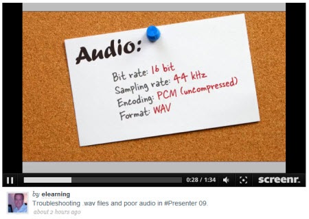
  • Get right to the point and stick with it.  A good habit is to have an opening line that states what the tutorial or screencast is about, and then jump right into it.  You only have a few minutes and you want to make it flow well and not bog it down with a bunch of chatter or dead space where you’re talking and the screen shows nothing new.  If you do have to explain something, create an image you can jump to with some text on it.  I like the way, David Anderson does that in this screencast on audio settings.
  •    The Rapid E-Learning Blog - good example of text in your screencast videos

  • Tell the viewer what they should be looking at.  You only have a few minutes and most likely the user is a little slower following you because they don’t always have the same context and can’t anticipate where you’re going.  It’s easy enough to follow the mouse, but make sure to point out what they should be looking at when you change screens or focus on a new area.  This is especially true if you’re doing things they can’t see like using a keyboard shortcut.
  • Get rid of the visual noise.  The learner can only see what you show.  There’s no need to show some stuff that could conflict with your message.  Frame your recording window only around what’s important for you to share the information.  If you have to do full screen videos where you show your desktop, try a product like Stardock’s Fences.  It’s free and can quickly hide your icons while you do your recording.  Here’s a tutorial to show how to use Fences to hide your desktop icons.
  • Hide personal or proprietary information.  If you find that you’re doing a lot of screencasts, then create another user account on your PC.  Just use the default settings and folders.  When you do screencasts from this account you don’t need to worry about hiding personal information like folders or toolbars in your browser.  I’d also make your desktop image a solid color rather than a distracting background image.  You can also try a virtual desktop.  Set one up just for screencast videos.  Here’s a demo of how to use a virtual desktop.
  • Control your mouse movement.  I have the habit of moving my mouse back and forth while I talk.  This is both annoying and distracting to the viewer.  If you do the same, take your hand off the mouse while you’re talking so you don’t drag the pointer all over the place.  When you do move the pointer, make sure to guide the viewer’s attention so she understands where you’re going.

Extra Screenr Tips

Here are some recording tips that are unique to Screenr.

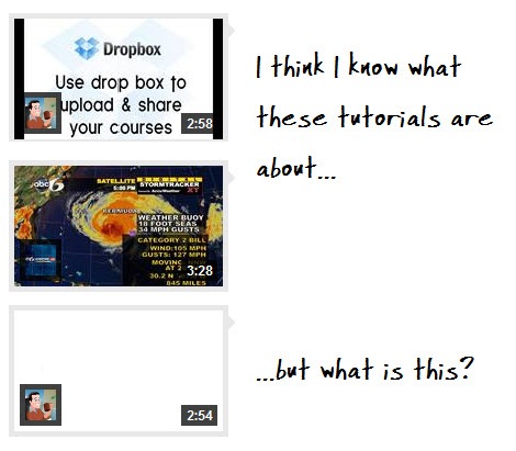
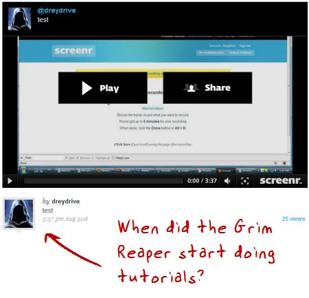
      • Create interesting thumbnails.    In Screenr, the first frame of the screencast becomes your thumbnail and visual cue.  Use that to your advantage.  Consider how you start your video.  One trick is to start with the final output.  Tell the viewer that this is what you’ll create and then jump to the tutorial and a different screen.

The Rapid E-Learning Blog - use good thumbnails

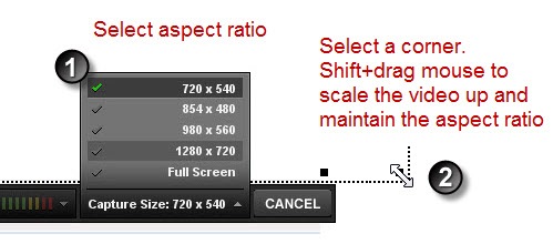
      • Select the right aspect ratio.  You can capture any size screen.  However. Screenr does come with some default settings that work well in your rapid elearning courses.  For example, 720×540 is the aspect ratio for a PowerPoint slide.  980×560 is perfect for videos in the no sidebar view mode in Articulate Presenter.

The Rapid E-Learning Blog - Screenr aspect ratios

  • Use pause (Alt+D) to create screencasts that flow well.  If you find that you have to click on buttons and open other screens during your demos, then you want to use Alt+D to pause your recording between mouse clicks.  This will let you set up your screens and create a faster screencast that will look more polished.  Here’s a demo where you can see the difference and how much nicer it looks using the pause feature.

Click here to view the Screenr demo.


  • What message does your avatar communicate?  Nothing tells people you’re an amateur than by using the default avatar that comes with Twitter.  At the same time, you want your avatar to communicate the right message.  In most cases, you’re probably better to err on the side of conservative than going with a wild avatar that confuses or offends your audience.

The Rapid E-Learning Blog - use appropriate avatars

See These Tips in Action

We created before and after versions of a simple screencast.  Watch both and see if you can tell the differences.  Not only is the after version a big improvement, it also takes a lot less time.

The Rapid E-Learning Blog - screencast before and after videos

Do you have any tips to help make screencasting easier and better for the learners?  If so, feel free to share them in the comments section.

Events

Free E-Learning Resources

Want to learn more? Check out these articles and free resources in the community.

Here’s a great job board for e-learning, instructional design, and training jobs

Participate in the weekly e-learning challenges to sharpen your skills

Get your free PowerPoint templates and free graphics & stock images.

Lots of cool e-learning examples to check out and find inspiration.

Getting Started? This e-learning 101 series and the free e-books will help.


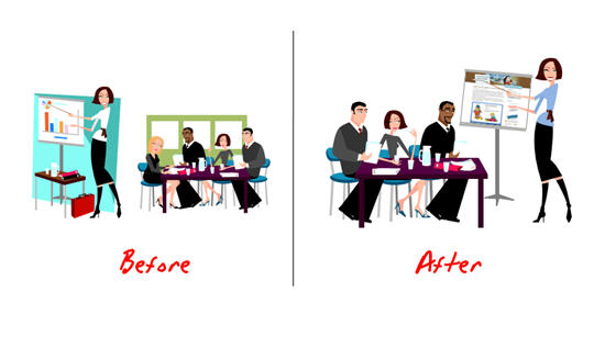
If you’re like many of us, you don’t have a lot of money to buy stock images or hire a graphics designer.  So that means you’re stuck using the free resources that come with PowerPoint.  In previous posts, I’ve discussed ways to ungroup your clip art and create your own clip art.  It only takes a few clicks to get from one image to the next.

The Rapid E-Learning Blog - before and after clip art

Even with those free resources available, it’s still time-consuming to find the right clip art to use.  So what I’m doing today is helping you get started by listing fifteen of my favorite clip art styles.  These are the ones that I commonly use for my elearning courses.

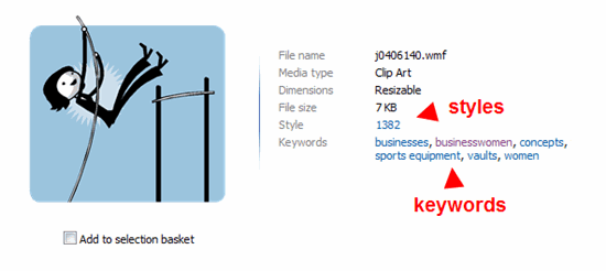
About Clip Art Styles

The Rapid E-Learning Blog - clip art styles

As you search, you’ll notice that not all of the clip art belongs to a “style.”  The reason I like to use clip art from the same style is because I can mix and match them and they’ll look like they belong together.  It gives your course a much more professional and polished look.

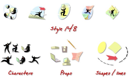
I like to find styles that have a lot of variety.  For example, I may not be interested in all of the clip art images in a particular style.  However, by ungrouping them, I can create an assortment of assets like characters, props, and shapes.  And since they’re all from the same style they’ll look like they go together.

In the example below, you can see how images from “style 148” provide characters, various props, and some shapes that I can use in my elearning courses.

The Rapid E-Learning Blog - pillaging styles for assets

Tips on Finding the Right Clip Art

Here’s a post that shows you how to create a consistent look for your courses.  It covers some of what I’m talking about today.   I also created a video that shares a few tips about how to search clip art. Those might come in handy.

Click here to view the Screenr video.

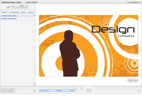
Below are some of my favorite clip art styles.  I’m fond of some because of the characters.  However, some I like only because of their colors and shapes.  For example, “style 1592” doesn’t have a lot of images, but here’s an example where I ungrouped one and used parts of the clip art to create a Flash intro screen demo in Quizmaker ‘09.

splashscreen

Click here to view the intro screen demo.


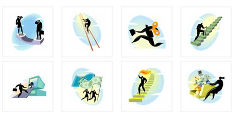
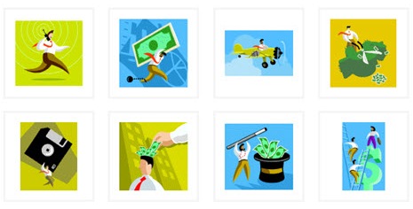
15 of My Favorite Clip Art Styles


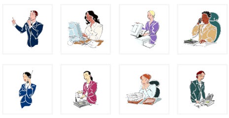
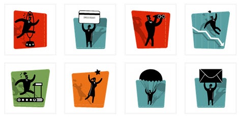
The Rapid E-Learning Blog - clip art style 148 

Style 148


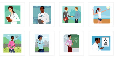
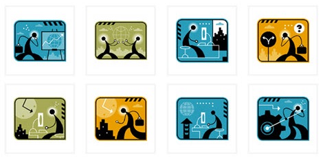
 The Rapid E-Learning Blog - clip art style 741 

Style 741 


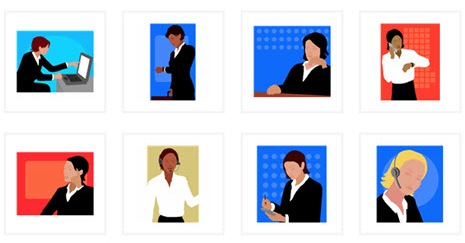
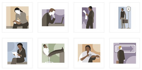
    The Rapid E-Learning Blog - clip art style 1252 

Style 1252


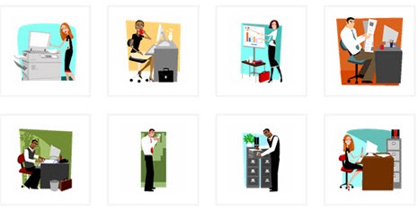
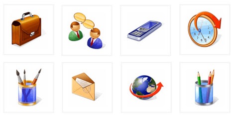
The Rapid E-Learning Blog - clip art style 1280  

Style 1280


The Rapid E-Learning Blog - clip art style 1366   

Style 1366 (no longer available)


The Rapid E-Learning Blog - clip art style 1368

Style 1368


The Rapid E-Learning Blog - clip art style 1402

Style 1402


The Rapid E-Learning Blog - clip art style 1423

Style 1423 (no longer available)


The Rapid E-Learning Blog - clip art style 1426

Style 1426 (no longer available)


The Rapid E-Learning Blog - clip art style 1441

Style 1441 (no longer available)


The Rapid E-Learning Blog - clip art style 1445

Style 1445 (no longer available)


The Rapid E-Learning Blog - clip art style 1541

 Style 1541


The Rapid E-Learning Blog - clip art style 1568

Style 1568


The Rapid E-Learning Blog - clip art style 1576

Style 1576


Update (6/8/10): Apparently some of the styles are no longer available. Here are some additional ones to replace the ones missing.

Sometimes it’s fun to just type in a style and see what comes up.  For example, the clip art images in “Style 13” turned out to be lucky. :)  They’ll work great in a future elearning course.  Do you have any favorite clip art styles that you’d like to share?  Add them to the comments section.

Events

Free E-Learning Resources

Want to learn more? Check out these articles and free resources in the community.

Here’s a great job board for e-learning, instructional design, and training jobs

Participate in the weekly e-learning challenges to sharpen your skills

Get your free PowerPoint templates and free graphics & stock images.

Lots of cool e-learning examples to check out and find inspiration.

Getting Started? This e-learning 101 series and the free e-books will help.