The Rapid Elearning Blog

Archive for November, 2009


The tendency when working with PowerPoint is to start with the template structure.  This works fine if you want to create quick presentations.  The problem with that approach is you tend to get slides full of bullet points.

To get the most out of PowerPoint and build the best elearning courses requires thinking of PowerPoint in a different way.  You have to think outside of the template and bullet point box.

In a previous post, I showed how to expand your PowerPoint skills by creating custom illustrations.  In today’s post we’ll build on that.  I’m going to show how to build a television graphic in PowerPoint.

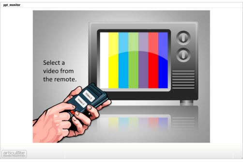
Before we get started, take a look at the example below.  I built the television set in PowerPoint and then added a clip art image to create a clickable remote control.

The Rapid E-Learning Blog - Televison remote and playing video for rapid elearning

Click here to play the demo.

The envelope icon exercise and this television set tutorial help you work with the PowerPoint features outside of the template structure.  By practicing these types of techniques you’ll learn to get more out of PowerPoint and think about what you can do with it from a different perspective. It helps you step away from reliance on the templates and bullet points.

Recently, I ran across a series of tutorials on Vectips.com by Ryan Putnam.  He does nice work and shares some of his expertise through the tutorials.  While his tips are for those who use Illustrator, many of them can be applied to PowerPoint.

Inspired by Ryan’s tips, I’m going to show you how to create a television icon for your elearning course using PowerPoint.

Click here to watch the Screenr tutorial.


1. Create the television set body.
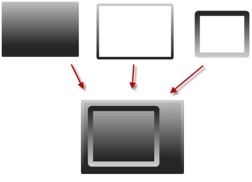
The Rapid E-Learning Blog - create the television body in PowerPoint

The set is made up of three rounded rectangle shapes and a gradient fill.

  • Add a rounded rectangle with gradient fill to be the main body of the set.
  • Create another rounded rectangle for the outer edge.  Use no fill and a gradient border that is the same as the box.  Make the light gray a bit lighter so it stands out.
  • For the screen, duplicate the border box.  Make the line thicker and flip it so it is the opposite of the set with the lighter gray on the bottom.

2. Create color bars & shimmer.
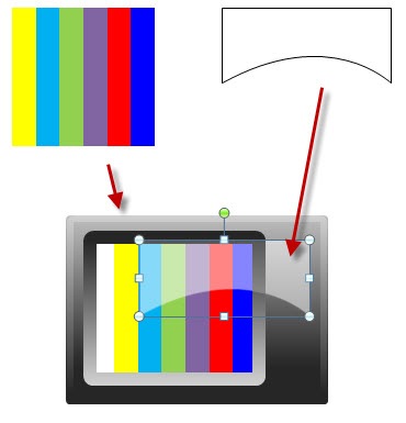
 The Rapid E-Learning Blog - create the color bars and gel look in PowerPoint

The color bars are a grouped set of colored rectangles with a 60% transparent shape to give it a gel look.

  • Create the color bars by combining a series of rectangle shapes and filling with the colors.  Group them and then move onto the set behind the frame.
  • The shimmer is a bit trickier.  Take a rectangle and convert it to a freeform and then edit the points to give it a curve.  Fill it with white and 60% transparent.

3. Add the television set details.
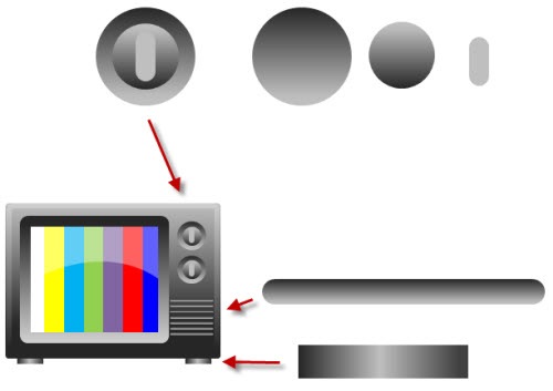
The Rapid E-Learning Blog - create the knobs and accessories in PowerPoint

The television set’s accessories are just basic shapes with simple gradient fills.

  • Knobs: Create a circle and use the same gradient fill as the set.  Duplicate the circle, flip it, and scale it down.  Create a rounded rectangle with a lighter gray.  Use the alignment tool to align them. Group the knob and add to the set.
  • Grills: Create a rounded rectangle and fill with a gradient.  Duplicate them and use the alignment tool to distribute them equally.
  • Feet: Create a rectangle and add a gradient with a lighter center and darker edges.

Now you have a completed television set created entirely in PowerPoint.  It’s a great display for those times where you want to add a video to your elearning course.

Bonus tips:

  • I opted for a squared TV window rather than rounded since the videos have a squared border.  This helps them sit in the frame better.
  • Group the TV and save as an .emf and then bring it back in as a picture.  This way it’s a single object and easier to work with.  You’ll still have it as a vector image if you need to make changes.  
  • Get rid of the dials and just have a big screen to give you more real estate for the video.
  • If you build the TV using the theme colors in PowerPoint 2007, you can quickly change the color of your television set when you apply a new color theme.

To help you deconstruct the file, I’ve attached the original PowerPoint file.  Download it here. Feel free to use it as you wish.  Also, send a nice message to Ryan and let him know how much you appreciate his tutorials.

If you experiment with some of these ideas, send them my way.  I’d love to see what you can come up with. Also, if you have some other tips and tricks, share them by clicking on the comments link.

In case you missed it:

For those of you who use the Articulate products you might find these two recent posts on the Word of Mouth blog useful.

Events

Free E-Learning Resources

Want to learn more? Check out these articles and free resources in the community.

Here’s a great job board for e-learning, instructional design, and training jobs

Participate in the weekly e-learning challenges to sharpen your skills

Get your free PowerPoint templates and free graphics & stock images.

Lots of cool e-learning examples to check out and find inspiration.

Getting Started? This e-learning 101 series and the free e-books will help.


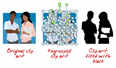
The Rapid E-Learning Blog - create silhouettes from clip art 

In a recent post, I showed how to easily create your own silhouette characters.  Today I share show some ways to use those silhouettes in your elearning courses.  Something to keep in mind is that the silhouette doesn’t need to be confined to people.  You can use them on objects, as well.

Create a Progress Meter

As a visual cue, use silhouette characters or objects to create a progress meter.  As the learners advance, the silhouettes change to real images.  This lets them see their progress through their course and where they’re currently at.

The Rapid E-Learning Blog - silhouettes as a progress meter in your elearning course

Create Section Breaks

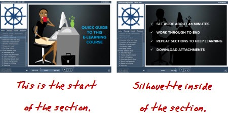
Use silhouettes as a way to divide sections within the course.  In the example below from Helmsmanship, you can see that the start of the section has the image and shares a core idea or theme.  The following slides contain a silhouette of the core section image.

The Rapid E-Learning Blog - silhouettes as section indicators

Isolate Information

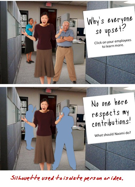
Silhouettes are great to draw the learner’s focus and isolate information.  For example, in the first image I introduce a group.  However, when I want to focus on just one character, I use silhouettes and only show the character of interest.

The Rapid E-Learning Blog -

Create Contrast

A great way to get a person’s attention is to create contrast.  This is easy to do with silhouettes.  I like the example below from a Goodwrench ad.  By removing the car, you can tell something’s missing.  You can apply the same effect to an elearning course. 

First, the contrast draws your attention.  Second, it can become a mechanism to find out what’s missing.

goodwrench

Be Politically Correct

It never fails that when you build elearning courses, HR shows up to make sure no one’s offended.  While there’s obviously a lot of value in diversity, it can still be one of the most frustrating parts of building courses as you navigate which ethnicity gets to represent the good manager and who gets to be the bad example.  A good way to work around this is to use silhouettes for your characters.  This way you can be race and gender neutral and make sure no one’s offended. 🙂

diversity

Creating silhouettes is pretty easy.  And using them in your elearning courses can add a little bit more visual intrigue and help make your courses more engaging.  What are some other examples of how you’d use silhouettes?  Click on the comments link to share them with us.

Events

Free E-Learning Resources

Want to learn more? Check out these articles and free resources in the community.

Here’s a great job board for e-learning, instructional design, and training jobs

Participate in the weekly e-learning challenges to sharpen your skills

Get your free PowerPoint templates and free graphics & stock images.

Lots of cool e-learning examples to check out and find inspiration.

Getting Started? This e-learning 101 series and the free e-books will help.


There’s a lot of debate about interactivity in e-learning.  You have some people who think e-learning is not valid unless it has a high level of interactivity. Anything that’s not interactive is just a “boring click-and-read course.” On the other hand, there are a lot of people who equate interactivity with nonsensical games. So to them, any interactivity is just extra time and expense.

The Rapid E-Learning Blog - excited elearning customer

I’ve worked with clients who thought interactivity was adding a rollover or slick animations.  They’d “ooh” and “aah” over the dumbest things.  It was easy to mask poor instructional design with cool effects and animations.  On the flip side, it’s easy to go overboard and build a lot of interactivity, that while interactive, isn’t really necessary or effective.

I was at a conference once where someone was demoing an e-learning course.  It was integrated with a game.  The goal was for the learner to master levels in the game to get to new pieces of information.  While the game was pretty cool, it was out of context for the learning.  Since the game was irrelevant to the learning objectives, I’d agree with one of the bystanders who said that it “was expensive and a waste of time.”

A common challenge we face in building courses is that the content owner has put a lot of effort into creating the content (like a 300 slide presentation) and is reluctant to lose any of the data or look at ways to rework it and make it more interactive because to them, everything is equally important.

In fact, when I get emails asking about interactivity, it usually involves the person trying to convince a customer or subject matter expert to make their courses more interactive.  I usually advise them to take a step back and build a foundation for the discussion about interactivity.

All E-learning Projects Are Not Equal

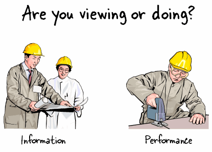
The first thing I like to address is that not all e-learning projects are the same.  Some are designed around only sharing information.  They don’t have any performance expectations tied to them.  How you approach interactivity in this type of course is a lot different than what you’re going to do in a course where you have very clear performance expectations and are looking for specific results.

 The Rapid E-Learning Blog - When it comes to elearning, are your learners viewing or doing?

There’s also a big difference between a project commissioned by a high level executive who has $100,000 or more to spend and the ones most of us have to build with no budget.  So, while you have a whole gamut of interactivity to choose from, you still have to work within the context of your skills and resources.

The good thing is that even if you’re working with just PowerPoint, you can still build effective levels of interactivity.  You just don’t have the same programming capabilities.

Here’s a simple way to look at interactivity.  It doesn’t represent a progression of interactivity.  Instead it’s more like three ways to view interactive content.  This is how I usually discuss it with my subject matter experts and clients.

Design an Interactive Look & Feel

If you’ve ever gone to a Broadway play, I’m sure you’ve walked way amazed at the brilliance of the set design and what they can do to pull you into their story, except for Cats, of course. 🙂 In the same way, when you build your course, you have to determine how to pull the learner into the “story.”  You’re the set designer.

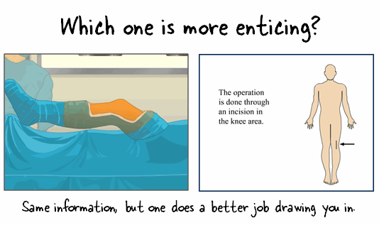
Look at the image below.  At this point we don’t see any interactivity.  Which screen is more inviting?  Couple the right graphics with an interactive user interface and you have the foundation for a good course.

The Rapid E-Learning Blog - entice your learners with good course design

You’re responsible for crafting the ambience and feel of the course that draws the learner in.  This is all part of the user interface and visual design.  Everything from colors, images, and animations.  All of the rollovers, effects, and transitions contribute to the look and feel of the course.  How your learner interacts with the screen elements is part of the course’s interactivity.  It’s not the critical part, but it does play a key role in how the course is perceived.  And for many people, perception is reality.  It’s a great way to have your learner get into the content rather than just hearing and seeing it.

Create Exploratory Content

Most people don’t learn in a linear fashion.  They tend to explore their environment.  In fact, exploration is a critical part of learning.  Despite this, many e-learning courses do two things that are contrary to what’s best for learning: force learners on a linear path and lock navigation that doesn’t allow for exploration.

I know that there are times when you’re required to lock the course navigation.  In those cases, you do what you have to do.  However, most of the times the rationale for locking navigation is misguided.

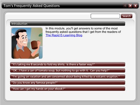
The Rapid E-Learning Blog - Ask Tom FAQ

Click here to view the dem

Even if you have to lock the navigation, there’s no reason you can’t at a minimum throw in something like an Engage interaction or something else that allows the learner to click around on the screen and collect information.  The example above is from a previous blog post.  Something like this could be inserted on a single slide.  What would be five slides of information could be one slide with five areas for the learner to explore.

If you want them to learn, free up the navigation and let them discover information.  They’ll feel empowered and more in control.  And that sets the stage for better learner.

Provide a Reason to Use the Information

Regardless of the technology you use, the essential part of interactivity is relevance.  In fact, the more relevant the content is, the less you have to rely on interactivity because you’re better able to tap into the learner’s motivation.

Considering relevance, what you want is an environment where they need to do something based on what they should understand about the information in the course.  A great way to do this is to just “throw them into the pool,” so to speak.

Are you teaching them about a new policy?  Give them a situation where the policy applies and let them work through it, with your course as a guide.

Teaching them math? Give them a reason to use math.

Want them to learn some history?  Make them a character of the time and have them deal with the issues critical to that time period.

The subject matter shouldn’t limit what you can do.  If it’s something that needs to be learned, there’s a reason why.  Use that reason as the basis for the interaction.

The Rapid E-Learning Blog - ergonomics example from Prometheus

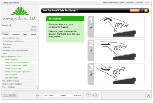
One of my favorite examples of a simple, yet interactive rapid e-learning course is the one above, created by the crew at Prometheus.  It’s an ergonomics course and they used the Engage interactions (that most people use just to share information) as self-assessment tools.  The learner has to assess her personal ergonomics and then interact with the course content.  It’s an effective use of a rapid e-learning tool to do more than click and read.

Your Limitation is Creativity Not Technology

There’s a difference between my neighbor’s Mercedes and my Nissan.  Considering that I paid about 20% of what he paid, I don’t expect the same product.  However, if I need to go from one place to the next, my solution works just fine.

The same is true when it comes to your e-learning course.  Even if all you have to use is PowerPoint, there’s no reason why you can’t build some level of effective interactivity for your e-learning course.

As I said earlier, interactivity can mean many things and what you can do depends on your budget.  With all that said, there’s really no reason why even a simple low budget course can’t have interactive elements.  What tips do you have for those who want their e-learning courses to be more interactive?

Events

Free E-Learning Resources

Want to learn more? Check out these articles and free resources in the community.

Here’s a great job board for e-learning, instructional design, and training jobs

Participate in the weekly e-learning challenges to sharpen your skills

Get your free PowerPoint templates and free graphics & stock images.

Lots of cool e-learning examples to check out and find inspiration.

Getting Started? This e-learning 101 series and the free e-books will help.