The Rapid Elearning Blog

Archive for December, 2009


The Rapid E-Learning Blog - 2010

It’s hard to believe that it’s almost 2010.  I think the emergency supplies in my Y2K kit have finally gone bad.  2009 zipped by so fast, that I’m still writing 2008 on my checks.  Do people still write checks?

It was a busy year.  Most of my highlights were from meeting blog readers at conferences.  It’s both a humbling and rewarding experience.  I especially love to learn what people are doing and the challenges they face building elearning courses.

Speaking of going to conferences, here are some things I learned this past year:

  • Johnny Cash says “don’t take your guns to town, leave them at home.”  That’s probably a good tip for guns, but not so good for socks.  Trust me on this one.  At 7:00 AM there aren’t too many places to find business socks in San Jose.  Business socks?  There’s a Flight of Conchords joke in there, but I’ll pass. 🙂
  • Be careful where you eat.  I won’t mention the restaurant in Boston, but there was a mouse running around under the tables.  While that was shocking enough, what shocked me more was the wait staff that seemed OK with it. The mouse must have been a regular.  Or he could have been the chef.
  • Sometimes it’s a good idea to wear a Speedo under your clothes.  This is especially true if you’re assaulted by a waitress who spills an entire glass of ice cold water in your lap.  With a Speedo on, you can quickly take off your pants and get back to enjoying the dinner.

…And Now for the Top 10 Posts for 2009

Here are your favorite posts of the year.  Check them out.  I’m sort of a goofball and enjoy the fun stuff, but my favorite didn’t make it.

  1. 9 Free Tools That Help Me Build Better E-Learning
  2. Here’s What You Need to Know About Mobile Learning
  3. 4 Simple Tips for Recording High-Quality Audio
  4. Now You Can Design E-Learning Courses Like a Pro
  5. Here’s Why You Need an E-Learning Portfolio
  6. Here’s a Free PowerPoint Template & How I Made It
  7. Here’s Why PowerPoint 2007 Helps You Build Better E-Learning
  8. How to Create a Visual Design for Your E-Learning Scenario
  9. Over 100 Free Handwritten Fonts
  10. How to Create Screencasts You Can Be Proud Of

Free Stuff!

Because we all like free stuff, here are the posts that had links to free software, assets, or PowerPoint templates.  Enjoy.

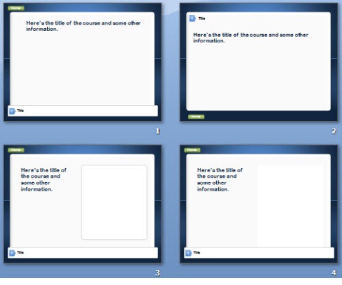
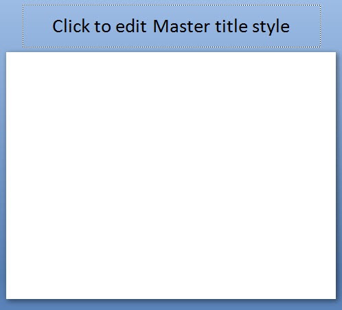
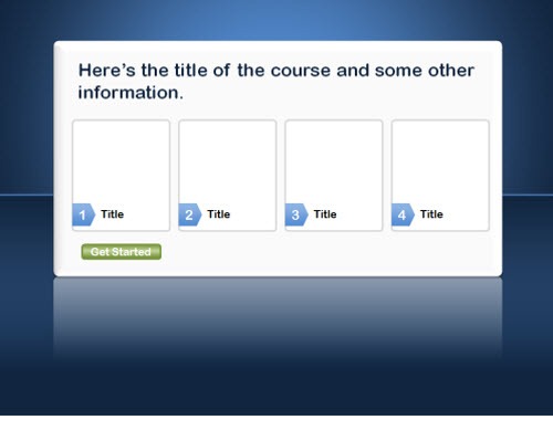
Bonus! Here’s another free PowerPoint template.  I used the PowerPoint 2007 color schemes so that you can easily edit it.  Here’s a quick tutorial that explains how.  You can download the template here.
The Rapid E-Learning Blog - template created in PowerPoint

The Rapid E-Learning Blog - template created in PowerPoint

Looking Forward to 2010

2010 is going to be a great year.  It’s an exciting time for our industry.  There’s a lot going on with the internet, social media, and other technologies.  And so much of it is rela
ted to learning.

I can’t think of a time in the past twenty years where those who are in the learning industry are so intertwined with what’s hot.  That’s pretty cool.

We’ll be doing some neat things this year.  So stay tuned to the blog.  I look forward to seeing many of you at other conferences and events.  Also, if you’re in the Seattle area, drop me a line.  I try to get out and meet people in the area as time permits.

Again, thanks for making the blog a success.  I hope you have a great 2010!

Events

Free E-Learning Resources

Want to learn more? Check out these articles and free resources in the community.

Here’s a great job board for e-learning, instructional design, and training jobs

Participate in the weekly e-learning challenges to sharpen your skills

Get your free PowerPoint templates and free graphics & stock images.

Lots of cool e-learning examples to check out and find inspiration.

Getting Started? This e-learning 101 series and the free e-books will help.


I love the holidays and this time of year.  It’s a season focused on hope; and with the New Year, a time for change.  Now, here’s an opportunity that is appropriate for this time of year.  image

LINGOs is looking for volunteers to help some of its member agencies build elearning courses.  Now you can share your instructional design and elearning skills to benefit those organizations that are working to make this world a better place.

The eLearning Guild is sponsoring the E-Learning Global Giveback Competition and will announce five finalist courses and the winner at the Learning Solutions Conference & Expo in March 2010.  Check out the links for specific details.

Why Should I Participate?

The obvious reason for participation is that you use the skills and experience that you have and bless others.  By doing so, you’re able to help those agencies train their staff and keep their costs low, allowing the money they have to go directly to helping people.

But here are a few more reasons that will also benefit you:

  • Build your portfolio. In this industry, you need to be prepared for opportunities.  So many of us only work on proprietary content and don’t have a portfolio to share.  Well, here’s your opportunity to create a portfolio project you can share.
  • Step away from the cubicle.  Are you stuck in an organization where you have to do the same type of boring elearning courses and would like to do something more?  Now you can.  Do more than boring, click-and-read courses.  Take on one of these projects and try out some of your interactive ideas.
  • Put up or shut up.  One of my big pet peeves is all of the critics of boring elearning who never seem to produce any of their own work.  There’s a lot of talk, but little action.  Well, here’s your chance.  If you have an answer to boring elearning, let us see what you can do. 🙂

Who Should Participate?

Anyone can participate, but here’s who I’d recommend take a stab at this.

  • Instructional design students.  Are you in a master’s or elearning certification program? Why not take on one of these projects?  You don’t need to do it by yourself.  Instead do it with some other students as a school project.  If you do decide to pursue this, let me know.
  • E-learning freelancers. I get a lot of emails from people wanting more exposure and experience.  Here’s the perfect opportunity.  Plus, it’s a project you can put in your portfolio.  And imagine the doors that can open if you get recognized or even win.
  • Small elearning companies.  This is the perfect opportunity to get some much needed exposure. Even if you don’t win, your courses will be out there and something you can point to.  And if you do win (or make the top five) that’s even better.

Are you up to the challenge?  If you’re interested, contact Eric Berg [eric at lingos.org] or look over the list of courses and contact the agency.  If you’d like to help but want to partner with someone else, leave some contact information in the comments link or contact me and I’ll see if I can get you connected.

If you do participate, let me know.  I’d love to see what you do and maybe feature it in a blog post.  Happy Holidays and may you have a blessed New Year!

Events

Free E-Learning Resources

Want to learn more? Check out these articles and free resources in the community.

Here’s a great job board for e-learning, instructional design, and training jobs

Participate in the weekly e-learning challenges to sharpen your skills

Get your free PowerPoint templates and free graphics & stock images.

Lots of cool e-learning examples to check out and find inspiration.

Getting Started? This e-learning 101 series and the free e-books will help.


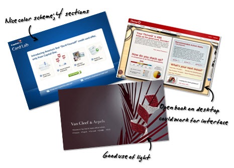
If you’ve been reading this blog for a while you’ll know that I recommend looking at web design sites and at other media-related industries for inspiration.  This is a good way to learn about different screen layouts and color schemes.  And then consider how they might work in your elearning courses. 

The Rapid E-Learning Blog - idea folder

It’s also a great way to learn to use PowerPoint’s graphic features; because a lot of your rapid elearning success depends on how well you can get around PowerPoint.  These types of exercises will only enhance your skills as a rapid elearning author.

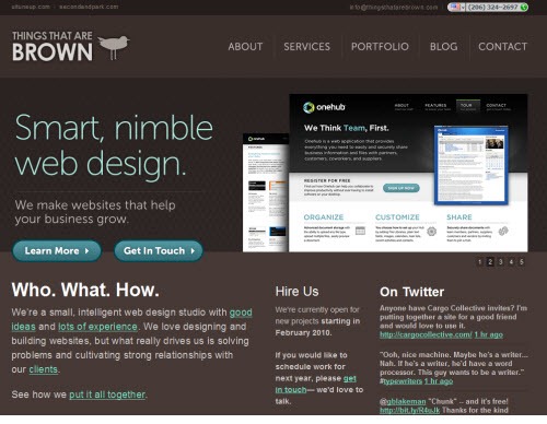
The other day I ran across this site, Things That Are Brown, by Matt Brown, a Seattle-based web designer.  I like the colors he uses and the general layout.  So I played around with some ideas on how this could work in an elearning course.

The Original Site

Here is an image of Matt’s site.  I like the clean lines and earthiness.  It’s so brown.  Being from the northwest, I’m kind of fond of brown.  Reminds me of good coffee, chocolate brownies, and the heavy, hand-knit wool sweaters I have to wear while strolling the beaches in the summer.   🙂

By using the darker color scheme in the template, any color or contrast on the site really pops and draws your attention.  That’s something to keep in mind when you consider the visual design of your own courses.  Remember, part of your visual design is how to direct the learner’s eye.

brown1 

The Mock Up

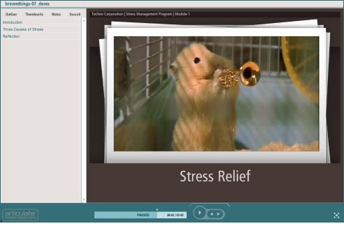
Here’s a published version of my mock up. As you can see in the demo, I kept the general layout and then created pieces of paper as the focal point.  I like the way the white contrasts with the brown.  The paper is where I’d put the course content. 

hamsters 

 Click here to view the demo.

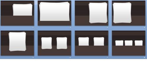
Once I created the general layout, I used Pixie to grab the colors.  Then I played with ways I could add the paper to the screen.  You can see some of them below.

brown2

If I were to use this in a real course, I’d probably animate the pages coming in and out.  That would have a nice effect.  Another idea is to have a new piece of paper load on each slide.  Then it would look like you’re adding to the pile of papers.  You could also make smaller versions of the papers and use those as icons that link to sections in the course.  It’s just a matter of playing around with some layout ideas. 

How I Built the Template in PowerPoint

Again, the goal in these exercises is to experiment with ideas and learn more about PowerPoint.  As you become more comfortable working with the slides and graphic features, you’ll become more efficient using the tools.  In this example, all of the design elements in the template were created in PowerPoint.

Here’s a quick tutorial on the approach I take when doing these exercises and how I created this template.

Click here to view the tutorial.

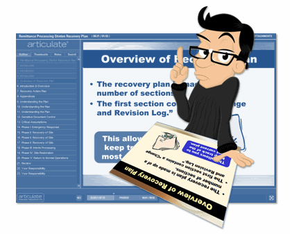
Here’s an additional tutorial on how to create the paper images.  As a habit, I’ll create these types of assets in PowerPoint and then save them as graphic files rather than keeping them as PowerPoint objects.  It’s what I discussed in a previous post on rapid elearning essentials.

 Click here to view the paper tutorial.

Some of the key things to focus on when doing these exercises:

  • Learn to create shadows.  PowerPoint 2007 makes it easy because it has a built-in shadow feature. But you can also create your own shadows as you can see in this tutorial on creating a page curl effect.
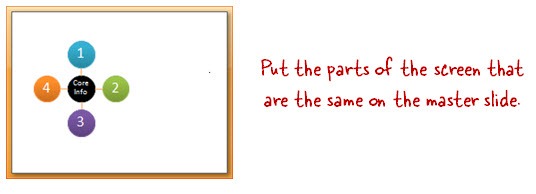
  • Leverage the master slides.  What’s persistent across all of the slides?  Put that on the master.  It’ll save you time and makes it easier to edits down the road.
  • Play around with color schemes. Use Pixie to pick one color and then apply that color to a color scheme.  See what interesting types of colors combinations you can create. You can get ideas from sites like Color Scheme Designer and Kuler.
  • Save you objects as graphics. Get in the habit of saving the objects you create as separate graphic files.  They’ll be easier to work with and improve your publishing time.

In summary, you’re not going to improve your PowerPoint skills without some practice.  These exercises will help you get the practice and give you some ideas about visual design and screen layouts.

Click here to download the PowerPoint template and images

Here’s a link to download this PowerPoint template.  I created one for PowerPoint 2007 and one for 2003.  

Got any tips and tricks you’d like to share when building rapid elearning courses in PowerPoint?  Share them by clicking on the comments link.

More Free PowerPoint Templates

If you liked this post, you’ll probably like these, too.  And you get seven more free PowerPoint templates:

Events

Free E-Learning Resources

Want to learn more? Check out these articles and free resources in the community.

Here’s a great job board for e-learning, instructional design, and training jobs

Participate in the weekly e-learning challenges to sharpen your skills

Get your free PowerPoint templates and free graphics & stock images.

Lots of cool e-learning examples to check out and find inspiration.

Getting Started? This e-learning 101 series and the free e-books will help.


The Rapid E-Learning Blog - too busy to help you with your small elearning course

A manager I know works for a multibillion dollar company that has its own elearning group.  However, when she needs to train her staff of about 200, she has no access to the elearning group’s resources.  Without rapid elearning tools, she’d be hard pressed to offer her team the benefits of online learning.  However, with rapid elearning tools she’s gone from no elearning to dozens of quick hit elearning courses.

While rapid elearning presents opportunities like this, the challenge is that many who build rapid elearning courses are not experienced at doing so.  Most of them are one or two person teams who have to do everything from creating their own graphics to all of the course authoring.  And there aren’t a lot of places for them to get help inside the organization.  

I find that the biggest hurdle is that people approach PowerPoint from a presentation mindset.  However, when you build elearning courses, you need to approach PowerPoint in a different way.  In today’s post, I want to address some production techniques that can improve your rapid elearning development. 

Following are five essential rapid elearning tips for working with PowerPoint.

Use a Blank Slide as Your Starting Point

One of the biggest hindrances to getting away from the dreaded PowerPoint look is the PowerPoint template structure.  There’s nothing wrong with templates because they can save you time.  But the default PowerPoint templates encourage bullet point lists and boring slides.  So I suggest that you get away from using the templates.

The Rapid E-Learning Blog - start with a blank slide

Start with a blank slide.  Then you’ll get used to building and adding your own screen elements.  Personally, I like to start with the title only slide.  Then, I go into the master slide and move the title off screen (like you see in the image above).  This way I can use the title for information, but the learner doesn’t see it in the published course.  This really helps when I need to add hyperlinks, which you can see in the tutorial below.

Step Away from Linear Slides, Think in Layers

By design PowerPoint is going to publish your slides like you’d publish a book.  You start at page one and keep turning until you get to the end.  This works in many cases.  However, when you design your courses in PowerPoint, it’s important to see your slides from a slightly different perspective.

The Rapid E-Learning Blog - the default information flow is linear

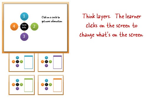
Think of your slide like a bucket of information.  Your job is to connect the information.  Sometimes the default linear settings work and sometimes you have to create your own branching and navigation.

When I was a kid, I had an anatomy book where some of the pages were transparent.  I could lift up the skin and various organs to get down to the bones.  Think of your slides in the same way.  Instead of linear pages, they can be like layered transparencies.  To the learner it looks like a single slide, but in reality, it’s just a series of slides.

 The Rapid E-Learning Blog - get away from linear by thinking layers

The learners don’t see PowerPoint slides.  They see a single screen.  All you’re doing is layering information on the screen so that when they click it just looks like the same screen with some new content.

Here are a few examples that demonstrate a non-linear approach where slides are seen as layers rather than linear information typical of a lot of PowerPoint-based courses.  They were created in PowerPoint and published with Articulate Presenter.

  • CA Student Teacher Ratio: David Anderson created this based on a multimedia file he saw online.  From the learner’s perspective, it just looks like a single screen, but it’s really made up of about 50 slides.
  • Exploration: Here’s a demo I created a while back.  It’s similar to David’s.  The learner clicks a link that jumps to another slide.  However, the learner doesn’t see it as a transition from one slide to the next.
  • Moving box: By using layers, you can create triggers that activate an animation.  While the demo is simple, the approach opens the doors to all sorts of interactions.

Make Full Use of the Master Slides

Most of the rapid elearning courses I see neglect the master slides.  That means the developer is copying and pasting the same content over and over again instead of using the master slides.

The Rapid E-Learning Blog - leverage the master slide

In PowerPoint, you can have as many master slides as you want.  If a course has the same content on 3 or more slides, it makes sense to put it on the master slide.  First, it’s easier to manage and edit.  Second, it improves your publishing time because you only have to publish the master file once rather than the same content multiple times over a series of slides.  It’ll also load faster for the learner since they’ll load the master slide movie once and the individual slides will be much smaller.

Add Hyperlinks to the Master Slide

Adding hyperlinks in PowerPoint can be tedious if you need the same links over a series of slides.  Why not try using the master slides?  The links get spread across all of the slides that use that master.  So if you have the same links (like a home button) just add it to the master rather than copying and pasting it on every slide.  Where you don’t need it on a slide, just cover it up.

The Rapid E-Learning Blog - put hyperlinks on the master

Bonus tip:

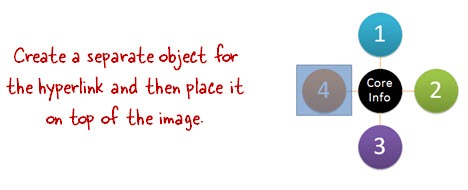
  • I usually create my own shapes for the hyperlinks rather than linking the object.  This helps if I decide to switch objects or if I want to quickly move the link around.
  • Don’t group objects that have hyperlinks.  They’ll work in PowerPoint, but probably not when converted to Flash.  That’s why I like to keep my links separate from my objects.

Use One File for Graphics & One for Course Authoring

PowerPoint makes it easy to build a lot of your own graphics.  This is especially true of PowerPoint 2007 with the new features.  PowerPoint 2010 will have even better graphic features.

Because of this, the tendency is to build your graphics and your course in the same PowerPoint file.  In many cases, this is probably fine.  However, as the projects become larger and more complex, it’s a good idea to have two PowerPoint files for your course.  One file is for creating graphics and the other is for creating your course.

The Rapid E-Learning Blog - separate graphics production from course production

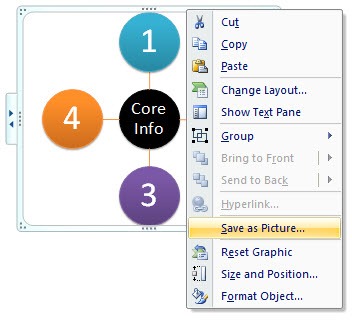
I like to create my graphics in PowerPoint.  When I have what I need, I right-click and save as an image.  Then I bring that image into my course file.  One of the benefits of this approach is that your publishing time is faster and you’re less apt to run into those odd issues and glitches that can occur trying to convert PowerPoint to Flash.

Below is a series of tutorials to support the information above and fill in some gaps.

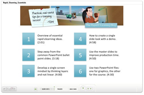
The Rapid E-Learning Blog - Essential rapid elearning tips

Click here to view tutorials.

The challenge for a lot of people is getting past PowerPoint as a presentation tool and seeing it as a tool to author elearning courses.  If you’re going to be successful using PowerPoint for elearning, you have to learn to use it in a new way.  Hopefully these tips helped.

What are some of your favorite tips and tricks?  Share them by clicking on the comments link.

If you liked this post, you might like these:

Events

Free E-Learning Resources

Want to learn more? Check out these articles and free resources in the community.

Here’s a great job board for e-learning, instructional design, and training jobs

Participate in the weekly e-learning challenges to sharpen your skills

Get your free PowerPoint templates and free graphics & stock images.

Lots of cool e-learning examples to check out and find inspiration.

Getting Started? This e-learning 101 series and the free e-books will help.


I get a lot of questions about whether or not to add background music to elearning courses.  That’s like answering whether or not you should put a blue square in your course.  If the blue square makes it a better course, “Yes.”  If not, then get rid of the square.  The same is true for background audio.  It all depends on the context.

Instructional Design 101

The Rapid E-Learning Blog - instructional design 101

Instructional design is about crafting a learning environment to meet specific objectives.  Nothing in your course should be accidental or haphazard.  All elements that make up the course should be intentional.  In that sense you need to ask if the audio you are using will add to or detract from the learning objectives.

When does Audio Detract from the Learning?

Some people like to add background audio to their courses because they know that by itself the course content is somewhat boring.  So adding some background audio will jazz it up a bit and makes the course exciting and inviting.

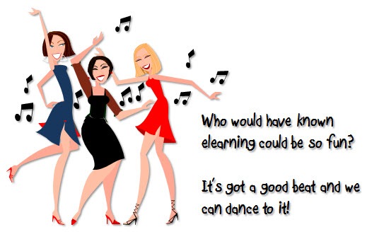
Guess what?  If the course is boring, adding audio will only make it boring and danceable.  You’re best served to spend your time designing the right type of course and spending less time looking for ways to “jazz it up.”

The Rapid E-Learning Blog - dancing to a good elearning beat


The course’s goal is to help your learner learn.  So when you add audio to the course it should contribute to the learning.  In a previous post, I shared a little about cognitive load and how to get your learners to remember more.  If the audio doesn’t help, then it offers little value; or worst case, it actually diminishes the value.

  • Background audio might impact your working memory.  Background audio might conflict with other information.  Adding too much information at once might overload the brain’s processing.  This impacts how well the learner can recall the information in the course.  It probably makes sense to skip this type of audio on crucial learning segments where retention is critical. 
  • Multiple audio tracks can impact retention.  Some studies suggest that combining narration, ambient audio, and background music can impact retention.  This makes sense because you’re giving the brain a lot of audio information to process at the same time.
  • Narration and background audio aren’t the same things.  With narration the risk is that you are sharing information that competes with information that the learner is processing visually.  Background audio is not the same since it has no informative value.  My guess is that the brain quickly learns to filter it, the same why I do to my kids when I watch boxing.  That’s why I wouldn’t get too dogmatic about background audio in all circumstances. 

Your ultimate goal is to craft the best learning experience.  If the audio adds no value, you’re probably better off getting rid of it than adding it to the course.  With that said, some courses are only designed to share information.  In those cases, you could probably be a little more liberal in your use of audio than if your goals are real retention and improved performance.  In either case, it should not detract from the course content.

When Does Audio Add Value?

Multimedia learning is relatively new and the way we craft elearning is changing.  We have everything from the standard page turners to immersive learning games and activities.  Because of this, the principles aren’t always the same.  What you might apply to a static page with text and narration isn’t going to be the same for a much more interactive activity where retention is more critical.

  • Ambient audio contributes to an immersive experience.  A role playing scenario is different than specific, step-by-step instructions.  In that case, there’s probably some value in using audio to create a more immersive experience.  Think of setting the scene where someone is working in a hurried environment with a lot going on…like an emergency room.  The proper use of audio and visual design can contribute to creating the right type of situation and context. 
  • Background audio can create emotional cues.  Think of a movie like Jaws.  Probably the most memorable part of Jaws is the sound track.  In some ways it acted as a narrator.  The music kept us at the edge of our seats, telling us, “Be careful, there’s something coming.”  There’s no reason why elearning courses can’t employ a similar use of background audio to provide some emotional cues and hooks.
  • Music can contribute to changed behavior.  There are some studies that suggest certain types of music at set beats per minute can influence how the brain receives information.  Perhaps there’s some value in adding a baroque audio track to certain types of elearning courses.  Here’s a site with some links if you want to read more about music and the brain.

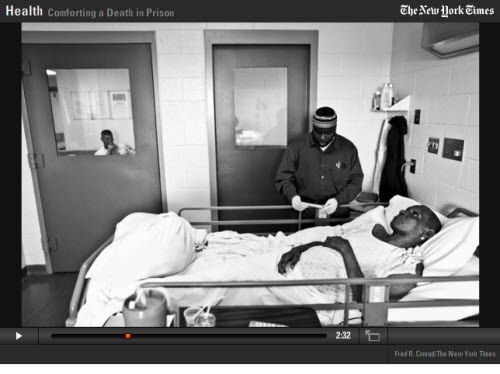
How are other industries using audio? I already mentioned the movie industry as an example.  But you can also glean some ideas from the gaming industry or multimedia news and documentaries.  I like the audio slide shows that the New York Times produces. 

The Rapid E-Learning Blog - New York Times multimedia example 

Click here to view the New York Times demo.

This one starts with a door slam.  It pulls you right in and sets the stage.  Then listen to some of the ambient background audio.  While it’s subtle, it all adds to the emotional value of the piece because it puts you there.  Without the ambient audio, it would lose some of the emotional edge and be a much more sterile and probably less personal piece. 

The same is true for your elearning course.  There are some courses and topics that can benefit from good ambient or background audio.  Next time you’re doing analysis and meeting with learners, stop and listen to what it sounds like where they work.  Is there a way you can bring that sound into your course?     

Things to Consider

There’s so much variety to elearning and the types of courses that are produced it’s hard to be dogmatic about when and where to use background a
udio.  The main point is less about the audio and more about your intention.  Once you know what you want to do, then you decide when and where audio fits in.

  • Each element of the course should contribute to the learning.  Don’t add audio for the sake of audio.  Everything you add to the course from the multimedia content to the activities should exist to satisfy the learning objectives.
  • Keep the content relevant.  The more relevant the content is to the learner, the more apt they are to pay attention.  When it’s not relevant, no amount of background music will “jazz it up.” 
  • People are complex.  While cognitive load theory is an important consideration in course design, we need to be careful not to be too dogmatic about its application.  The brain is complex and sometimes the cognitive load discussion seems to be too simple and applied with a broad brush.  Like all learning theories, they’ll be refined over time.  I see them more as considerations and principles to guide design and less as steadfast rules. 

I like the story Malcolm Gladwell tells of the early days of Sesame Street in the Birth of Big Bird.  The scientific advisors (probably steeped in sound research) warned against mixing fantasy and reality.  If the founders had gone with that advice, the show would have died.  Instead, they did mix them and the show proved successful.

There’s probably a lesson in there for us.  To learn more about multimedia in elearning and the effective use of audio, it might help to step away from the elearning industry and look at other disciplines that use multimedia, like the advertising, gaming, and movie industries.  What can we learn from them?

I’d love to hear how you’re using audio in your courses.  Got any tips and tricks?  Feel free to share them by clicking on the comments link.

Events

Free E-Learning Resources

Want to learn more? Check out these articles and free resources in the community.

Here’s a great job board for e-learning, instructional design, and training jobs

Participate in the weekly e-learning challenges to sharpen your skills

Get your free PowerPoint templates and free graphics & stock images.

Lots of cool e-learning examples to check out and find inspiration.

Getting Started? This e-learning 101 series and the free e-books will help.