
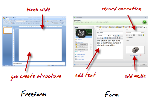
Rapid elearning tools generally fall into one of two groups: freeform and form-based authoring.
PowerPoint-to-Flash publishing is freeform. You start with a blank slide and then build your structure and interactivity. And the other type of tool is form-based where the application has a pre-designed structure and the developer only needs to add content like text, narration, and multimedia. Hit publish and you have clean, professional output.
Most rapid elearning courses use a combination of form-based modules and PowerPoint. A good example of this is the Pallet Jack demo. It combines content created in PowerPoint (freeform) with interactions built in Engage (form).
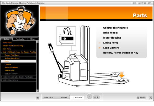
Click here to view the Pallet Jack demo.
As you can see, it doesn’t have that “PowerPoint” look and the integration between form and freeform generated content works well.
The Truth About PowerPoint
Most PowerPoint criticism is misguided. It’s not hard to find critics of PowerPoint because it’s an easy target. Who hasn’t had to sit through boring PowerPoint presentations? Unfortunately, much of the criticism is off target because bad content is the result of poor design and not the application you use.
Books like Beyond Bullet Points and Slide:ology have done more than enough to show how to use PowerPoint for more than bullet point presentations. If you’re critical of something created in PowerPoint tell the person who created it and spare us the tearing of shirts and sprinkling of ash as you lament the inevitable collapse of our industry. 🙂
PowerPoint is a multi-faceted application and used for more than presentations. So a carte blanche dismissal of PowerPoint is ridiculous. As proof to PowerPoint’s versatility you don’t need to go very far. In recent posts, I’ve shown how to use it to build graphics as well as interactive elearning. I even met someone recently who used PowerPoint to publish a book.
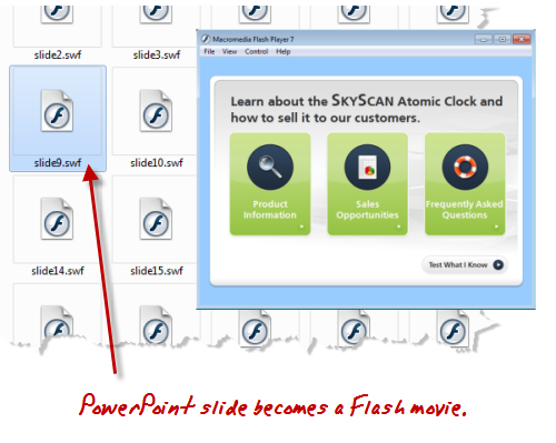
Here’s what’s true about PowerPoint and rapid elearning. Your slide starts as a blank slate. You can add animations, narration, interactivity, and multimedia to create a pretty dynamic elearning course. When you publish your course, that PowerPoint slide becomes a Flash movie.
Do you build the Flash movie in Flash? Or do you build the Flash movie in PowerPoint?
Here’s the deal, you can learn Flash and actionscript to build elearning content. Or you can leverage PowerPoint’s flexible and easy authoring environment to create Flash-based elearning. Either way, the output is still Flash. The only difference is that with PowerPoint you get to create your Flash movie (with animation and audio) in an environment you already know. All without having to be a programmer.
While actionscript programming does provide more control over the Flash content, rapid elearning generally gives you a lot more convenience. And for most courses, I’ll take the convenience over the time and cost associated with the extra programming. It’s part of the rapid elearning strategy I recommend and similar to what Kevin Maney discusses in his book, Trade-Off.
Keep in mind that while rapid elearning gives you the ability to create good courses at a fraction of the cost and time, it doesn’t mean that you skip instructional design. Regardless of your tool, the course is only going to be as good as you designed it. But because you use rapid elearning tools doesn’t mean that you can’t build a quality elearning course.
Rapid E-Learning Doesn’t Mean Low Quality
If you read this blog, then you know that there are more than enough examples to show how you can build high quality elearning using rapid elearning tools. In fact, here are a couple of quick examples I built based on the demos in Michael Allen’s Guide to E-Learning. The first uses a form-based module and the other is built entirely in PowerPoint. They both demonstrate the power of rapid elearning and that you can create viable courses without being a programmer.
Form-based Authoring Example
The example below is an excerpt from one of the Allen Interaction courses. The original is an information-based interaction. I replicated the interaction using Engage, a form-based rapid elearning tool. It took less than 10 minutes to build it.
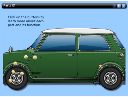 Click here to view the rapid elearning demo.
This form-based example demonstrates the benefits of the rapid elearning approach. You don’t need any advanced programming skills, yet you can still create a rich media experience. In addition, because you cut the programmer out of the process, you cut out all of the associated meetings and project reviews. That’s a big time savings.
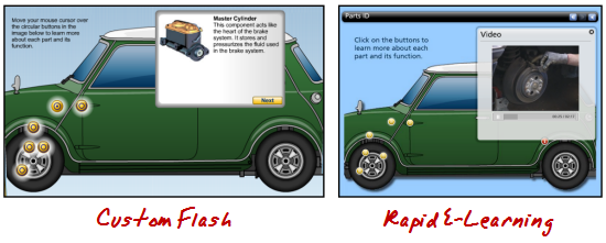
Click here to see a comparison between the Flash and rapid elearning versions.
In the comparison video, you’ll see that working in a form-based application is pretty easy. That’s because everything’s pre-built and you just need to add content. The key to using the interaction effectively is in how you structure the learning experience.
PowerPoint E-Learning Example
The first example is more like reading through a manual than active learning. You get good information, but you don’t really do anything with it. This second demo has more interactivity.
Here’s the original built by Allen Interactions. Typically this type of policy training would be your standard click-and-read course where you see page after page of corporate policy about workplace violence. I like the way Allen Interactions built the course. It’s designed in an environment that’s more real life and relevant. Instead of reading about workplace violence, you are a manager who has to analyze the situation, make a threat assessment, and then refer the people to right departments. It’s a great learning environment.
Below is the demo version I that I built in PowerPoint. I scaled it down a bit because I was less concerned about the content and more focused on showing that you can craft a very similar learning environment. I also challenged myself to use only PowerPoint for the graphics so that it was all done in a single tool.
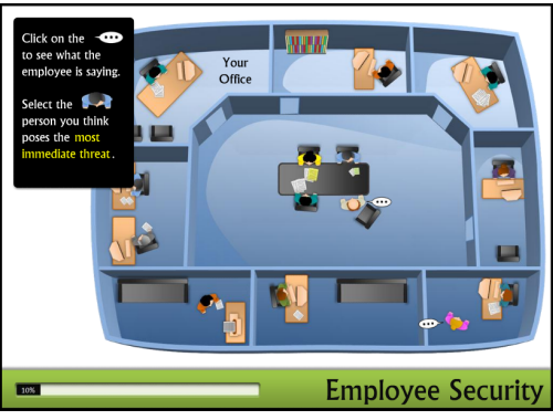
Click here to view the rapid elearning example.
When you compare the two examples, you’ll notice that the original offers a drag and drop; and there’s some logic built into the questioning process. I had to modify that a bit in PowerPoint because of the limitations when converting PowerPoint to Flash.
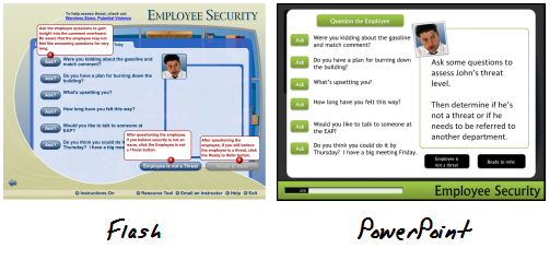 Click here to view a comparison between Flash and PowerPoint versions.
However, I can live with the differences because the course content and learning interaction are essentially the same. Don’t believe me? Ethan Edwards from Allen Interactions said, “…even with the compromises, the PowerPoint piece still has 90% of the impact of the original or more.”
I can live with the compromises. Here’s why and where I make up for it.
We’ll assume that the same effort was applied to the instructional design regardless of the tool used. So that’s a wash. Once I had the content and course structure, it took me about 10 hours to build the prototype from scratch. That includes building all of the graphics, which was most of the time.
A less experienced person would require a bit more time, but in the long run you still get easy authoring at a good price. And that’s where rapid elearning shines.
Rapid elearning doesn’t mean you skip instructional design and the process of designing a good learning experience. That still has to happen. But it also doesn’t mean that you can’t design a good learning experience. Even if all you have is PowerPoint, there’s no reason why you can’t build engaging and effective elearning courses. All it takes is a little practice.
Events
Free E-Learning Resources










41
comments