Here Are Ten Rules to Create Engaging Elearning
May 25th, 2010
At the recent ASTD conference, I was asked how to create engaging elearning. If you’ve been reading the Rapid E-Learning Blog for a while, then you know I’ve tackled this subject before. I decided to pull ten ideas that are fundamental to building good elearning courses.
Rule 1: Don’t Create the Course
This is probably not the advice your client wants to hear. But let’s face it; there’s quite a bit of elearning that’s just a big waste of time. If the course isn’t tied to real performance improvements, it might not be worth building. During the initial project meetings, I try to get the client to tie the course to real performance goals. If they can’t, then I suggest that a course might not be the best option.
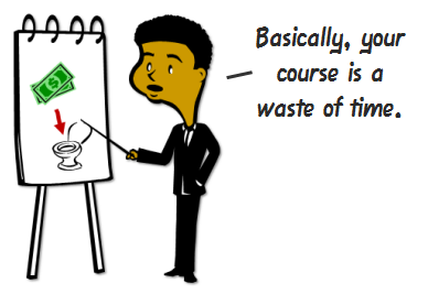
Besides, many of the courses we create are just sharing information that’s already available in other places like the organization’s intranet or via job aids. Why build an elearning course that rehashes information available elsewhere? If anything, build a course that teaches people how to find the resources already available to them.
Rule 2: The Course Needs to be Relevant to the Learner
Most boring courses are the result of the content not being relevant to the learner. Even if you build simple compliance training, there’s a way to make it relevant. Talk to your learners and find out how they use the compliance information. Then place the course in a context where it makes sense for the learner.
Also, consider that not all learners are created equal. They come to the courses with different levels of experience and knowledge. By creating a learner-centric course, you can accommodate their diverse needs.
The key to interactive courses is not multimedia, rollovers, or drag-and-drop interactions. Instead, it’s how the learner will interact with the content. Create courses where the learner doesn’t just passively receive information. Instead give them opportunities to reflect on and use the information to make decisions and get feedback.
Rule 3: Understand Your Objectives
If all you’re trying to do is share information and track completion before December 31, then build a course that’s appropriate for those objectives. The best bet might be to make it easy for the learners to find the information, complete the course, and get back to productive work.
On the other hand, if you’re building a course where you desire to change behaviors, an information dump is not going to work. In that case, you want a course that builds the skills the learner will need to meet the performance goals.
Rule 4: Free Up the Navigation
In a recent article on iPad usability, Jakob Nielsen had this to say:
Using the Web has given people an appreciation for freedom and control, and they’re unlikely to happily revert to a linear experience.
In the same sense, people like the freedom to review and scan information in the elearning course. Nothing is more frustrating than locked navigation where control is stripped from the person who’s supposed to be doing the learning.
Here are a few things that bug the learners:
- People like to explore and experiment. It helps them build context. Locked navigation doesn’t allow this.
- We can read faster than the narration. Don’t make people wait for the narrator to advance if you give them the option to read.
- You have a screen that’s 5 minutes long. At 4:18, the learner misses a key point. Because the navigation is locked he can’t rewind a few seconds. Instead he has to go back (if he can) and repeat the first four minutes.
Many times the navigation is locked for fear the learner will just click through the course. If that’s the case, see Rules 2 and 5. Instead of locking the navigation, control their movement through the course via decision-making. This gives them the freedom to move around and odds are you make the course more engaging.
Rule 5: Don’t Push, Let the Learner Pull
Many courses are designed to push information out. But that’s not best for learning. You’re better off if you can create an environment where the learner has to pull information in.
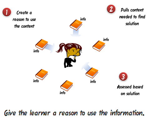
Instead of a series of click-and-read screens, give the learner a problem to solve. Then provide all of the information that you would normally have pushed by creating access to additional, just-in-time resources. As the learner attempts to solve the problem, she’ll pull the information she needs.
Rule 6: Consider the Pacing & Flow
Learning is like eating. You don’t just shovel spoonful after spoonful of food into your mouth, at least not normally (unless it involves Nutella). Instead, you take in a spoonful of food; chew it up to break it into smaller pieces; and then swallow it so that it can be processed further down the digestive tract.

In the same way, you can’t expect to shovel new information on top of new information in the brain. You have to pace it. Take in new information; reflect on it (maybe practice using it); and then send it to other parts of the brain for processing.
Avoid shoveling too much information by working on the pacing and flow of the course. With new information provide opportunities to use it. On a side note, I don’t advocate the classic 5 screens of information and then a knowledge check approach. Try something more creative.
Rule 7: Look for Inspiration Outside of E-Learning
Sometimes in the elearning industry we tend to become so idealistic about what real elearning is or isn’t that all we do is complain o
r force all sorts of instructional design rules that diminish creativity. There’s a good chance that if you listen to elearning people you’ll end up with a course that does a great job avoiding cognitive load but little to engage the learner. 🙂
Seth Godin made an interesting point about finding good ideas.
The best ideas come out of the corner of our eye, the edge of our consciousness, in a flash. They are the result of misdirection and random collisions, not a grinding corporate onslaught. And yet we waste billions of dollars in time looking for them where they’re not.
Put yourself in a position where things can randomly collide. Media Journalism is a field that is similar to elearning. Every day they have to crank out all sorts of interactive multimedia. Why not be inspired by that industry? Follow David Anderson in Twitter. He does a great job collecting good examples.
Personally, I like to review design sites and the advertising industry. I focus on how they structure the message and layout the screens. Those are ideas I can use in my courses.
Rule 8: Create a Course That is Visually Appealing
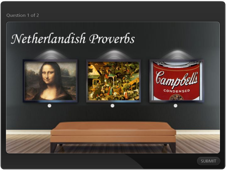
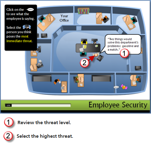
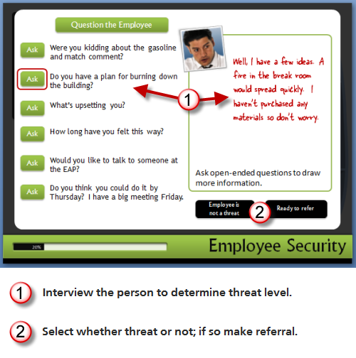
Unless you’re doing a sleep study with a group of insomniacs, most likely a white screen full of bullet points won’t attract their attention. People are attracted to things that look interesting. Compare the two images below. Which one gets your attention?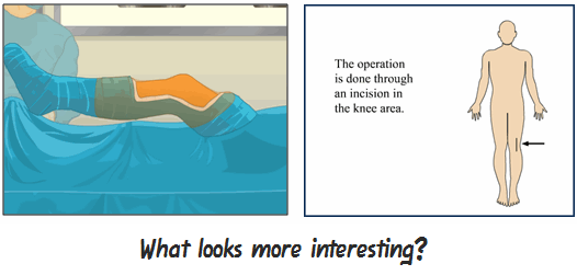
If you want to engage learners, start by crafting a visual theme that is visually interesting, relevant to the content, and immerses the learner into the course.
Rule 9: There’s a Place for Novelty
While we don’t want to go overboard with superfluous navigation or rollovers, there is a place for novel design. There are times I’ll think a game or some whiz bang effect in a course is lame. But I’ll debrief some of the learners and they’ll mention how much they liked it (or appreciated that the course didn’t look like the rest of the courses). Thus, a novel approach or design to your course can be critical to engaging the learner.
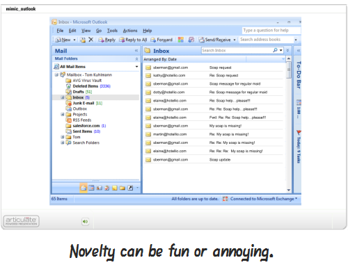
Here’s a mock up I did for creating a course that looks like an email exchange for a previous post on mimicking the real world in your courses. Something like this is different than a typical course and could be a fun.
Just remember that what’s novel at the beginning of a course can quickly become annoying. So you want to balance it with good design and probably look at giving the learner an alternative, or a more traditional, means of getting information.
Rule 10: Commit to Engaging E-Learning
It’s easy to rant and rave about PowerPoint and rapid elearning, and then place the blame for bad elearning on those tools. But the real reason that a lot of elearning is no good is that there’s no real commitment to make it more engaging. And that falls on the shoulders of those who build the courses, whether the client, subject matter expert, or instructional designer.
Regardless of the tools you use, you can create effective elearning. Step away from the information dump and focus on the learner. Then find creative ways to place the course content in a context that is relevant to the learner. If you do these two things, you’re on your way to creating effective and engaging elearning.
There are more than enough resources out there to help you build better elearning. In addition to this blog, I like what Cathy Moore has to share. Her action mapping is a straightforward approach to building effective courses.
As far as books, I usually recommend the standards that cover everything from graphic design to presentations to elearning. Here are a few that I think are worth owning if you don’t already own them (the links to Amazon produce a small commission):
- The Non-Designer’s Design Book: covers basic design principles
- Slideology: lots of good examples and overview of presentation design concepts
- Beyond Bullet Points: learn to structure content that is very relevant to instructional design; plus it includes the essentials regarding cognitive load
- Don’t Make Me Think: web usability and navigation; good examples and relevant to moving the learner through a screen
- E-Learning by Design: probably the best book that covers the most ground
Those are ten rules to help you get started. Your next step is to start applying them. What else would you add to the rapid elearning developer who’s just getting started? Any other books that you’d recommend?
Share your thoughts by clicking on the comments link.
Events
- Everyday. Check out the weekly training webinars to learn more about Rise, Storyline, and instructional design.
Free E-Learning Resources
 |
 |
 |
|
Want to learn more? Check out these articles and free resources in the community. |
Here’s a great job board for e-learning, instructional design, and training jobs |
Participate in the weekly e-learning challenges to sharpen your skills |
 |
 |
 |
|
Get your free PowerPoint templates and free graphics & stock images. |
Lots of cool e-learning examples to check out and find inspiration. |
Getting Started? This e-learning 101 series and the free e-books will help. |

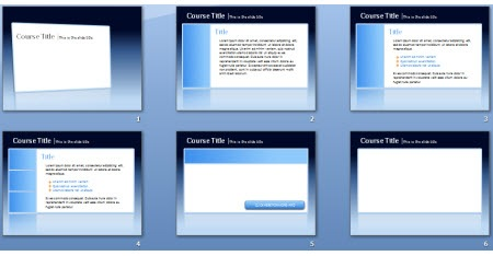
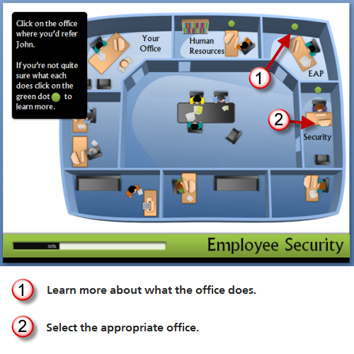
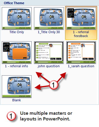
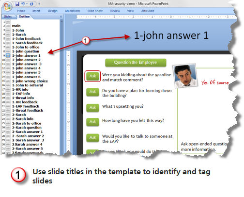
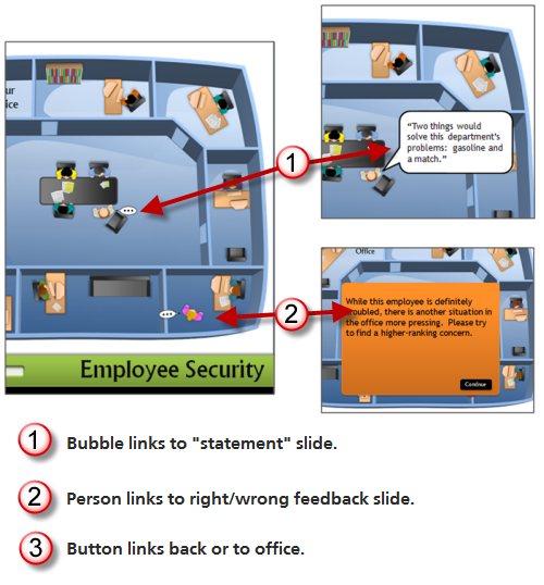
 There are a few common issues when working with rapid elearning tools. A form-based application makes creating your course real easy. But since it’s a form, you’re locked into a distinct look. Think of it like a Jell-O mold. You get what the mold is designed to give you.







48
comments