The Rapid Elearning Blog

Archive for June, 2010


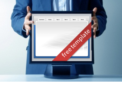
The Rapid E-Learning Blog - free PowerPoint template

I was moving some files around the other day and found a tabbed PowerPoint template I started working on about a year ago.  So I finished it up and am giving it away today.  Feel free to use it as you wish.

I like making these PowerPoint templates because it’s a good way to practice production techniques.  They can make you more efficient when building your elearning courses.  I also added some tips and tutorials below.

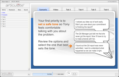
First, here’s a quick mock up of the template in action.

The Rapid E-Learning Blog - tabbed template demo

Click here to view the demo.

PowerPoint Tips

  • Keep graphics development separate from the elearning course.  It’s a good idea to have one PowerPoint file to build the graphics.  And then have another for the actual course.  The advantage is that the course file will have fewer objects on the screen and make publishing faster.  It’s also a good idea to keep the graphics production separate from the course file.
  • Use colors you can modify.  PowerPoint 2007 has a color scheme feature.  I design my templates with the default color scheme and then if I want a unique color applied, I just create my own scheme.  Get used to building your template for quick editing and reusability.
  • Create multiple masters.  You can have as many master slides as you like.  If I have four slides or more with mostly the same content, I’ll create a master slide.  It makes it easier to edit and publishing is also a bit faster because a lot of the redundancy is removed.
  • Build navigation in your masters.  You can add hyperlinks to the master slide and they will work across all of the slides.  That’s how the tabs work in the demo above.  In addition, if you add something like a next arrow to a master (and you don’t want it to show on your slide), create a box that covers it up.
  • Use slide masters as a repository for items you’re not using, but want access to.  Sometimes I’ll create shapes or objects that work with the template but am not currently using.  I create an extra master layout and dump those objects on the screen.  They remain in the file, but don’t end up in the final publish.
  • Keep hyperlinks separate from the objects.  Create a rectangle shape and add the hyperlinks to that.  Then place the link shape on top of the place where you want the link to be.  This makes it easier to work with the links when you want to do edits or move the links around.  Prior to publishing, I make the link boxes completely transparent.
  • Rename your objects.  Starting with PowerPoint 2007, working with layered objects is a lot easier. You can move them around; and show/hide them, too.  Because of this, it’s a good habit to rename the objects so it’s much easier to work with them as layers.

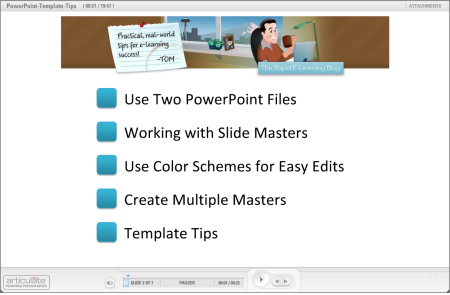
I did a series of quick tutorials to show these tips in action.  You can view them below.

The Rapid E-Learning Blog - PowerPoint tips

Click here to view the tutorials.

You can download the PowerPoint templates here.  I also included the demo file so you can see how I pulled it together.  Feel free to use the template as you wish for your elearning projects.

Want to take a stab at creating your own tabbed template?  I’d love to see what you come up with.  Feel free to add a link to the comments section.  Or better yet, create a template that you can share with the community.

var
pdfbuttonlabel=”Save page as PDF”

Events

Free E-Learning Resources

Want to learn more? Check out these articles and free resources in the community.

Here’s a great job board for e-learning, instructional design, and training jobs

Participate in the weekly e-learning challenges to sharpen your skills

Get your free PowerPoint templates and free graphics & stock images.

Lots of cool e-learning examples to check out and find inspiration.

Getting Started? This e-learning 101 series and the free e-books will help.


The Rapid E-Learning Blog

I’m intrigued by some of the reality television shows.  I don’t care much for the trashy ones, but the ones where there are skilled people competing are interesting.  I usually catch snippets of Project Runway or Top Chef since those are two of my wife’s favorites.

As can be expected, these shows typically have colorful characters that produce the drama.  And some of the people can be arrogant and ruthless.  The other day my kids were watching a cooking competition.  I used the show as a teaching moment.  We talked a bit about humility and being kind to others.

Not only are there teaching moments for the kids, there’s really a lot that can be applied to elearning.  So here are five things that we can learn from reality television.

There’s never just one way to do something.

In many of the shows, the contestants are all given the same task and same materials.  Then they’re asked to put their personal stamp on it.  It’s interesting to see the different perspectives and creativity.

What strikes me is that even though they all start at the same place, how they approach the challenge is usually different and unique.

The Rapid E-Learning Blog - different approach to the same content

Key points:

  • There’s more than one way to approach the course design.  Don’t spend all your time trying to find the “right” approach.  Besides, those who end up taking the course aren’t privy to the alternatives, anyway.
  • Try to brainstorm and get feedback from others.  Everyone has a unique perspective and something to add.  On top of that, others see things we don’t.  Most likely your project designs will be more diverse and better constructed if you can bring in an extra set of eyes.

Grow thick skin and learn to take criticism.

Most reality shows have some sort of judging component where a panel of experts critiques the contestants’ work.  That part of the show is usually the most entertaining, especially if you have a judge like Simon Cowell.

The Rapid E-Learning Blog - there's always going to be a critic

It never fails that as soon as a judge offers some criticism, one of the contestants will get defensive and offer a long-winded explanation of what they were trying to do.  You know what?  In most cases, no one really cares.  Take the feedback, make the changes, and move on.

It’s natural to get defensive when their hard work is being torn apart.  However, in most cases the judges are right on and offer the type of criticism that is fair and will only help the people get better.

Key points:

  • Your job is to please the client.  Listen to what they say.  Avoid being defensive, even if you don’t agree.  Humility goes a long way. Not only will you satisfy the client, you’ll also build a stronger relationship.
  • Just to be sure, ask clarifying questions so that you find out exactly what it is they didn’t like and what recommendations they have to make it better.  That’s different than being defensive.

Learn to give constructive feedback.

My kids were watching the Next Food Network Star.  The goal of the show is to not just be a good cook, but to be a good cook who connects with people on TV.  Some of them didn’t meet that goal.

What impressed me was the feedback given by Bob Tuschman, the VP of Programming.  While he might have come off a bit insensitive because of his matter-of-fact manner, he got straight to the point and made sure that his critique was centered on meeting the ultimate objectives.

The Rapid E-Learning Blog - learn to give constructive feedback

Because we’re so sensitive to not offend, it can seem harsh to give any type of corrective feedback.  Some people take any criticism as a personal assault.  However, in our industry it’s important to be able to give good, constructive feedback.

Key points:

  • Understand your goals and give feedback targeted to meeting them.  Don’t focus on the person; instead focus on the objectives and whether or not they were met.  And why.
  • Provide direction in your feedback.  It’s not enough to point out that something’s good or bad.  Be specific and focus on the desired action and result.  For example, “The course seems slow,” doesn’t say much.  What does “slow” mean?  Something like this could be better.  “Most screens had over 30 seconds of audio narration and there wasn’t much happening on the screen.  Perhaps we need to trim the audio and change up the screen content a bit more.”

Design for others.

Most of the people who make it to the television competitions already have some sort of creative talent.  Otherwise they wouldn’t be on the show.  The challenge for them is to focus on how others can benefit from their skills and less on how they’re a gift to humanity.

This is really evident in a show like Project Runway.  Often the fashion designers flounder because they place so much emphasis on their creativity that they lose sight of the objective to please someone else.  The ultimate goal is to marry their creative skills with a marketable product.

Key points:

  • Your success hinges on the success of others.  Focus on the customer’s needs and deliver a course that helps them succeed.
  • When it comes to elearning, the more learner-centric your course is the more likely it is that you’ll succeed.

Be flexible and willing to learn.

There’s usually some contestant who struggl
es early on, but in each round makes adjustments to get better.  It’s impressive when a person can dismiss the need to justify their work and instead incorporate the criticism from the judges to give it a better go the next time.

The Rapid E-Learning Blog - be flexible and willing to learn

Success in life is less about getting it perfect and more about the adjustments you make along the way.  My guess is that successful people can probably list a lot more failures than they can successes.

Key points:

  • Put yourself in a position to be critiqued.  Find a mentor who can give you good counsel.  Or have regular team meetings where you review each other’s work.  If you don’t have a team, jump into the user community and ask for feedback.
  • Try something new.  Don’t create twenty courses that are all essentially the same.  Play around with ideas and try to incorporate them into your courses.

Granted a lot of the activity is staged and edited for entertainment value, but what makes reality television intriguing is that they place people in circumstances that stress them.  We might not be on television, but we definitely face similar issues as we create elearning courses.  Have a thick skin; be humble; and focus on others.  That’s a winning combination that can only make your courses and relationships better.

Events

Free E-Learning Resources

Want to learn more? Check out these articles and free resources in the community.

Here’s a great job board for e-learning, instructional design, and training jobs

Participate in the weekly e-learning challenges to sharpen your skills

Get your free PowerPoint templates and free graphics & stock images.

Lots of cool e-learning examples to check out and find inspiration.

Getting Started? This e-learning 101 series and the free e-books will help.


The Rapid E-Learning Blog -  ten tips for elearning tables

I had a blog reader ask about the best way to animate a table in her rapid elearning course.  Like a lot of things, it’s usually less about the best way and more about understanding the many ways that you can do something.  Once you know what you can do, it’s easier to choose the best option that meets your objectives.

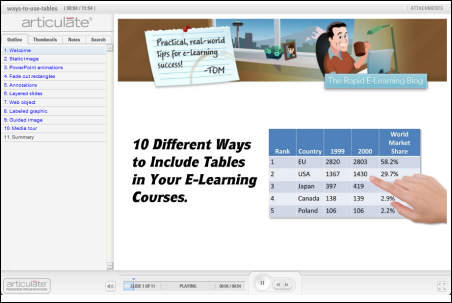
Her question did cause me to think about some of the different ways you can use tables in an elearning course.  So I put together ten ideas that may help the next time you need to add a table to your course.  Below is a quick demo that shows them in action.  I explain more below.

The Rapid E-Learning Blog - elearning tables demo

Click here to view the table demo.

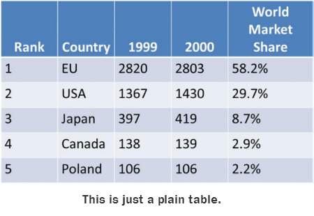
The No Frills Approach

Just add the table and do nothing else.  Add some narration that explains the table.  If you want to make it a bit more interactive, ask the learner to look for information.  One challenge with this approach is that there are no visual cues.  The learner could easily lose track of the narration and where it’s at on the table.

The Rapid E-Learning Blog - plain table

Simple PowerPoint Animations

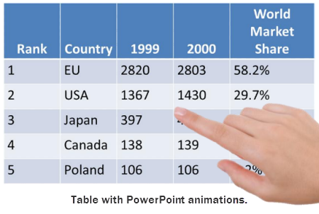
Use PowerPoint shapes or images to point out things on the table.  Add on-click animations to the objects and you can sync the animations to your audio.   This provides good visual cues and helps direct the learner’s focus.

The Rapid E-Learning Blog - table with PowerPoint animations

A downside to this approach is the time it takes to build the animations and get them just right.  Also, if you want to print out the PowerPoint files, you have to remove all of the animations from the slide.  Otherwise, they’ll cover up the content.

Progressive Reveal Animations

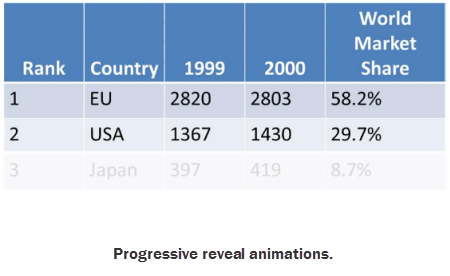
Another way to use on-click animations is to cover the table with rectangles.  Set them to fade out on mouse click.  Then as you talk and click the animation, the box fades away.  It looks like the table is actually fading in.

The Rapid E-Learning Blog - table with PowerPoint animations that are progressively revealed

This looks nice and is a bit easier to build and manage than the other types of PowerPoint animations.  You still have to remove the objects if you want to print the slides.

Just-in-Time Annotations

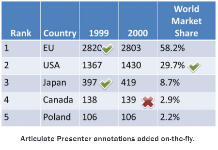
Articulate Presenter has that cool annotations feature.  They look great and can be added on the fly.  So there’s no building of animations or cluttering your slides with content you have to remove prior to printing.

The Rapid E-Learning Blog - table with Articulate Presenter annotations

Annotations are probably my favorite solution.  I just like the way they look and using them is really no different than how you might use a laser pointer.  Of all the solutions it’s probably the easiest.

Duplicate Slides & Hyperlinks in PowerPoint

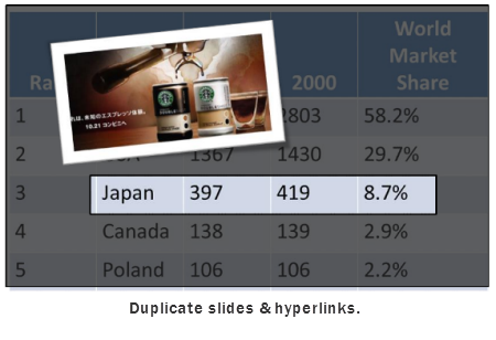
If you want to get a little trickier and add more content than just audio narration, then this approach may work for you.  Essentially you make a duplicate slide for each category.  Then add hyperlinks to those slides.

The Rapid E-Learning Blog - table that uses duplicate slides and hyperlinks

The benefit to this approach is that it makes the entire slide area open to you as you focus on a single point of information.  In the demo, I show a few different ideas.  The negative to this approach is that it requires a lot more work.  But if you have the right type of table and content it is a neat way to do it.

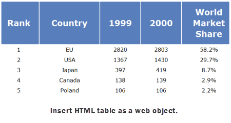
Create a HTML Table

Sometimes the table content is dynamic and can change more frequently than you choose to publish the course.  Using the web object feature is a great way to avoid a bunch of extra work.

The Rapid E-Learning Blog - table as HTML and via web object

What you do is create the table as a HTML file; then place it on a server.  Insert the URL as a web object and publish your course.  You can update the table on the server and it’
s automatically updated in the course.

Adding Interactive Multimedia

Sometimes, tables are just boring.  It’s cool when you can augment the table’s information with audio, images, and videos.  So I played around with a few ideas in Articulate Engage.  What I like about this approach is that you can make the information more interesting and relevant to the learner.

For example, what if each cell included a video of a subject matter explaining how the information impacts the organization in a real way?  That could be impactful.  It definitely would make the table more engaging and possibly help the learner connect it to the real world.

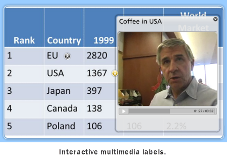
Add Interactive Multimedia Labels

The labeled graphics interaction lets you insert an image of the table.  From there, you can add labels on top of the image.  The labels can contain audio, images, and video or Flash files.

The Rapid E-Learning Blog - table using Articulate Engage labeled graphic

What I like about this approach is that I can add a label over each cell.  It allows the learner to explore and click on only the area of interest.  Combine that with an interactive Flash file (such as the one in my demo) and you have a pretty dynamic multimedia table.

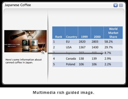
Use a Guided Image with Multimedia

The guided image interaction is similar to the labeled graphic because you can add text, audio, and multimedia.  However, it’s more of a linear presentation of the information.  Personally, I like to give the learners more control so I’d probably go for the labeled graphic over the guided image.

The Rapid E-Learning Blog - table using Articulate Engage guided image

You do have the option of having the arrows come from the top, bottom, or either side.  While the guided tour isn’t as interactive as the labeled graphic, it does look nice and much easier to work with than a PowerPoint slide if you want to augment the information with some multimedia.

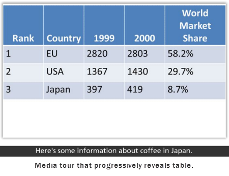
Let the Media Tour Progressively Reveal

This one’s similar to the progressive reveal in PowerPoint.  However, instead of adding the rectangles and having them exit on click, you insert multiple images.  When the learner advances, the table builds.

The Rapid E-Learning Blog - table using Articulate Engage mdia tour

The media tour lets you add an image (or other media) and some audio.  You also get the text are on the bottom.  For this example, it’s probably not the option I’d select, but it is a different way to display the table in your course.  And that’s the main thing.

Understand the tools you have and what they can do.  Then look at all of your options and match the best option to what you hope to accomplish in your course.  My favorites are the annotations (because of ease) and the labeled graphics (because I like to give the learners control).

Can you think of other ways to add table to your elearning courses? If so, add your ideas by clicking on the comments link.

Events

Free E-Learning Resources

Want to learn more? Check out these articles and free resources in the community.

Here’s a great job board for e-learning, instructional design, and training jobs

Participate in the weekly e-learning challenges to sharpen your skills

Get your free PowerPoint templates and free graphics & stock images.

Lots of cool e-learning examples to check out and find inspiration.

Getting Started? This e-learning 101 series and the free e-books will help.


The Rapid E-Learning Blog - use one clip art style

It would be great to have a graphics artist on staff who could build the graphics you need for your elearning courses.  But the reality for many of us is that’s not going to happen.  So you’re left to fend for yourself.

In previous posts, I shared a lot about how to customize your clip art so that you have some flexibility when building your elearning courses in PowerPoint.  In today’s post I want to expand on that a bit by showing you how you can use a single clip art style to create your basic elearning template.

Find a Style You Like

Look over the clip art that you have and locate a style that you like.  For this post, I’m using Style 802.  What I like about it is the hand drawn look and simplicity of the style.  I also like that there’s a lot of variety.

A few things that I look for:

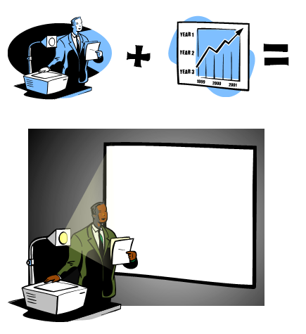
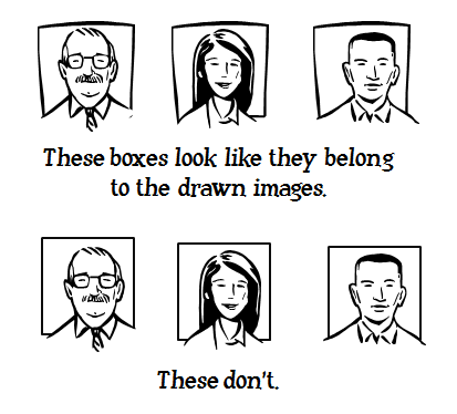
  • Characters:  What type of people, poses, and variations exist?  I look for heads that can be removed and matched to other bodies.  This way I can create the same character in multiple settings.

The Rapid E-Learning Blog - combine clip art to create custom images

  • Objects: What objects are available that I can pull out and use?  I look for rectangular shapes that could become boards or pieces of paper.  Computers are another hot item for elearning.

The Rapid E-Learning Blog - look for shapes that you can use in your elearning courses

  • Lines and shapes:  Are there some shapes or lines that I can pull from the clip art and use in other places?  Style 802 is a good example for this.  The images have a hand drawn look.  Adding a PowerPoint shape or line really stands out.  So I want to find lines and other shapes I can pull from the clip art and apply elsewhere.

The Rapid E-Learning Blog - use shapes from the clip art style to create a consistent look

Play Around with Ideas

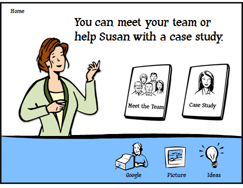
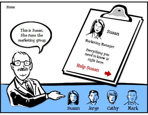
Try to build a template structure using elements from the clip art.  For example, you probably need some content boxes.  Perhaps you’ll want sections or menu options.  You might even offer a little resource section with clickable icons.

The Rapid E-Learning Blog - startinc screen for an elearning course

The Rapid E-Learning Blog - create a scenario or case study screen for your elearning course

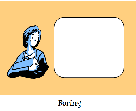
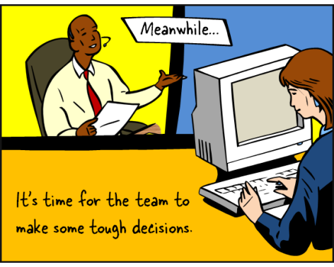
You might also change up the look.  Many times, the images are all sized the same way.  Try something new.  Make your images real big.  Or, make them real small.  Flip them.  Crop them.  Bring them in at different angles.  Try bold colors.  Make a comic book panel.

Once you start moving the images around, you might find some interesting layouts.

The Rapid E-Learning Blog - kind of boring look

The Rapid E-Learning Blog - play around with the layout of your characters and screen elements

The Rapid E-Learning Blog - use clip art to create comic book style elearning course

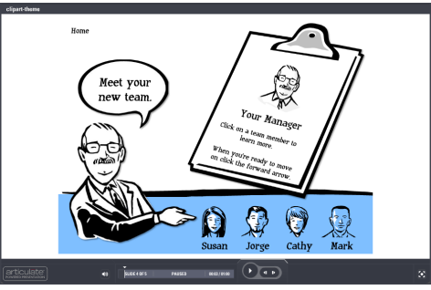
I created a quick mockup using the Style 802 clip art.  Hopefully, it gives you some ideas for your next elearning course.

I also included the PowerPoint files so you can see what I did.  Feel free to break them apart and build your own ideas.  Download the PowerPoint files used in this post.

The Rapid E-Learning Blog -  elearning tutorial using PowerPoint clip art style 802

Click here to view the demo.

There’s a lot more that you can do with these clip art styles.  Then main thing is to train your eyes to recognize usable shapes and lines, as well as which characters work.   

Here’s a link to some clip art styles that might work for this.  What clip art style do you think work best?  Add your favorite by clicking on the comments link.

Events

Free E-Learning Resources

Want to learn more? Check out these articles and free resources in the community.

Here’s a great job board for e-learning, instructional design, and training jobs

Participate in the weekly e-learning challenges to sharpen your skills

Get your free PowerPoint templates and free graphics & stock images.

Lots of cool e-learning examples to check out and find inspiration.

Getting Started? This e-learning 101 series and the free e-books will help.


The Rapid E-Learning Blog - this elearning course rocks

I’m no audio engineer.  And odds are that neither are you.  So I won’t get into all of the nitty gritty details of audio editing.  If you want more details, one of the community MVPs shared some tips on how to improve your audio quality.  It’s a good post and worthy reading.

Today I want to share some free or inexpensive ways to work with the audio in your elearning courses.  Let’s start with narration.

Do the Basics Right

Your audio quality is never going to be better than what you originally recorded.  So you need to do the best you can to record good quality audio from the start.  The two best things you can do are:

  • Invest in a good microphone.  I’m surprised that organizations will invest hundreds of dollars in software, pay someone thousands of dollars to build courses, and then only let them buy a cheap microphone for $20.  Makes no sense. Even if you’re on a limited budget, you can get a good microphone for about $50.
  • Control your recording environment.  If you record in a conference room next to the copy machine or at your office cubicle, odds are that you’ll have sub-par audio.  Try to find a consistent place to record audio so that you can better control your environment.

You can find some additional tips in these posts on recording high quality audio and recording narration like a pro.

Audacity

I’ve mentioned Audacity before.  It’s an audio editor that is free and easy to use for beginners.  But if you want to do more than basic editing, you have a lot of features to work with.  So it’s a tool that you can grow into.

Here’s a good tutorial from Brian that shows how to clean up your audio starting with those “little itty bitty” wave forms.

Click here to view the screencast.

If you want a little bit more detail, David did a few tutorials that show how to edit your narration for greater impact.

Myna (out of business)

Aviary’s Myna is an online audio editor.  It’s easy to use; and as long as you have a decent Internet connection, it’s a practical tool.  It’s also free, which is a big plus.  What I like about Myna is the library of assets available to you.

I did a quick screencast to show how it works.  If you want to learn more, go to the site and check out the demo and tutorials.

Click here to view the screencast.

Levelator

Levelator is a really simple way to make some improvements to your audio narration.  I can’t think of any easier way to adjust your audio.  Basically, all you do is drag and drop you audio files onto the desktop shortcut and the application does the rest.  Levelator does its magic and provides edited copies right inside the same folder.

Below is a quick tutorial that shows just how easy it is to use.  I’ve also added a before and after audio file to hear the difference.  It’s a little richer and louder.  You can also see the differences in the wave forms below.

Click here to view the tutorial.

Levelator – before


Levelator – after

Creative Commons Audio

The tools above ar
e free and help you get better sounding audio.  But sometimes our audio needs aren’t just for narration.  Sometimes we need background music or sound effects.

If you have some money you can always buy background music and sound effects on CD.  When I did video production, we had a CD binder that held about 200 disks full of just about any music style you would need.  It was a great resource.

Even if you don’t have money, there are some free resources available to you.  Here are a few sites that offer sound effects and free music.  Be sure to check out their Creative Commons License agreements before using them.

Another option is to buy stock sounds.  I’ve used Soundsnap before.  iStockphoto also sells stock audio.  They have a good library and the prices are decent.

Another idea is to contact an independent artist who may give you permission to use some music.  It never hurts to ask.  Of course, even a good song can’t make a bad course enjoyable.

The Rapid E-Learning Blog - the elearning course was boring, but it had a beat and I could dance to it

Create Your Own Audio

When all else fails you can create your own audio files.  If you want simple sound effects, record your own.  Need ambient office noise?  Just set up a mic in a busy area and record the audio.  Or go to the cafeteria.  That’s what Chris Kelly did to get the busy pub sound for his Beer Brewing Overview.  Love the tips on sustainable brewing. 🙂

The Rapid E-Learning Blog - make your own music

You can even create your own music.  You can create everything from a hip hop beat to softer background audio. Musicshake and TuneAround are free tools that let you easily create your own music and soundtracks.  Be careful, though.  You can end up spending hours playing around and creating your own music.  As an example, I used Musicshake to create Dr. Werner’s SMART Goals: The Musical.

You can always download and use Microsoft’s Songsmith and create brilliant stuff like this.  The video kind of reminds of all of the lame training programs I’ve been in where we had to write and perform songs based on what we learned.


Click here to watch the Songsmith video.

I’m not sure what Microsoft is thinking or why anyone would pay $30 for it considering the alternatives above, but Songsmith is available for free to educators.  Based on how my kids have played with it, I can see where this could be a good tool to use in class as part of a creative exercise.  For example, write a song about something you learned.

So those are some simple tools that you can use when including audio in your rapid elearning courses.  Have any other free audio tools to recommend?  Feel free to share them in the comments link.

Events

Free E-Learning Resources

Want to learn more? Check out these articles and free resources in the community.

Here’s a great job board for e-learning, instructional design, and training jobs

Participate in the weekly e-learning challenges to sharpen your skills

Get your free PowerPoint templates and free graphics & stock images.

Lots of cool e-learning examples to check out and find inspiration.

Getting Started? This e-learning 101 series and the free e-books will help.