Last week I took a stroll through New York City’s Central Park. While walking along the paths, I saw a black squirrel digging for acorns. I’m not sure how many black squirrels live in Central Park so they may be somewhat common. But for me, they’re uncommon and that got my attention.
After seeing the first black squirrel I surveyed the park to look for more. I didn’t see any others, but I did see a lot of grey squirrels. In fact, there were grey squirrels everywhere. I just hadn’t noticed them before.
This reminded me of Seth Godin’s book about purple cows. He talks about how we don’t notice regular cows, but we’d certainly notice a purple cow. The essence of his book is about doing something remarkable. As he says, what you do should be “worth making a remark about.” While he’s in the marketing industry, there’s no reason why his thoughts can’t be applied to elearning courses.
Of course, the odds are that people are already making remarks about the elearning courses, so I’d add that the remarks should be positive. : )
Below is a video of Seth explaining how to stand out with remarkable products. I also encourage reading his blog. It’s not about elearning but it is about how to serve people and meet their needs. And that is a large part of elearning.
Click here to view the Seth Godin video.
Grey Squirrel vs Black Squirrel E-Learning
With rapid authoring tools, it’s becoming easier to build and deliver elearning courses; and that means more and more organizations are building them. So over time, we get a lot of courses that all start to blend together.
They’re like the grey squirrels in Central Park. There were a lot of them around but they just didn’t stand out. It’s easy to build grey squirrel elearning where one course seems to be exactly the same as the next course. But that doesn’t have to be the case. There’s a place to create black squirrel courses—those that stand out and make people take notice. Here are a few ideas to help you get started.
Build Eye-Catching Courses
There’s a lot to be said about the aesthetic design of your course. Some people discount the focus on looking good as mere “eye candy. “ But, the look and feel does matter. The more polished your course is the more value the learner will assign. They see the course before they do anything else with it. So you want it to be inviting and visually interesting to start. You definitely don’t want them starting the course thinking that it’s another boring elearning course and probably a waste of their time.
The challenge for many people is that they aren’t trained graphic designers and not sure how to design the right look and feel. Fortunately there are some resources. First, I’d invest in a graphics design book to learn some basic concepts. The Non-Designer’s Design Book is a good start. You’ll learn the basics with some good before and after examples. Be sure to apply the concepts to your own course design.

David Anderson also has a great mind mapping exercise where he walks you through the process of building a unique look and feel for your elearning courses. As an example, check out the before version of the art history quiz. It’s typical of what we see in many elearning courses.
 Click here to view the before version.
By applying David’s mind map exercise, he was able to convert a somewhat generic-looking quiz to something much more rich and dynamic. Instead of using the quiz form, he leveraged Quizmaker’s slide view to create a very compelling look that only enhances what you’re trying to teach.
The information’s the same in both quizzes. But given the choice, which would you want to be part of your elearning course?

Click here to view the after version.
Keep in mind, the goal isn’t to create eye candy where you have a good looking course with no substance. Instead, the goal is to combine the right look and feel with relevant and meaningful content.
Go From Push to Pull
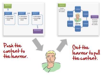
Many elearning courses push information to the learners. I discussed this a bit in the blog post, Are Your E-Learning Courses Pushed or Pulled? The assumption is that people will learn because we make the information available to them. While you do get the informat
ion out there, it doesn’t mean any of it is relevant or sticks.

Ideally, elearning courses have the learners pull information. You do this by giving them a reason to look for it and use it. Find out how the course’s content is relevant to them and then build places in the course where they are challenged to make decisions. Don’t push the information at them. Instead, give them a means to find it and then pull what they need to make the right decisions that help them learn.
Free Up the Course Navigation
Personally, I think one of the worst parts of elearning is when the navigation controls are locked. Typically, the rationale is that “we can’t guarantee that they get all of the information or view all of the screens.” This is a bogus reason to lock navigation. Essentially, you’re already admitting that the course is lame and not important to the learner because if given the opportunity, they’re going to leave. That’s not a navigation issue, that’s an instructional design issue.

If the content is relevant and meaningful to the learner, locking navigation is less an issue. The push-pull approach above is one way to make the content meaningful. You can explore some other ideas in this post on why course navigation is less important than you think.
For those who ask, “How do I know they learned what they needed?” I suggest that you look carefully at your course objectives. There’s a reason that the course exists. In some sense, you’re trying to persuade the learner to a point of view. Considering this, you have to determine how to measure your success at persuading them. When you look at it that way, locking navigation hardly seems a successful route of persuasion.
If the goal is to teach something, then having viewed a screen is probably not the best measure of success. Figure out how the learners can demonstrate their understanding of the content, and then build scenarios, assessments, or other decision points in the process so they can demonstrate their understanding. That’s more meaningful than screens viewed.
There are other ways to make your content remarkable. You can get rid of a lot of content or come up with creative and unique ways of presenting the information. The main point is to look at your courses and ask if they stand out. Are you building grey squirrel courses that are ho-hum and easy to ignore? Or are you building courses that like the black squirrel make people take notice and desire to know more?
What are some tips you have for making elearning courses more remarkable? Share them by clicking on the comments link.
Events
Free E-Learning Resources


81
comments