The Rapid Elearning Blog

Archive for September, 2011


The Rapid E-Learning Blog - avoid common roadblocks

Building elearning courses is hard enough.  Most people are working with limited resources and time.  So having to deal with anything that slows down the process is a hassle.  Here are three common roadblocks and ways to avoid them.

Lack of Clear Objectives

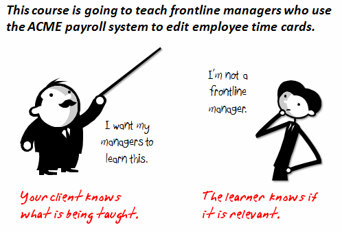
I get to look at hundreds of courses during the year.  One of the biggest issues I see is that the objectives of the course aren’t clear.  They’re all wishy-washy with statements like you’ll “learn” or “understand.”  They tell you what you should learn, but they should be telling you what you’ll be able to do.
The Rapid E-Learning Blog - create clear objectives

Don’t make a list of objectives based on what a person should learn or understand.  Instead declare what the person will be able to do.  And then determine how you’ll prove that they can do it.

At a previous place we used to ask, “If I saw it in action, what would it look like?”  This helped us to focus on actionable results.  If there’s nothing to see or no real action associated to the course completion, then you might want to consider not building the course.

Sloppy Asset Management

One of my pet peeves is tangle cords.  There’s nothing more frustrating than going to get an extension cord or a power adapter out of a box and find it all tangled and knotted.

In the elearning world, sloppy asset management is like a box of tangled cords.  It wastes time because it’s hard to find what you need when you need it.  This is easy to avoid.
The Rapid E-Learning Blog - use a consistent asset management system

Here are two simple things you can do:

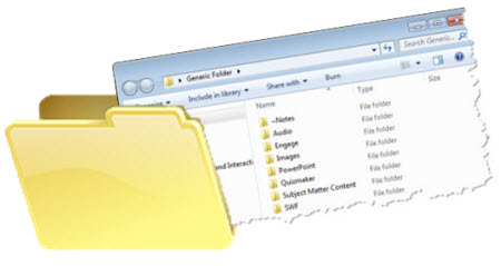
  • Create a generic folder structure for your courses.  I have a folder that I copy when I start a new project.  Inside that folder are other folders that will hold the courses assets.  Some of the sub folders I have are: Quizmaker, Engage, Flags, audio, images, notes, fonts, templates, etc.  Every course I build uses the same folder structure so I know where things are and it’s easy to share the project folders with others.
  • Come up with a consistent naming structure.  I’ll have to admit that I can get a little sloppy on this myself.  I don’t know how many “temp” folders I have on my desktop.  There’s no set rule on how to do it, but come up with a consistent way that you and your team can identify and label your files.  Common elements are version numbers and date created.

Who Controls the Content?

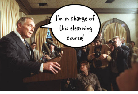
Who owns the content and has final say on the design and implementation of the elearning courses?  If you’re the subject matter expert and final authority of the content, then that’s perfect.  But for many, that’s not the case.  Find out who owns the content.
The Rapid E-Learning Blog - find out who's in charge

There are a few things to consider:

  • Who can help you identify and craft actionable objectives?
  • Who gets to offer feedback and make changes to the content?
  • Who owns the final sign off?  Pull those people in right away so you don’t have to make last minute changes.

There’s a lot that goes into building elearning courses; and with that a lot that can slow things down.  Develop clear objects, keep track of your files, and make sure you’re connected to the right people.  That’ll help you stay on top of things and make the development process much more successful.

What are some roadblocks you experience?  What do you do to avoid them?  Feel free to add your thoughts via the comments link.

Events

Free E-Learning Resources

Want to learn more? Check out these articles and free resources in the community.

Here’s a great job board for e-learning, instructional design, and training jobs

Participate in the weekly e-learning challenges to sharpen your skills

Get your free PowerPoint templates and free graphics & stock images.

Lots of cool e-learning examples to check out and find inspiration.

Getting Started? This e-learning 101 series and the free e-books will help.


The Rapid E-Learning Blog - free projection screen resources

A lot of rapid elearning content finds its roots in repurposed classroom slides.  The challenge is to rework the screens and get rid of the bullet points so they don’t always look like classroom slides.

A great way to get out of the PowerPoint look is to create screens that hold content in different ways.  For example, if you put a TV monitor on the screen you’re less inclined to use bullet points.  So a good way to rework the screens (and get rid of bullet points) is to think of different types of display screens you can use as content holders.

WARNING: Course context is everything.  So don’t get rid of bad bullet points and replace them with display screens that make no sense.

With that said here are a few ideas from previous posts and those are followed with some new ones and free downloads.

The Rapid E-Learning Blog - examples of free PowerPoint templates

You can download many of these templates (and more) from the E-Learning Heroes community.

In today’s post, I thought I’d share yet one more display screen graphic—the projection screen.  Projection screens are common to training so they make good content holders.  And many elearning courses use characters in front of projection screens.

Here are a few simple projection screen images that I created.  They also included the original PowerPoint files.  Feel free to use them as you wish.  In addition, here are some tutorials on how to create the projection screens on your own.  You’ll see that they’re very easy.

The Rapid E-Learning Blog - 5 free projection screen images

Generally, I like to keep the screens simple.  You want the essence of the screen, but not all the work required to make it detailed.  Plus, the less detail the better they work with the vector images.

Below are links to the tutorials where I show how to create them.

You can download the projection screens as images from here.  And if you want the PowerPoint files to deconstruct them, you can download from here.

I also pulled the tutorials into a single module for those who can’t access Screenr.

The Rapid E-Learning Blog - free tutorial that shows how to make graphics in PowerPoint

Click here to view the tutorials.

Hope you enjoy the free resources.  If you make some of your own projection screen images, feel free to share them with the community or via the comments link.

Events

Free E-Learning Resources

Want to learn more? Check out these articles and free resources in the community.

Here’s a great job board for e-learning, instructional design, and training jobs

Participate in the weekly e-learning challenges to sharpen your skills

Get your free PowerPoint templates and free graphics & stock images.

Lots of cool e-learning examples to check out and find inspiration.

Getting Started? This e-learning 101 series and the free e-books will help.


We’re in the middle of beta testing a new product.  It’s an interesting process because I get to see how people approach their projects and the steps they use to solve problems and find solutions.

I had a conversation with a beta tester who was struggling with doing something.  One reason for his struggle was that he was applying production techniques he used for a different product to the beta software.  So things weren’t working as he had planned.

His struggle was one common to many of us.  He started with a solution and then tried to make it fit the problem he was trying to solve.  He started with a production process (solution) and then tried to force his objective (completing his project) to the solution.

He should have stepped away from the solution, taken a closer look at what he wanted to do, and then look at the options he had for meeting his objective.  At that point he could have determined the most effective solution for meeting his goals.  It would have saved him some time and frustration.

Starting with a solution isn’t an issue isolated to those beta testing software.  It’s really an issue with a lot of training and elearning programs.  How often have you been in a meeting where the client says, “We need a new course,” before they even presented their objectives?  It seems that almost every time I start a project, the client’s already determined that some sort of training is required even if that’s not always the case.

Recognize that elearning courses aren’t the objective.

E-learning courses (and training programs for that matter) exist to meet objectives.  They really aren’t THE objective.  They’re solutions.  If you start with a pre-determined solution without evaluating your objectives, there’s a good chance that you won’t meet your objectives.

It’s easy to be seduced by solutions because these seem tangible and active, especially with the simple and quick authoring of rapid elearning tools.  They allow you to easily create solutions.  Need a quick course?  No problem.  I can get one to by the end of the week.  And many times you’ll be the rock star at work because you’ll have this cool, interactive elearning course to show off.  That’s a lot more tangible than a brainstorm list of possible solutions.

Step away from the solutions.

Before committing time and resources to a solution make sure you fully understand the objectives.  What do you hope to accomplish?  Once you’ve done that, you’ll be able to look at all of the solutions available to you and then decide which is best to meet your objectives.

Another reason to step away from the solution is that we tend to get enamored with features and then work to get our objectives to meet the feature whether or not it adds real value.

Collect data to help make an informed decision.

We’re an information-driven culture so it’s easy to understand why we fall back on the need to create a course.  The thought is that if only people knew more they’d be able to make better decisions and accomplish their goals.  So a lot of our training is focused on pushing information to people so that they can know more.

Let’s take a step back and do the “knowing more” at the front end.  What do you know about your objectives?  Why do they exist?  Usually there’s some sort of gap between where you are and where you want to be after the training is implemented.

What’s causing the gap?  Is it really a lack of knowledge or understanding, which may require training?  Perhaps there’s a lack of resources?  Maybe there’s an issue with motivation.

As you can imagine, not all gaps are covered by a training program.  Many times there are issues like performance support, management styles, personal motivation, or available resources.  No matter how hard you try, the elearning course won’t fill those gaps.

Determine the best solution.

Once you’ve identified your objectives, you’re able to determine the best solution to meet them.  Somewhere in the process you’ll know if an elearning course is part of the solution.  If it’s not, then you’ve saved the organization time and money.  On the other hand, if it is, you’ll have a better handle on the objectives and what you need to do to meet them.  You’ll also have some metrics to compare the pre- and post- course results.

Elearning courses play a role in your training initiatives.  But they’re not always the right solution.  Before you invest a lot of time and money into building courses, make sure you know that the course will meet your objectives.

And then when you do start building the course, worry less about using the feature and more about what you want to do.  Then figure out which features let you do that best.

E-learning books don’t usually deal with this type of stuff and the decisions you have to make prior to building the course. But your successful implementation of elearning requires that you’re building the right type of courses (if at all). While you don’t need an MBA in business, you should be familiar with performance consulting at some level.

Here are a few book recommendations.

The links to Amazon books produce a slight commission.

If you want to recommend a good resource or performance consulting blog, feel free to mention it in the comments section.

Events

Free E-Learning Resources

Want to learn more? Check out these articles and free resources in the community.

Here’s a great job board for e-learning, instructional design, and training jobs

Participate in the weekly e-learning challenges to sharpen your skills

Get your free PowerPoint templates and free graphics & stock images.

Lots of cool e-learning examples to check out and find inspiration.

Getting Started? This e-learning 101 series and the free e-books will help.


The Rapid E-Learning Blog - build a free laptop image

My guess is that some of the most common screen elements in elearning courses are computer monitors.  They’re nice to use because contextually they fit elearning.  And they’re great for holding the images and multimedia we use.

There are all sorts of computer monitors available through the office online site.  But sometimes it’s just easier to build what you need.  Plus, it’s a great way to learn more of PowerPoint’s illustration features.

In today’s post, I’ll show you how to build a laptop monitor inspired by the free laptop image file you can get from the psdGraphics site.  It’s pretty simple and is made up of a rounded rectangles and essentially the same gray gradient.

Below is the tutorial.  And at the end of the post you’ll find the original PowerPoint file for you to download and deconstruct.

The Rapid E-Learning Blog - psdGraphics inpsired laptop graphic

Click here to view the tutorial via Screenr.

Here are some simple steps to create the laptop:

  • Start with a rounded rectangle to create the top of the laptop.  Then fill it with a gray gradient that runs from the top left-corner to the bottom right-corner.  Add a thick line to the outside and use the same gradient, but make the light gray on top just a bit lighter.
  • Duplicate the rounded rectangle shape and scale it down a bit.  Center it and then fill it with your wallpaper image.  I also like to add an inset shadow to create some separation.
  • The bottom keyboard shape is a rounded rectangle with the top squared off.  Use the format painter to fill the shape with the same gray gradient as the top and change the angle of the gradient to straight down so the dark is on the bottom.
  • Create a small pill-shaped rounded rectangle and use the format painter to fill it with the same as the keyboard section.  Then turn the shape upside down to create that indented look.
  • Add a trapezoid shape to connect the top and bottom of the laptop.  Fill it with the dark gray and then send to the back.
  • To create the light effect, use a shape filled with semi-transparent white.  Then right click and edit the points to the angle you want.  If you find it a challenge to create the light effect, just skip it.

Bonus tip:

  • If you want to add pictures or videos over the laptop image, then it’s probably a good idea to just fill the inside with black and square off the corners since the videos won’t have rounded corners.
  • I combined shapes in PowerPoint 2010 to cut a hole in the lid and make it transparent.  I saved it as a PNG.  The inside is transparent and lets me put anything under the laptop image.

Here’s a quick mockup of how you could use the laptop image in an elearning course. I also added the tutorial to the last slide for those who can’t access the Screenr tutorial.

The Rapid E-Learning Blog - laptop tutorial and examples

Click here to view the demo.

As you can see, building your own illustrations in PowerPoint isn’t that difficult.  It’s just a matter of doing a few and soon you’ll develop a knack for building your own.  At a minimum, these types of tutorials are good for you to practice your PowerPoint skills.

Of course if you don’t want to build the laptop image yourself, feel free to download the PowerPoint file or the laptop images I created from the Elearning Heroes community:

Here’s an illustrator tutorial that shows how to build a different type of laptop.  Do you want to try building it in PowerPoint?  If so, let us know how it comes out.

Events

Free E-Learning Resources

Want to learn more? Check out these articles and free resources in the community.

Here’s a great job board for e-learning, instructional design, and training jobs

Participate in the weekly e-learning challenges to sharpen your skills

Get your free PowerPoint templates and free graphics & stock images.

Lots of cool e-learning examples to check out and find inspiration.

Getting Started? This e-learning 101 series and the free e-books will help.