The Rapid Elearning Blog

Archive for March, 2013


Articulate Rapid E-Learning Blog - hundreds of free textures for elearning

There are tons of free textures and background images online. Some good and some not so good. It can be a bit overwhelming looking for textures so I went through some of the free textures and included the ones I think work well for elearning courses.

To save you some time, I looked around and only added textures that are free to use for commercial projects. Of course, it is a good habit to give props to the source of the free file. If you can’t give them a link back, at least go to their site and let them know you appreciate the free help.

Which Textures Work Best for E-Learning?

Fortunately no one’s written a book on the science of using textures in elearning courses. So for right now, you’re free to use any texture you like. But that may change at a future elearning conference.
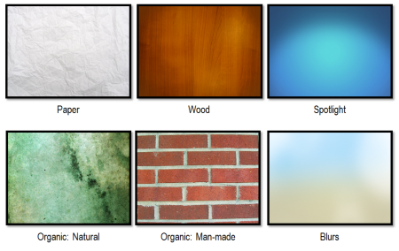
Articulate Rapid E-Learning Blog - examples of free textures

In either case, here are the main categories that I look for:

  • Paper: These work well for office-theme courses.
  • Wood: As Seinfeld says, “Wood is good.” Enough said!
  • Spotlights: Spotlight effects can help pull the eye towards the content area.
  • Organic Natural: Organic material like rocks, torn paper and vegetation works because they don’t have straight lines. It gives you some wiggle room in your composition.
  • Organic Man-made: Includes organic textures like brick walls and wood planking. They combine the organic look with sectioning or straight lines that work well in screen composition.
  • Blurs: Blurred textures suggest depth or context without pulling your focus. They also help the content on the screen standout.

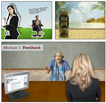
As a bonus, while it’s not a texture, I do like the why-be-flat approach for screen backgrounds where we combine design elements to create depth and perspective.

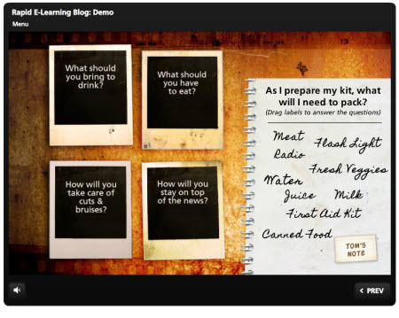
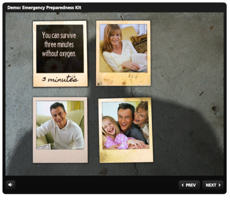
Here are two demos from recent posts on simple background images and creating course objectives. They’re essentially the same. In one I used a film strip texture. And the other uses a grungy concrete. They may give you some ideas on how to use textures.

Film Strip Texture

Articulate Rapid E-Learning Blog - example of elearning course and texture

Click here to view the film strip demo.

Grungy Concrete Texture

Articulate Rapid E-Learning Blog - example of elearning course on concrete texture

Click here to view the concrete demo.

Free Textures

Here are some free textures that may work for your elearning courses. I tried to only include the ones that allow commercial use. As always with these free resources, be sure to do your own research on terms of use prior to using them in a project.

Free Paper Textures

Free Wood Textures

Free Spotlight Textures

Free Organic Textures

Free Blurred Image Textures

If you do a search online, you’ll find all sorts of free textures. So have at it. The key though is that not all free textures are free for commercial use. Based on my research, the ones I’ve included above are available for commercial use. So you should be able to use them in your elearning projects.

What are your favorite textures and do you have a place to go for commercially free textures? If so, please share the links with the rest of us.

Events

Free E-Learning Resources

Want to learn more? Check out these articles and free resources in the community.

Here’s a great job board for e-learning, instructional design, and training jobs

Participate in the weekly e-learning challenges to sharpen your skills

Get your free PowerPoint templates and free graphics & stock images.

Lots of cool e-learning examples to check out and find inspiration.

Getting Started? This e-learning 101 series and the free e-books will help.


Articulate Rapid E-Learning Blog - free elearning templates and PowerPoint

As a matter of habit I review design sites looking for inspiration and ideas that I can practice and incorporate into my elearning designs. Often I won’t even use the design ideas for real work, but I still like to practice building them.

This practice lets me develop better designs skills and helps me become more efficient using my elearning tools as I develop more production tips and procedures. In fact, over the years that’s how I learned most of my advanced PowerPoint skills.

When I find something I like, it gets added to a folder. Then when I get time or need some inspiration, I’ll run through the folder for ideas. Here’s something I ran into a couple of weeks ago that will come in handy for an elearning course. I’ve also included downloads for Storyline and PowerPoint below.

Pre-built Gate Screens

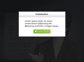
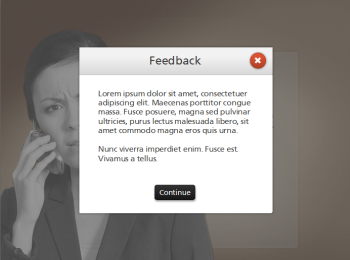
A common part of many elearning courses is the instruction or feedback screen. I like to call them “gate screens” because they serve as gates by stopping the flow of information until you’re ready to move on. I wrote more about them in this recent blog post on stopping the learners before they get started.

Articulate Rapid E-Learning Blog - example of a free PowerPoint gate template

Introduction Gate

Articulate Rapid E-Learning Blog - example of a free PowerPoint gate template

Feedback Gate

Because these gate screens are very common to elearning, a simple way to speed up production of your courses is to pre-build a few of them. And then when you need a gate screen, you’re ready to go.

Inspiring Ideas

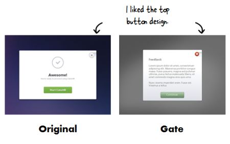
One of my favorite design sites is Dribbble. It’s a community of designers who share ideas and feedback. As I was looking at some of their demos a few reminded me a bit of the gate screens I’d build for an elearning course. So I used some of those ideas as inspiration for a few simple gate screens.

Articulate Rapid E-Learning Blog - inspiration for the free PowerPoint gate template

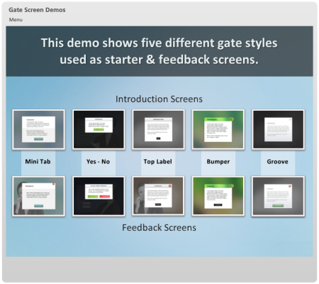
Below is a demo of five gate screens. I show them as both introduction and feedback screens. The demo’s built in Storyline. But you can use them in Articulate Presenter and PowerPoint, as well. In fact, I used PowerPoint to build the all of the initial templates. Which allows me to reiterate something I stress all the time—PowerPoint is a great tool for basic illustrations and graphic design.

Articulate Rapid E-Learning Blog - demo of the elearning gates in Storyline and PowerPoint

Click here to view the demo.

I’ve included some files for you to download and use if you’d like. Feel free to use them as you wish.

Free Downloads:

  • Storyline: You’ll find two slides for each gate screen.
  • PowerPoint: You’ll need to copy and paste the gate objects to a slide. Then set your hyperlinks to branch to the appropriate slides.

Here are links to the originals because I want to give props to the many designers who freely share their ideas and things they’re working on. They always give me some cool ideas to play with.

So there are two key lessons for today’s post:

  • The first is to continually look for inspiration and apply the ideas. They’ll improve your design skills and help you be more fluent with your elearning tools.
  • The other key idea is that you can pre-build certain parts of your elearning course. Then when you need them you’ll be able to speed up production and save time.

Have you found any cool ideas that would make great gate screens? If so, please share them with the rest of us.

Events

Free E-Learning Resources

Want to learn more? Check out these articles and free resources in the community.

Here’s a great job board for e-learning, instructional design, and training jobs

Participate in the weekly e-learning challenges to sharpen your skills

Get your free PowerPoint templates and free graphics & stock images.

Lots of cool e-learning examples to check out and find inspiration.

Getting Started? This e-learning 101 series and the free e-books will help.


Articulate Rapid E-Learning Blog - are you sure you want to click that next button

In my elearning workshops we discuss the parts of elearning courses that are common to most courses. One of the goals is to get participants to think through the common parts of a course and then determine how much of that can be prebuilt to save time.

For example, most likely the course will have welcome and exit screens. They may not look the same for each course, but odds are that both will exist. Why not build a template that has a screen reserved for the welcome and exit process of the course? At this point, you’re not assigning a look or feel; you’re just making a space for it.

Introducing the Gate Screen

Another common part of many courses is what I like to call the “gate screen.” It’s a screen that serves as a gate by stopping the flow of information until the learner is ready to move on. Generally, there are two types of gate screens: introduction and feedback.

Introduction Gate. This gate usually appears prior to the start of an interaction. It pauses the course to provide some introductory information and instructions. Then when the person is ready, she can advance.

Articulate Rapid E-Learning Blog - example of an elearning gate screen

Feedback Gate. The feedback gate does the same thing as the introduction gate—it pauses the flow and provides some information which is usually the result of a decision the learner’s made. This type of gate is very common as feedback in elearning quizzes. Make a choice and hit submit. Up pops the feedback screen. Read the feedback and then click the next button (or possibly go back to make a different choice).

Articulate Rapid E-Learning Blog - example of an elearning gate screen for quizzes

Both of these gates are essentially the same because they stop the flow of information, let the person regroup or get oriented, and then move on.

As I stated earlier, these are fairly common in the construction of elearning courses. And since that’s the case, why not plan for them in your design before you get started?

  • Create a placeholder for the gate screens in your initial design so you don’t forget to add them in during the production process.
  • Plan the look so that it fits your course design. The last thing you want is a Frankencourse. I usually use the same design for both gates and then just change the buttons and placement of them for each screen.
  • Determine the user experience. How will they work and will they seem intuitive to the flow of the course?

The two gate screens are essentially the same. They’re gates that stop what you’re doing; get you to focus on something; and when you’re ready let you advance (or go back). And odds are that they’ll be in your next elearning course. So why not save some time by putting them in the production queue before you get started?

Do you use gate screens in your elearning course? If so, share with us how you use them.

Events

Free E-Learning Resources

Want to learn more? Check out these articles and free resources in the community.

Here’s a great job board for e-learning, instructional design, and training jobs

Participate in the weekly e-learning challenges to sharpen your skills

Get your free PowerPoint templates and free graphics & stock images.

Lots of cool e-learning examples to check out and find inspiration.

Getting Started? This e-learning 101 series and the free e-books will help.


Articulate Rapid E-Learning Blog - the world isn't flat why are my elearning courses

Many rapid elearning courses look at lot like the stereo-typical PowerPoint slide. They’re flat and bland. In a recent email, someone wanted to know how to make their screens look more interesting without requiring advanced graphics skills.

In today’s post I’ll show a simple tip that we’ve been sharing in our workshops for a few years now.

Why Be Flat?

We call the following tip the floor-wall-baseboard (FWB) technique. However at a workshop a few years ago, one of the participants recommended we change the FWB to WBF (Why Be Flat). I like it.

Why be flat? That question addresses the essence of this technique. Why should your screen be flat? The world isn’t flat (maybe). It has dimension and perspective. So why not do the same for your elearning courses?

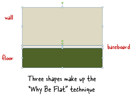
The trick is to break the screen into three pieces: floor, wall, and baseboard. That’s all you need to get started. To do this, create three core shapes. The shapes can be filled with solid colors, gradient effects, or images.

Articulate Rapid E-Learning Blog - the floor wall baseboard technique for elearning

Essentially you’re adding a horizon line which creates a sense of perspective and the illusion of space. This allows you to convert a flat screen into one that is visually rich and offers a sense of perspective.

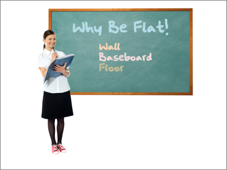
Here’s a quick example of the “Why Be Flat” technique.

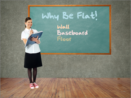
Articulate Rapid E-Learning Blog - simple elearning screen

The image above represents the typical slide. We have a character and we’re using the ever popular chalkboard. This screen isn’t bad, but the background is stark and there’s no depth.

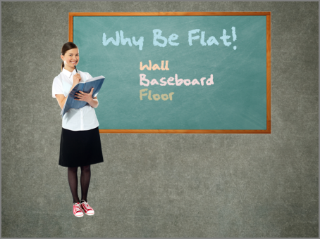
First, we’ll add a different background. That’s our wall.

Articulate Rapid E-Learning Blog - add a background to the elearning screen

The wall already starts to make the screen look more interesting. The white’s gone and the screen has a softer and more elegant look. Next we add the floor.

Articulate Rapid E-Learning Blog - add perspective to the elearning screen

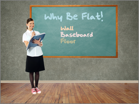
The floor creates the horizon line which gives the image depth and is visually rich. But just like when remodeling your house, you want a baseboard on the floor to add that extra finish.

Articulate Rapid E-Learning Blog - add more perspective to the elearning screen

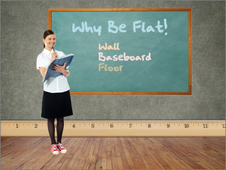
As you can see, the baseboard does a great job dressing up the image. It creates a clean line; and based on where it’s positioned, the baseboard adds perspective. The cool thing is that you’re not limited to be too literal. In the example below, the baseboard’s a ruler which ties into the visual theme of education.

Articulate Rapid E-Learning Blog - the visual design in your elearning screen doesn't need to be literal

The examples above are a literal floor, wall, and baseboard. But don’t limit yourself to what’s literal. The key point is to create a horizon line and then work from there. In fact, David Anderson, who presents with me at my workshops, has some really good tips on using the “Why Be Flat” technique for your elearning.

If you want to continue the conversation and learn more, follow this thread in the elearning community. It offers some additional tips and tricks as well as files to download.

Events

Free E-Learning Resources

Want to learn more? Check out these articles and free resources in the community.

Here’s a great job board for e-learning, instructional design, and training jobs

Participate in the weekly e-learning challenges to sharpen your skills

Get your free PowerPoint templates and free graphics & stock images.

Lots of cool e-learning examples to check out and find inspiration.

Getting Started? This e-learning 101 series and the free e-books will help.