The Rapid Elearning Blog

Archive for February, 2014


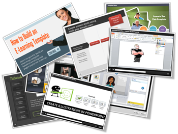
Articulate Rapid E-Learning Blog - 9 examples of online software training

The other day someone asked for different ways to present simple screencast videos. They didn’t want an elaborate production process. Instead just a few ideas to help them change up the way they’re currently doing their screencasts for their online software training.

I regularly put together simple screencast videos. Sometimes I’ll play with different ways to present the information. Below are a few examples from the blog over the past couple of years. I highlight some of the things I did to mix it up a bit.

Not All Software Training Needs to Be Video

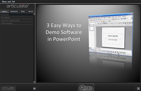
In the example below, I demonstrated how sometimes it’s easier to use static images to teach about software than creating a video. Some of the benefits of this approach are smaller file size, easier updating, and less production time.

This example was built in PowerPoint. So if you don’t have a different application, you can still create some simple interactivity that mirrors the software training.

Articulate Rapid E-learning Blog - 3 easy ways to demonstrate software in PowerPoint

Click here to view the demo.

Speed Up Production with a Form-based Software Training Application

Form-based tools are nice because they make production super simple. All you do is add your content to the form. This can be text, narration, images, or video. And then you hit publish. The software does the rest because it’s already designed to do something very specific. That means fewer decisions for you and a faster production time.

Articulate Rapid E-learning Blog - Use Articulate Engage to build simple softwarre training

Click here to view the simple software training demo.

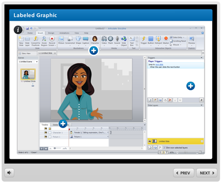
In the demo above, I used an image of the software I was training (in this case Articulate Storyline). Then I inserted some labels on top of the image to highlight features of the software.

This demo has three labels to show what you can do:

  • Text only: the easiest to do
  • Image & narration: added a more detailed image to dig deeper and recorded some narration to explain more
  • Video screencast: which lets me chunk up the video part of the training into smaller and more targeted videos.

Below are a few tutorials that I’ve done in the past. They’re mostly video screencasts. But sometimes I like to mix up how I present them. This way I can play with ideas on the look and layouts. I also try to add some interactive elements if I can.

Software Training: How to Customize a Free PowerPoint Template

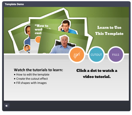
In this example, the main page mirrors the free PowerPoint template. I broke the tutorial into three chunks and used the circles as a menu.

Articulate Rapid E-learning Blog - how to build a custom elearning template in PowerPoint

Click here to view the software training example.

You’ll also notice that once complete, the circles indicate a visited state to show that the tutorial has been viewed.

Software Training: How to Crop Images in PowerPoint

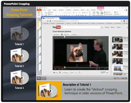
Here is a somewhat different take on the tutorial page. I was playing around with some drag & drop ideas where the end user selects a video and drops it in a box which loads the video.

Articulate Rapid E-learning Blog - learn how to crop images in PowerPoint

Click here to view the software training example.

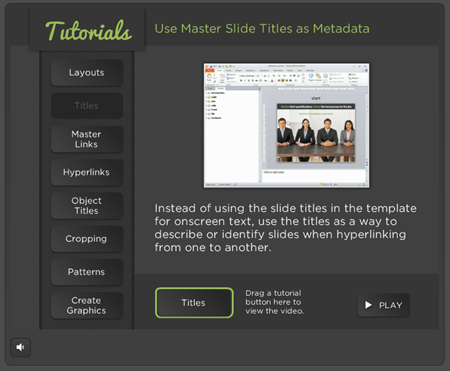
The tutorial below looks different but is similar in design. And here’s a follow up post on how to make the interactive tutorials more practical in their usability since the drag & drop interaction is novel, but maybe not always practical.

Articulate Rapid E-learning Blog - learn to create an interactive e-learning template in PowerPoint

Click here to view the software training example.

It’s easier to build a simple click interaction to play the video tutorials. But sometimes the contrast of doing something different (like a drag & drop) helps engage the person during the training.

Original posts:

Software Training: How to Build an E-Learning Template

In this example I start the tutorial with a simple page that explains the series of tutorials. The first tutorial just goes to just the video. For the second tutorial, I added a start image with the idea that you can quickly brand or describe the video prior to clicking.

Articulate Rapid E-learning Blog - how to build an elearning template

Click here to view the software training example.

You’ll also notice that in this demo I chose not to use the player controls so the profile of the course is a bit different.

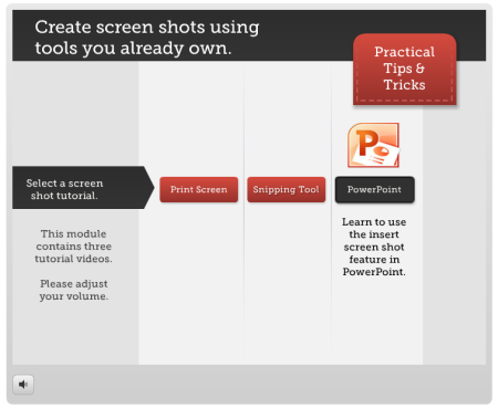
Software Training: 3 Tools You Own to Take Screenshots

For this example I tried a different looking layout and some animations to make the menu screen less static. On each button there’s an animated icon and tutorial description.

Articulate Rapid E-learning Blog - three free screencast tools you may own

Click here to view the software training example.

Each video starts with a washed out screen and title bar graphic. This fades away as the video plays. I also added an interactive menu for quick access to the other tutorials.

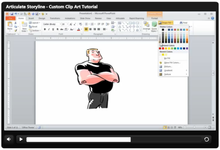
Software Training: How to Customize Clip Art

Articulate Rapid E-learning Blog - how to customize clip art in PowerPoint

Click here to view the software training example.

This example is pretty generic because it just starts right with the screencast tutorial. I threw it in as a way to show some contrast compared to the examples above.

What I like about some of the other examples is that there’s more visual indication of what the tutorial covers. You don’t get that with just the video, unless you add some details to the screen like a starter image or title graphic.

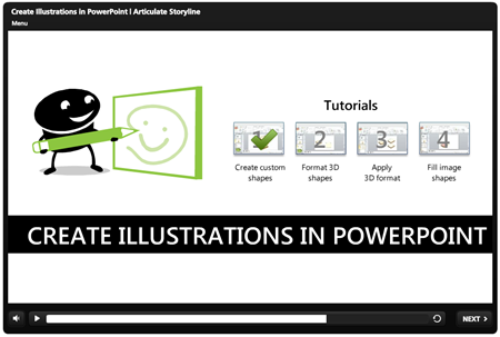
Software Training: Create Custom Illustrations in PowerPoint

In this last example, the software training has links to four tutorials with descriptive titles. And the tutorials have a visited state to indicate that they’ve been viewed.

Articulate Rapid E-learning Blog - How to use PowerPoint to create your own custom illustrations

Click here to view the software training example.

So there you have it, simple examples of different ways to build your screencast tutorials. The easiest thing is to just record the screencast video and upload it to a server. But sometimes it helps to change things up. That’s what I showed with these examples.

My favorite demo is the last one. I like it because it’s a combination of tutorials with visited states. I also like the simple title graphic and that it is consistent across the other tutorials.

Hopefully these examples inspire your own ideas for your next screencast or online software training. Which of the examples above do you like best and why? Or what would you recommend for those just getting started? I look forward to your comments.

Events

Free E-Learning Resources

Want to learn more? Check out these articles and free resources in the community.

Here’s a great job board for e-learning, instructional design, and training jobs

Participate in the weekly e-learning challenges to sharpen your skills

Get your free PowerPoint templates and free graphics & stock images.

Lots of cool e-learning examples to check out and find inspiration.

Getting Started? This e-learning 101 series and the free e-books will help.


Articulate Rapid E-Learning Blog - visual design for e-learning

In a recent post, I discussed some issues that organizational branding introduces to course design. In today’s post we’ll review a few of the visual design issues I often see in some of the elearning courses I review.

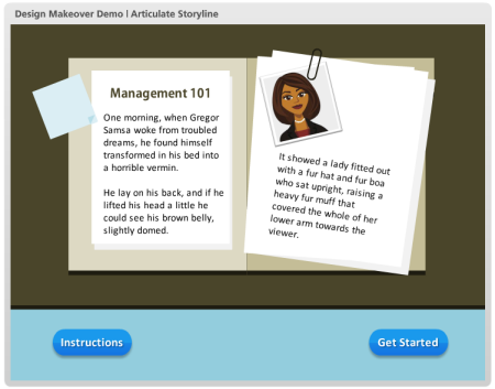
Below is a demo course slide that represents a few common design issues. Look over the interactive slide and we’ll review it below.

Articulate Rapid E-Learning Blog - example course for elearning

Click here to view the interactive example.

Following are a few things that stood out to me and some ideas on how to fix them.

Elements Should Follow a Consistent Design

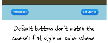
The first thing you’ll notice about this example is that the course has a flat visual design. However, the buttons I added use the default gradient and shadowing that comes out of the box. Normally, contrast is a great way to draw attention to the onscreen information. Having a contrasting button is good. But in this case, it probably makes sense to go with the flat design of the course rather than the default buttons.

Articulate Rapid E-Learning Blog - buttons should match the course design

My fix would be to drop the default button settings and create a flat button that matches the course design. Also use a matching color scheme. Rounding the button works since it is a button and you do want it to stand out. I’d go with a softer rounded edge rather than the pill shape.

Not All Onscreen Objects Are Equal

You’ll notice that the two buttons are equal in prominence. However, which button do you want the learner to click? My guess is that it’s not the “Instructions” button.

Seems to me that “Getting Started” is key. That’s what I want the person to do. The instruction button is important and exists for a reason, but give it less prominence.

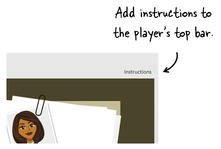
An easy solution is to add the instructions to the top tool bar. That makes them available to the person who needs them, but doesn’t make them prominent.

Articulate Rapid E-Learning Blog - add course instructions to the player bar

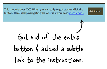
Or you can replace the button with a simple text link in the instructions to get started.

Articulate Rapid E-Learning Blog - get rid of less prominent buttons

Either way, you give less prominence to the “Instructions” button and place more focus on the “Get Started” button.

How are You Revealing More Information?

Hover effects are great for elearning courses. They expand the screen’s real estate since the information is not available until the person activates the hover. Thus you don’t need to reserve space for that information on the main screen.

In this demo there are a few issues with the hover effect:

  • Do you need instructions when the instructions are so obvious? If the button says “Get Started” I probably don’t need an additional box that states that the button is for getting started. It’s redundant and seems like a waste of time and effort.
  • Assuming the call outs are necessary, don’t use the defaults. Instead, have them match the course’s visual design.
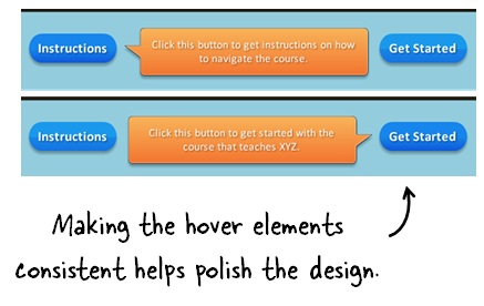
  • The call outs are different sizes, the tails are different, and the alignment is off. That needs to be fixed. They’ll look better and more polished if the alignment and sizing is consistent.
  • One of the callouts overlaps one of the other buttons. This is probably fine. But as a general rule, I try not to block other interactive objects on the screen if I don’t have to. Just something to consider.

Articulate Rapid E-Learning Blog - create consistent design elements in course design

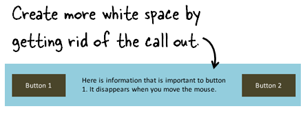
A simple solution to some of these hover elements is to create a hover dock. This is a place on the slide, where all of the mouseover information is revealed. This way you ensure consistency and don’t have to deal with the box size, colors, or shapes.

In the image above, the space between the buttons could be used as an area to reveal information. Since this is a clean space, you could get rid of the call out boxes altogether. This lightens the design and offers more white space.

Articulate Rapid E-Learning Blog - create white space in e-learning course design

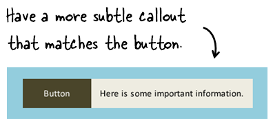
If you did want to have a call out, then do something like the image below were the call out is a bit more subtle, matches the design, and is connected to the button.

Articulate Rapid E-Learning Blog - make callouts more subtle

Here’s a made over demo, where I show a few different ways to modify the slides.

These types of issues are common to many of the courses I review. The good thing is that they’re really simple to fix. The key is that your design is intentional and that by fixing these simple issues you present something more polished and professional. This is really important if you have limited graphic design experience and have to do all that work by yourself.

The other point I’ll make is that a lot of this is subjective. Do what you feel works best, but be consistent in what you do.

How would approach some of these design issues? Please add your comments here.

Events

Free E-Learning Resources

Want to learn more? Check out these articles and free resources in the community.

Here’s a great job board for e-learning, instructional design, and training jobs

Participate in the weekly e-learning challenges to sharpen your skills

Get your free PowerPoint templates and free graphics & stock images.

Lots of cool e-learning examples to check out and find inspiration.

Getting Started? This e-learning 101 series and the free e-books will help.


Articulate Rapid E-Learning Blog - how can your learners help you build better elearning

One of the best ways to build good elearning is to get close to those who are going to take the courses. This is because they often understand the content in a different way than the organization does.

A few years ago I worked for a large financial institution and was hired to build training for loan officers. One of my first requests was to meet with some loan officers. I wanted to get a sense of how they did their jobs and the decisions they made as it related to the course material.

I was told by the senior level management that the loan officers didn’t have time to meet with me and that it was a waste of time because the organization already knew what they needed to teach. I just needed to focus on the content and not waste time meeting with people who didn’t determine what that content was.

As can be expected, the result was a long-winded training program full of information but largely irrelevant to what the loan officers needed to do. But it was compliant with the various financial regulations, so the organizations saw it as a win. However, they missed an opportunity to craft a program more valuable to those they were training.

Understand Your Training Objectives

The truth of the matter is that often the objective of the training program really isn’t training. Often it’s to have a legal check mark on a piece of paper come December 31. In that case, instructional design is not the primary concern. Thus trying to figure out how to make the course more than an information dump can be a challenge.

It’s important to distinguish between compliance courses with no real training objectives from those where you are required to help change behaviors or improve performance. One type of course can get away with a simple information dump, but the other can’t.

Following are some tips to leverage the expertise and perspective of your learners to help develop an elearning course that meets their performance goals.

A Second Set of Eyes Always Helps

We tend to have blind spots or are a bit myopic. So it’s easy to overlook things that may be obvious to those who are less vested in what we’re doing. In that sense, it’s a good thing to have someone add eyes to the project.

When I prototype a course, I like to have someone look over it and provide feedback. It always amazes me how the second set of eyes helps. Often they’ll pick up on ways to tighten the visual design and many times offer ideas on how to approach the content from a different angle.

I may not always use the feedback, but the second set of eyes usually exposes something that forces me to think more about what I am doing.

Make time to get feedback from those who will take your courses. Ideally it’s a mix of recent and experienced staff. And don’t wait until the end. Try to pull them into the process as soon as you can. Build a prototype and have them give you feedback right away.

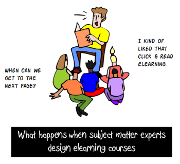
Only Course Developers Care About E-Learning

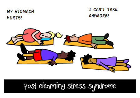
Most likely those who have to take the elearning courses don’t care about the courses as much as you do. Usually that’s because the elearning courses they take are largely irrelevant to their needs. Much of the training they have to complete has little to do with their performance goals and more to do with regulatory compliance. If I’m not a sexual harasser, why am I taking a course on sexual harassment? And then why is that course so long?

Articulate Rapid E-Learning Blog - post elearning stress sydrome

With all that said, there usually is a relevant angle to most of the training we create. It’s just that we need to discover it. If you want a course that is relevant to your learners, here are a few simple tips:

  • Ask the learners to review the content and then frame it in a perspective that makes sense to them and works in their world. I often ask for scenarios where these issues may happen. What types of decisions do they need to make? How do they handle them? Those scenarios can find their way into your courses.
  • Don’t rely solely on your subject matter experts. They may know the content, but over time they lose perspective on how they acquired it. Connect with recent learners to get their perspective. Compare what they learned in the training program to what was actually required on the job. See if there’s an opportunity to make the training better and more like the world they’ll function in.
  • Recruit people who don’t know anything about the course and have them go through it. Observe what they did and how they interact with the course. If you can’t afford a formal usability testing process, that’s OK. I usually have my wife or someone in the family look over the course. I’m sure you can find someone at work who can provide some insight. One set of eyes is better than no set of eyes.
  • Don’t wait until the end. Many developers wait until the course is almost complete before they test it. That doesn’t leave a lot of time to make changes. Develop a quick prototype and test that. Get some feedback and then start building. Find a few places to test and adjust. Often you’ll get valuable feedback that could change the way you want to develop the course. But if you wait until the end, it’s not going to happen.

One of the biggest questions I get is how to make the courses more engaging and relevant to the end user. A first step is to connect to the end user. Get their perspective and feedback and you’ll build more meaningful elearning courses.

What do you do to connect with the end users during your course development?

Events

Free E-Learning Resources

Want to learn more? Check out these articles and free resources in the community.

Here’s a great job board for e-learning, instructional design, and training jobs

Participate in the weekly e-learning challenges to sharpen your skills

Get your free PowerPoint templates and free graphics & stock images.

Lots of cool e-learning examples to check out and find inspiration.

Getting Started? This e-learning 101 series and the free e-books will help.


Articulate Rapid E-Learning Blog - Are you making these mistakes with your online training program

I was in London last week attending the Learning Technologies conference. It was great to meet so many blog readers and Articulate customers. During an interview at the conference I was asked about the three most common issues I see with elearning. Here are a few of my thoughts concerning those issues.

Will You Get 100% With a 50% Commitment?

There’s a big push to move content online. Usually the organizations start by converting existing classroom content into an “elearning” course. They do that with one of those easy-to-use rapid elearning tools. That part is good. The challenge though is that elearning is more than converting existing content to create online content.

Articulate Rapid E-Learning Blog - there's a lot that goes into building an elearning course

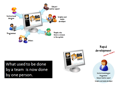
Many elearning developers kind of stumbled into the field. That means they usually don’t have a lot of the skills and experience required for more than basic course design and development. Sure they get the tools to create content and put it online. However, the organizations often tend to expect a result that is greater than the investment they make to get there.

If you want a successful elearning program you have to make the appropriate investment. Purchasing software like that made by Articulate is a good first step. But the software doesn’t determine course objects and it surely doesn’t replace sound instructional design. In addition, there’s more to elearning than just instructional design. For example, where will it reside and how do users access the courses? Will it be tracked? Who analyzes the reports?

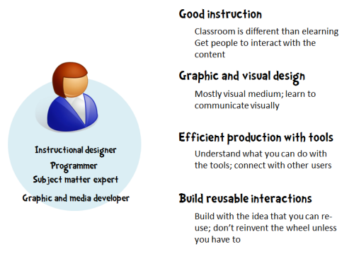
Articulate Rapid E-Learning Blog - elearning developers require a lot of divers skills

Here is a list of the types of skills required for successful elearning design and implementation. It’s not exhaustive but it does provide insight into what makes a course successful and that there are a lot of diverse requirements. This blog post on the skills you need to succeed will help flesh out some of those ideas.

Important E-Learning Skills

  • Project management: coordinate the design and delivery of the elearning course
  • Performance consulting: help the organization to identify the training need and recommend the best solution
  • Instructional design: craft a relevant learning experience to meet the course objectives
  • Graphic design: determine the visual design and develop the graphic assets
  • UX design: create the user experience
  • LMS/IT administrator: manage the course and access to it
  • Runner: order pizza and beer

Successful online training programs require people with these types of skills and understanding of technology. And the smaller the team, the more those expectations are placed on a single person. The organization needs to do those things that lead to success. Without the appropriate commitment, it’s guaranteed that the results will not be what they could be.

Do you Have Graphic & Visual Design Skills?

Articulate Rapid E-Learning Blog - visual design tips for elearning

Many people tend to be a one-stop solution for the organization. That means they’re doing most of what’s listed above. Outside of instructional design and fluency with the software, the single most important skill is graphic design. Considering the state of today’s elearning (where many courses are bland information dumps) it could be argued that perhaps graphic design may rank higher than instructional design. I’d rather have a good-looking bad course than a bad-looking bad course.

Here are a few posts that highlight key considerations for this type of design:

Does Your Online Training Impact the Organization?

Ideally every course we create is meaningful and provides a positive impact to the learner and the organization. However, the reality is that there are a lot of courses that only exist for the purpose of delivering information and tracking completion. In those cases, the courses aren’t designed to change behavior. Instead their objective is sharing information and marking it the course complete. With that said there are many courses that do require changed behavior where the learner is able to process and apply what the course teaches.

Articulate Rapid E-Learning Blog - performance consulting tips for elearning and online training design 

In the first example, the measure of success is course completion at the lowest cost to the organization. In the second example the measure of success is meeting performance expectations. It’s important to understand the distinctions between those two types of courses. Otherwise you’ll waste resources on courses that don’t really need them, and possibly not meet the goals of those courses that require improved performance.

The first step towards success is the quality of performance consulting and nailing down a clear objective and understanding of the organization’s goals. This helps you build the right course. It’s not always practical to build elaborate, scenario-driven courses when the only expectation is a check mark indicating completion. Build a simple course and save your resources for those that require them.

If you’re just getting started, here are some posts I’ve written in the past:

Ultimately the goal is to bring value to the organization. Sometimes value is found in performance improvement and sometimes it’s found in resource management. By understanding the types of course your need to build and the impact on the organization, you’ll be on the road to success.

Events

Free E-Learning Resources

Want to learn more? Check out these articles and free resources in the community.

Here’s a great job board for e-learning, instructional design, and training jobs

Participate in the weekly e-learning challenges to sharpen your skills

Get your free PowerPoint templates and free graphics & stock images.

Lots of cool e-learning examples to check out and find inspiration.

Getting Started? This e-learning 101 series and the free e-books will help.