The Rapid Elearning Blog

Archive for October, 2015


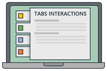
tabs interaction post

The most common types of interaction we see in elearning courses are the tabs interactions and for good reason—they’re an easy way to sort and present information. Tabs can be simple content chunks or a way to explore and collect information to make decisions during an interactive scenario.

The Value of the Tabs Interactions

Let’s face it, most elearning isn’t overly interactive. In fact, a lot of it is more explainer-type content than it is interactive decision-making. Regardless of how dynamic or interactive an elearning course is, the majority of it still consists of text and presenting content. And since you’re going to present content, tabs interactions are a great way to do so. Here’s why?

  • Easy way to organize content. Most elearning content follows some sort of sequential process. Tabs interactions are an easy way to organize and layout the content. Using tabs interactions also forces the course developer to better organize and label the content. The most popular type of tabs interactions are process interactions that go through procedural steps from A to Z.
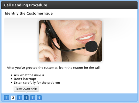
tabs interaction via process interaction

  • Chunk content for easier understanding. Many elearning courses have too much content that’s hard for the learner to parse. A lot of organizations are moving towards micro-learning where the content is distilled into easier chunks.  Tabs interactions are an easy way to create and organize the content into more digestible pieces. The entire course could be a single tabs interaction or the content can be chunked into slide-specific tabs.
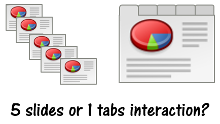
tabs interaction or slides

  • Open and personalized navigation. The tendency for many organizations is to lock down the course content and force the learner to go through it sequentially. One of the benefits of tabs interactions is that the navigation can be opened up and allow the person to go through the tabs in any order. And if the course needs to be locked down, it can happen with a conditional button that’s not active until all tabs are visited. Thus still providing some free navigation within the interaction.
  • Initiate learner engagement. One challenge with elearning is to engage those taking the course. Obviously we want to engage them with the content and learning to apply it. But we can also engage them by getting them to “touch the screen.” This is something we discussed in this post on interactive elearning. We want to pull them in and have them do something onscreen and then couple it with good decision-making. Tabs interactions help initiate the activity.
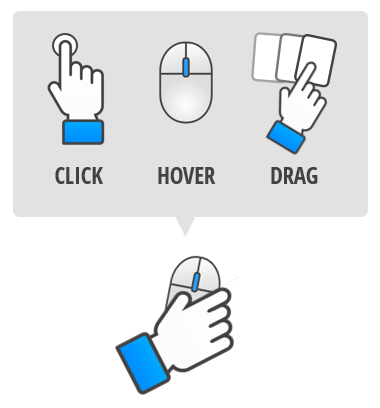
touch screen as part of tabs interaction

  • Lots of flexibility. As noted earlier, tabs interactions can be the entire course or the tabs interaction can be slide-specific. Tabs can be placed up, down, left or right. They can also be what I like to call in-slide interactions. The tabs are usually click-and-reveal interactions, but hover interactivity works, too.
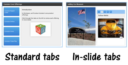
tabs interaction types

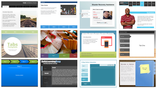
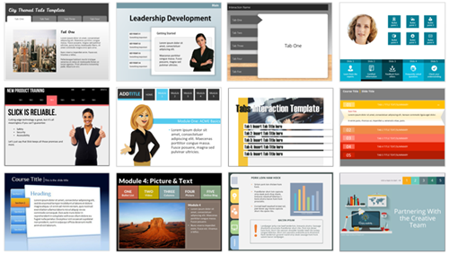
The next time you build an elearning course, don’t neglect the simple but effective tabs interaction. To help you out, I’ve included some links to many of the free tabs interactions templates you can download from the community.

Free Tabs Interactions Templates

PowerPoint Tabs Interactions Templates
free PowerPoint templates tabs interaction

Storyline Tabs Interactions Templates

free e-learning Storyline templates tabs interactions

Events

Free E-Learning Resources

Want to learn more? Check out these articles and free resources in the community.

Here’s a great job board for e-learning, instructional design, and training jobs

Participate in the weekly e-learning challenges to sharpen your skills

Get your free PowerPoint templates and free graphics & stock images.

Lots of cool e-learning examples to check out and find inspiration.

Getting Started? This e-learning 101 series and the free e-books will help.


instructional design tips

At a recent workshop I was asked to put together a post with some of my top instructional design tips. So here it is. Of course, over the past 8 years most of the posts are littered with various tips related to instructional design.

If there’s a single best tip it’s that the course content needs to be relevant to the learner’s needs. If not, why is the person taking the course?

Instructional Design Tips

Here’s a list of blog posts related to instructional design.

Instructional Design Tips from the Community

I’m a big advocate of the weekly elearning challenges because they offer a reason to step away from the daily grind of building the same types of courses and doing the same thing over again and again. We get to try out some new ideas, practice production techniques, show off our skills, and see how others approach the same challenge.

Here is a list of challenges that offer an extra bonus because they each share some tips and tricks that will help you build better courses.

Do you have any instructional design tips to share?

Events

Free E-Learning Resources

Want to learn more? Check out these articles and free resources in the community.

Here’s a great job board for e-learning, instructional design, and training jobs

Participate in the weekly e-learning challenges to sharpen your skills

Get your free PowerPoint templates and free graphics & stock images.

Lots of cool e-learning examples to check out and find inspiration.

Getting Started? This e-learning 101 series and the free e-books will help.


multimedia for e-learning blog post

Multimedia for elearning is something common to all of our courses. There’s only so much you can put on the screen. It’s either going to be text or some sort of multimedia like shapes, pictures, or video. In addition, you may have audio narration to complement what’s on the screen.

At some of our workshops we discuss inexpensive ways to acquire multimedia for elearning. We’ll reference some of the previous posts when we’ve discussed different ways to either get free multimedia for elearning or learn to create them yourselves:

However, sometimes you don’t have the time or skill to create your own assets. And all of those free media assets may not fit the real needs of your course design. That means you’ll have to find someone to build them for you.

Fiverr is a site that offers access to all sorts of multimedia and graphic artists for $5 a project. While the advertised costs are $5, most of the projects are limited in scope and the artists are looking for a way to market their skills and have up sells. If you plan it right, you can get multimedia for elearning at a reasonable price.

Here are a few examples I pulled together to give you some ideas. I have no affiliation with any of the artists and it’s possible they may have restrictions on what they will do. So you’ll want to connect with them personally.

Multimedia for E-Learning: Custom Illustrations

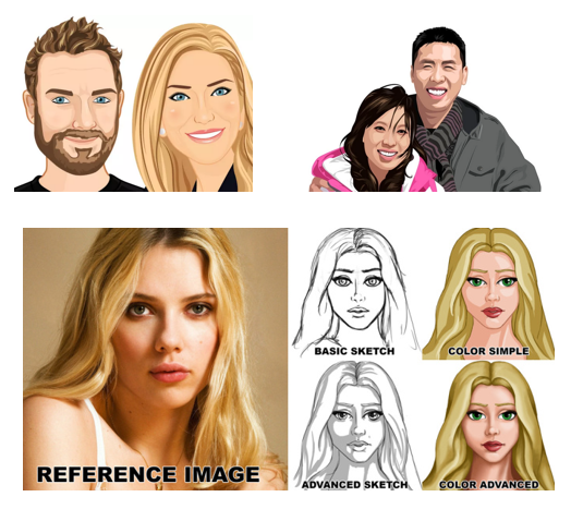
multimedia for e-learning inexpensive custom illustrations for e-learning

Proposed plan:

Many of the artists only do head and shoulder images. However, some do full body. They usually have a starting pay scale and range of add-ons. Even if the image goes from $5 to $50 per image, that’s a great deal for custom art work.

  • Storyboard your screens so you know exactly what characters and poses you need.
  • Create a shot sheet with a list of required characters.
  • Find some co-workers and take photos of the expressions and poses as a reference for your artist.

Artists shown: BroomvectorMariadesignsPunisher357

Multimedia for E-Learning: Audio Narration on a Budget

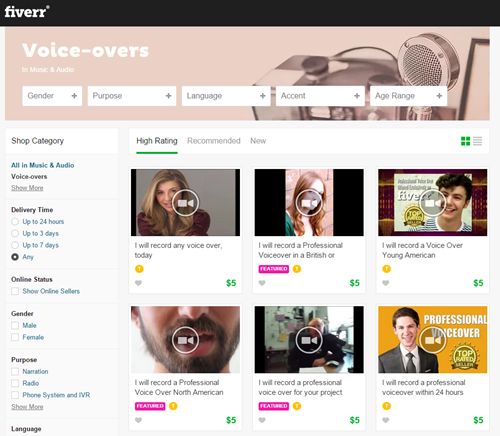
multimedia for e-learning voice over audio narration for e-learning courses

Proposed plan:

As can be seen in the image above, you can select voiceover talent by gender, accent, age, and more. There are a lot of really good voiceover artists on Fiverr. Most of them will do 75-100 words for $5.

This is close 75 words of text:

What would the world be like if the objects that surround us became less mysterious, if not only the bits but also the bolts became something into which we could peer? What if the black boxes that occupy our desks, our homes, our skies suddenly became transparent?

We asked more than a dozen open-minded technologists to explain how applying open source principles to physical devices is shaping the way we work and play.

That means you can get each slide recorded for about $5-15 per slide.

  • Write your narration script.
  • Get rid of half the words. You don’t need as much as you think you do.
  • Make sure it sounds like a human is reading it and not some corporate drone or lawyer (although they’ve been known to be human).
  • Get the final script approved before sending it out to be recorded to avoid do overs.

Multimedia for E-Learning: Video Actors & Presenters

multimedia for e-learning video presentations and green screen video for e-learning

Proposed plan:

Adding video to your elearning courses adds a lot of texture and personality. To me this is one of the best things available on Fiverr because creating video requires video production skills, audio narration, and great on-screen talent.

Many of the producers offer green screen recording so that adding the videos to your course screen is seamless. Although unless you can do the editing, you want to request that the video has a transparent background and not the green screen.

To manage costs and production, I’d only add video to a few strategic sections like the opening, summary of sections, and closing.

  • Storyboard the course to determine where you need video.
  • Develop some shot sheets of required video. Also determine if the person is on left or right of screen. A recording with a transparent background is ideal because you can nudge it into position.
  • Create narration script.

Artists Shown: TamerakSebski22Mjenning

Multimedia for E-Learning: Custom PowerPoint Templates

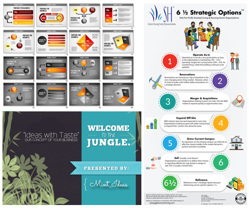
multimedia for e-learning powerpoint templates for e-learning

Proposed plan:

There are artists who will create infographics, templates, and presentations. Essentially any graphic file can find its way on your course screen. What’s the difference between a PowerPoint, web site, or elearning course screen? They all have the same elements.

  • Storyboard your screens
  • Define visual elements and content containers
  • Determine color scheme  and font style

Artists shown: Mint_IdeasBelieveable VideoDanukz

There are all sorts of other services offered on Fiverr that may add value to your courses. One of the benefits of the site is that you can dip your toes in the market and see how things go. You’ll get some inexpensive multimedia assets and can test the service and responsiveness of potential multimedia developers. As I stated earlier, I have no vested interest in the site or the artists. I just want to give you some ideas on how you might use it to your advantage.

If you do use the services on Fiverr, especially video, let me know. I’d love to see how it turns out.

Events

Free E-Learning Resources

Want to learn more? Check out these articles and free resources in the community.

Here’s a great job board for e-learning, instructional design, and training jobs

Participate in the weekly e-learning challenges to sharpen your skills

Get your free PowerPoint templates and free graphics & stock images.

Lots of cool e-learning examples to check out and find inspiration.

Getting Started? This e-learning 101 series and the free e-books will help.


e-learning characters add interest and context

When designing the visuals for an elearning course there are only so many things that fit on the screen and one of the most important of those things is a character. Here’s why.

E-Learning Characters Initiate Engagement

Adding the right image initiates engagement because it draws the learner’s attention, communicates the general topic, and can generate a visceral reaction. Review the images below. What response do they elicit? What do you think the courses are about? Are they serious? Funny? Do they seem interesting?

e-learning characters for online training

Suppose you can only put one image on your screen, what would it be?

Many of the courses I see use bland, corporate branded templates coupled with generic stock images. The imagery is boring and does nothing to engage the initial interest. That can all change when coupling the right characters with good content.

Simple Ways to Use E-Learning Characters

Obviously this is a challenge because most of us aren’t illustrators nor have access to graphic designers who can create custom characters for us. If that’s true for you, here are a few simple solutions:

  • Choose characters that map to the context of your course. You may be stuck with generic stock photos, but choose the ones that align to your course content. For example, if you’re creating a medical course, select medically-themed characters. Also, instead of cut-out characters, select a character in a contextual background. Seems obvious, but it’s the first step.

medical e-learning characters

  • Select a consistent visual style. You’ll notice in the first image above that the characters range from photographic to illustrated vectors. Find a style that works and use it consistently. If you use photos, select the same type with similar backgrounds. If you use vectors, use the same style. Or flip it. If you always use photos, try illustrations.  And you may be able to edit them to meet your specific needs.
  • Shoot your own photos. At least two of the images above are not stock photos. Here’s a post with tips when shooting your own stock photos.
  • Don’t use humans. Characters can be animals, icons, etc.
  • Try some that are more dramatic or in your face images. Humor and drama go a long way to initiate engagement.

funny e-learning characters

Additional resources:

  • If you need some examples of how people have used characters in elearning courses, check out this weekly elearning challenge.
  • These two books discuss characters/avatars in course design. Some people call them pedagogical agents. Those are the people I tend to avoid. In either case, these two books discuss how they may add value to your courses: E-Learning and the Science of Instruction and The Gamification of Learning and Instruction. 

Characters add context. Medical characters say it’s a medical course. People in suits suggest something more corporate. Someone dressed as a clown probably means executive training. See how that works? Adding the right character is a step in the right direction for your visual design.

Step away from bland, generic templates. Find ways to add characters to your screens. It’s one of the easiest ways to engage your learners visually.

Events

Free E-Learning Resources

Want to learn more? Check out these articles and free resources in the community.

Here’s a great job board for e-learning, instructional design, and training jobs

Participate in the weekly e-learning challenges to sharpen your skills

Get your free PowerPoint templates and free graphics & stock images.

Lots of cool e-learning examples to check out and find inspiration.

Getting Started? This e-learning 101 series and the free e-books will help.