The Rapid Elearning Blog

Archive for April, 2016


powerpoint illustrations

In this post we’ll look at an easy way to customize illustration in PowerPoint, since it’s a tool most of us have and it’s easy to do.

Most illustrations are vector images that are saved in a format such as. EPS or .AI that allows you to edit them. However, what happens when you have an illustration in a bitmap version such as .JPG or .PNG but you don’t have the source file to edit it?

This is an issue I run into quite a bit because I get some of my graphics from those low cost (or free) stock image sites and often they only provide a .PNG version of the file. In fact, I ran into this issue in a previous post on getting an elearning job. I’ll explain what I started with and how I made the modifications I needed.

Finding the Right Illustrations in PowerPoint & E-Learning

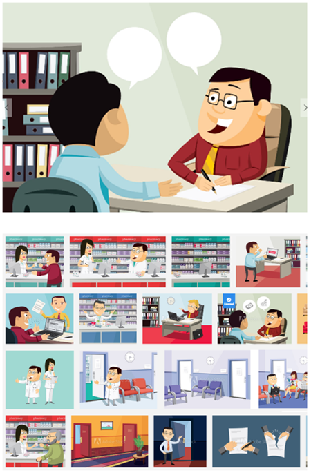
I found an illustration style that I liked. Then I clicked to see what else the illustrator created. This is a great way to find multiple images of the same style.
Illustrations in PowerPoint 1

Production Tips:

  • Stick with the same illustrator to have a consistent look.
  • Review all of the illustrations from the illustrator.
  • Don’t spend too much time trying to find the perfect illustration. Instead, identify elements of the illustration that you may extract to create your own custom illustration. For example, in the images above, the backgrounds would be perfect for elearning scenarios.

How to Edit Vector Illustrations in PowerPoint

Many of the illustrations you purchase will be in one of these formats: .EPS, .AI, .PNG, or .JPG. The first two are compiled illustrations which can be ungrouped and edited. Unfortunately, this may mean you need to learn how to work with an illustration app like Inkscape.

However, if that’s not something you feel comfortable doing, you can always edit .EPS vector images in PowerPoint. This is something I covered in this blog post on how to edit free vector illustrations. It’s not always perfect, but it works well most of the time.

Production Tips:

How to Edit Non-Vector Illustrations in PowerPoint

Here’s the real challenge. You have a great image, but all you have is the bitmap version or it (and you’re not that great of a graphic designer). How do you modify characters to meet your needs?

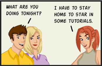
That’s exactly what I ran into with the blog post I mentioned earlier. All I had was the .PNG files. I liked the illustration style, but the images only had men in it and I wanted to add a female character. Here’s how I made the modifications. It’s pretty simple.

Here’s a video that walks through the production process in more detail.

Click here to view the video tutorial.

Illustrations in PowerPoint 2

The image above shows the before after versions. I didn’t need make significant edits.

  • I selected the easiest character to modify.
  • I changed the hairstyle by adding some ovals.
  • I used the color picker and matched the oval fill color with the hair.
  • I added a yellow oval to the ear lobe and color picked from the guy’s tie.

As you can see, the results are OK. The key is simplicity and not trying to add too much detail. I also, needed more room for text, so I added a white oval over the smaller chat bubble.

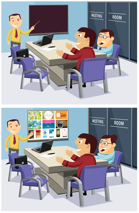
This next image was a little bit more involved. I modified the face and blouse using custom shapes.
Illustrations in PowerPoint 3

  • I added an oval for the hair.
  • I rounded the face a little using the curve tool and color picked from the wall to cover up the jaw line.
  • I added color to the lips and softened the color by making the shapes a bit transparent.
  • I used the curve tool to modify the blouse and filled with the blouse color.
  • You probably can’t see it, but I added some eye liner.

Again, watch the video above to see more detail on how to make the modifications. This isn’t a perfect solution, but when you’re stuck with bitmap images (and can’t easily edit them in a graphics tool) you can still meet your needs modifying the images in PowerPoint. The good thing is that these flat illustrations are easily covered with custom shapes and filled with matching colors.

Here’s a bonus challenge for you, assuming you only had the .PNG and could only work in PowerPoint, how would you change the skin tone?

Events

Free E-Learning Resources

Want to learn more? Check out these articles and free resources in the community.

Here’s a great job board for e-learning, instructional design, and training jobs

Participate in the weekly e-learning challenges to sharpen your skills

Get your free PowerPoint templates and free graphics & stock images.

Lots of cool e-learning examples to check out and find inspiration.

Getting Started? This e-learning 101 series and the free e-books will help.


e-learning portfolio post

I had a couple of questions this week about elearning jobs. First, someone asked me what they should expect when hiring an elearning course developer. And on the flip side, someone I know was looking for work and wanted some tips on how to get a job.

Here’s my take and some things I’ve done in the past as a hiring manager and when looking for work. Also, I just updated a lot of the event info for this year. Be sure to check out if we’ll be in your area.

Expect an E-Learning Portfolio

For the manager:

Some people are good talkers and do great at interviews. They’re pros at answering your behavioral questions. They may also have a strong resume listing good work experience and education. All of those things are great and important to consider, but can they really do the work? How do you know?

I like to see a portfolio of projects. I want to see what they’ve worked on and know what exactly they did in those projects.

e-learning portfolio

For the job seeker:

If you don’t have a portfolio, how can I see the type of work you’ve done? Often people will tell me that they can’t share what they’ve done because it’s proprietary and they don’t have the rights to show it. While that may be true for some, I’ve found that to be mostly hogwash and an excuse to not show work.

Even if it’s true that you can’t show your real projects, it’s still not an excuse for not having a portfolio. If you can’t show real work, remove the proprietary content and use lorem ipsum text, if you have to. Or participate in the weekly elearning challenge. That’s an easy and quick way to build a portfolio.

This may sound harsh and it’s your prerogative to not have a portfolio. But the reality is that the job will attract other job seekers who do have a portfolio and are better prepared to get hired. Your education and experience don’t entitle you to anything. The only thing that matters is if you can use your skills to help the hiring organization meet its needs. And a portfolio is one of the best ways to demonstrate your work experience.

Look for Diverse E-Learning Examples.

For the hiring manager:

As you know, elearning is more than a bunch of bullet point screens. If that’s what you need, you can hire just about anyone. If you want a good elearning developer you should look for one who can do more than great looking bullet point slides. Some of what I look for:

  • How they got past bullet points with unique layouts or small interactions
  • Types of interactive content and learning activities
  • Scenario driven content
  • Software training: simulations or screencasts
  • Creativity

e-learning portfolio examples

For the job seeker:

When assembling a portfolio, pull together diverse elearning examples with different types of courses and interactions. Don’t expect the hiring manager to click through 30 slides to get to the one interesting interaction. Pull the interaction out and show just that.  Don’t show twenty click-and-read compliance courses that are all essentially the same. Also, don’t lock the navigation. That guarantees that the reviewer won’t click past the first slide.

One last point on this: looks matter. You may have the most instructionally sound course to show, but the ones that get the eyes are the ones that look good. Something to keep in mind.

Hire for Desired E-Learning Skills

For the hiring manager:

Understand what role you’re trying to fill and then craft questions to collect the information you need to assess whether the person can fill that role. It also allows you to be consistent in the process across candidates. I like to create a rubric so that I’ve consistent and can compare candidates based on the same question.

This appears to be an obvious point, but often the interviews get sidetracked. And sometimes the hiring staff gets enamored with the person’s personality or other things and never gets around to finding out if they’re really qualified.

skills e-learning portfolio

For the job seeker:

I used to make a two-column list. On one side I listed what the organization identified in the job announcement. And on the other, I listed my response and my experience. This helped me prepare custom resumes specific to the job application. It also helped me with practicing my interview answers.

Collect some job posting and make a list of what they want and then compare what they want to your skill set. Even if you’re not looking for work, this is a great way to identify areas for personal development.

Assign an E-Learning Project

For the hiring manager:

Some people are good talkers (our industry is filled with good talkers) and sometimes it can be hard to assess whether or not they actually have the skills you desire. When I get to the next round of interviews, I assign a simple project. I tell them I don’t expect a polished module. I just want to get a sense of what they can do and then walk through what they did. It’s a way to establish some context for talking together and for them to show off what they can do.

Here is what I like to know:

  • Why did they take the approach they did?
  • What part did they like best? Worst?
  • Where do they feel they best demonstrate their skills?
  • If they could do it again, what would they change?

Some people put in a lot of effort and some put in the bare minimum. Again, they can do what they want. But to me it says a lot when a person who’s competing for job does the bare minimum to impress you.

I’ve had people tell me that it’s ridiculous that I expect them to build a simple module for the interview. That’s fine because it helps weed out candidates. Again, this may seem harsh, but as a hiring manager I usually have more than enough qualified candidates, so if someone is kind enough to make the screening process easier on me, that’s great.

For the job seeker:

e-learning portfolio presentation

If you made it to this point in the process you have a great chance of getting the job. Now it’s time to impress the hiring manager. Here are a few key things to consider:

  • Do your best. You’re competing against other qualified people.
  • Looks matter. Even if it’s a simple project, make sure it looks tight.
  • Focus on activities and interactions.
  • You probably don’t have time to build a whole course, but be prepared to talk about what you’d do if you did have the time and resources.
  • Humor is good and can make you stand out. But it can also make you stand out for the wrong reasons in our hyper sensitive culture.

The key in all of this is to find the best person for the job. Hopefully these tips help. And for the person who’s looking for a job, you want to be the one who stands out.

If you’ve recently hired an elearning developer or gone through an interview for an elearning job, what tips to do you have? Feel free to share them in the comments.

Events

Free E-Learning Resources

Want to learn more? Check out these articles and free resources in the community.

Here’s a great job board for e-learning, instructional design, and training jobs

Participate in the weekly e-learning challenges to sharpen your skills

Get your free PowerPoint templates and free graphics & stock images.

Lots of cool e-learning examples to check out and find inspiration.

Getting Started? This e-learning 101 series and the free e-books will help.


interactive video for e-learning made easy

A few years back working with video was not all that easy. Most networks couldn’t support the delivery of video and producing video was expensive and really time-consuming. However, that’s changed quite a bit over the years.

Rapid E-Learning Makes Interactive Video Easy

Here’s one of my favorite examples of how things changed with the advent of rapid elearning. A few years back, one of our Flash developers was a little behind on a project to create a flash-based video player for one of our courses. When I looked at what he was doing, I asked why he didn’t just use Engage’s media interaction since it was easy enough to insert the video and required no programming.

interactive video for e-learning

Click here to see an example of an Engage interaction with video.

Of course, since he was an experienced Flash programmer (who took pride in his programming chops) he hemmed and hawed about why rapid elearning sucked and how it was better if he did it on his own. However, with some prodding he relented and gave Engage a chance. And guess what? 5 minutes later he was done which meant he could use his advanced programming skill on other projects that required it more.

The point is that today’s tools have made video production so much easier. Gone are the days of burdensome programming. On top of this, most of us have smartphones and tablets that are pretty awesome media production tools. And now delivery over the organization’s networks is also much better.

So that means today producing interactive and engaging video-based courses is viable and a great way to deliver your training. Here are a couple of easy ways to use interactive video for your online training.

Interactive Video: Click and Collect or Explore for More

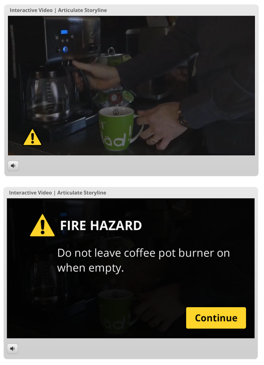
In this example the video plays and at certain points a clickable object displays. The user can ignore it and continue viewing the video or she can click on the object which pauses the video and exposes additional content. Here’s quick demo I created using this video from YouTube produced by Union Gas.

interactive video for e-learning example

Click here to view interactive video example.

Here are a couple of other examples of similar interactive videos:

This approach works great for annual refresher training where the experienced person watches the video, but the less experienced person has the option to stop and learn more. It’s also a great way for the user to collect information that may be critical for other interactions in the course.

Interactive Video: Click & Quiz

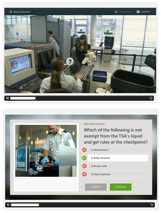
This example is similar to the example above. The main difference is that you can pause the video to assess the users understanding at certain points in the instruction.

interactive video for e-learning example 2

Click here to view the interactive video quiz example.

The example above also introduces two options. One is for quick assessments where tracking is not required. And for those times where tracking in the LMS is required, the lightbox method works perfectly.

Here are a few other examples of similar interactive videos.

This use case is perfect to confirm that they’re acquiring information from the video to quiz them on what they’ve learned. While the quizzes in these examples are basic, there’s no reason why you couldn’t make them more complex using variables or branched video interactions.

As noted earlier, interactive video for e-learning is a viable solution. Check out some of the other examples here and try your hand at your own interactive video. And of course, if you have any questions, don’t be afraid to ask. We’re always there to help.

Events

Free E-Learning Resources

Want to learn more? Check out these articles and free resources in the community.

Here’s a great job board for e-learning, instructional design, and training jobs

Participate in the weekly e-learning challenges to sharpen your skills

Get your free PowerPoint templates and free graphics & stock images.

Lots of cool e-learning examples to check out and find inspiration.

Getting Started? This e-learning 101 series and the free e-books will help.


<p align="center">

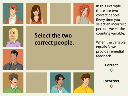
Here’s an easy way to turn a single image into an interactive image. This tip comes in handy if you use collage images for interactive stories or have a great illustration but no way to break it into separate pieces. That’s what I ran into with this recent demo I built for the blog post on simplifying variables for e-learning.

e-learning tutorial interactive image

Click here to view demo.

I had a great image of multiple characters, but all I had was a single .png file. I needed a separate image for each character to create my interaction. In my example, I wanted the individual people to have a hover effect. Since I couldn’t separate them into individual images, I used the crop tool to isolate the characters and create a simple interaction.

E-Learning Tutorial Step-By-Step

Learn more by following the steps of the e-learning tutorial below and then watch the video for more detail.

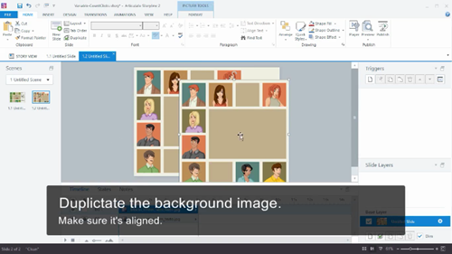
  • Insert the image and duplicate it. Make sure the duplicate is on top of the original and perfectly aligned. I also recommend naming all of the assets you place in your slide. I like to lock the original image so I don’t accidentally nudge it out of place.

e-learning tutorial interactive image duplicate

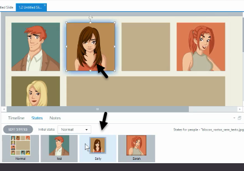
  • Create a state for each character. Add a new state for each character on the duplicate image. Then crop each state to isolate the character. You’ll want to make the state visually different so that when you switch to a character state there’s some sort of contrast to the original. Some people like to add glows or resize the new state.

e-learning tutorial interactive image make states

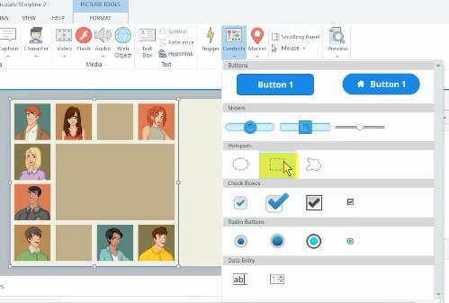
  • Insert a hotspot over each character. Since you only have a single image, you’ll need multiple hotspots on top of it to simulate the interaction and change the large image to the isolated character states.

e-learning tutorial interactive image add hotspots

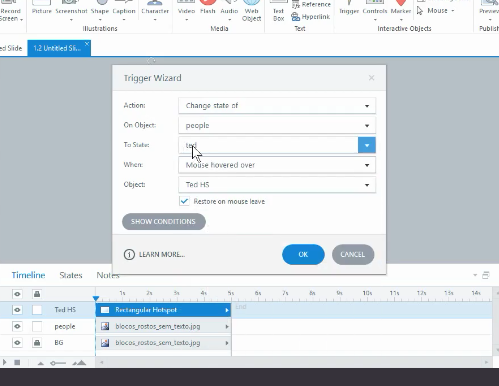
  • Add a trigger to the hotspot. Each hotspot triggers a state change to a specific character. Add the first one, and then duplicate it to speed up production. For this demo, I’m using on mouseover, but you can use any action appropriate to your interaction.

e-learning tutorial interactive image add triggers

Now you have an interactive image built from a single image. It didn’t require you to break the image into smaller pieces or manipulate an illustrated vector.

E-Learning Tutorial Video

Here’s a video that shows the steps in a bit more detail.

Click here to view the e-learning tutorial.

This is a great technique when you’re stuck using an image that you can’t edit. And as you can see, it doesn’t take long to convert the static image into something a bit more interactive.

Events

Free E-Learning Resources

Want to learn more? Check out these articles and free resources in the community.

Here’s a great job board for e-learning, instructional design, and training jobs

Participate in the weekly e-learning challenges to sharpen your skills

Get your free PowerPoint templates and free graphics & stock images.

Lots of cool e-learning examples to check out and find inspiration.

Getting Started? This e-learning 101 series and the free e-books will help.