The Rapid Elearning Blog

Archive for October, 2016


free flip card interaction

A great way to learn to use the elearning software you have is to create small interactions. As I’ve noted before, at work you may end up building one hundred courses, but the reality is you just build the same course one hundred times. That’s one of the reasons I like and promote the weekly elearning challenges. They provide a mechanism to quickly build prototypes to play around with ideas and learn new production techniques.

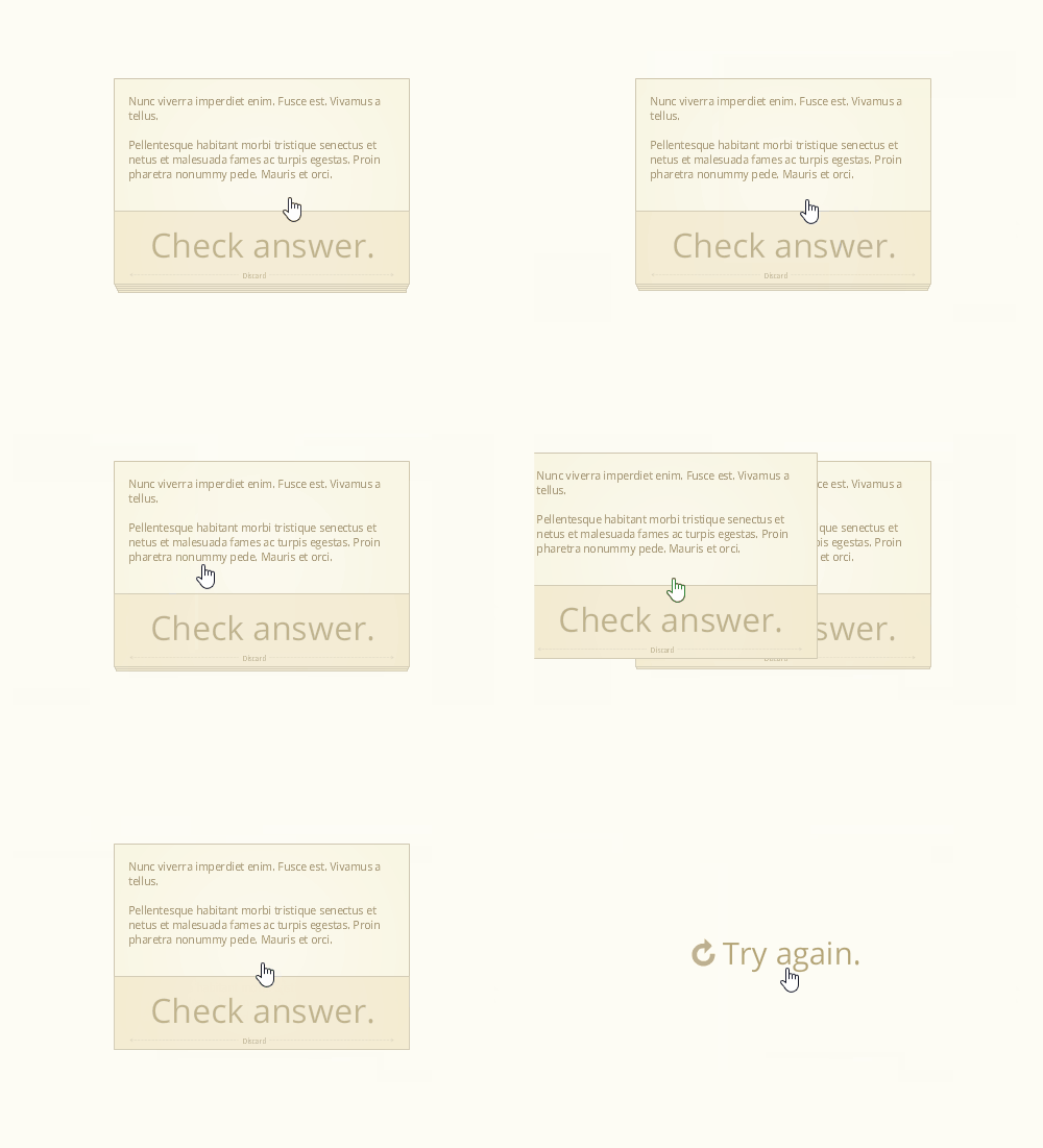
A recent challenge was to create a note card interaction. There are some pretty cool submissions so be sure to check them out in the comments. I happened to be working on a note card interaction for a workshop and submitted it to the challenge above. Here’s the interaction:
free flip card interaction

View the notecard interaction in action.

Here are a few things that I highlight in the workshop activity. I also created a quick tutorial that explains the file and how it’s constructed.

  • View tutorial to learn how to create and customize the free flip card interaction
  • Download file for the free flip card interaction

Create Content You Can Use More Than Once

One of my goals when creating any interaction is to design it so it’s easily re-purposed. Ideally, I want it to become a template. In the case of the note cards, I designed them so that I can quickly copy and paste to create additional cards. Then I just need to swap out the content in the card.

In addition, once the interaction is complete it can be saved as a template file where it will always be at your fingertips and available for use in other courses.

Learn to Leverage the Features

For this free flip card interaction I created the cards with a Selected State.  In essence, the Selected State of an object is like a light switch that can be turned on and off. This is perfect for a note card interaction. Click on it to get information. Click on it again to go back.

Using a Selected State also makes it easier to build a reusable template for copying and pasting. Often, we use layers to show or hide content. That means every time I want to duplicate a card, I also have to duplicate a corresponding layer. With a Selected State, I only need to duplicate the object because it automatically duplicates the state. That saves a lot of time creating the interaction and adding additional cards.

Find Inspiration from Others

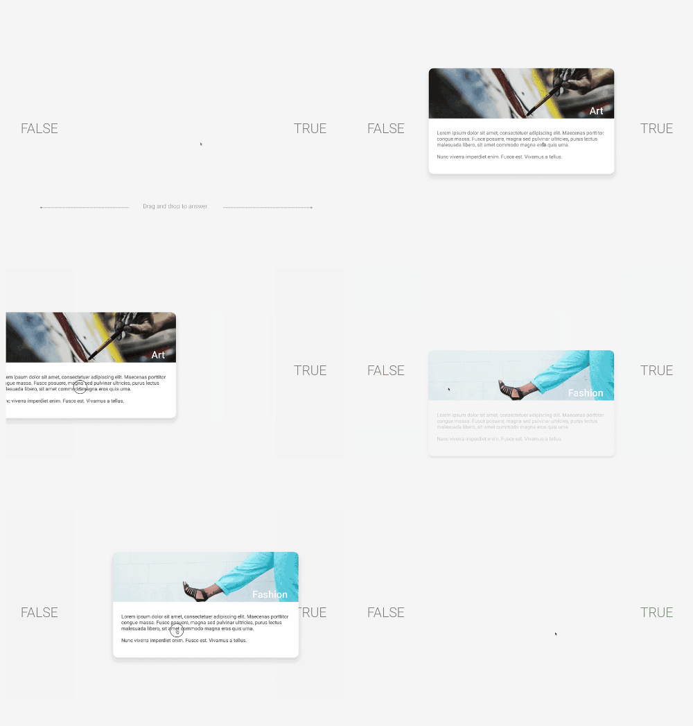
Josh Stoner does really nice work. At a recent Articulate workshop he showed how to build this drag and drop interaction that gave the appearance of swiping cards left and right. It’s a slick interaction. I used his design to inspire my note cards.
free flip card interaction

What I like about this free flip card interaction is that it allows the user to interact with the screen and this is a key part of building interactive content. I also like that it’s a novel interaction when compared to how most elearning content looks. While the cards kind of serve as flashcards in these examples, they could just as easily be bullet point slides converted to cards. Even if all you have is linear content, you make it a bit more engaging because of the novelty and interactive component. Keep in mind: it doesn’t make it a better learning experience, but it does make it a more engaging interactive experience.

To sum it all up:

  • Develop the practice of building prototypes. If you need some structure or calendar, participate in the weekly challenges. You don’t need to do them every week, maybe once a month or every couple of months is fine.
  • Get more life out of the features. This comes with practice (see above) and connecting with more experienced users who have developed some good best practices and creative techniques.
  • Find a source of inspiration. Make it a habit to look for good multimedia examples and then try to recreate them in your software. It’s a great way to learn to use the tools in a new way and also to see your projects and the potential interactions they offer.
  • Free download. Here’s a link to the flip card interaction. I’ll leave it to you to download and deconstruct to learn more. If you need help, watch the tutorial.

Events

Free E-Learning Resources

Want to learn more? Check out these articles and free resources in the community.

Here’s a great job board for e-learning, instructional design, and training jobs

Participate in the weekly e-learning challenges to sharpen your skills

Get your free PowerPoint templates and free graphics & stock images.

Lots of cool e-learning examples to check out and find inspiration.

Getting Started? This e-learning 101 series and the free e-books will help.


build better courses

At a recent conference I was on a panel that asked about how to get better at building elearning courses. I reflected on a few things that I did when I first started and some of those things carry forward to today. I discussed this a bit in this post on how to build your elearning skills.

Learning is an Iterative Process

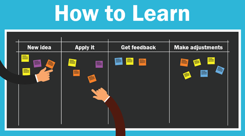
Essentially, we learn something new, apply what we learn, look at the results, and then make adjustments.

Your first project isn’t going to be your best. I look back at some of the stuff I did worked on earlier in my career and am surprised that I wasn’t tarred and feathered by those who had to take the courses.

I recall one where I taught people how to use this new thing called the Internet. Instead of having them open Netscape and doing searches for things that interested them, I spent a bunch of time explaining the interface features, and focused on a lot of unimportant information. What could have been a fun time searching for interesting things became the world’s most boring introduction to the Internet.  How lame was that?

If I were to build that course today, it would be much different.

how to learn

How to Build Better Courses

  • Focus on the learner. We tend to make our courses info-centric and because of this, we focus on how to structure and present content. We should focus on the learner and how they’ll use the content. Then build activities to help them practice doing that.
  • Ask for honest feedback and try to apply what you learn to the next project. This suggestion is a bit challenging because it requires some vulnerability, but it also requires access to an expert who can provide relevant feedback. This is why being connected in the community helps.
  • Keep an idea folder that you can review when starting new projects. I collect ideas from all sorts of sources. When I want some inspiration, I look over the ideas. I will add that it does help to make a note about what you found inspiring at the time you saved it. Often, I’ll review an idea from the folder and can’t recall why I liked it.
  • Set some time aside to practice. I usually find one or two cool multimedia interactions online each week. I try replicate them in Storyline. I don’t worry about how they look. I just focus on wiring it all together to see if I can get the multimedia interaction to work. One of the things I really like about Storyline is that I can quickly prototype my ideas. The other thing I like is that when I do build something from the idea, I can save it as a template and it becomes a reusable interaction.
  • Do one new thing. You’ve collected ideas and tried to prototype them. You’ve chatted with others and solicited feedback. Now it’s time to put it all into action. Take one idea and apply it to a real course. And every time you build a new course, try something new. I know that it’s not always easy to do that in the corporate environment so at a minimum participate in an occasional weekly challenge. At least then you can work on something real and try new things.
  • Keep on learning. Watch tutorials, take informal courses, get a formal degree or read some books.

What are some things you’d share with the person who wants to learn how to build their skills to build better courses? Feel free to share them in the comments section.

Events

Free E-Learning Resources

Want to learn more? Check out these articles and free resources in the community.

Here’s a great job board for e-learning, instructional design, and training jobs

Participate in the weekly e-learning challenges to sharpen your skills

Get your free PowerPoint templates and free graphics & stock images.

Lots of cool e-learning examples to check out and find inspiration.

Getting Started? This e-learning 101 series and the free e-books will help.


instructional design tip

This instructional design tip focuses on how to simplify and chunk content in complex training courses. Essentially, instructional design is about crafting a viable learning experience. Based on our desired learning outcomes, we create a way for people to learn (and hopefully apply) the content in a relevant context.

Often we have to teach content that’s too complicated for new learners. The risk is that we dump too much on them and overwhelm them with a lot of new information. Or we over-simplify the course content (especially real-life decisions) and the result it the course is not complex enough. This can also make the courses less engaging because they’re less challenging.

Instructional Design Tip: Break Your Content into Chunks

One way to teach complex content is to break it into more manageable chunks and getting rid of a lot of extra content. Guide the learners to work through the chunks and as they acquire new skills (and comfort) they’re able to work through more complex content.

instructional design tip

I find that one major challenge for adult learners is the unease that comes from not understanding the appropriate context and how the learning fits into the bigger picture. Because of this I like to break the content into chunks and progressively assemble the chunks to build a broader context of the course content and objectives.

Below is an example from a previous project that may inspire some ideas for your own courses.

Instructional Design Tip: Get to Know Your Learners

A few years ago I had to design training for machine operators in a complex production environment. The machine was a linchpin in the production process because the work flow boomeranged and returned to the machine twice during production. A good operator kept things moving forward, but one less experienced could hold up the entire floor’s production and cost the organization time and money. Our task was to get all of the new operators at an acceptable level of production within 90 days.

instructional design tip

I met with managers and subject matter experts who gave me a lot of content to review. And then I spent some time on the floor. This is a key part of instructional design—get to know your learners, their work environment, and what they have to do. Don’t just review documentation or trust what the subject matter expert says. They often dismiss real world issues or present things from an ideal perspective based on years of experience.

By meeting with everyone including the learners and investigating the real world environment, I had a better understanding of how the environment impacted the learning experience for new people.

Instructional Design Tip: Identify the Discomfort

When I analyzed the workflow, one of the first things I learned was that the new operators were intimidated by the machine and the fast pace of the workflow. They had to constantly upload and unload material and then deal with machine-related issues. In addition, the work environment was really noisy so it was hard to hear instructions and get feedback. And to make matters worse, they were constantly reminded how expensive the machine was and to “not mess it up.”

These are things not covered in documentation manuals.

We designed some elearning modules around the parts of the machine. They were pulled from the production floor and took a few modules to learn about the machine, preventive maintenance, and the general workflow.

Then when they got back on the floor, all they focused on was daily maintenance of the machine. For most of the first week, they just touched the machine a lot without a lot of focus on production work. By the time they got into production, they were so familiar with the machine that they no longer were intimidated.

Instructional Design Tip: Peer Coaches Help Train

Another challenge was that all of the people were being trained by different machine operators—some better teachers than others. And most were not given an incentive to make the training stick. And they were doing the training in real time with real production in a loud facility.

A new learner benefits from having a go-to contact who provides guidance, answers questions, and provides feedback. The organization benefits from having a consistent message and a vehicle to mentor potential supervisors or managers.

instructional design tip

We trained some of the production staff to be “peer coaches.” This gave us quality control over how the content was delivered. The peer coaches became a consistent point of contact for the new learners.  And the new learners felt more comfortable when requiring help, as they didn’t feel like they were getting in the way.

The peer coach program also provided a way to train future supervisors by giving them elevated responsibilities.

Instructional Design Tip: Learning Journals

We created a learning journal. The journal served as a dynamic operator’s manual. It contained all of the core content the new learners required, all of their notes from the conversations, day’s work, and online training was captured in the journal.

instructional design tip

We also used it as the guide for the peer coaches to help them, especially when they were busy. They didn’t need to think through what to teach, they just had to follow the guide and review the learner’s progress.

Instructional Design Tip: Online Training Compresses Learning Time

One of the benefits of instructional design is being able to compress the time required to learn. For example, in a given work day, a person may do a specific task 2 times. Thus in the course of a week, they only get 10 repetitions of that task.

Instructional design allows us to pull that task out of the normal workflow and create a practice activity where they can repeat just that task many more times than what they’d do in the daily workflow. I also found that when a task only happens a few times, those are pushed out for more advanced learning and only experienced people get to do the task for fear that a new person messes it up.

Instructional Design Tip: Create a Working Lab

We created a working lab by slowing down the production on the training machine. Initially the organization didn’t want to slow down production. But we convinced them that slowing down production allowed the learners to get meaningful repetition and as they gained confidence we would increase the speed to match the real world.

instructional design tip

For this training, we created individual activities. Thus they didn’t focus on getting everything through the machine. Instead they only focused on that one part. As they became more comfortable, we added more speed and combined tasks.

Breaking your content into distinct chunks helps make the learning experience more manageable and it’s easier to develop and update. In the example above we were able to separate the tasks from the real world flow and chunk them into smaller learning activities. And as their skills improved we combined tasks to add complexity.

The result for us was that we had almost all people trained within 10 days. In fact, we did so well with the training that we under reported our success because we didn’t want people to think that we were fibbing on the numbers.

Events

Free E-Learning Resources

Want to learn more? Check out these articles and free resources in the community.

Here’s a great job board for e-learning, instructional design, and training jobs

Participate in the weekly e-learning challenges to sharpen your skills

Get your free PowerPoint templates and free graphics & stock images.

Lots of cool e-learning examples to check out and find inspiration.

Getting Started? This e-learning 101 series and the free e-books will help.