The Rapid Elearning Blog

Archive for May, 2019


meaningful e-learning courses

We spend hours building courses that look great and have rich interactive elements, but often we’re missing the key component to an effective course: tapping into the learner’s motivation.

When you frame the e-learning content into a meaningful context, you’ll not only tap into the motivation of the learner, but there’s also a good chance you won’t be tempted to stuff the course with meaningless interactivity (that has the appearance of value).

When building courses, can you answer the following three learner questions?

Meaningful E-Learning: Why Am I Taking This Course?

Good e-learning courses start with solid, actionable learning objectives. The goal is to help the learner to see the value of the objectives. Sure you can start with a bullet point list of objectives and what they’ll learn.

But you really want to convince them that this course has value. And once they understand the value, their more motivated to succeed. And learner motivation is the foundation of a great learning experience.

Meaningful E-Learning: What Am I Supposed to Do with All of This Content?

There are three main parts of e-learning course construction:

  • What content needs to be in the course?
  • What does the course look like?
  • What does the learner do?

Not only does the course need clear objectives that convince the person of it’s value, it also needs clarity around the action required to use the content. What is the person to do with all of this new information?

A real challenge with e-learning is that we’re good at pushing content out. And the reality is most e-learning is rooted in some sort of compliance or regulatory training with little focus on more than a final quiz to certify course completion. But even those courses are rooted in performance expectations.

Help the learner to see the value in the course and then create a means for them to use the new information to improve or enhance their performance.

Meaningful E-Learning: How Can I Prove I Know it?

If you don’t answer the two questions above, the incentive is to click through the course to get to the final quiz and get back to work.

Quiz questions are fine for simple assessments, but do they really measure true understanding of the content and the ability to use it in real life?

Ultimately, the course mimics real world experiences and expectations. In that environment, the learner gets to learn meaningful content and practice using it in a way that demonstrates their understanding. That’s how they prove they learned the information.

It’s easy to build content heavy courses with simple quizzes at the end. That’s why there are so many. And maybe it’s not always wrong. Let people take a course, quick quiz, and get back to work. However, if we want course to be effective we need to engage the learner and create meaningful learning experiences. And that starts by answering the three questions above.

Events

Free E-Learning Resources

Want to learn more? Check out these articles and free resources in the community.

Here’s a great job board for e-learning, instructional design, and training jobs

Participate in the weekly e-learning challenges to sharpen your skills

Get your free PowerPoint templates and free graphics & stock images.

Lots of cool e-learning examples to check out and find inspiration.

Getting Started? This e-learning 101 series and the free e-books will help.


We all like to see good e-learning examples. That’s one reason I really enjoy the e-learning challenges. They’re little nuggets of creativity. They’re usually not full-fledged courses, but they often have some interesting elements.

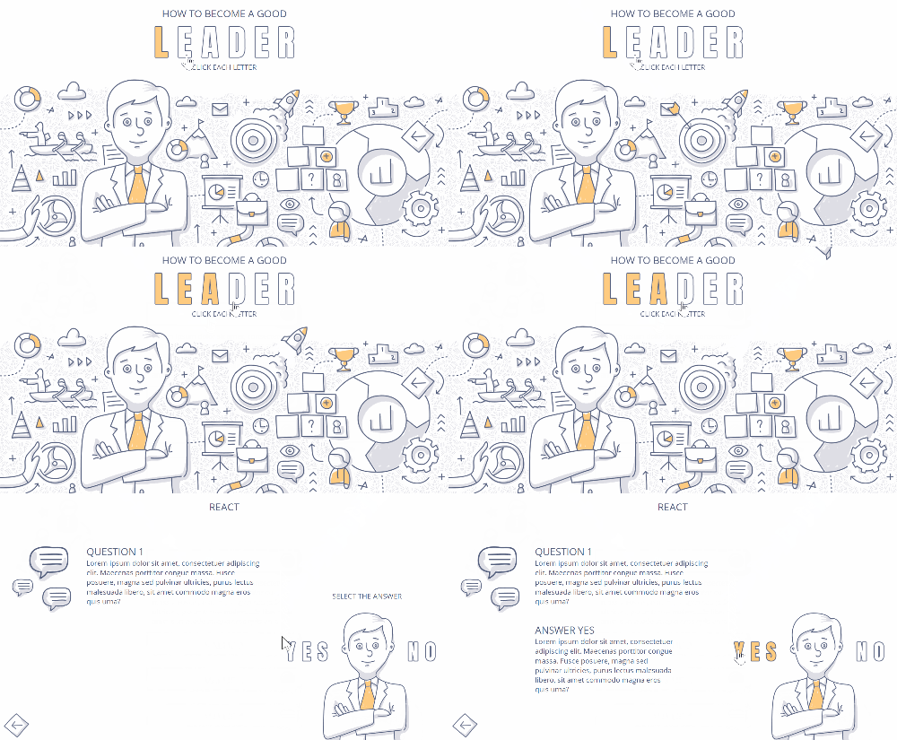
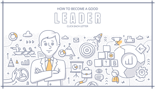
In a recent challenge on course starter templates for leadership training, community member, Andrzej Jabłoński, shared a really nice example. Check it out below.

e-learning example leadership template

Click here to view the demo.

Here’s what stood out:

  • The visual design is fun and clean. I think often our e-learning courses look too formal or corporatey (if that’s a word). We think because it’s a serious topic that the visuals need to look serious. Maybe they do, maybe they don’t. I like this design because it doesn’t look like a typical corporate course. Yet it’s professional and engaging.

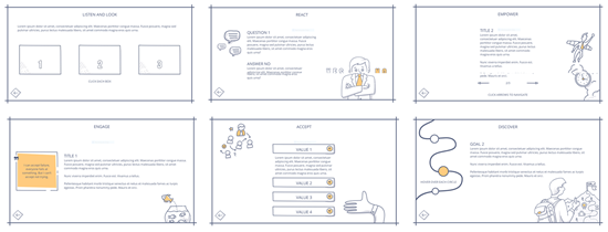
e-learning example

  • The subtle animations work well. They get your attention, but they’re not gratuitous. Break down the course and look at how he used the animations.
  • Leverages existing illustrations. He used an image from freepik to create the visual elements for his demo. As he says, “I mainly work on redesigning and adjusting images for my projects. It’s also a good way to learn how to design when you have to work on ready-made elements. I often try to add something more from myself to develop graphic skills.”
  • Andrzej also shared the source file so you can open it up to see how he created the animated effects and other slides. You can find it in the recap post.

Look at what he did, find an image, and see what you can do to apply similar effects for your own template design.

Events

Free E-Learning Resources

Want to learn more? Check out these articles and free resources in the community.

Here’s a great job board for e-learning, instructional design, and training jobs

Participate in the weekly e-learning challenges to sharpen your skills

Get your free PowerPoint templates and free graphics & stock images.

Lots of cool e-learning examples to check out and find inspiration.

Getting Started? This e-learning 101 series and the free e-books will help.


interactive scenarios for e-learning

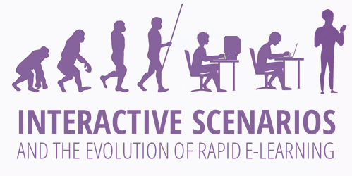
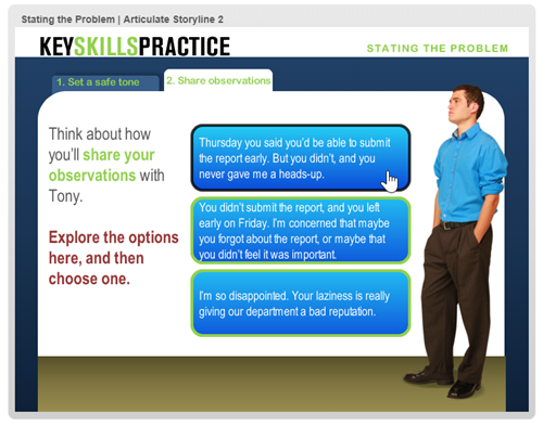
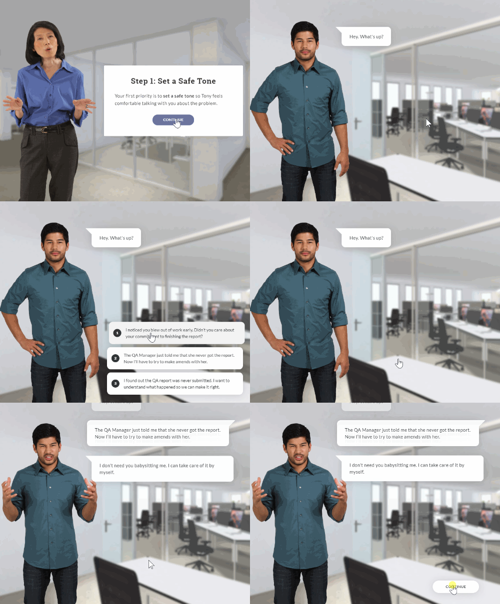
Here’s some content that spans the past decade or so of rapid e-learning. Originally, the interactive scenario started as a PowerPoint file that was published with Articulate Studio to demonstrate how to create simple branched scenarios in PowerPoint.

Interactive Scenario: PowerPoint

interactive scenario in PowerPoint

Click to view the interactive scenario create with PowerPoint

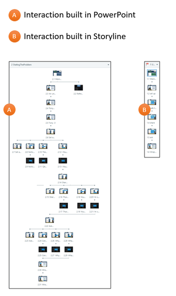
Since PowerPoint is linear and doesn’t offer tracking logic, it requires a lot of slides to create the illusion of movement and branching complexity. The slide number increases exponentially with each additional choice and gets to a point where it’s not manageable.

In those cases, PowerPoint isn’t the best solution for interactive courses.

Interactive Scenario: Storyline

The same content goes from 154 slides in PowerPoint to just 18 slides in Storyline. That’s a dramatic decrease in slides and the production time required to create an interactive scenario. It really shows off the power of Storyline and why it’s so well received as a preferred authoring tool.

interactive scenario built in Storyline

Interactive Scenario: Rise 360 Content Blocks

When we launched the Rise 360, I wrote about the new approach to rapid e-learning. Rise 360 is form-based so the authoring process is different than PowerPoint or Storyline.

I played around with how to convert the PowerPoint scenario into Rise 360, a completely different type of tool. Here’s the first attempt using content blocks.

interactive scenario demo 2

Click here to view the interactive scenario using content blocks in Rise 360.

Interactive Scenario: Rise 360 Scenario Block

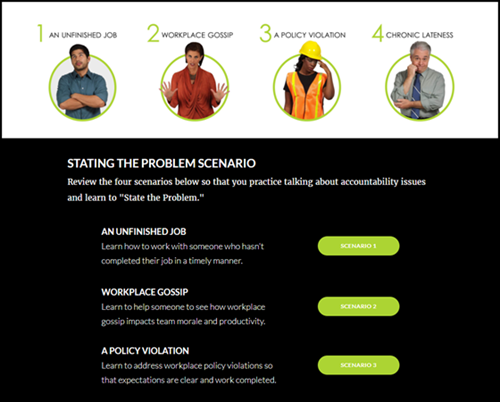
The content block scenario works, but with the scenario block in Rise, I am able to create something that is visually more in line with what I want and it’s a lot easier to build. Here’s an example of the same content in the Rise 360 scenario block.

interactive scenario Rise 360 scenario block

Click here to view the interactive scenario using the scenario block in Rise 360.

Interactive Scenario Resources

It really is interesting to see the evolution of rapid e-learning through this scenario content. It started with PowerPoint, passed through Storyline, and now it’s part of Rise 360.

Events

Free E-Learning Resources

Want to learn more? Check out these articles and free resources in the community.

Here’s a great job board for e-learning, instructional design, and training jobs

Participate in the weekly e-learning challenges to sharpen your skills

Get your free PowerPoint templates and free graphics & stock images.

Lots of cool e-learning examples to check out and find inspiration.

Getting Started? This e-learning 101 series and the free e-books will help.


create animated gif

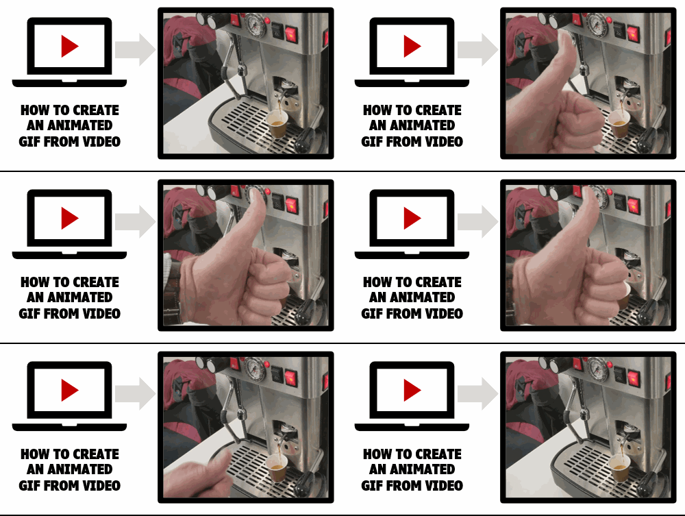
Animated .gifs are great for e-learning. Often, I like to use them instead of videos for e-learning interactions, especially process interactions that go through a sequence of steps.

Here are a few previous posts on animated .gifs with some free resources:

Today I’ll show a simple way to convert a video of a process into smaller animated .gifs that you can insert into a slide, article, or process interaction.

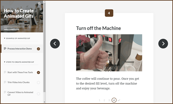
Demo of the Animated Gifs in a Process Interaction

Here’s a demo I created using Rise and the Process Interaction.


animated gif example

Click here to view the example.

Animated Gifs Tutorials

Below are a couple of tutorials that go into it in more detail:

Animated Gifs: Create a Procedural Video

Record a video of the process. Don’t worry about the audio as it will be removed. To keep the edits to a minimum, make sure to be clear on the steps and to not waste a lot of movement. Get to the point quickly.

At our workshop in Milan, David and I quickly recorded the process to make an espresso with the machine in the back of the room. While we pretended to be working, it was really a way for us to sneak in a few more shots of espresso.

Here’s the original video.

Click to play the video on YouTube.

Animated Gifs: Convert the Video to Gif

There are a number of ways to convert video to animated .gifs. I like to use ScreenToGif because it’s free (which is always good) and it is really easy to use.

The conversion process is simple: import the video and convert it. However, there are some key considerations.

The original .MP4 video is 159 MB at 1920 x 1080 resolution. Animated .gifs can be large, really large.  Without any significant edits, the 159 MB video becomes a 470 MB animated .gif. That’s just not manageable.

There are a few things you can do to decrease the file size of the animated .gifs:

  • Scale the video down from it’s original resolution. There’s no need for an HD quality .gif. In this case 1920 x 1080 will be sized down to 500 x 281.
  • Crop the video to just the critical pieces of info. The fewer frames the smaller the file size. You can always duplicate frames to keep something on screen longer with minimal impact to size.
  • The less difference there is with the pixels from one frame to the next, the smaller the file will be. Unfortunately, video isn’t static and those millions of pixels are changing from frame to frame. You could try to shoot against a solid background and with a tripod. That may help, depending on your subject.
  • Video runs at about 30 frames per second (FPS). When you convert the video to .gif, you can modify the frame rate to something like 10 to 15. It just depends on how much motion is in the video. The less motion, the more you can lower the frame rate.

Animated Gifs: Edit to Individual Steps

Unless the steps are very short and can be shown in one file, it makes sense to break the steps up to individual parts. That helps reduce the file size and keeps the focus on very specific parts of the process.

  • You can import the entire video and then cut it down. Or cut the video into smaller videos first and work with them individually. It’s probably easier to edit the videos first and then import the smaller videos. This is more manageable and less strain on your system.
  • Get rid of what you don’t need, cut out extra frames.
  • The animated .gifs loop, so it may make sense to add a little buffer at the front or back end to let the user orient to the start and end of the process.

The original video was 1 minute long. Converted to an animated .gif without edits, it was 470 MB. After cutting it into pieces and creating four smaller gifs, the total ended up being about 15 MB. That’s a pretty significant difference and the output works well for the demo.

That’s basically it, shoot a video and then convert it to animated gif.

Events

Free E-Learning Resources

Want to learn more? Check out these articles and free resources in the community.

Here’s a great job board for e-learning, instructional design, and training jobs

Participate in the weekly e-learning challenges to sharpen your skills

Get your free PowerPoint templates and free graphics & stock images.

Lots of cool e-learning examples to check out and find inspiration.

Getting Started? This e-learning 101 series and the free e-books will help.