The Rapid Elearning Blog

Archive for September, 2020


instructional design for a new generation

Ok…I’m not sure that’s the right title. I’m working on a presentation that covers instructional design challenges and wanted to share a few points to consider about course design and how we need to move past the way many of today’s courses are constructed.

Technology has changed the landscape for today’s course designers
instructional design content owners

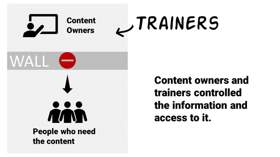
Years ago, someone other than the learner controlled access to content. We were all beholden to the subject matter experts and their walled gardens. We saw this in universities. We saw this in organizations. Subject matter experts owned content and they determined how it was packaged and delivered. Organizations created their learning management systems and determined who had access to what and when. Their quizzes determined who was smart enough.

But a lot of that has changed.
instructional design learners

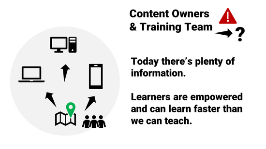
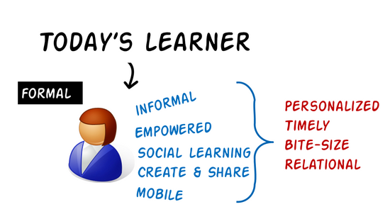
The internet and mobile devices give us access to everything we need to know, and mostly at a point when we need to know it. It doesn’t make us deep experts, but it makes us experts enough.

Need to repair sheetrock gone bad? Find a YouTube video. I won’t be quitting my job to build sheetrock walls, but I can learn to do what I need to do when I need to do it.

If I know something and want to share it. I’ll join a community. I can create a video (or some other asset) and make that available for others who want to learn what I know. The people who want to learn can find what they need when they need it. And they can find some comfort in the personal connection to an expert. They won’t feel sold to or manipulated. It’s a community and not a place worried about optics and spinning the meaning of every word.
instructional design today's learner

Course designers need to embrace a new role

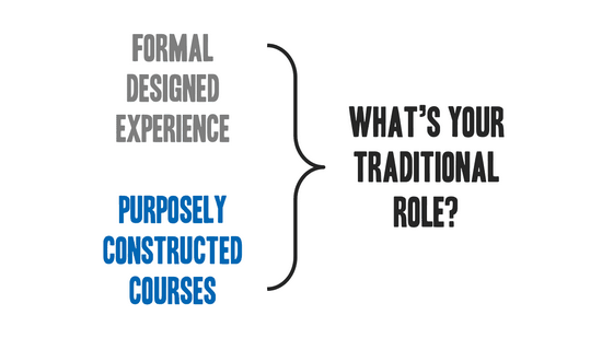
It’s not enough to build a course and upload to a learning management system. This forces all of the content behind a wall. We should start to see our role evolve.

Today’s learner has access to what they need. They can get it when it makes the most sense to them. It’s usually in context. And it’s not overwhelming.

However, they may not always know what they need or how much of it. And they may not know what’s most critical or what’s best for meeting objectives. They may also waste a lot of time on irrelevant content.
traditional instructional designer

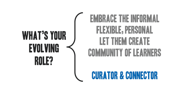
This is where we step in. Instead of just being traditional course creators, we should become both curator and connector.

Curating resources helps sort through the noise and package what’s most important to meeting objectives.

Connecting is all about facilitating a learning community and connecting experts with novices. It allows the content to live and breathe. The community has a knack for sorting value.
evolving instructional design

There will always be a place for formal course design and delivery. Government regulations and the fear of lawsuits will ensure that. However, if learning is really the goal, then how we make content available and help people succeed must be more than just putting together a bunch of online presentations and quizzes. Look at the way you learn things today and where you go to learn them. Find ways to make that part of your instructional design, too.

Events

Free E-Learning Resources

Want to learn more? Check out these articles and free resources in the community.

Here’s a great job board for e-learning, instructional design, and training jobs

Participate in the weekly e-learning challenges to sharpen your skills

Get your free PowerPoint templates and free graphics & stock images.

Lots of cool e-learning examples to check out and find inspiration.

Getting Started? This e-learning 101 series and the free e-books will help.


accessible e-learning retrofit

A guest post by Elizabeth Pawlicki, Training Program Manager, Articulate.

Many e-learning designers are challenged because they don’t often build accessible e-learning courses. So, they’re not sure what accessibility means and how it impacts course design.

In a recent webinar, we discussed general ideas around accessible e-learning, common design challenges, and some ways to overcome them. One of the tips was to plan for accessibility from the start because it’s not a good idea to retrofit 508 or WCAG compliance into existing e-learning courses.

An attendee asked, “What’s wrong with retrofitting a course?”

Good question.

Understanding Accessible E-Learning

Imagine a city that already exists full of apartment buildings, skyscrapers, and transit systems. And then the city council implements a law that says there must be a half-acre of park every two square miles.

How will you accomplish that?

You either must tear down what you’ve already built or try to squeeze the bare minimum of acceptable “parkland” into your existing space. Since the parks weren’t an initial consideration, you do what you can to meet minimum guidelines, but you may not meet the aspirational goals of the intent of more parks.

And that’s often the case with e-learning courses that weren’t built with accessibility in mind. The retrofitted courses may appear to meet the minimum requirements but may not offer the best user experience; and they may not actually meet the requirements if all you did after-the-fact was apply accessible features to the original content.  And of course, all of that retrofitting costs a lot of extra time and money.

Challenges Retrofitting Accessible E-Learning

There’s a lot that goes into creating an e-learning course like consulting with subject matter experts, writing scripts, developing prototypes, presenting content to stakeholders, and iterating on the prototypes you have created. In the end, you have a published output that everyone has agreed upon.

When you try to retrofit a completed course, it may seem easy and straightforward. But once you begin to uncover how much needs to be undone, redone, and how many people could and should be involved in that process, you’ll find it’s more costly, time-consuming, and downright difficult. This is especially true when you consider the interactive nature of e-learning and how different users access the content.

Therefore, it’s important to consider accessibility as part of the initial production process so that you understand what’s required and build a course that meets everyone’s needs. If you start with accessibility in mind, you’re considering everyone. Everyone will feel included because they are.

Want to learn more:


Events

Free E-Learning Resources

Want to learn more? Check out these articles and free resources in the community.

Here’s a great job board for e-learning, instructional design, and training jobs

Participate in the weekly e-learning challenges to sharpen your skills

Get your free PowerPoint templates and free graphics & stock images.

Lots of cool e-learning examples to check out and find inspiration.

Getting Started? This e-learning 101 series and the free e-books will help.


3 ways to use theme colors for e-learning

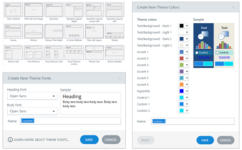
One way to speed up production in your e-learning course design is to use themed slides. You can create robust and visually varied templates like the ones you get in Content Library. The templates are a combination of layouts and two themed elements: fonts and colors. However, you don’t need to have a complex template to leverage theme colors.

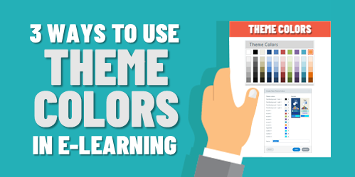
Theme colors allow you to pre-determine the colors you’ll use in your course’s slides. There are several benefits and reasons when using theme colors.

Make Easy Updates to Theme Colors for E-Learning

Here’s a common scenario: insert an image and then do a color pick of the image to pull a color to use for outlines or shapes in the course. Later someone suggest changing the color. The challenge is going through every slide and making changes where that color was used.

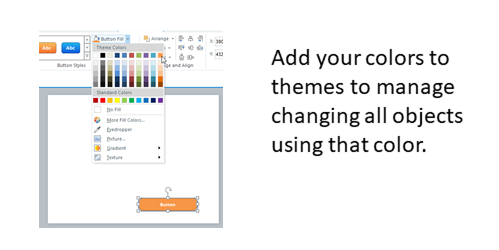
Use theme colors to quickly modify all the objects with that same theme color. This doesn’t require a lot of consistency in terms of how you use the colors. It just means that if you do a color pick, for example, you add that to one of the accent colors so you can apply that accent color through the course.

If you have red shapes and they need to be blue, if you used a theme color to fill the shape all you need to do is change the theme color.

theme colors for e-learning templates

Create a Loaded Palette of Theme Colors for E-Learning

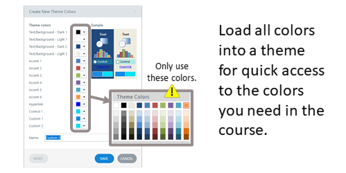
You get six accent colors, and each has five derivatives. You don’t need to have a real strategy when using theme colors. You get six slots. Figure out what six colors you need in your course and then create a palette, so you always have those six available to you.

You can use the colors willy nilly with no consideration to any real structure. The key advantage is having a palette of desired colors on hand.

theme colors for e-learning templates to have a palette

Develop a Strategy for Theme Colors for E-Learning

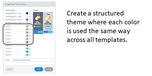
Assuming you build a lot of templates and you re-use them, then it makes sense to be strategic about how you use the theme colors. You get six slots. Use them the same way every time you create a theme color. That makes it easy to create a new theme and re-use templates because you know that the theme colors are applied the same way to the same objects.

Determine how you want to use the color slots and then use them that way consistently. This allows you to quickly apply new color themes knowing that the entire template will change, and the colors will make universal changes to the entire course.

theme colors for e-learning templates for universal changes

Some people are very strategic an organized in how they use theme colors. And some just use them with no sense of structure. They just want a place to load some colors and have quick access. That’s fine, too.

What you want to avoid is using single colors outside the theme that can’t easily or quickly be updated later. Theme colors help prevent that and save time when building courses whether your strategic or just using a palette.

Events

Free E-Learning Resources

Want to learn more? Check out these articles and free resources in the community.

Here’s a great job board for e-learning, instructional design, and training jobs

Participate in the weekly e-learning challenges to sharpen your skills

Get your free PowerPoint templates and free graphics & stock images.

Lots of cool e-learning examples to check out and find inspiration.

Getting Started? This e-learning 101 series and the free e-books will help.


e-learning template

Templates offer a lot of value and power in your e-learning course design. They help keep things consistent, provide a good starting structure, and they make it easy to swap and replace theme elements.

The main benefit of a template is saving time. But templates come with constraints and when attempting to customize them you may be robbed of the time saved. This is something I see all the time when working with e-learning developers.

To keep things simple, I like to consider templates from two perspectives.

Option 1: The E-Learning Template is Plug and Play

Use a template where the layout and all its features are pre-determined. The goal here is to select a templated screen and expect to make minimal changes. The value of the template is that everything is there and all you need to do is add your content.

e-learning template

All you want is a slide with a specific look and swap out the placeholders for your course content. You don’t want to change layouts, redesign the slide, add new elements, or customize colors.

The core value is that the template is pre-designed and all you do is add content. This is great for quick authoring and for the person who has limited graphic design experience.

Option 2: The E-Learning Template is Customizable

Use a template where all the features are themed. This usually consists of layouts, colors, and fonts. The value of this type of template is that you can easily modify it by making universal changes to the theme elements. And those changes are applied across all the slides in the course.

e-learning template themes

This second perspective requires a bit more forethought and restraint in using the features. For example, all the text and colors on the slide need to use theme text and colors. Also, all layouts need to be mapped to the same placeholders, otherwise, they’re not interchangeable.

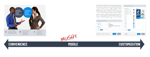
Avoid the Mushy Middle

Think of these two perspectives as two ends of a spectrum. On one end you have the convenience of a pre-built screen that only requires content. Select it and add the content.

On the other is a screen that is built to be modified. It’s not tied to content but the theme elements.

e-learning template spectrum

Realistically, you can do both by making a designed slide with themed elements. But…and this is a big but (cue Pee Wee Herman) most of the issues I see when people work with templates is that they want the convenience of plug and play and then they want to customize, too. Inevitably this leads to a lot of time wasted trying to make things work.

So, I usually recommend this: if you use a template you didn’t create, accept the fact that what you select is what you get and all you need to do is add your content. Don’t expect to import it and then begin to make too many edits. At that point you lose the power of what the template gives you.

Or…

Create your own templates. Design specific layouts and multiple versions of them. For example, if you build a tabs interaction, design a 3-tab, 4-tab, and 5-tab version. Don’t just design a 3-tab and expect to modify it.

When you build the slide template, only use theme elements.

  • That means you use create placeholder layouts and use them consistently on the various slides.
  • Determine your theme colors and only use colors from your theme. And use them consistently.
  • Set your theme fonts (usually a heading and body). And all text on the screen uses the theme font. You don’t insert that one cute curly font to make your course engaging. One, it isn’t engaging. And two, it’s not a theme font.
  • Before using a template like that, you determine a new theme font and color scheme. And then insert the slide and apply the new theme elements.

Notice how the first option is just plug and play and the second requires a lot more intention and more production? That’s the big consideration. The template should provide some time-saving guidance. If you need to make a bunch of tweaks or mess things up because you didn’t plan on the theme elements, have you really saved any time? Did the template offer real value?

There you have it: two perspectives on when to use a template. Use it as is for quick authoring with minimal changes. Or use templates where you can make universal changes to the themes and quickly create new looks.

Events

Free E-Learning Resources

Want to learn more? Check out these articles and free resources in the community.

Here’s a great job board for e-learning, instructional design, and training jobs

Participate in the weekly e-learning challenges to sharpen your skills

Get your free PowerPoint templates and free graphics & stock images.

Lots of cool e-learning examples to check out and find inspiration.

Getting Started? This e-learning 101 series and the free e-books will help.