
I saw this video clip the other day on Instagram about how comedian and teacher, Leslie Robinson, views mandatory training videos.
It’s funny and it’s true!
What’s even better are the comments like this one:
“I had 7 of those to watch one day, tried watching them on different browser windows simultaneously, but no luck, those developers outsmarted me.”
“Yeah, they’re messing up our learning process” 🤣
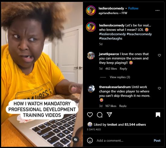
Click here to view on Instagram.
The comments are loaded with good feedback that is so true to many e-learning courses and online training.
- Complaints about locked navigation
- Tips to not click complete until you meet a minimum time requirement
- Irrelevant information
- Stupid questions in the middle to get past the locked navigation
Here’s the deal. We all recognize that there’s something broken with e-learning. We’ve probably had to make these courses and also take them.
So what’s the solution?
Create Better E-Learning
Here are four tips to prime the pump:
- Show your clients this video and tell them they don’t want that or they’re wasting the organization’s time and money.
- Face the facts. Sometimes you can’t get past this type of training. It’s what the client wants. In that case, build the best and quickest course possible.
- Focus on the learner. Make the content more relevant to their needs. What will they learn? Why is it important?
- Get rid of locked navigation and find better ways to make the course more engaging.
What would you add this list?
Events
Free E-Learning Resources
There are three primary forms of onscreen interaction used in e-learning courses: clicking, mouseovering and dragging. If desired, user input interactions such as data entry or text input with variables can also be added. However, the majority of interactivity is based on the three aforementioned types.
Recently, I was experimenting with a mouseover interaction concept which was mainly a gimmick, and wouldn’t be feasible as a real e-learning course. This nonetheless made me ponder the various uses of mouseover interactions and the current state of e-learning.
How Are Mouseover Interactions Used
There are all sorts of reasons and ways people build mouseover interactions. Here are three of the most common:
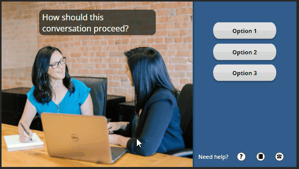
- Indicate a selected or current location: you see this often on a button. As you mouseover, the button changes to indicate where you’re at, or that it’s an active button. In the example below, there’s a hover state to indicate the mouse is over the button.
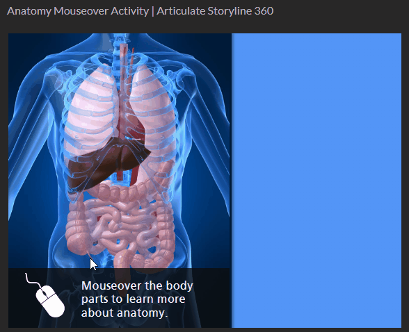
- Expose additional information: many people use the mouseover to expand the screen real estate. Slide over an object to get access to quick information. Slide away from the object to hide the information. In the example below, the mouseover interaction allows the learner to explore human anatomy.
- Provide quick tool tips: the mouseover interaction may provide information or hints. Sometimes it’s used to describe or explain the button or clickable object. In the example below, the tool tips provide quick access to hints on where to learn more.
What is the Current State of Mouseover Interactions
Mouseover interactions are fine and are also often used for creative ideas or to provide a certain type of aesthetic. However, a lot has changed over the past few years.
- Mobile Devices. Many courses are consumed on mobile devices which require touch-based interactivity. The concept of a mouseover doesn’t really exist when using a finger to navigate the content. Technically, you can press and hold to expose a hover state, but that’s not really practical for mobile training.
- Accessibility. Ideally, all courses are built with accessibility in mind, but that hasn’t always been the case. Accessible compliance is more of a concern for course builders today than it was a few years ago. The market has changed and with that comes more awareness and desire to build accessible e-learning. Mouseover interactions are a bit problematic especially for those using keyboard navigation.
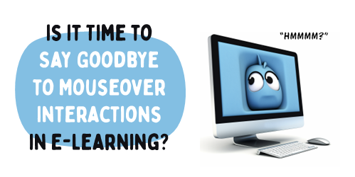
It appears that it may be time to say goodbye to mouseover interactions in e-learning. Creating a click alternative to the mouseover is an extra effort that may not be necessary. Therefore, I propose that we accept the reality of changing technology and choose to forgo this type of interaction in most cases.
What is your opinion? What are the use cases that support the mouseover? How would you tackle the problem if you decide to keep it?
Events
Free E-Learning Resources


