The Rapid Elearning Blog

A good scenario can make your elearning courses engaging and more real to your learners.  It’s a great way to get them to learn to use the course information and make the decisions you want.

Where I live, the threat of earthquakes is real so we were required to have a 72-hour emergency pack at our desks.  Needless to say not many of us did.  However, we always passed the online safety courses that required we have 72-hour packs.  Fortunately, we never had an earthquake that warranted using the 72-hour pack.

This example represents the challenge with a lot of our elearning.  Most courses have a purpose tied to real performance.  But they tend to focus on sharing information rather than performance.  One of the problems with the information dumps is we get so used to the mind numbing slide-after-slide of information, that the value of the information is lost and it renders the course useless.

A great way to counter this is to build scenarios where the learner uses the information.  In the example above, if the safety course started with an earthquake, I’d have to make decisions and get routed through the course based on the decisions I made.  For example, not having the 72-hour emergency pack might mean I die or suffer some other negative consequence.  It brings home the value of the pack more so than just a bullet point telling me to have one.

Using scenarios to share the information is an effective and engaging way to build your courses.  You can make them as simple or complex as you want.  They don’t need to be big Hollywood productions.  Build a little story around the course information and then get the learners to make decisions based on the type of performance you expect from them.  If they make the appropriate decisions move them on.  If not, then give them another little scenario or a screen with some remedial information.

So, that’s the case for using scenarios.  However, if you decide to build these sorts of scenarios, you need to have the right types of images.  In an earlier post, I showed you how to create your own characters using clip art.  Today, we’ll use a similar approach to build our own scenes.  This way you can stage your scenarios and never be at a loss for the right type of scene.

Find Images with Good Backdrops

The first step is to find a series of images.  When I look through my clip art, I’m always looking for interesting backgrounds.  I prefer to stay with the same clip art style, but the good thing is that you can typically choose any background from your clip art because you’re just using the backgrounds. 

Below are four images that have different backgrounds. 

 The Rapid E-Learning Blog - Four clip art images with different backgrounds

Clean Up the Clip Art to Create Distinct Backgrounds

Once I have an image, I ungroup it and pull out the people or other objects I don’t want.  You can learn more about how to do this in my post on working with ungrouped objects

This leaves me with a distinct background.  I’ll save the background for use in other projects.  If you save it as a vector image (.emf), you’ll be able to make modifications to the background later.
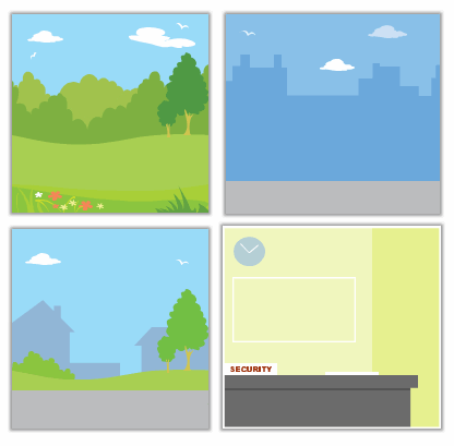
The Rapid E-Learning Blog - People pulled out of the clip art image to make background images

Create More Interest by Varying Your Background Images

Now that you have a background image, you can place your characters in various scenes.  To make the scenes more interesting, change up how the background images are used.

For example, the image below shows some simple changes I’ve made to the same image.  Yet, I get three distinct looks.  Don’t be afraid to stretch the image outside of the PowerPoint slide.

 The Rapid E-Learning Blog - Three variations of the same image

By using the backgrounds that come with your clip art, you’ll never be at a loss for the right type of background.  It will open the doors to all types of scenes and with that all sorts of possibilities.

If you’ve built any scenarios using these techniques, I’d love to see them.  Also, if you have any comments or suggestions, feel free to add them to the comments section.

Events

Free E-Learning Resources

Want to learn more? Check out these articles and free resources in the community.

Here’s a great job board for e-learning, instructional design, and training jobs

Participate in the weekly e-learning challenges to sharpen your skills

Get your free PowerPoint templates and free graphics & stock images.

Lots of cool e-learning examples to check out and find inspiration.

Getting Started? This e-learning 101 series and the free e-books will help.


20 responses to “3 Simple Steps to Create Background Images for Your Next E-Learning Scenario”

June 24th, 2008

Tom I have read your other blogs on clip art and the many things you can do with them, i.e., animation, etc. I’m glad that you didn’t rule out how great to have backgrounds to make a scenario. The PowerPoints I have made based on your blogs I’ve used a plain white background; however I see how putting in a different background can create the scenario. Well thanks again Tom, you have inspired me to create and save backgrounds.

Cheers!

Hi Tom, and thanks for another useful post. I wonder what you and others think, however, of the proposition of doing scenarios without any graphics?

I’ve just done a set of scenarios for managers in my company, and decided to leave them as just text; I admit this was partly due to the difficulty of finding images of the same people with different facial expressions, but the more I thought about it the more I hoped it would enable the users to visualise their own staff – their latecomers, long-term sick, tribunal managers and family members; on the same principle that when you read a book the characters have the faces you put on them, but when you see the film they’re ‘fixed’, can we expect the learner to engage more when they ‘see’ perhaps someone they know from their own office? They’ve only just gone out so I’ve no feedback to judge it on, only my hunch. What do you think?

“Don’t be afraid to stretch the image outside of the PowerPoint slide.”

That’s the most important sentence in your entire post (though don’t get me wrong – the other sentences are good too).

Going beyond the boundaries of your slide transforms your content from “meh, looks like PowerPoint-to-eLearning” to a “hey, it’s a real big-dollar multimedia presentation!”

Everything is great, you write a lot about using MS Clipart to create courses, but the true is, that it’s illegal to use this graphics in companies(for any commercial use).
So for lots of as it’s useless(unnfortunately).

June 24th, 2008

We wanted an interesting background for a workshop that suggested a tropical island. I took a clip art from PowerPoint of a beach looking out at the water, removed the items I didn’t want, squeezed the water down a little to give me more sky, then took some palm fronds from another file and added them in around the top left and right.

The result gives you the feeling that you’re in the shade of a palm tree looking out over the beach. There’s lots of room in the sky for content. We ended up with a lot of interest for this course despite the topic being how to create a file plan!

Later when I started creating eLearning for the same project, I used the same background. Again, the sky gave me room for content and the beach gave me a great location for navigation controls, and where I needed some secondary controls they went in the water. A simple sound file of a steel drum band playing something upbeat gives everyone that tropical island feeling.

The scenarios revolve around a group of people getting ready to deliver hurricane preparedness sessions for the island residents – a good reason to work with the file management software to find and update last year’s information, update the handouts, find the evaluation forms, update the slides etc. Most people can relate to this and the feedback about the design has been very positive.

June 24th, 2008

Norman, for some good examples of text-only scenarios, see http://www.halfbakedsoftware.com/quandary/version_2/examples/

June 24th, 2008

Everytime there’s a blog post about clip art someone makes statements about copyright issues. The author isn’t telling us to violate any copyrights. He’s showing us how to use clipart. You can apply the same ideas to your purchased clipart.

I disagree with Damian about using Microsoft clipart for commercial use. In fact, a previous post (I don’t know how to add the html link) had a good series of comments about using clipart. Here’s an excerpt from Ezra, “…you may copy and use the media elements, and license, display and distribute them, along with your modifications as part of your software products, including your web sites, but you may not (i) sell, license or distribute copies of the media elements by themselves or as part of any collection, or product if the primary value of the product is in the media elements; …”

June 24th, 2008

Great article…as usual!

How do you set up these scenarios? How do you tell the program to move based on the response? I think Captivate does this…but would prefer not to use this if I can avoid it! Ryan, what did you use to create the examples above? Is that in Quizmaker?

Mandy

Thanks for your always e-learning preciuos pieces.

@Norman: I was going to suggest some of the examples from half-baked as well. What’s most critical is that the content is compelling which equates to making it relevant to the user. While not a scenario, I’ve always found the Lessig presentations to be interesting and they’re just text.

@Mandy: You can build scenarios in any tool that has some sort of linking. In the blog, I’ve demonstrated using PowerPoint to quickly build scenarios. You can even build out scenarios/case studies in a linear fashion and still be engaging.

@copyright: I don’t advocate copyright violations. I can understand Damian’s comment, however, I don’t think it is accurate to flat out state that you cannot use MS clip art for commercial purposes. In either case, it’s you responsibility to read the EULA and determine whether or not you can use the images that you have with your office suite. In addition, the ungrouping tips can be applied to any grouped vector images.

Hi Tom,

I really value your input into eLearning, as a fellow eLearning developer it’s great to see the effort you put into your posts. But I think it’s time you moved on from posting on ungrouping clipart graphics in powerpoint. Yes it is a great resource and one I use but it’s as simple as attaching a picture in an email.

Thats a big call from me who hasn’t written any blogs myself but would love to start reading more advanced practices/informtion on eLearning. You have a wealth of knowledge in the area – share the great stuff and lose the basic stuff.

Always love your articles. Do you have any suggestions for backgrounds when your company branding restricts the usage of clip art?

@Mikki: In your case, I’d skip the background and just put the characters on the slide without it. If you keep the character backgrounds transparent they should blend in just fine.

@Adrian: Thanks for the feedback. We’re actually nearing the end of the series on building scenarios. When we pull it all together, you’ll have a lot of details on building the scenarios and creating the assets you’ll need for them.

What topics would you like to see covered?

I use alot of photos in my presentations. Can they also be manipulated in the same way clip art can?

@Theo: I’ll cover that in next week’s post. The process is a little different and requires a little more effort.

Hello sir,
I wonder we are fantasizing about cliparts a lot, as far as ia m concerned i dont use clipart too often, i would be more obliged if we have an article about making e learning courses minus clipart information. Although the information you render is of a great use and very stunning.

Thanks for the feedback, Moiz. I’ve mapped out a number of posts for future blogs that won’t deal with graphics.

Re Adrian’s comment that ungrouping clip art is “as simple as attaching a picture in an e-mail” – I’m afraid I disagree.

I’ve tried working with ungrouped clip art and find I can do the basic stuff, like taking portions out and flipping images, but when it comes to things like changing the angle of a person’s arm while still keeping it coming out from the shoulder, I get in a real muddle.

Tom, I really appreciate all your tutorial postings on the subject of using clip art. Is there an interactive course I could work through on this, please?

M

March 15th, 2010

Dear Tom:

I find your blog very useful and informative. Thank you for your posts.

[…] 3 Simple Steps to Create Background Images for Your Next E-Learning Scenario […]