Love your tips — thanks for sharing!
3 Tips for Building Drag & Drop Learning Interactions
May 13th, 2014
Drag and drop interactions are great to get the user interacting with the screen and the course content. In a previous post we explored the basic building blocks of drag and drop interactions.
In today’s post we’ll review some general tips to help build your next drag and drop interaction.
Provide Clear Instructions for the Learning Interaction
Many courses already come with some sort of navigation controls. For example, it’s common to have the previous and next controls on the bottom of the screen. Because the navigation is common, knowing what to do during the course is generally intuitive.
Occasionally the course may have an interaction where the learner is asked to interact with the screen. This interaction is not part of the common course navigation and probably not as intuitive.
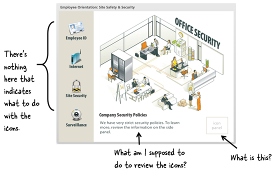
If the learner is used to clicking a navigation button and you want them to do something different it’s important to provide clear and concise instructions. In the example screenshot below, it’s not quite clear what the person is supposed to do.
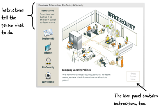
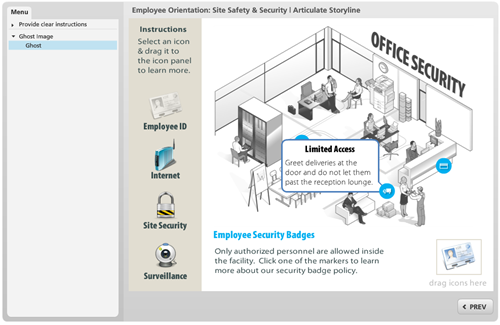
In the following screenshot, the instructions provide more information on how the learner is to interact with the screen.
If you repeat the same type of activity in your course then it’s probably not necessary to add specific instructions each time. Or perhaps the instructions can be delayed. For example, if nothing’s happened after 30 seconds, have the instructions appear.
Create a Ghost Image for Drag Objects in Your Learning Interaction
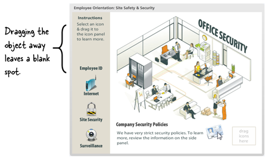
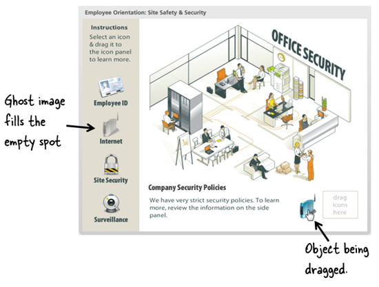
As the learner drags an object away it leaves an empty spot. Depending on the type of interaction this could look odd or the empty spot may look out of place.
As in the image below, I like to add a ghost or watermarked version of the dragged object. This fills the empty area and reminds the user from where the dragged object comes.
In this particular example, it’s probably not too bad because of the spacing and icon labels. However if you do build drag and drop interactions, then adding a ghost image is something to consider.
See it in action. Here’s an example of the points above.
Click here to view the elearning example.
Create a Ghost Image for the Drop Target in Your Learning Interaction
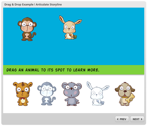
Adding a ghost image to indicate the drop target can also be valuable. Many drag and drop interactions are used as assessments. But often they can be used as a means of navigation. And it’s an easy way to indicate progress during the interaction.
Check out the example below.
Click here to view the learning interaction.
Drag and drop activities are great for learning interactions. They engage the user in a couple of ways. First, the user gets to do something onscreen. This helps keep them focused. Couple that with appropriate decision-making and you’ve got a nice learning interaction.
So if you’re just getting started, be sure to add clear instructions and a few visual nuances to create an effective learning interaction.
Events
- Everyday. Check out the weekly training webinars to learn more about Rise, Storyline, and instructional design.
Free E-Learning Resources
 |
 |
 |
|
Want to learn more? Check out these articles and free resources in the community. |
Here’s a great job board for e-learning, instructional design, and training jobs |
Participate in the weekly e-learning challenges to sharpen your skills |
 |
 |
 |
|
Get your free PowerPoint templates and free graphics & stock images. |
Lots of cool e-learning examples to check out and find inspiration. |
Getting Started? This e-learning 101 series and the free e-books will help. |
10 responses to “3 Tips for Building Drag & Drop Learning Interactions”
I’m a teacher from Spain. I like your nice office environment. It’s like Sims game? How can I build it? I see like a perspective point of view. Have you got some suggestion to help us? I think If I learn to do it I can engage attention of my learners in the classroom. Thanks a lot!
In addition to that, a ghost image also enables the developer to create “undrop” functionality if desired, which comes in handy in many situations.
I was wondering if you had suggestions (maybe another post) on handling feedback with drag and drop interactions. If I build an interaction that has several options and a submit button, I find it difficult to explain the rationale for each of the options in one feedback statement at the end. So I usually end up having the drop item snap back if it’s incorrect so I can give that feedback. But that just seems stupid because the user can keep dragging until they get it right. It would be great to get ideas on more interesting and challenging ways to handle this. Thanks!
Lggi qui la traduzione in italiano autorizzata:
Thanks for sharing this, Tom. The ghost image does add some structure. Hadn’t thought of that, which is why I need your posts. –Daniel
I am not sure I see the value of making these drag and drop interactions. It feels like it is asking the student to do an extra step for the sake of giving them something to do. This could have been done without the drag and drop and just having the student click on the individual items to select them. You can add checks or other styles to indicate which have been selected and which have not.






0
comments