[…] This post was mentioned on Twitter by Brian Batt, Myles Runham, Justin Tymm, cfidurauk, Snare The Job and others. Snare The Job said: 3 Ways to Build Remarkable E-Learning http://bit.ly/b4IR4o #ELearning […]
3 Ways to Build Remarkable E-Learning
November 16th, 2010
Last week I took a stroll through New York City’s Central Park. While walking along the paths, I saw a black squirrel digging for acorns. I’m not sure how many black squirrels live in Central Park so they may be somewhat common. But for me, they’re uncommon and that got my attention.
After seeing the first black squirrel I surveyed the park to look for more. I didn’t see any others, but I did see a lot of grey squirrels. In fact, there were grey squirrels everywhere. I just hadn’t noticed them before.
This reminded me of Seth Godin’s book about purple cows. He talks about how we don’t notice regular cows, but we’d certainly notice a purple cow. The essence of his book is about doing something remarkable. As he says, what you do should be “worth making a remark about.” While he’s in the marketing industry, there’s no reason why his thoughts can’t be applied to elearning courses.
Of course, the odds are that people are already making remarks about the elearning courses, so I’d add that the remarks should be positive. : )
Below is a video of Seth explaining how to stand out with remarkable products. I also encourage reading his blog. It’s not about elearning but it is about how to serve people and meet their needs. And that is a large part of elearning.
Click here to view the Seth Godin video.
Grey Squirrel vs Black Squirrel E-Learning
With rapid authoring tools, it’s becoming easier to build and deliver elearning courses; and that means more and more organizations are building them. So over time, we get a lot of courses that all start to blend together.
They’re like the grey squirrels in Central Park. There were a lot of them around but they just didn’t stand out. It’s easy to build grey squirrel elearning where one course seems to be exactly the same as the next course. But that doesn’t have to be the case. There’s a place to create black squirrel courses—those that stand out and make people take notice. Here are a few ideas to help you get started.
Build Eye-Catching Courses
There’s a lot to be said about the aesthetic design of your course. Some people discount the focus on looking good as mere “eye candy. “ But, the look and feel does matter. The more polished your course is the more value the learner will assign. They see the course before they do anything else with it. So you want it to be inviting and visually interesting to start. You definitely don’t want them starting the course thinking that it’s another boring elearning course and probably a waste of their time.
The challenge for many people is that they aren’t trained graphic designers and not sure how to design the right look and feel. Fortunately there are some resources. First, I’d invest in a graphics design book to learn some basic concepts. The Non-Designer’s Design Book is a good start. You’ll learn the basics with some good before and after examples. Be sure to apply the concepts to your own course design.

David Anderson also has a great mind mapping exercise where he walks you through the process of building a unique look and feel for your elearning courses. As an example, check out the before version of the art history quiz. It’s typical of what we see in many elearning courses.
 Click here to view the before version.
By applying David’s mind map exercise, he was able to convert a somewhat generic-looking quiz to something much more rich and dynamic. Instead of using the quiz form, he leveraged Quizmaker’s slide view to create a very compelling look that only enhances what you’re trying to teach.
The information’s the same in both quizzes. But given the choice, which would you want to be part of your elearning course?
Click here to view the after version.
Keep in mind, the goal isn’t to create eye candy where you have a good looking course with no substance. Instead, the goal is to combine the right look and feel with relevant and meaningful content.
Go From Push to Pull
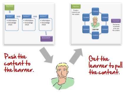
Many elearning courses push information to the learners. I discussed this a bit in the blog post, Are Your E-Learning Courses Pushed or Pulled? The assumption is that people will learn because we make the information available to them. While you do get the informat
ion out there, it doesn’t mean any of it is relevant or sticks.

Ideally, elearning courses have the learners pull information. You do this by giving them a reason to look for it and use it. Find out how the course’s content is relevant to them and then build places in the course where they are challenged to make decisions. Don’t push the information at them. Instead, give them a means to find it and then pull what they need to make the right decisions that help them learn.
Free Up the Course Navigation
Personally, I think one of the worst parts of elearning is when the navigation controls are locked. Typically, the rationale is that “we can’t guarantee that they get all of the information or view all of the screens.” This is a bogus reason to lock navigation. Essentially, you’re already admitting that the course is lame and not important to the learner because if given the opportunity, they’re going to leave. That’s not a navigation issue, that’s an instructional design issue.

If the content is relevant and meaningful to the learner, locking navigation is less an issue. The push-pull approach above is one way to make the content meaningful. You can explore some other ideas in this post on why course navigation is less important than you think.
For those who ask, “How do I know they learned what they needed?” I suggest that you look carefully at your course objectives. There’s a reason that the course exists. In some sense, you’re trying to persuade the learner to a point of view. Considering this, you have to determine how to measure your success at persuading them. When you look at it that way, locking navigation hardly seems a successful route of persuasion.
If the goal is to teach something, then having viewed a screen is probably not the best measure of success. Figure out how the learners can demonstrate their understanding of the content, and then build scenarios, assessments, or other decision points in the process so they can demonstrate their understanding. That’s more meaningful than screens viewed.
There are other ways to make your content remarkable. You can get rid of a lot of content or come up with creative and unique ways of presenting the information. The main point is to look at your courses and ask if they stand out. Are you building grey squirrel courses that are ho-hum and easy to ignore? Or are you building courses that like the black squirrel make people take notice and desire to know more?
What are some tips you have for making elearning courses more remarkable? Share them by clicking on the comments link.
Events
- Everyday. Check out the weekly training webinars to learn more about Rise, Storyline, and instructional design.
Free E-Learning Resources
 |
 |
 |
|
Want to learn more? Check out these articles and free resources in the community. |
Here’s a great job board for e-learning, instructional design, and training jobs |
Participate in the weekly e-learning challenges to sharpen your skills |
 |
 |
 |
|
Get your free PowerPoint templates and free graphics & stock images. |
Lots of cool e-learning examples to check out and find inspiration. |
Getting Started? This e-learning 101 series and the free e-books will help. |
25 responses to “3 Ways to Build Remarkable E-Learning”
Tom,
I have settled on using “templated” options for the meat and potatoes of E-learning courses (Articulate, Engage, etc.), and also rely on them for the built in functionality and navigation. They save me a lot of time, which I then use for working in FLASH to create more unique, “Black Squirrel” content. It’s a nice mix, I’ve found: Gray and Black Squirrel content in the same course. Time saving structure, layout and functionality blended with unique, engaging content.
Excellent Article, as usual. I had an “ah-ha!” moment and have to agree with you relative to NOT locking the navigation buttons.
Even for me while in review of a course before I record it, I like to flip through it to see where it will go. On the flip side, when I take a course, I’m frustrated when I can’t flip through as well.
As a lifelong learner, I know it is important to realize that our “quirks” are not all that entirely unique. I’m never trying to “get out” of a course…unless it’s information I already know. So, WHY NOT unlock the navigation for the students? Can it me THAT easy?
To reiterate my sentiment above, I like the ability to learn what I’m getting into before I settle in and commit to a course as a learner and that’s how I feel my most at ease in a lesson. Whether it is a textbook or an online course, I do the same thing. Perhaps allowing the ability for other learners to “settle in”, readies them to engage in their learning.
Anyway, thank you for the spotlight on that particular nugget. It helped.
[…] Here is the original post: 3 Ways to Build Remarkable E-Learning » The Rapid eLearning Blog […]
I loved he Diabesity course…but how were they able to incorporate the process “buttons” on the actual picture? That was very cool.
Thanks!
We used Lego – why because it is remarkable in that we all know and love it.
We created a small story about Lean in Manufacturing and then created a stop motion movie out of Lego. (http://www.youtube.com/watch?v=24PH9OCe4C8 Lean Gone Lego)
This created massive remarks from the learners, which in turn created context, which created understanding creating outcomes.
You can easily drop bits of these into your course then making it remarkable.
Thanks Tom for all your inspiration, watched the Seth Godin TED talk, thanks again for the prompt!
I know this is picky, but shows I am watching 🙂 Campbell’s Soup Can is spelled wrong in the quiz.
How did he do that in Quizmaker though? What are the actual steps to incorporate graphics like that? Thanks!
I have been following this blog and a few others for quite a while now. The ideas that are shared from the whole community are great and are in line with the way I design my eLearning courses. Unfortunately I find that I am faced more and more with creating training that is basically changing a dry process into an online course. There is little that the learners need to do but lots that they need to know. There are few, if any, related images etc. And I am afraid that scenarios will not be accepted readily (the audience is University Faculty).
I do create an appealing and sharp looking course interface and introduce the course in a way that invites and motivates the learner. I reduce the content significantly and use and use Engage and Quizmaker interactions where possible. But feel that I am just dumping information in a slick manner.
I know that this topic has been discussed before but I am faced with the challenge more and more these days.
If anyone has any ideas, that would be great! Thanks!
@sealiz – We have the tutorials, source files and screencasts available in the forums: http://www.articulate.com/forums/articulate-quizmaker/15079-name-masterpiece.html
I leveraged Quizmaker’s layers (Slide View) to layer two similar images. The bottom image is the flat, art gallery wall and the top image is the flat art gallery wall with art frames and transparent areas for the art pics. Lot of opportunities for hides and reveals in Quizmaker.
Another use of the technique can be seen in Kevin’s Guru winning course: http://www.articulate.com/community/showcase/?page_id=197 He added a really great twist on the effect.
Check out the art gallery tutorials. if you have any questions, let us know and we’ll support you. Oh and thanks for the catch on the Campbell’s Soup:-)
[…] Tom Werner on November 19, 2010 Tom Kuhlmann summarizes his e-learning design philosophy in an educational and entertaining […]
[…] This post was mentioned on Twitter by Craig Hicks, Giancarlo Colombo. Giancarlo Colombo said: POST + VIDEO (~17') 3 Ways to Build Remarkable E-Learning + Seth Godin video presented at TED – http://ow.ly/3aZ4i #cg […]
Nice post, this is something we struggle with every day – making something teachable – allowing the user to drive progression through the course and giving it all a sense of environment. I think above all it shows that having a great set of resources (fonts, imagery, templates & books) will help a lot. We keep brochures around the office from car dealerships, marketing firms, brand centric stores (like Starbucks) and a stack of communication arts. Having the right direction (almost to the extent of creating your own brand kit for each course) will set you and your developers free creatively, while not having to think about the small stuff (like consistency, fonts, colors – all of which have been detailed out & take care of).
[…] 3 Ways to Build Remarkable E-Learning […]
Wow! Love the art quiz, that looks fantastic. I also really liked your black squirrel/purple cow analogy, how true.
Can you tell me how it works with licence on microsoft pictures. Is every picture of Microsoft free to use voor e-learning products? (for intern use)
Thanks a lot!
I am in the process of create an learning application for a client. This was a very interesting read!
i don’t know why it took so long for me to find this site, but its amazing. i am in the process of building a few e learning classes. i also plan on using this for my current high school students. i feel like old teaching methods are obsolete, they need more engagement
I found some clip art that I am going to be able to ungroup and use for my class like Tom has taught us to do on this blog.
If I search for “00140923.wmf” on the microsoft clipart online site, I can find the clipart and can find simular, but how can I find the style number?
Great article! I completely agree that in addition to content, visual appearance is also very important. It isn’t just about ‘eye candy’, it contributes to the learning experience by keeping it interesting and in turn helping people get more out of a course.
About ten minutes ago, I didn’t really know exactly what e-learning was, but after reading a few of your articles, I know a ton! Thank you, your information really helped.
[…] Content is irrelevant with no connection to real world solutions […]
[…] Il contenuto è irrilevante senza connessioni a soluzioni reali […]
[…] từ 3 Ways to Build Remarkable E-Learning của Tom […]


0
comments