The Rapid Elearning Blog

It seems that the last few weeks I’ve previewed a lot of courses that had charts or graphs.  Most of the slides kind of looked like the chart below.  You end up with a lot of information and not quite sure what to do with it.

Today, we’ll look at three sure-fire ways to make your charts and data more memorable.

The chart below tells me to look at the growth, but what growth am I to look at?  Each group has improved from the first quarter to the fourth.  Some more than others.  What does all of this mean?  Why did oranges drop in the third quarter?  Am I even supposed to look at that number?
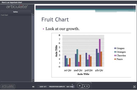
The Rapid E-Learning Blog - typical PowerPoint chart

This is even worse when you get one of those charts where you’re not quite sure what the chart means.  I’ve seen some charts that make me feel like a dummy.  They’re usually those radar charts or the ones with splatters all over the place.  They could have just as easily been created by Jackson Pollock, because they make about as much sense to me. 🙂

A lot of the discussion about cognitive load deals with the information you share and how it’s processed by the brain.  When you add a chart to your course it’s possible that the chart provides way too much information and makes it confusing for the learner to know what to focus on.

The chart below is a good example.  It’s from the Lawrence Livermore National Laboratory.  When I look at the chart, I’m not quite sure what to do with the information.  Where’s the focal point?  If your learners don’t know what to look at, then they’ll probably be confused or glean the wrong information.
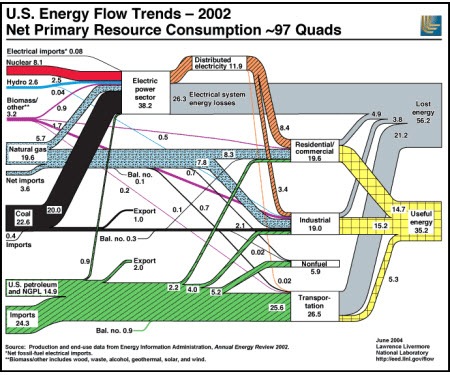
The Rapid E-Learning Blog - confusing chart with a lot of information 

Keep It Simple

Most charts have a lot of information on them; usually more than what’s needed.  If we look at the first chart above, what is it telling us?  There are a lot of things to extrapolate from it.  On top of that, I could focus on the wrong things and infer a cause and effect relationship between the data, perhaps linking decreased orange sales with increased cherry sales.

You’re the one who’s adding the chart to the course.  Do what you can to clean it up and make it more impactful.  At a bare minimum, get rid of some of the distracting elements.  For example, what can you do to add more white space?  One of the problems when converting slides to Flash is that thin lines can lose their clarity.  Do you need all of those lines?  Can you make the data larger and easier to read?

Without a lot of extra effort, I increased the chart to fit the slide.  I moved the key to the bottom; got rid of the gray background; and deleted the chart title.  This helps make the chart a bit more legible.  However, there’s still a lot that can be done to make the information more effective.

The Rapid E-Learning Blog - clean up the basic chart and make it easier to read

Focus on the Key Information

The chart above is an improvement over the first one.  However, there’s still a problem.  I’m not quite sure what I’m supposed to be looking at.  Now, if you actually had this chart in your elearning course, you’re most likely going to include some sort of narration to go with it.  In that case, you can add something like an annotation to draw attention to the information on the chart.  That’s easy enough to do.

However, you still run the risk that the learner is pulling other information out of the chart, which may or may not be correct.  So what you want to do is direct the learner’s attention to the right information.  Below are some examples of what you can do.

  • Add a trend line.  In the example below, I’m able to draw the learner’s attention to the information that is important, which is the increase of cherry sales that year.  I matched the trend line color to the cherry column and added an arrow to indicate movement.
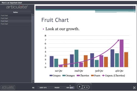
The Rapid E-Learning Blog - a trendline can add focus

  • Tell the learner what they’re supposed to see.  I added some text that basically tells the learner what the chart tells them.  Cherry sales have increased dramatically.  For proof, they can look at the chart.
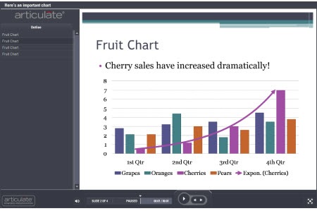
The Rapid E-Learning Blog - tell the learner what they should see

  • Use contrast to create a focal point.  In the chart below, I made the other sales data gray and colorized the information that I want the learner to focus on.  Immediately, you’re drawn to the color and will look at that information first.  Contrast is a key visual design principle and effective in moving the learner’s eye across the screen.  You’ll notice that I also got rid of the lines and numbers on the side to give it more white space.
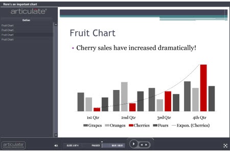
The Rapid E-Learning Blog - use color contrast to gain focus

  • Get rid of the noise.  In this example, all I want to focus on is the cherry sales.  Why do I need all of that extra information?  This is probably one of the most important considerations when using charts.  What do I need to have on the screen that tells the learners what I want them to know?  Do I need all of that other comparative data?  If not, get rid of it.  It’s just going to confuse the
    learners and distract from what you’re trying to convey.
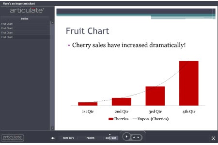
The Rapid E-Learning Blog - get rid of the noise and distracting data

Don’t Use a Chart

Building charts in the presentation tool is easy.  And because of that, we’re quick to use them.  It’s kind of like using PowerPoint templates.  They make the job easier, but might not really help make the elearning course better.

As you can see from the previous points, all of that extra information about the other fruit sales might not add any value to your course content.  In that case, do you really need a chart to tell your learners that cherry sales have increased?
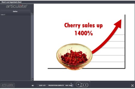
The Rapid E-Learning Blog - do you even need a chart?

  • Step away from the chart-building tool.  Instead of using a chart, break out the key points that you want the chart to make.  Then build out your content to be more focused and visually interesting than you’d get with a chart or graph.  The cherry sales image above shares the same information but doesn’t confuse you with other sales data.  
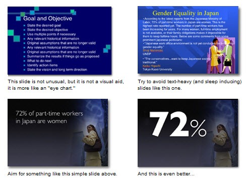
  • Focus on one point per screen.  If you need a chart to tell a few different things, then spread that over a few slides, rather than dumping it all on one screen.  When you do that, you can possibly get rid of the chart itself and make your points in other ways…and make them more memorable.  I like the way Garr Reynolds of Presentation Zen, pulls the key point into focus from the slides below.  You’re going to remember that one point more than you’ll remember all of those bullet points that support it.  The same is true of the data from your charts.  The Rapid E-Learning Blog - example from the Presentation Zen blog
  • Ask why this is important to the learner.  Part of instructional design is to make the content relevant to the learner.  It improves the stickiness of the data.  Find an emotional hook to represent that data.  Most likely a chart isn’t that hook.  Is there a better way to share the data that also adds some emotional impact?  Remember, people aren’t robots that just scan the screen for data.  They’re real people that are swayed by their emotions.  The visual design of your data and its aesthetic value is just as important as the actual data.  Especially if you want it to be memorable.

Check out the Miniature Earth demo below.  What they share could just as easily have been a bunch of boring charts and tables and looked like a UN presentation.  However that would have lost the emotional appeal and definitely make the content less memorable.  How can you hook your learners with the data in your charts?

The Rapid E-Learning Blog - miniature earth demo

Click here to view the Miniature Earth presentation.

Even if you’re building your elearning course in PowerPoint, there’s no reason why you can’t replicate the look and feel of the demo above.  They’re simple graphics and basic fade in and out transitions with some slight animations.  All of that is easy enough to do in PowerPoint.

In either case, when you build an elearning course you’re basically telling a story.  It can be a boring story or one that intrigues the learners.  When you use data from charts and graphs it needs to be part of that story and not just a bunch of data.  Follow sound visual design principles and get rid of the noise that will distract from the key points.  You’ll build better courses that will have more impact.

I haven’t read this book yet, but it was recommended to me and you might find it of value, Stephen Few’s Show Me the Numbers: Designing Tables and Graphs to Enlighten. If you have read it, tell us what you think.

What are some things you do when using charts in your elearning courses.  Share your thoughts by clicking on the comments link.

If you liked this post, try these:

Events

Free E-Learning Resources

Want to learn more? Check out these articles and free resources in the community.

Here’s a great job board for e-learning, instructional design, and training jobs

Participate in the weekly e-learning challenges to sharpen your skills

Get your free PowerPoint templates and free graphics & stock images.

Lots of cool e-learning examples to check out and find inspiration.

Getting Started? This e-learning 101 series and the free e-books will help.


29 responses to “Try These Tips for Great-Looking Charts”

Rule number one: know your chart types!
More often than not people choose wrong chart types to display their information.

In your example, we probably don’t need grouped columns. We need four trend lines (like the one you added), and no columns.

Another common mistake: people use two (three, four) pie charts to show let’s say, “market share before and after”. They should have used colour-filled stacked areas instead, or stacked columns with leader lines.

July 7th, 2009

These are great tips — given some rather narrow constraints in audience, purpose, and context of use. That is, if you are addressing a general, non-expert audience, with the purpose of memorable impact for a few simple notions, and a context of one-time exposure. If, however, you are addressing an expert audience in a self-paced learning context with unlimited access to the information, the problem charts you begin with, though harder to read and impossible to remember, are much more informative than your final product. I am convinced, as I imagine you are, Tom, that emotional impact is the key to durable memory, but some learning should emphasize detailed understanding.

I would suggest that you shouldn’t remove the Y axis from the last charts. Readers need a sense of scale that is absent from those charts. And since you remove them in a context of “get rid of noise” readers may assume that the Y axis is noise, which is not.

And I would *start* by asking myself “do I really need a chart?”.

Otherwise, a nice post.

Good tips Tom and I prefer the bowl of cherries and trend line. If that’s what’s important that’s what you should present.

A book I’d like to recommend is called “How to Lie with Charts“.

The goal is to help you avoid making the mistakes that could be considered ‘lying’ and how to spot it when someone else is. In that quest for truth it touches on how to present information simply and clearly. It made a huge difference in my understanding and is much easier to digest than Tufte or Few (imho). I’ve taught a classroom course about charts and drawn heavily on the book for my materials and it’s always a big eye opener!
j

July 7th, 2009

These are great tips for easy to understand charts, especially as used in eLearning, but I have to say that I thought the Lawerence Livermore energy graphic was incredible! The amount of information that is clearly shown in that graphic is astounding; you can see a graphical representation of the relative size of the inputs, what those inputs are used for, the staggering ineffeciency of transportation and electricity generation, imports, exports, and more, all in a graphic that’s very easy to understand by dedicating a couple minutes.

You should have selected one of those awful infographics where the radius of the circle contains the information, but the area of the circle is the thing that people notice, giving a totally misleading view of the information provided. Or maybe one of those charts with two or more independent x- and/or y-axes.

I came across that book recently Julie and wasn’t sure if it was a joke or not! I will have to take another look.

Thanks for sharing ‘The Miniature Earth Project’ Tom, what a great example of using keynote to create a truly memorable (and personal) experience.

Good feedback.

@John & Fran: good points. I actually have a follow up post planned on dealing with the charts when you need to share more information.

Tom,

Thanks for addressing charts and graphs. I look forward to next week’s follow-up post!

How about a pie chart using the photos of real pies? 😉

Hi Tom,

The cherry bowl really drives it home and really makes you want to eat up the chart.. er.. I mean need to know information. It can get mixed up with charts and I agree that charts should be used when absolutely essential. Another twist to the Cherries Sales example in Powerpoint could be careful choice of color with the other bars and then in a few seconds fading them out to leave the cherry sales arrow and of course, the bowl of cherries;-)

@Sergey Do you have any resources for learning more about chart types and selecting appropriate charts for data types?

Thanks,
Will

The Miniature Earth presentation was very moving – and a fabulous example of data presentation.

I paid my 5 bucks to download and hope the donation will be used appropriately.

Tess

For some great advice on charts, and when not to use them, I recommend:

How to make an impact‘ by Jon Moon.

It also contains other great information about laying out documents, some of which can be transferred to elearning.
After reading chapter one of this book I redid (no change in the words, just the layout) a report I had just sent to senior management. I was embarassed as to how bad my original (sitting in their inbox) looked by comparison…

Tom, Great post again.

Thanks for sharing the Miniature Earth link. I had first seen ~ 2 years back. But when I looked at it again today, it was equally moving. Forces one to think …

Amit

Nice post! I forwarded the link to your post to all my friends. All of us create charts on a regular basis and these tips should help with more effective communication of data.

Thanks Tom for your tips!
Unfortunately it’s not easy to replicate the zoom ‘n pan effect (Ken Burnst) in powerpoint.
What about choosing camtasia or screenflow instead of MS ppt?

fabio

@fabio: there are all sorts of ways to create a demo like that. However, the point is that if you wanted to build an elearning course that was similar to the structure of the miniature earth demo, that would be easy enough to do in PowerPoint.

To do a zoom and pan, just combine the grow animation with a motion path. I did this demo real quick. Only took about a minute to build. I just grabbed the first image available so the resolution isn’t very good. But you can see the effect works.

Click here to view the demo.

July 8th, 2009

Hi Tom,

A great chart can convey so much info, but they are so overused! I too am a great fan of removing the grid lines – even in print documents.

Loved the minature earth – I wish the corporate world was less attached to corpoate colours and templates.

I thought Fran’s comments on the Lawrence Livemore summed up exactly why I would never use a chart like that – a learner needs to dedicate minutes to understand it. My suggestion is that if you have to include charts like that(and I’ve been directed to in the past – despite howls of protest), then you ‘build’ them up one layer at a time in your powerpoint or eLearn.

As always, a wonderful post!

Jen

Every time I visit this blog there is beautiful step-by-step learning. The graphs never looks so interesting before. Thanks for all the very interesting posts. I admire the spirit of sharing here.

Thanks for posting on this important subject. For more great information on graph design based on how we perceive and process information, see Stephen Kosslyn’s “Elements of Graph Design (1996).” I think you’ll enjoy it.

[Ed note: also available or Graph Design for the Eye and Mind (2006).]

Connie
http://theelearningcoach.com/

Hi, thanks Tom.

Re-enforced my thinking on presenting information. There’s some great content in How to Make an Impact by Jon Moon.

Tony

I highly recommend reading most everything by Edward Tufte. Although it is presented in an academic format, he understands how to best display quantitative information. One can use complexity, but still engage a learner.

I can imagine the U.S. Energy Flow being best suited for an interactive slide that helps the learner through the data – well, and yes, some cleaning up of the slide as well. In other words, you don’t have to sacrifice complexity, but you DO have to think of how to best layer the data to allow the learner to understand the relationships.

Tufte’s stuff is good and recommended. However, there is a difference between a presentation and elearning course. For example, a presentation is usually an isolated event where an elearning course can be rewound and repeated.

Thanks for the post on creating charts. I haven’t been able to master the basics for creating them but can understand the need for simple and direct presentation of data or ideas. What readily available programs do people generally use to create charts?

[…] quanto riguarda le altre due strategie vi rimando ad un post che mi è stato segnalato da un commentatore: guardate le operazioni che vengono compiute […]

[…] quanto riguarda le altre due strategie vi rimando ad un post che mi è stato segnalato da un commentatore: guardate le operazioni che vengono compiute […]

Hi Tom,

Did you know Garr Reynolds just released Presentation Zen: The Video? Thought you and your readers would like to know.

A couple of the other posters mention Jon Moon’s book. There’s also some e-learning courses which practices what the book preaches:

http://www.jmoon.co.uk/online_courses.cfm

Great charts. I have just upgraded from Excel 2003 to Excel 2007 and I am impressed by the improvements in charting.

[…] un post molto interessante di Tom Kuhlmann, come al solito tradotto per voi. Il post originale è qui Molte delle slide con dentro dei grafici assomigliano a quella che vedete sotto: molte […]