[…] This post was mentioned on Twitter by Brian Batt, Justin Tymm, Justin Wilcox, Paul Simbeck-Hampson, SHARP! Biz Comm and others. SHARP! Biz Comm said: Here's How to Add Personality to Your E-Learning Courses » The … http://bit.ly/bqcpbo […]
Here's How to Add Personality to Your E-Learning Courses
February 9th, 2010 
In a previous post, I shared some free handwritten fonts. Today, we’ll explore how you might use them in your elearning courses.
We already looked at how fonts are more than the text you read. As a graphic element, they convey meaning and play a role in the message you communicate. That means you always have to consider what visual cues the text provides in addition to what is being read.
A Few Examples
Below are images from some web sites that include the use of handwritten fonts. Look them over and consider what value they bring to the screen. How would those sites be different if the font used was not handwritten?
Handwritten fonts can draw attention to important parts of the screen, add a sense of personality, and speak to the user in more personal and informal tone. It’s as if the instructor is letting you in on some personal notes, giving you extra information. Kind of like the director’s commentary on DVD. Because of this, handwritten fonts can add value to your elearning course.
When to Use Handwritten Fonts
Below are some tips to help you determine why and when you might use them.
- Novelty can contribute to engagement. Most courses have a generic and familiar look. Combine handwritten fonts with a less familiar look and you’ve got a course that stands out. The cork board example above could easily be the design theme for an elearning course.
- Add a human touch. Handwritten fonts can draw the learner in and make it seem like the information is a bit more personal. Augment the screen content with a personal note and it appears as if you’re speaking past the course and directly to the learner.
- Instead of black, use a dark gray. It warms up the “ink.” I’d also look at common marker colors. Bold colors probably work better than those that are gentle or subdued. Plus, colors have their own meanings. Like red, which can imply an error or command attention.
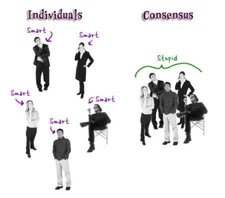
- Use strong contrast. You really want the handwriting to stand out. That’s where the bold marker colors come in handy. The effect works well on the third image above because she used black and white images with colored handwritten fonts and arrows.
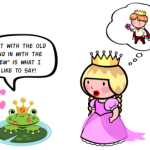
- Rotate the text slightly. Never leave the text perfectly horizontal, it’ll look more natural. Kathy Sierra from Creating Passionate Users also once suggested adding hand drawn lines to the handwritten fonts to make the font seem more real. That’s why I included a free font set with some hand drawn lines.
- Contrast formal and informal content. For example, the course content is represented with a traditional font, but when you want to pull out some key points or “did you know” text, handwritten fonts work well.
- Change the tone or voice of the course. By changing from a formal font to the handwritten font, you create a visual cue for the learner. An example of this might be where you transition from the formal course content to a case study. The case study is pointed to the learner so the tone of the content changes and comes across as more personal and less generic.
- Create a sense of urgency. Striking through some text and overwriting it with a handwritten font implies urgency or possibly an important last-minute change. It definitely stands out and makes you notice the change.
I applied some of the tips in the image below. The handwritten text represents the answer to a question. It contrasts with the question text. The red also helps the answer stand out and is probably the first thing most learners will focus on.

Add personality to your elearning course with handwritten fonts. The contrast helps you focus on key information and they can create a more personal setting. They can help step away from that common corporate look.
Do you know of some good examples of elearning courses that include handwritten fonts? Feel free to share your thoughts by clicking on the comments link.
Events
- Everyday. Check out the weekly training webinars to learn more about Rise, Storyline, and instructional design.
Free E-Learning Resources
 |
 |
 |
|
Want to learn more? Check out these articles and free resources in the community. |
Here’s a great job board for e-learning, instructional design, and training jobs |
Participate in the weekly e-learning challenges to sharpen your skills |
 |
 |
 |
|
Get your free PowerPoint templates and free graphics & stock images. |
Lots of cool e-learning examples to check out and find inspiration. |
Getting Started? This e-learning 101 series and the free e-books will help. |
49 responses to “Here's How to Add Personality to Your E-Learning Courses”
Excellent Post! Thanks for sharing this.
Using a handwritten font does indeed apprear to be ‘speaking personally with the learner’. Sometimes you wonder how small changes could make big difference. 🙂
[…] Here’s How to Add Personality to Your E-Learning Courses » The Rapid eLearning Blog. fevereiro 9th, 2010 | Category: ead, noticias […]
[…] […]
First, that’s a great header image Tom!
The excellent Head First series of tech books from O’Reilly (nay – the *only* tech books that have ever really “clicked” with me) uses a handwritten font for annotations to great effect.
http://oreilly.com/store/series/headfirst.csp
This simple but effective trick has been used in other books for many years of course, perhaps in recent years most famously in the Harry Potter series, which uses (among other alternating text styles) Felt Tip Roman (from one of my favorite font designers, Mark Simonson) for Hagrid’s handwritten notes.
http://www.ms-studio.com/FontSales/felttiproman.html
And if throwing in some handwritten text makes a book more engaging, it’s axiomatic the device can do the same for eLearning.
Your posts on fonts, Tom, are nice additions to the rapid e-learning discussion. I’m wondering if any evidence-based research is out there for review. Just curious.
Regarding the red font: My health care clients do not want the color red in their courses because it equates to blood, which conjures up injury and pain.
That’s where the handwritten font can help. Instead of making certain content stand out by using a red font, we can replace the color red with a handwritten font. I’m trying a Did You Know… header in the client’s branded color scheme as a handwritten font.
@jenisecook
Most people tend to retain more data with visuals when learning and handwritten fonts are another great way to captivate your audience. Thanks for the information — great tips on when to use the fonts too.
Thanks for another great post, Tom! Unfortunately your link to the free font set isn’t working.
This link was not working for me: free font set with some hand drawn lines. Did others experience this? It took me to a page saying the page does not exist.
Another great article, keep up the good work. Loved the picture of the lady with the big eyes at the top of the article.
Clicky linky still no worky 🙁
Great post, Tom, and a wonderful public service… People need to know that there are options other than Comic Sans!
Here’s an important tip about rotating items that I learned in Graphic Design class in college: If you are going to rotate something, rotate it enough so that people know you meant to rotate it — otherwise it just looks crooked. (Same thing applies if you want to off-center something or make one object bigger/smaller than another.
P.S. I enjoy seeing all the different examples you pull in from different websites and courses… and that you normally give credit where it’s due. The last one looks familiar — where did it come from?
I’m a fan of “I-Q”. 🙂 Thanks!
Just be aware that in many applications (MS Word, emails, etc ), unless the end user has installed the same font, your font will default to their normal font.
[…] Here’s How to Add Personality to Your E-Learning Courses » The Rapid eLearning Blog – Tom Kuhlmann offers up advice on how to integrate script fonts into your elearning courses for personality. […]
Hi Tom,
Another great post! I’ve been using these for a little while now (and must confess to be inspired by some of your examples).
Here is a fantastic site for fonts which includes a bucketload of free handwritten fonts:
http://www.urbanfonts.com/fonts/handwritten-fonts.htm
Cheers
Jen
@Sam: if you’re using Articulate or Captivate, the fonts won’t change. If you’re using powerpoint – just save it to PowerPoint Viewer and it’s all good. With Word docs, you can always convert them to PDF to eliminate this problem.
Tom-
Cool how you customized your own font. I downloaded it and played around.
Here’s a screenr of an effect I used with your font and some hand cutouts to show how you can create a writing effect.
http://screenr.com/Ywd
Tom,
First, I am a presentation designer, not an e-learning developer, but I definitely appreciate the value of using handwritten fonts in my PPT presentations.
Here’s the issue for me…
I see how the handwritten fonts would be excellent in an e-learning environment, but I see complications when they are used in a ‘pure’ PowerPoint presentation.
Many of these handwritten fonts would not be a part of the font family of many computers that a client would use to play the presentations I design for them.
I know it is possible to embed fonts when saving a PPT presentation, but they must be TrueType. Is embedding the font a guaranteed way to preserve the font no matter what computer is running the show?
If not, what other ways would you suggest to assure the non-traditional fonts are displayed in a PPT show as the designer intended?
Thanks.
Michael Schwartz
Michael asked:
“I know it is possible to embed fonts when saving a PPT presentation, but they must be TrueType. Is embedding the font a guaranteed way to preserve the font no matter what computer is running the show?
If not, what other ways would you suggest to assure the non-traditional fonts are displayed in a PPT show as the designer intended?”
Here’s one solution. Turn your text into a graphic image. (In PPT) Select your text box, then right click and choose ‘save as picture’. Then replace the text box with the image of your text (Insert picture) that you just created.
“Instead of black, use a dark gray. It warms up the ‘ink’.”
– this is an important tip for almost all design work. Apart from body text and background, VERY rarely do you want to use total black (000000) or white (ffffff). A shape, background, gradient, or incidental text will always look better near-but-not-quite-black.
If you stick with going close to primary colours, but just a little off, the human eye will see it as not only ‘warmer’ but more ‘real’, and often will mentally create a shading or gradient effect when one isn’t even really there.
[…] Great Post: Tom and the Rapid eLearning Blog on when to use handwritten fonts. […]
Thanks John and Tom for your suggestions about embedding fonts.
[…] […]
I thought the screen shot of the demo you referenced didn’t look familiar, but it did sound familiar – the text was taken from an Allen Interactions course that they show repeatedly in their ASTD courses on Instructional Design and Rapid Prototyping.
(http://www.alleninteractions.com/content/supervisor-effectiveness-employee-security).
Hi Tom, In the last bit of your article you have a screen shot of an example where the learner is meant to select a question to ask an employee. Once they select the question to ask the employee and the answer is provided on the right hand side, does this then go on to getting them to ask another question and if so how do you do this while showing that they have already asked that particular question? Am wanting to do a similar thing as per my forum question http://www.articulate.com/forums/general-discussion/15615-using-power-point-hyperlinks-navigate-through-list-questions-help-needed.html#post71511 Thanks.
[…] Here’s How to Add Personality to Your E-Learning Courses » The Rapid eLearning Blog – Tom Kuhlmann offers up advice on how to integrate script fonts into your elearning courses for personality. : email : print : bookmark : […]
I agree, handwritten fonts make the website more personal. This is so important especially in the digital age.
Thanks for the Font Sets Tom, have been using them successfully for a while now!
Thought you might be interested in my post on using Google’s Font API to get handwritten fonts into your HTML without having to worry about converting and embedding fonts.
[…] Here’s How to Add Personality to Your E-Learning Courses […]
I think hand-written fonts adds informality feeling to the e-learning course. When speak to personality, I think more about personal interests. However, great post as always Tom!
Hi Tom! I was just wondering which handwritten font you use most often in your presentations? What size do you use? Do you bold it? I have tried a few but the quality of them don’t present well once published. Is there any chance that you would be able to do a blog post or Screenr on the process of how to do it properly or how you step through the process yourself when creating something? I’m not sure if I am doing it correctly and most efficiently.
I’m not sure if you are creating text boxes with the font on top of the image or creating the words and arrow and saving it as an image. How did you produce the arrows? I know you have some in the fonts you provided, but I am finding it difficult to find them and use them. I have also tried to use a handwritten font and arrows in a Word document with screenshots for a manual, and that is even more cumbersome!
I recently tried Snagit and their arrows, but I have found that I need to make the canvas larger to fit the handwritten words and arrows, thus making the screen shot smaller than I would like. The fonts didn’t look smooth (I will try the dark gray next time). Thanks for any help you can provide!
[…] work well in elearning, too. I discussed the value of hand-drawn elements in this post on adding personality to your elearning courses. I like that it adds some novelty, feels personal, and creates good contrast. We used […]
[…] […]
[…] In aggiunta c’è molto da dire sul valore di un aspetto armonico e l’emozione data dagli elementi grafici disegnati a mano. […]
[…] Adding organic elements to your content area is a great way to add contrast and draw attention to parts of the screen. I discussed this a bit in the post on adding personality to your courses. […]
[…] How to use hand-written fonts to add personality to your courses […]
[…] a previous post I shared ways to use the handwritten fonts as well as some speech bubbles and free hand-drawn graphics that you can download and use with the […]
[…] link […]


0
comments