
A common frustration for many rapid elearning developers is wanting to build elearning courses that look good but not having the graphic design expertise or resources to make it happen.
Today, we’ll look at a simple way to solve that problem. I call it the “quick template” technique. It’s a trick I share in many of my workshops.
In a previous post we reviewed how to design an elearning course on a budget. It’s a good overview of what we’ll look at today. In that post, we explored:
- Where to locate existing course assets
- How to leverage the company website
- Ways to modify the assets you find
E-Learning Courses Compared to Websites
Websites and elearning courses are very similar in how they’re built. They’re both screens on a computer. So what they have on the screens is very similar. And when you think about it, there’s really only so much you can put on the screen.

The screen usually has text, colors, and some other design elements like shapes and images.
You may not have a graphic designer at your disposal, but odds are that your organization hired one to build its website. And since a website and course design is very similar, there’s probably a lot you can glean from your company’s site.
Another advantage is that the website also alleviates some of the branding issues that you may face in the organization because they’re typically branded to meet the organization’s needs and comply with the organization’s branding guidelines.
How to Create an E-Learning Template
Here are the key elements I look for when pulling ideas from the company website:
- Colors and how they’re used. What’s the main color? How are accents used? What color is the text?
- Treatment of images. Do they use photos or illustrations? What type of photos are they using? How do they work the logo or branded images into the template?
- Typography. Does the company have a designated font? What fonts are used for title and body? What colors are they? How are they used?
- Design elements. Are the lines straight or curved? Squares or circles? Pointed corners or rounded rectangles?
- Content containers. This is the main thing for me. How is the content on the site framed? Can I use some of the design elements for specific types of content like call out boxes or media holders?
Once I review the site and make notes on what I can use, I assemble the template. Most of the times it requires a few different layouts. Keep in mind the template you create doesn’t need to be an exact duplicate of the website. You’re merely looking for design ideas that will help you develop a clean and nice looking elearning course design.
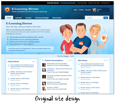
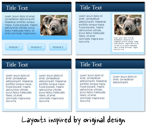
For example, I may take some of the design elements that I like from the demo website above and then modify them to be different types of content containers. This allows me to create an assortment of layouts that I can use throughout the course.
Here’s a quick tutorial on how to find course design ideas from your company website. One video goes through the site and looks for inspiration. And the other shows how to transform the ideas into an actual template design.

Click here to view the tutorial.
You may not have the graphic design skills or resources to build your elearning course design, but you may find that those things already exist in some format for you to use. Make friends with your IT staff, web design team, and any other group that produces designed materials. This will put you on the road to a clean and consistent design for your next course.
Where do you find ideas within your organization? Leave a comment by clicking on the comments link.
Events
Free E-Learning Resources






0
comments