Many of the blog’s subscribers are new to elearning. Because of this I get a lot of questions and many of them are similar. So today I’m going to do a recap of a few of the more common questions.

What mic I use is the most frequent question I get. There are all sorts of good mics out there. I can’t speak to all of them, but I can share my experiences. I used to use a headset mic, but I didn’t like that it was more susceptible to picking up the “popping p” sound. So I switched to a desktop mic and haven’t looked back.
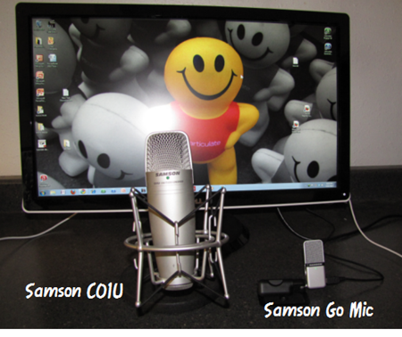
I’ve been using a Samson CO1U for the past three years. But I just bought a Samson Go Mic from Amazon for about $50 (about half of what I paid for the CO1U). I really like it. I’ll probably make it my default microphone because it’s much smaller, sounds great, and it gives me three audio recording modes.
Here’s what I like about desktop microphones. They tend to produce a richer sound; and you can share them. I don’t know how you feel about this, but I don’t want someone else’s spit on my mic. You also have more control over recording because you can position the microphone where you want for the best sound.
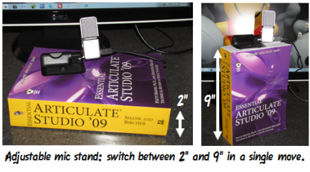
Some people run their audio through a mixer. Not me. I just plug the mics into my computer and record. In fact, here’s my audio set up. Pretty simple, huh? Fortunately, the Essential Articulate Studio ‘09 is such a well-documented book, because its size makes the perfect portable mic stand. 🙂
For those who want to hear the difference, here’s a test I did of the Go Mic. And here are a couple of demos that show the difference between a headset and desktop mic. There are also a few community members who also shared what they use and recorded some demos.
I like my Samson mics, but there are a lot of other affordable options. The key point is that your audio should sound good. And you really hurt your elearning course it if looks great but sounds bad. If you do a lot of narration, then a desktop mic is the way to go.
Related links:
 There are a few common issues when working with rapid elearning tools. A form-based application makes creating your course real easy. But since it’s a form, you’re locked into a distinct look. Think of it like a Jell-O mold. You get what the mold is designed to give you.
Typically, with a form-based tool, you have limited customizations outside of changing the template colors and fonts. But, with some creativity you can make the output appear different. For example, in the LINGOs course we built, we inserted the Engage interactions as Flash files and then moved the .SWF up to hide the black title bar. If you use Quizmaker ‘09, make sure to take advantage of the Slide View feature. This lets you break the standard form look and create a product that can be very rich-looking, like the example below. This lets you be as creative as possible.
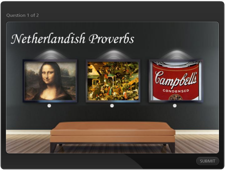 Click here to view demo.
Another issue is when working with PowerPoint. We tend to gravitate towards the templates and placeholder structure that PowerPoint provides. While it’s fast to assemble content, the trade off is that you get stuck in that dreaded “PowerPoint” look.
The first thing I recommend is to get rid of the templates and placeholders, and start with a blank slide. Then I suggest getting inspiration from web design sites. These are great places to get ideas for color schemes and page layout. That’s where I got the ideas for these free PowerPoint templates.
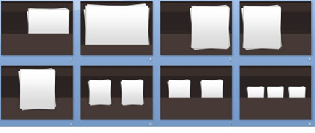
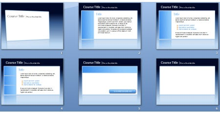
After you do a few of these types of designs, you’ll start to get a better feel for how to move past bullet-point elearning and start to work on something more creative.
Related links:

Screenr’s a great product for quick tutorials. In fact, since it launched a few months ago there are already a few hundred free elearning-related tutorials that cover all sorts of topics. While it’s not an option for everybody, if you can use Screenr videos for your training here are a few ideas:
- You can insert the Screenr video in PowerPoint using the developer tab and inserting the .SWF link from the embed code. Here’s a tutorial that shows how. This works fine if you are working in PowerPoint only. If you’re publishing your course to Flash, follow the steps below.
- Insert the tutorial as a web object. Screenr gives you an embed code. Use that embed code to insert the video as a web object. Here’s an example of what it looks like. This tutorial explains the two ways to use the web object feature with Screenr.
- Download the video as an .MP4. The first two options require that the learners have Internet access. By downloading the .MP4 video file and inserting the video into the slide, the learner won’t need Internet access. Screenr has some preset record options. 720×540 is the 4:3 ratio of PowerPoint slides. You can also record at 980×560 and insert the video using the no sidebar option in Articulate Presenter. That’s what I did in this demo.
Concerned about the 5 minute limit and lack of editing in Screenr? That’s easy enough to fix. Just record your video in chunks. Don’t worry about edits or the time limit. Then download the .MP4s and edit them in Microsoft MovieMaker. It’s free and easy. Plus you get all of the advantages of editing video applications like cool transitions, inserting additional audio, and adding titles and captions. Here’s a tutorial that show you how to edit the Screenr videos in MovieMaker.
Related links:

Good question. We just announced the 2010 Articulate Guru Awards. It’s a great way to show off your rapid elearning skills. If you don’t have a real course to work on, create a fake one. Do one on setting goals or how to make toast. The content really doesn’t matter.
Now’s the time to show the world what you can do. As I tell some of my friends, “Quit your belly achin’ about what’s wrong with elearning! And show me what YOU can do.”

If you have any specific questions or things you’d like to see covered in the blog, let me know. I’ll see if I can work them in.
Events
Free E-Learning Resources


 There are a few common issues when working with rapid elearning tools. A form-based application makes creating your course real easy. But since it’s a form, you’re locked into a distinct look. Think of it like a Jell-O mold. You get what the mold is designed to give you.




0
comments