Very Interesting post , also very entertainment 🙂
Thank you for sharing
How to Build Your E-Learning Skills
October 15th, 2013
Many elearning developers are challenged because they work with a lack of resources, formal education, and experience. In a recent post I asked whether or not one needed an instructional design degree. That prompted some really good discussion.
While pursuing a formal education is great, it does take time and money. So what can you do to build skills today? Here are a few tips to nudge you forward.
Let Others Inspire Your E-Learning Skills
If you’ve been reading this blog for a while, then you know that I routinely stress the need to find inspiration from others. This helps you glean design ideas and production tips. Once you have them it’s a matter of practicing and applying them to your own projects.
We recently released Articulate Studio’13. One of the things I like when we do a product launch is that some people from the community share quick examples using the tools. The examples are a great source of inspiration for those just getting started.
Below are three of the examples. They’re not full-fledged courses but they give you some ideas of what you can do with the rapid elearning tools you use.
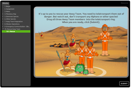
E-Learning Example: Space Training Mission
Click here to view the elearning example.
E-Learning Example: Kids Sun Safety Game
Click here to view the elearning example.
E-Learning Example: Journey as a Sea Turtle
Click here to view the elearning example.
Coming from the perspective of inspiration, here are some tips I pulled from their demos:
- Avoid the Frankencourse. Rapid authoring tools are powerful because they remove a lot of the programming requirements. But because they often use media created from multiple applications the courses tend to get that disjointed Frankencourse look. In the examples above, most combine PowerPoint slides with inserted quizzes, interactions, and a Replay video. But it’s not easy to see where one starts and the other stops. Part of it is the new integrated player in Studio ‘13, but most comes from the course designers who found a way to make all the tools work together. Regardless of the tools you use, focus on creating an integrated look.
- PowerPoint is still powerful. There are plenty of critics of PowerPoint and rapid elearning. But they’re mostly wrong. As you can see in the examples above, with some creativity you can do quite a bit and produce great results. Essentially PowerPoint is a blank screen. What you put on the screen determine how it looks.
-
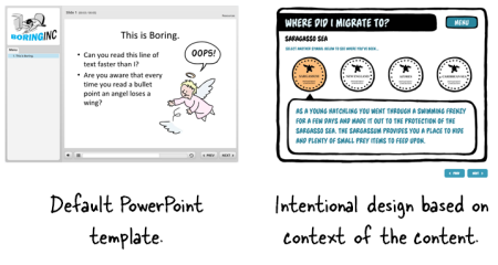
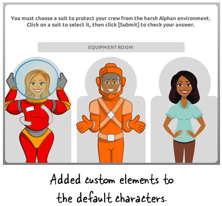
Don’t stick with the defaults. By default you get a standard player with a sidebar menu. But you don’t need to stick with the defaults. You’ll notice each demo had a custom look. That means they ditched the default PowerPoint templates, the default blocky quizzes, and the default player settings. The same can be said for how the vector characters are used. I really like the way Prometheus added the space suits to the characters and integrated them into the course. That gives the characters context and makes them more meaningful to the content.


- Out of the box thinking. One thing that stood out to me was the way the space training demo used the presenter panel. It’s designed to display the course presenters. But they used it as a way to show progress in the course. Instead of inserting presenter images and names, they inserted the “System Status” and level. Pretty clever. This is the type of stuff you’ll only learn from other users and a good reason why connecting with other users is important.

Be an Active Voice to Develop Your E-Learning Skills
Communities of practice are built on the foundation of sharing and learning from each other. When people ask how they can learn more about elearning one of my first responses is to be active in the community. Ask questions when you need to learn. But also commit to sharing what you know.

Tim Slade is a great example. He’s an active community member who regularly shares what he knows. And it’s in that sharing he’s grown quite a bit in his own skills. Here are a few examples of how he’s involved in the community and how it’s helping him develop his elearning skills:
- Be present. Tim is an active presence in the community, helping people. A lot of people find being active a chore. But if you want to stay connected and learn, then being part of the community is important.
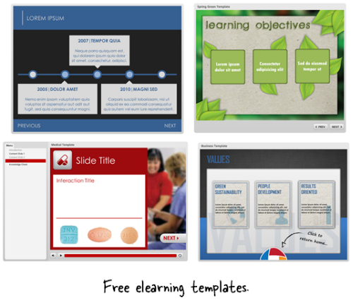
- Share what you know. Tim shares free elearning templates which you can find here, here, here, and here. As he shares in this forum post: they’re simple to build and a great way to practice your skills. By sharing these templates and helping in the community, Tim is building his reputation and authority.
- Write a blog. A great way to learn is to commit your thoughts to paper. Don’t worry about writing a blog to get subscribers. Instead write a blog to capture your learning. In turn you’ll share your expertise and help others. I like the way Tim’s blog has evolved from when he first started to where he’s even doing product reviews. He can do that because people trust him. He’s developed his credentials in the community by showing a commitment to their needs. How do you think this helps his professional prospects going forward?
Tracy Parish is another good example of someone who is active in the community and regularly captures her thoughts to make her learning journey public. Even Prometheus has gotten into the act. They’ve started a series showing how they built their Space Training Demo.
You don’t need a polished blog like Tim’s and you don’t need to build free templates to develop your skills. The main point is to be connected to the community and share what you know with others. Many of the other elearning developers are in the same boat—working under sever time constraints with limited resources. So any help and advice is appreciated.
Finding inspiring ideas and applying them to your own courses will help you build better elearning courses. But better yet, be active in the community. You’ll grow in your skills and build a network of peers.
What do you do to practice and develop your skills?
Events
- Everyday. Check out the weekly training webinars to learn more about Rise, Storyline, and instructional design.
Free E-Learning Resources
 |
 |
 |
|
Want to learn more? Check out these articles and free resources in the community. |
Here’s a great job board for e-learning, instructional design, and training jobs |
Participate in the weekly e-learning challenges to sharpen your skills |
 |
 |
 |
|
Get your free PowerPoint templates and free graphics & stock images. |
Lots of cool e-learning examples to check out and find inspiration. |
Getting Started? This e-learning 101 series and the free e-books will help. |
19 responses to “How to Build Your E-Learning Skills”
None of the examples works on my mobile? (Samsung Note 3, Android 4.3)
Thanks for these examples Tom. Do you know which Interaction or Quiz was used for the 7th slide “Away Team Preparation” for the “Space Training” e-learning example?
Thanks, Bryan.
Great stuff – thanks again!
One question: where, and how is the ‘talking head’ done in the Kids Sun Safety Game? I was looking to do something just like that, but didn’t know where to begin.
Thanks! -Tim
oh boy i have been out of the job force for a year and I don’t know storyline or Articulate ’13 how much am i at a disadvantage what can i do to keep up to date to increase my skills??
Sincere thanks Tom for a very interesting discussion group.
Great to see other trainers questions.
Good Job Tom, post is very informative and knowledgeable for readers. I agree that images, powerpoint on any articles would make it more interesting and informative. I will be following same in my blog from now. Thanks One Again
Great advice. I check in on e-Learning Heroes and follow these posts. I like to capture screenshots of elements that I like – a layout, a color scheme, interaction concepts – and make a few notes on what I like about it. I do this in Evernote. Then I have a notebook of ideas to refer to when I have a creative block. Many good ideas come from website design as well as e-learning design.
@Pam Richmond
I love the idea of keeping a digital scrap book of ideas that you find around the web! I think I might try that.
Hi…Tom,
Thanks for this great ideas. I really love all. These are fantastic ideas to build or improve E-learning skill.
Hi Tom,
I like your blog very much, I am following it for a long time. I wrote a post about your blog. You can check it by going on this link http://www.educationalgeek.com/rapid-elearning-e-learning-blog-every-educator-must-follow
I also believe in the effectiveness of e-learning, because it saves us the money and we get to learn a lot, and e learning comes really with inspirations from others.
Hi Tom, I loved this post. This particularly rings true for me: “find inspiration from others.” This is exactly what I do when I’m stumped and am at a creative roadblock. It’s so amazing to see what others are able to do and to modify it for your own. Speaking of that…
I’ve tried to create a custom html background for one of my courses, as is visible in the sun safety course. I haven’t been successful. I’ve seen the screencast on adding an image to the player.html file but am at a breaking point. Any ideas how to recreate this?
@Tim I created the Sun Safety demo and Tom is correct I did use CrazyTalk Pro to create the talking heads. Instead of using the characters that come with CrazyTalk, I pulled in my own characters and backgrounds.
@Lesley – in Studio 13 you edit the presentation.html page after publishing
Look for:
body {
margin: 0px:
background-image: url (NameOfBGimageGoesHere.png);
background-repeat: no-repeat;
Once you have added the name of the image file to the html page and saved it be sure to add the actual image file into the output folder.
Note: The image file I used for the Sun Safety course is large – dimensions where 1280px x 1024px. Most of this is the pink background.
Nancy Woinoski – Pinched Head


0
comments