The Rapid Elearning Blog

Archive for the ‘E-learning’ Category


free multimedia apps

We all love free tools to help us save time and resources so that we are more efficient building our elearning courses. Here are two free multimedia applications that I use quite a bit.

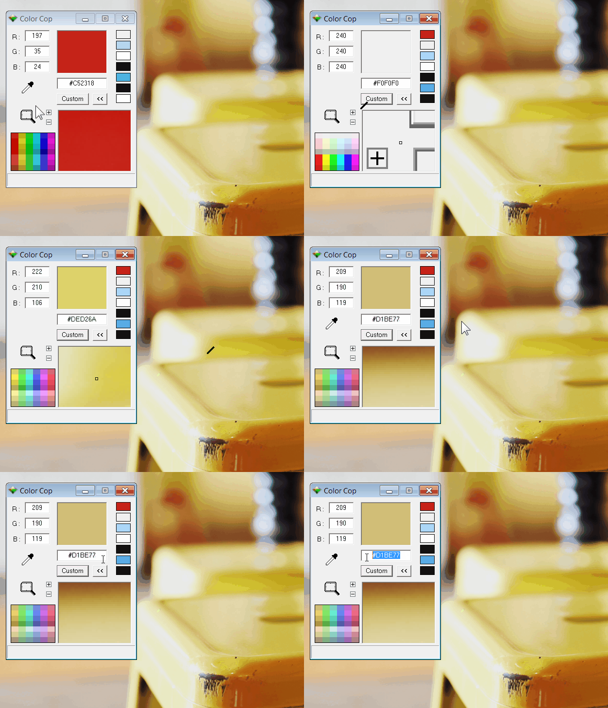
Color Picking with Color Cop

If you’re using Storyline that’s already easy to do because there’s a built in color picker. However, if you need to pick colors outside of your authoring tool, Color Cop is a good one to use.

free color picker

I use color pickers all the time. One way I integrate colors into my slides is by adding an image to my screen and then I pick colors from the image to create my buttons, background and accent colors. This way everything kind of look like it belongs together.

Create & Share Screenshots with ShareX

ShareX is a pretty slick application and I use it all the time to create quick screenshots and share them with team members and customers. I find it really useful to provide visual feedback when working on courses.

I use a keyboard shortcut to grab the screenshot and then it automatically uploads to my service of choice. I have use my Google Photos account, but images can be uploaded to all sorts of services, which can be seen in the image below.

free application

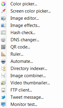
ShareX isn’t limited to just screenshots. In fact, it does quite a bit more (almost too much more). For example, you can color pick, edit images, and create animated .gifs. Here’s a screenshot of some of the other applications that are part of ShareX.

sharex

You can even create QR codes like this one below. Check it out and see where it goes.

common-challenges

So there you have it, two free multimedia applications that will come in handy for your elearning development. And if you want even more recommendations, check out this weekly challenge when community members shared some of their favorite tools.

Are there any free applications you use? Feel free to share in the comments below.

Events

Free E-Learning Resources

Want to learn more? Check out these articles and free resources in the community.

Here’s a great job board for e-learning, instructional design, and training jobs

Participate in the weekly e-learning challenges to sharpen your skills

Get your free PowerPoint templates and free graphics & stock images.

Lots of cool e-learning examples to check out and find inspiration.

Getting Started? This e-learning 101 series and the free e-books will help.


free flip card interaction

A great way to learn to use the elearning software you have is to create small interactions. As I’ve noted before, at work you may end up building one hundred courses, but the reality is you just build the same course one hundred times. That’s one of the reasons I like and promote the weekly elearning challenges. They provide a mechanism to quickly build prototypes to play around with ideas and learn new production techniques.

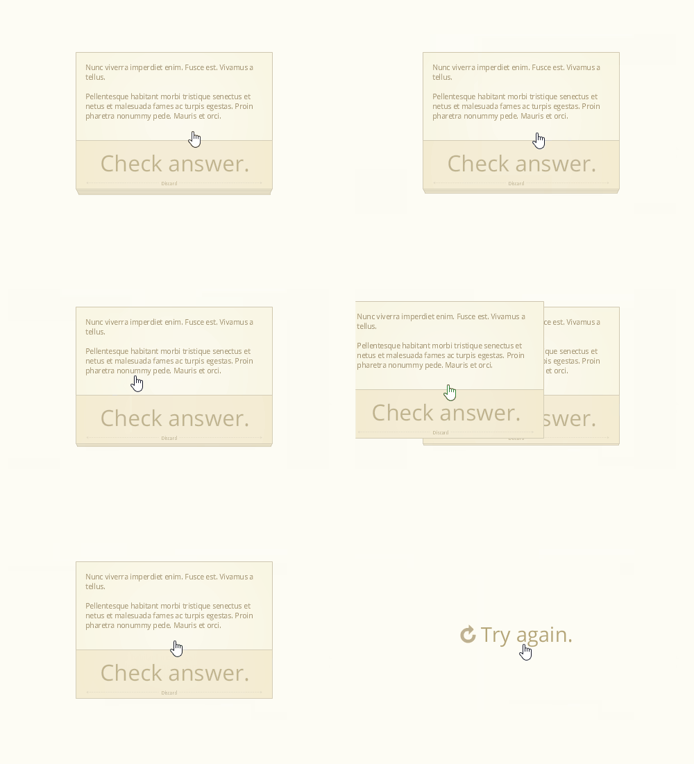
A recent challenge was to create a note card interaction. There are some pretty cool submissions so be sure to check them out in the comments. I happened to be working on a note card interaction for a workshop and submitted it to the challenge above. Here’s the interaction:

free flip card interaction

View the notecard interaction in action.

Here are a few things that I highlight in the workshop activity. I also created a quick tutorial that explains the file and how it’s constructed.

  • View tutorial to learn how to create and customize the free flip card interaction
  • Download file for the free flip card interaction

Create Content You Can Use More Than Once

One of my goals when creating any interaction is to design it so it’s easily re-purposed. Ideally, I want it to become a template. In the case of the note cards, I designed them so that I can quickly copy and paste to create additional cards. Then I just need to swap out the content in the card.

In addition, once the interaction is complete it can be saved as a template file where it will always be at your fingertips and available for use in other courses.

Learn to Leverage the Features

For this free flip card interaction I created the cards with a Selected State.  In essence, the Selected State of an object is like a light switch that can be turned on and off. This is perfect for a note card interaction. Click on it to get information. Click on it again to go back.

Using a Selected State also makes it easier to build a reusable template for copying and pasting. Often, we use layers to show or hide content. That means every time I want to duplicate a card, I also have to duplicate a corresponding layer. With a Selected State, I only need to duplicate the object because it automatically duplicates the state. That saves a lot of time creating the interaction and adding additional cards.

Find Inspiration from Others

Josh Stoner does really nice work. At a recent Articulate workshop he showed how to build this drag and drop interaction that gave the appearance of swiping cards left and right. It’s a slick interaction. I used his design to inspire my note cards.

free flip card interaction

What I like about this free flip card interaction is that it allows the user to interact with the screen and this is a key part of building interactive content. I also like that it’s a novel interaction when compared to how most elearning content looks. While the cards kind of serve as flashcards in these examples, they could just as easily be bullet point slides converted to cards. Even if all you have is linear content, you make it a bit more engaging because of the novelty and interactive component. Keep in mind: it doesn’t make it a better learning experience, but it does make it a more engaging interactive experience.

To sum it all up:

  • Develop the practice of building prototypes. If you need some structure or calendar, participate in the weekly challenges. You don’t need to do them every week, maybe once a month or every couple of months is fine.
  • Get more life out of the features. This comes with practice (see above) and connecting with more experienced users who have developed some good best practices and creative techniques.
  • Find a source of inspiration. Make it a habit to look for good multimedia examples and then try to recreate them in your software. It’s a great way to learn to use the tools in a new way and also to see your projects and the potential interactions they offer.
  • Free download. Here’s a link to the flip card interaction. I’ll leave it to you to download and deconstruct to learn more. If you need help, watch the tutorial.

Events

Free E-Learning Resources

Want to learn more? Check out these articles and free resources in the community.

Here’s a great job board for e-learning, instructional design, and training jobs

Participate in the weekly e-learning challenges to sharpen your skills

Get your free PowerPoint templates and free graphics & stock images.

Lots of cool e-learning examples to check out and find inspiration.

Getting Started? This e-learning 101 series and the free e-books will help.


build better courses

At a recent conference I was on a panel that asked about how to get better at building elearning courses. I reflected on a few things that I did when I first started and some of those things carry forward to today. I discussed this a bit in this post on how to build your elearning skills.

Learning is an Iterative Process

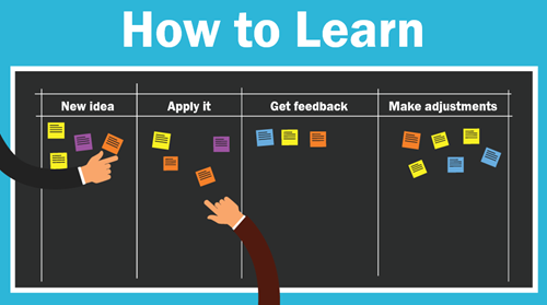
Essentially, we learn something new, apply what we learn, look at the results, and then make adjustments.

Your first project isn’t going to be your best. I look back at some of the stuff I did worked on earlier in my career and am surprised that I wasn’t tarred and feathered by those who had to take the courses.

I recall one where I taught people how to use this new thing called the Internet. Instead of having them open Netscape and doing searches for things that interested them, I spent a bunch of time explaining the interface features, and focused on a lot of unimportant information. What could have been a fun time searching for interesting things became the world’s most boring introduction to the Internet.  How lame was that?

If I were to build that course today, it would be much different.

how to learn

How to Build Better Courses

  • Focus on the learner. We tend to make our courses info-centric and because of this, we focus on how to structure and present content. We should focus on the learner and how they’ll use the content. Then build activities to help them practice doing that.
  • Ask for honest feedback and try to apply what you learn to the next project. This suggestion is a bit challenging because it requires some vulnerability, but it also requires access to an expert who can provide relevant feedback. This is why being connected in the community helps.
  • Keep an idea folder that you can review when starting new projects. I collect ideas from all sorts of sources. When I want some inspiration, I look over the ideas. I will add that it does help to make a note about what you found inspiring at the time you saved it. Often, I’ll review an idea from the folder and can’t recall why I liked it.
  • Set some time aside to practice. I usually find one or two cool multimedia interactions online each week. I try replicate them in Storyline. I don’t worry about how they look. I just focus on wiring it all together to see if I can get the multimedia interaction to work. One of the things I really like about Storyline is that I can quickly prototype my ideas. The other thing I like is that when I do build something from the idea, I can save it as a template and it becomes a reusable interaction.
  • Do one new thing. You’ve collected ideas and tried to prototype them. You’ve chatted with others and solicited feedback. Now it’s time to put it all into action. Take one idea and apply it to a real course. And every time you build a new course, try something new. I know that it’s not always easy to do that in the corporate environment so at a minimum participate in an occasional weekly challenge. At least then you can work on something real and try new things.
  • Keep on learning. Watch tutorials, take informal courses, get a formal degree or read some books.

What are some things you’d share with the person who wants to learn how to build their skills to build better courses? Feel free to share them in the comments section.

Events

Free E-Learning Resources

Want to learn more? Check out these articles and free resources in the community.

Here’s a great job board for e-learning, instructional design, and training jobs

Participate in the weekly e-learning challenges to sharpen your skills

Get your free PowerPoint templates and free graphics & stock images.

Lots of cool e-learning examples to check out and find inspiration.

Getting Started? This e-learning 101 series and the free e-books will help.


instructional design tip

This instructional design tip focuses on how to simplify and chunk content in complex training courses. Essentially, instructional design is about crafting a viable learning experience. Based on our desired learning outcomes, we create a way for people to learn (and hopefully apply) the content in a relevant context.

Often we have to teach content that’s too complicated for new learners. The risk is that we dump too much on them and overwhelm them with a lot of new information. Or we over-simplify the course content (especially real-life decisions) and the result it the course is not complex enough. This can also make the courses less engaging because they’re less challenging.

Instructional Design Tip: Break Your Content into Chunks

One way to teach complex content is to break it into more manageable chunks and getting rid of a lot of extra content. Guide the learners to work through the chunks and as they acquire new skills (and comfort) they’re able to work through more complex content.

instructional design tip

I find that one major challenge for adult learners is the unease that comes from not understanding the appropriate context and how the learning fits into the bigger picture. Because of this I like to break the content into chunks and progressively assemble the chunks to build a broader context of the course content and objectives.

Below is an example from a previous project that may inspire some ideas for your own courses.

Instructional Design Tip: Get to Know Your Learners

A few years ago I had to design training for machine operators in a complex production environment. The machine was a linchpin in the production process because the work flow boomeranged and returned to the machine twice during production. A good operator kept things moving forward, but one less experienced could hold up the entire floor’s production and cost the organization time and money. Our task was to get all of the new operators at an acceptable level of production within 90 days.

instructional design tip

I met with managers and subject matter experts who gave me a lot of content to review. And then I spent some time on the floor. This is a key part of instructional design—get to know your learners, their work environment, and what they have to do. Don’t just review documentation or trust what the subject matter expert says. They often dismiss real world issues or present things from an ideal perspective based on years of experience.

By meeting with everyone including the learners and investigating the real world environment, I had a better understanding of how the environment impacted the learning experience for new people.

Instructional Design Tip: Identify the Discomfort

When I analyzed the workflow, one of the first things I learned was that the new operators were intimidated by the machine and the fast pace of the workflow. They had to constantly upload and unload material and then deal with machine-related issues. In addition, the work environment was really noisy so it was hard to hear instructions and get feedback. And to make matters worse, they were constantly reminded how expensive the machine was and to “not mess it up.”

These are things not covered in documentation manuals.

We designed some elearning modules around the parts of the machine. They were pulled from the production floor and took a few modules to learn about the machine, preventive maintenance, and the general workflow.

Then when they got back on the floor, all they focused on was daily maintenance of the machine. For most of the first week, they just touched the machine a lot without a lot of focus on production work. By the time they got into production, they were so familiar with the machine that they no longer were intimidated.

Instructional Design Tip: Peer Coaches Help Train

Another challenge was that all of the people were being trained by different machine operators—some better teachers than others. And most were not given an incentive to make the training stick. And they were doing the training in real time with real production in a loud facility.

A new learner benefits from having a go-to contact who provides guidance, answers questions, and provides feedback. The organization benefits from having a consistent message and a vehicle to mentor potential supervisors or managers.

instructional design tip

We trained some of the production staff to be “peer coaches.” This gave us quality control over how the content was delivered. The peer coaches became a consistent point of contact for the new learners.  And the new learners felt more comfortable when requiring help, as they didn’t feel like they were getting in the way.

The peer coach program also provided a way to train future supervisors by giving them elevated responsibilities.

Instructional Design Tip: Learning Journals

We created a learning journal. The journal served as a dynamic operator’s manual. It contained all of the core content the new learners required, all of their notes from the conversations, day’s work, and online training was captured in the journal.

instructional design tip

We also used it as the guide for the peer coaches to help them, especially when they were busy. They didn’t need to think through what to teach, they just had to follow the guide and review the learner’s progress.

Instructional Design Tip: Online Training Compresses Learning Time

One of the benefits of instructional design is being able to compress the time required to learn. For example, in a given work day, a person may do a specific task 2 times. Thus in the course of a week, they only get 10 repetitions of that task.

Instructional design allows us to pull that task out of the normal workflow and create a practice activity where they can repeat just that task many more times than what they’d do in the daily workflow. I also found that when a task only happens a few times, those are pushed out for more advanced learning and only experienced people get to do the task for fear that a new person messes it up.

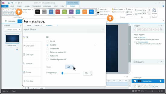
Instructional Design Tip: Create a Working Lab

We created a working lab by slowing down the production on the training machine. Initially the organization didn’t want to slow down production. But we convinced them that slowing down production allowed the learners to get meaningful repetition and as they gained confidence we would increase the speed to match the real world.
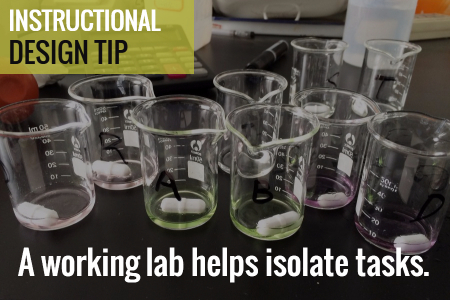
instructional design tip

For this training, we created individual activities. Thus they didn’t focus on getting everything through the machine. Instead they only focused on that one part. As they became more comfortable, we added more speed and combined tasks.

Breaking your content into distinct chunks helps make the learning experience more manageable and it’s easier to develop and update. In the example above we were able to separate the tasks from the real world flow and chunk them into smaller learning activities. And as their skills improved we combined tasks to add complexity.

The result for us was that we had almost all people trained within 10 days. In fact, we did so well with the training that we under reported our success because we didn’t want people to think that we were fibbing on the numbers.

Events

Free E-Learning Resources

Want to learn more? Check out these articles and free resources in the community.

Here’s a great job board for e-learning, instructional design, and training jobs

Participate in the weekly e-learning challenges to sharpen your skills

Get your free PowerPoint templates and free graphics & stock images.

Lots of cool e-learning examples to check out and find inspiration.

Getting Started? This e-learning 101 series and the free e-books will help.


free resources

Free resources always come in handy when building courses or slide presentations. At most of my workshops we take a few minutes to share different free resources people use. It’s a great way to be reminded of resources you may have already bookmarked but have forgotten. And of course, there’s always something new to learn from others when the share what they use.

At this point, I find that there’s not a lot of new free resources being added. So I compiled the resources and put them in some sense of order to make it a bit easier to parse. I can’t vouch for all of the sites but from what I can tell, they’re all legit.

Most of the resources are free. And with all things free, be sure to check on the usage terms and give proper attribution. Here’s a post on how to did this: how to use free assets in commercial projects.

Where to Get Help from the Community

Where to Get Free Resources from Your Organization

  • Marketing team: they usually have graphics and other collateral
  • Web team: collection of online resources
  • Public relations: public facing graphics

Create Your Own & Share

  • Take your own pictures of people and share
  • Walk around organization and get background and ambient images
  • Get inspiration from stock photo sites and try to mimic them

Free Resources: Icons

Placeholder Content

Free Stock Photos

Free Medical Images

Free Illustrations

Free Templates

Free Audio

Free Fonts

Free Video

Deal Sites

These sites aren’t free but they often offer great deals. For example, I’ve been able to get a lifetime membership to a graphics site for $49 and picked up a bunch of cutout people images for just a few dollars. It’s worth subscribing to these types of sites just to see what deals come your way. Most of the deals are not relevant to elearning but you can just delete those emails.

If there’s a free resource or site you like to use, feel free to post in the comments. Spammers will be deleted.

Events

Free E-Learning Resources

Want to learn more? Check out these articles and free resources in the community.

Here’s a great job board for e-learning, instructional design, and training jobs

Participate in the weekly e-learning challenges to sharpen your skills

Get your free PowerPoint templates and free graphics & stock images.

Lots of cool e-learning examples to check out and find inspiration.

Getting Started? This e-learning 101 series and the free e-books will help.


powerpoint tips tutorials

When we started this blog in 2007, PowerPoint-based elearning was all the rage, and for good reason. It was a great entry point for people just getting started, especially when the alternative was custom Flash programming that required programming skills and resources.

Today, the elearning market is different and PowerPoint elearning isn’t as important (or relevant) as it was ten years ago. It’s something I shared in this blog post on why PowerPoint isn’t the right tool for interactive elearning. With tools like Storyline, you get PowerPoint ease-of-authoring with a lot more capability and you still don’t need to learn any programming.

But that doesn’t mean PowerPoint’s obsolete. It just means that a lot of the tutorials shared over the past ten years are not as relevant as they were when they were first published, such as working with clip art (which is now defunct).

I did look through many of the older posts and here’s an updated list of PowerPoint tutorials that still come in handy if you build elearning courses  with PowerPoint; or if you want to become a PowerPoint guru and learn things like how to use it to create graphics and illustrations.

There are some really good PowerPoint tips and tricks in that list. Even if you can’t go through them all, make sure to bookmark them for quick reference.

What’s your favorite PowerPoint tip learned via these blog posts over the years? Feel free to share them via the comments.

Events

Free E-Learning Resources

Want to learn more? Check out these articles and free resources in the community.

Here’s a great job board for e-learning, instructional design, and training jobs

Participate in the weekly e-learning challenges to sharpen your skills

Get your free PowerPoint templates and free graphics & stock images.

Lots of cool e-learning examples to check out and find inspiration.

Getting Started? This e-learning 101 series and the free e-books will help.


lorem ipsum

Adding placeholder text is one of those tasks that we do a lot when building our course screen layouts or templates. It helps us make sure things are looking right before we spent too much time building out the real content.

In today’s post I’ll share three easy ways to add placeholder text to your elearning courses.

Use the Built-in Lorem Ipsum Generator

PowerPoint, Articulate Studio, and Storyline offer built-in lorem ipsum generators so that it’s really easy to add some placeholder content. Here are the steps:

  • Add a text box
  • Type in =lorem() 
  • Hit enter

That will create a good amount of random placeholder text. However, it may be more than you need. That’s OK because you have some flexibility.

lorem ipsum

You can add numbers inside the parenthesis to control how many paragraphs and sentences are presented. For example, =lorem(2,1) will give you two paragraphs with one sentence each.

Here’s a tutorial that shows how to create random text in PowerPoint. The process is exactly the same in Storyline, but you use lorem instead of rand.

Use an Online Lorem Ipsum Generator

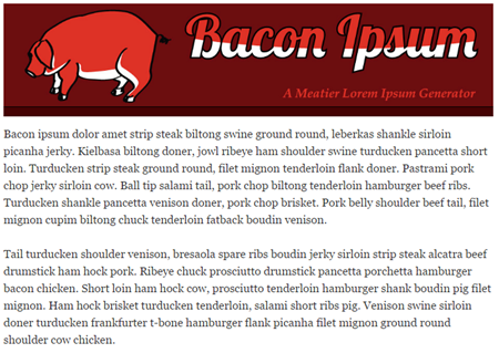
There are a lot of online lorem ipsum generators. Just do a search and you’ll find more than you need. I like the ones where you can generate placeholder text in other languages, too. This is another good one because you can set word count and choose Kafka text which is perfect for bureaucratic, compliance training. It may even be possible to use nothing but Kafka for your real training and have no one notice.

If all you need is lorem ipsum text, then the built-in tools are fine. Why go to a website to find something you already get in the elearning applications? However, some people don’t like the lorem ipsum text and want real readable text. Or they don’t like the fact that the lorem ipsum text doesn’t get past the spellchecker.

lorem ipsum

That’s OK, too, because there are sites that create random text that is also legible. And some of them are funny. Here are a few:

Use a Lorem Ipsum Browser Extension

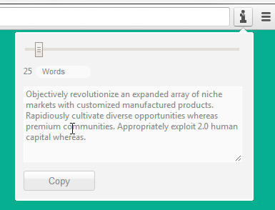
Why go to a website to get your placeholder text? Why not just grab some from right within your browser? There are a number of browser extensions that offer quick lorem ipsum text. Just click on the extension and copy and paste your placeholder text.

lorem ipsum

Here are a few that I’ve used in Chrome. I’m sure that the other browsers have something similar.

As you can see, there are more than enough ways to generate fake text and with the amount you need for your slides. And of course, make sure that you let your subject matter expert know it’s fake text so that they don’t ask why you localized the course before getting final approval.

Events

Free E-Learning Resources

Want to learn more? Check out these articles and free resources in the community.

Here’s a great job board for e-learning, instructional design, and training jobs

Participate in the weekly e-learning challenges to sharpen your skills

Get your free PowerPoint templates and free graphics & stock images.

Lots of cool e-learning examples to check out and find inspiration.

Getting Started? This e-learning 101 series and the free e-books will help.


dropbox

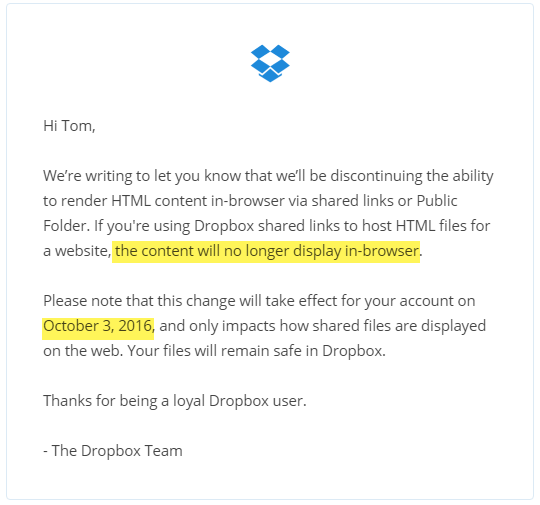
You need to stop sharing your elearning courses and portfolios using Dropbox’s public folder. Effective October 3, 2016, Dropbox is disabling the feature to render HTML pages. It’s one that many have been using to share their courses and elearning portfolios. This is similar to the action Google took last month to disable webpage sharing via the Google Docs service.

If you’re a Dropbox user you probably already received an email from Dropbox alerting you to this change. If not, I’m here to alert you today.

dropbox

Why Should I Care?

Many people in the elearning community currently share their courses via Dropbox. In fact, we have close to 4,000 weekly challenge entries in our weekly elearning challenges; and at least 20% are shared via Google Drive or Dropbox. Maybe more.

It’s a bummer that the service is being discontinued. But the bigger bummer is that all of that content shared by the community will no longer work. That means if you shared a demo in previous challenges (or if you were using Dropbox as a free way to feature your portfolio of courses) all of those links will be broken.

What Are The Alternatives?

In a previous post, I shared a few alternatives. I’ll share them here again.

  Click here to view the YouTube video.

  • Use Amazon S3 or a competing service. Here’s how to set up the Amazon S3 service. That’s what I use.
  • Buy your own domain and manage it yourself. A domain name and hosting may cost about $50/year. That’s not expensive at all.
  • Can you upload your course? A lot of people use Wix and Weebly type services for their portfolios. They are good services for websites, but sharing files isn’t easy. You need a place to host the courses files and create a link. Those website services often don’t have a file/folder upload feature. Something to keep in mind.
  • Be careful of free services. Odds are they’ll be gone or remove the free part of the service and you’ll be in the same place you are today.

Personally, I think it’s worthwhile to create a custom domain and manage the demos and courses that way. It doesn’t cost that much and then you have complete control over your brand and you’re not at the whim of those free services that may or may not be available at a future date.

What do you recommend?

Events

Free E-Learning Resources

Want to learn more? Check out these articles and free resources in the community.

Here’s a great job board for e-learning, instructional design, and training jobs

Participate in the weekly e-learning challenges to sharpen your skills

Get your free PowerPoint templates and free graphics & stock images.

Lots of cool e-learning examples to check out and find inspiration.

Getting Started? This e-learning 101 series and the free e-books will help.


cons of social media negative

Social media is what you make of it. For the most part it is valuable and offers a number of ways for you to succeed. We discussed this in the previous post on the pros of social media. Today we’ll look at the cons of social media and the potential impact they have on you, your job, and our industry.

Cons of Social Media: Too Much Noise

I have this routine where I read my elearning news feeds on a tablet (usually at night). I have a goofy process. The ones I like, I tag for later reference. The ones I think are really valuable, I’ll email to myself to make sure that I can spend more time on them when I get to my desk. But I never do because I end up occupied with more important things.

Eventually my inbox fills with a lot of those “important” links so to clean up my inbox, I created a filter to put all of the emailed links in one place. The other day I looked at all of the important content I’ve saved over the past few years. I have almost 11,000 links that I still haven’t read (but found to be really valuable). That’s about 916 hours of reading.

cons of social media full inbox

Here’s the deal: your social media connections deliver a lot of good content, but there’s just so much of it…and it doesn’t stop. I liken it to standing on a rock in the middle of a river. At best, you can put a net in to scoop something out, but the river continues to flow. And so it is with social media content, it just keeps coming with all of its alerts and beeps and constant notifications. Throw in the additional correspondence via Facebook, LinkedIn, and Twitter and that’s a ton to parse.

This stream of content is not only distracting it can also cause some anxiety as you see the world slipping past you. I experience it myself. There are many days I feel like I’m out of the loop and losing touch with what’s going on in our industry. I was just getting used to SCORM and now I need to learn about TinCan xAPI. Come on!

If only WUHPF was a reality; I could use the Dog Pack today.

Turn this into a positive:

  • Find a single solution to manage the content you value. There are all sorts of tools like Pocket, Feedly, Flipboard, Diigo, Evernote, OneNote, and even your browser via add-ons.
  • Set a specific time to review the important content. And then leave it at that. Don’t worry about missing anything. It’s not as important as you think anyway.

What do you use to manage the content from your social media stream? Do you have a way to stay on top of what you are most interested in?

Cons of Social Media: Where’s the Social?

Sharing with your social network is valuable, but how social is it really?

It seems that for something that begins with the word social, there’s not a lot that’s social about it. Instead it’s more like we’re conduits of pushing content to our connections. And a lot of that content is manipulated by advertisers, marketing teams, and social media services.

cons of social media negatives

While social media does give everyone a voice, I wonder how much real dialogue actually happens. It seems like we’re just taking turns standing on the soapbox?

Social media and the mobile devices that we use to consume it are changing how we interact with each other. Here’s an interesting article on how social media is making people less social and a thought-provoking photo essay by Eric Pinkersgill where he removed all of the mobile devices from his subjects. It really makes you think about how we connect today.

Turn this into a positive:

  • In addition to pushing content, actually connect with a person. Use social media to build relationships. Ask or answer questions. Participate in one of those social media chats.
  • Make time to unplug. It doesn’t hurt to step away for a bit.

Cons of Social Media: Professional Life Beware

There are all sorts of laws that protect you from discrimination during job interviews. There are things you can’t be asked and you aren’t required to disclose. However, if someone did want to learn more about you without violating the law all they need to do is an online search. Odds are they’d find more that you want to share.

Your online profile with its pictures, political memes, and comments creates a perspective on who you are and what you value. It may not be totally accurate, but people will draw conclusions based on what they see. And that may impact your professional relationships and potential business opportunities.

Which is another issue. The line between business and personal is getting a bit blurry.

Today, we’re connecting in ways that may not be appropriate or professional. Should I really be looking at your family vacation photos and what you had for Thanksgiving? Do I need to know your religious and political views?

Professional services like LinkedIn are good because they do separate your business social profile from the personal one. However, I will add that LinkedIn seems to be a source of some of the same nonsense you’ll find in less professional social networks. So I’m not sure how that will evolve.

Turn this into a positive:

  • Determine how you want to frame your online presence.
  • Create separate accounts for your professional and personal networks. Keep your personal accounts private (or recognize that it becomes part of your professional persona).
  • Create clear guidelines on what you post and how you respond.

Generally, social media is neutral and controlled by what you consume (and share) and how you’re connected. It can be positive or negative, or both. The main thing is that you see it as a tool that helps you learn more about the industry, your job, and build a network of peers. And then of course, be careful what you share as that does partially determine how you are perceived.

How are you using social media today? And how has it changed the way you work?

Events

Free E-Learning Resources

Want to learn more? Check out these articles and free resources in the community.

Here’s a great job board for e-learning, instructional design, and training jobs

Participate in the weekly e-learning challenges to sharpen your skills

Get your free PowerPoint templates and free graphics & stock images.

Lots of cool e-learning examples to check out and find inspiration.

Getting Started? This e-learning 101 series and the free e-books will help.


pros of social media positive

The training industry is changing rapidly and technology plays a big role in that change, especially social media. However, like any change, there are positives and negatives that come with it.  Today, I’d like to discuss a few pros of social media as it relates to our industry and then I’ll follow it up with a post on some of the cons.

What is Social Media?

Wikipedia has a good detailed definition of social media. I see it as technology that allows people to connect and share information.  To be more specific, it’s about being connected to a community that shares interests and has a desire to share expertise around that interest. The social media technology just facilitates the connection.

The Growth of Social Media Technology

Most people in our industry probably see the following three services as their core social media tools: Twitter, Facebook, and LinkedIn. Many organization are also using internal social media services like Yammer and Slack .

However, everyday there seems to be a new tool and people in our industry willing to hype it up. Look at some of the recent raves about Pokemon Go by the same people who were peddling Second Life just a few years ago. New technology can be both positive and negative. New ways to connect and share are good. But if you use a service and no one’s there, what good is it? Remember Google Wave or even Google+?

Many of the new and novel social media tools will be gone soon enough or they’ll be consumed by larger organizations. Sticking with the three above is probably more than adequate for our needs today.

Does your organization use a social media service? What do you think about it? How have is it helped your job?

Pros of Social Media: Curated Content

One of the biggest values of social media is the content stream. There’s a lot of really good information being shared everyday by all sorts of people in our industry. The challenge is knowing what’s out there and then sorting it by what’s important.

  • Find content curators. Some people are really good at curating and staying on top of things. They’re the curators and you’re the beneficiary. For example, David Anderson is one of the elearning people I follow on Twitter. Even though I work with him, I’m always amazed at how well he curates and posts a lot of relevant links and lots of cool elearning examples—just the sort of practical content our community needs. The same can be said for organizations. Articulate does a great job highlighting it’s customers, free downloads, templates, and cool elearning examples.

pros of social media connected to content

  • Follow topics not people. Another way to stay on top of the good content is to track topics is via hashtag. Instead of following a person, or everyone in an industry (which can be overwhelming), follow topic-specific hashtags like #elearning or #training. You will stay on top of all posts relevant to that topic.

I use Hootsuite to manage what I do, but there are other apps out there, too. Do you use a social media application? Which one?

Pros of Social Media: Connect with Experts

Quite a few years back I wrote to a well-known author in our industry. I actually had to write a real letter, mail it, and then hope for a response (which never came). Things are different today because we have access to experts (and what they know) via a few clicks. And I find most of them to be responsive.

pros of social media lrnchat

A good example of access to experts is something like #lrnchat where people post questions, answers, and discuss learning related topics. Not only can you share your thoughts, but you get to dialogue with well-known experts in our community. This can lead to building your professional network and often meeting them face-to-face at workshops and conferences where you can continue the dialogue.

And on the flip side, social media allows you to establish your own expertise by curating content and sharing what you know. In the past you had very few outlets to build your professional reputation. But today, you can easily connect and contribute to build your reputation and expertise.

Pros of Social Media: Get Help from Others

Social media is powerful in the connections it can foster and in turn the help those connections can provide. Just recently, I got to witness an excellent example of how broad our social media connections can be and the access we have that we didn’t a few years ago without it.

Justus is a young boy who was rushed to the hospital with a very serious medical condition. As people rallied around the family, they used social media to keep everyone up-to-date. To do so, they created #TeamJustus as a way to share what was happening but also to pass on encouragement and kind words. It was amazing to see how the network rallied to support the family. They even received encouragement from unlikely participants like former President, George Bush, and NFL quarterback, Andrew Luck.

pros of social media

We may not all have connections to celebrities and famous people, but you can be sure that your connections are broad; and odds are that if you need something, there’s someone in your network who can help. And if they can’t, they’re connected to someone who can.

The good news is that we are members in an overly generous industry where willfully helping other seems to be the default disposition. I see this all the time in the E-Learning Heroes community. In a sense, being connected to a community of peers is like an expansion of your cubicle and there’s all sorts of help for you. Your team of one can become a team of many. This is a point I made in this post on why the community brings real value.

There’s a lot more to say about the pros of social media. It provides practical value that will help you in your job today and in your future prospects. The key is to get connected and then to participate. If you’re not currently active in social media, perhaps these tips will help you reconsider your participation.

What do you see as some of the pros of social media?

Events

Free E-Learning Resources

Want to learn more? Check out these articles and free resources in the community.

Here’s a great job board for e-learning, instructional design, and training jobs

Participate in the weekly e-learning challenges to sharpen your skills

Get your free PowerPoint templates and free graphics & stock images.

Lots of cool e-learning examples to check out and find inspiration.

Getting Started? This e-learning 101 series and the free e-books will help.


interactive video example

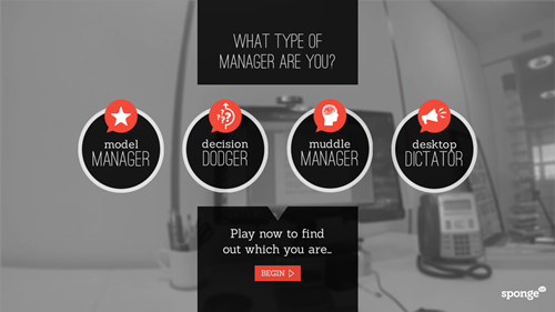
Earlier I shared a nice example of a gamified elearning course. Today I’d like to share a really neat example of an interactive video scenario. This example comes via the fine folks at SpongeUk who do some really cool work and said I can share it.

View the Interactive Video Example

interactive video

Click here to view the video interaction.

What I Like About This Interactive Video

  • I like the real life decision-making that they use. The situation is relevant, the choices are legitimate, and the consequences of the choice leads to more choices. It has a game-like feel to it and the timer adds a sense of urgency.
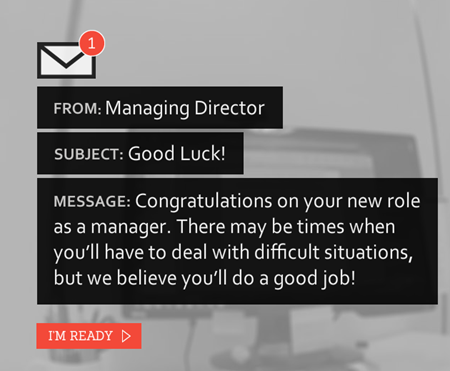
  • I really like the way they did the email treatment. It’s a clean design and novel. And overall their visual design has a simple elegance.

interactive video email

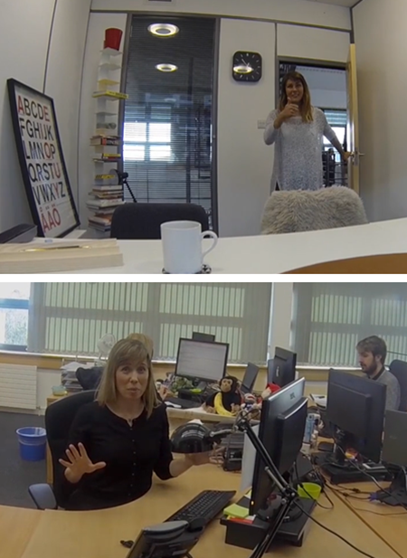
  • There’s something about video that’s much more engaging than reading slides of content. Setting up a quick video shoot like this doesn’t take long and the scripted dialogue is short enough to keep the home grown talent in check. My guess is they kept it simple and used a head-mounted GoPro camera (or a smart phone) to create the first person perspective. And it doesn’t sound like they used any special mics. Besides, you can’t go wrong with monkeys and bananas.

interactive video Go Pro

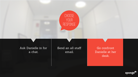
  • Despite how much we try to complicate things, interactive scenarios are essentially glorified multiple choice questions. I like the 3C model for scenarios: give the learner a challenge (what to do with employee), provide viable choices, and the choice produces a consequence (which could be immediate feedback or another challenge).

interactive video decision

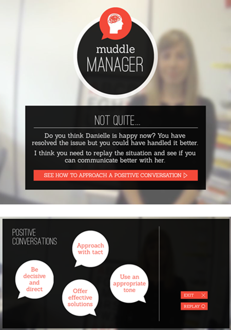
  • I also like the way they pulled the feedback together to identify what type of manager you are and tips on how to be better.

interactive video feedback

  • Finally, I get a lot of questions about how to do this or that in elearning. Often people start by showing me examples of popular multimedia content they find online. I believe that was the case with this example. If I recall, it’s not a real project but a quick prototype based off of this popular Deloitte recruitment video.

Kudos to the folks at SpongeUK. They did a great job showing how Storyline can be used to create interactive scenarios that use video. They also did a great job reinterpreting the interactive video and creating something uniquely theirs. And as a bonus, once you build the foundation for this type of interactive, you can save it as a template and re-use it for other courses.

What did you like best about this example?

Events

Free E-Learning Resources

Want to learn more? Check out these articles and free resources in the community.

Here’s a great job board for e-learning, instructional design, and training jobs

Participate in the weekly e-learning challenges to sharpen your skills

Get your free PowerPoint templates and free graphics & stock images.

Lots of cool e-learning examples to check out and find inspiration.

Getting Started? This e-learning 101 series and the free e-books will help.


free animated .gif

Most software training is done using screencasting tools like Storyline or Replay. However, you don’t always need a full video to show procedural steps. Sometimes, it’s easier to create animated .gifs. And here’s an easy way to create them for free.

Create Animated .GIFs for Free with Screen2Gif

Screen2Gif is a free open source application available here for download. It’s created by Nicke Manarin, so be sure to give him props or send him a few bucks for his efforts. You can find his contact info and a link to PayPal (if you want to help him out) in the options tab.

Here are a few quick pointers if you’re using the application to create animated .gifs:

  • There’s no installation required. When you click the .exe file it opens the application.
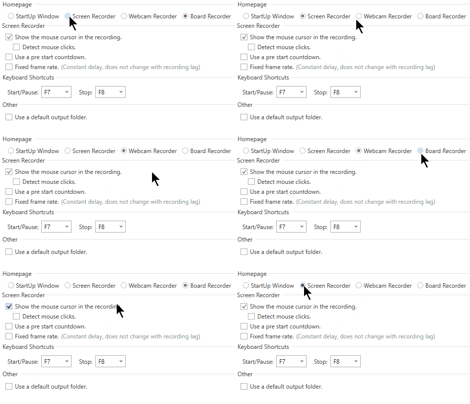
  • You can record your screen, a webcam, or whiteboard. It defaults to screen recording, but you can change it to open in either of the recording options.

animated .gif recorder

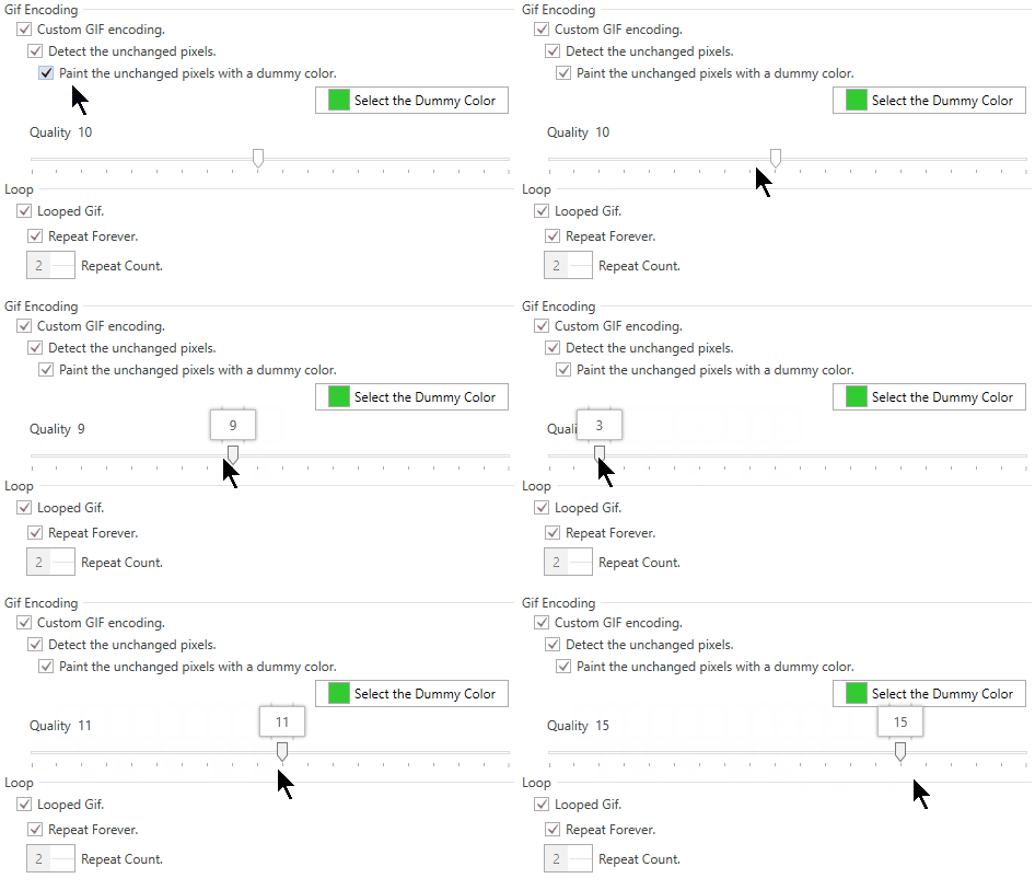
  • You can set the quality settings for the recording as well as change the DPI and resize the image.

animated .gif quality

  • There’s no formal community with the animated .gif software, but there is an active Reddit group where you can get all sorts of help.

Play Around with Quality and Recording Size When Creating Animated .GIFs

You’ll need to play around with the quality settings especially if you want to resize the recorded window down. Here are some examples recorded at different quality levels:

  • Default 10 quality setting: 1355 x 762 (328 KB) and here’s the same recording resized down to 500 x 281 (125 KB).
  • The highest 20 quality setting: 1355 x 762 (366 KB) and resized down to 500 x 281 (136 KB).
  • You can play around with the DPI settings as well; but you should probably learn more about DPI and how it relates to images.
  • Ideally you don’t want to scale the recording size down. Often people record the entire screen when they only need to record a portion. By recording a portion you can maintain a nice crisp image and smaller file size.

Personally I find the default settings fine. The key is to record at a resolution where you won’t need to scale the image so that you can retain a nice crisp image.

Animated GIF Example for E-Learning

animated .gif

Click here to view the demo.

Above is a simple example of an animated .GIF used with a static image. I did a screen grab of a software screen and then inserted markers for specific areas. This allows me to skip recording a video and instead focus on key areas where I need to show specific steps. This is a good approach when you have features that are still in flux and if recording the full screen is problematic.

Animated .gifs are great for simple steps. They’re easy to create. And now you can do it for free.

Events

Free E-Learning Resources

Want to learn more? Check out these articles and free resources in the community.

Here’s a great job board for e-learning, instructional design, and training jobs

Participate in the weekly e-learning challenges to sharpen your skills
Get your free PowerPoint templates and free graphics & stock images.

Lots of cool e-learning examples to check out and find inspiration.

Getting Started? This e-learning 101 series and the free e-books will help.