The Rapid Elearning Blog

Archive for the ‘Online Course Design’ Category


instructional design for new century

I have an older Sega Master System. I recall spending hours and hours playing on that thing. It was cool 25 years ago. Then it was lame. But now it’s cool again. I took it out of storage to show my kids.

What struck me were the instruction booklets that came with the games. They seem so archaic especially when I look at how my son learns the games. He downloads them and just starts playing. What’s changed?

Back Then

  • The expectation was to have instructions. How else would you learn?
  • Video game consoles were still relatively new, so it made sense to have booklets to help new customers learn.
  • The Internet didn’t exist (or at least not for me) so getting access to information wasn’t easy. Thus an instruction book made sense. I also didn’t have any friends who had the console to offer counsel.
  • It was an analog age, thus having analog content was the norm. The idea of a digital instruction guide made no sense unless you were Marty McFly.
  • An instructional designer on the training team convinced someone that people will never learn to play the games without clear instructions.

instructional design manual for Sega Master System

Today

  • Expectations have changed. Game players don’t expect detailed instructions. They just jump right in.
  • Instructions are provided just-in-time as you need them. I love the way it works with the Wii. Right before you do something new, they give you quick instructions and a practice option.
  • Game players are often connected to other game players and learn through their community of peers. They learn how to play and they learn the nuances and cheats, as well.
  • Who has time to read through manuals?
  • Game instruction is often predicated on simple, intuitive steps where the challenges increase with proficiency. Typically, the learning is chunked with the option to repeat when necessary. And you tend to pick up where you left off.

How does any of this relate to how we build courses today?

Most of the elearning courses I see aren’t overly complex. Yet they’re saddled with meaningless navigation instructions and all sorts of content irrelevant to the learner’s needs or the course’s learning objectives. In fact, the other day I was talking to a young man about the elearning industry and the career opportunities it presented. I showed him how the authoring tools work and then showed him a bunch of examples.

One of the first things he noticed was all of the navigation instructions and lead up to the course. And the other thing was all of the information. He asked how to move past it and when he got to the real action. Unfortunately, all of the examples were locked down and there was no action.

Here are a few tips I’d offer for today’s course builders:

instructional design starts with small bite-size courses

  • Keep the courses short. Shorter courses are more digestible. They keep people focused.
  • Break the content into single topics. This allows you to accomplish the first item above. And it provides freedom for the learner to get what they need.
  • Get rid of the navigation instructions. The course navigation design should be intuitive. If you need a course on navigating the course, something’s broken.
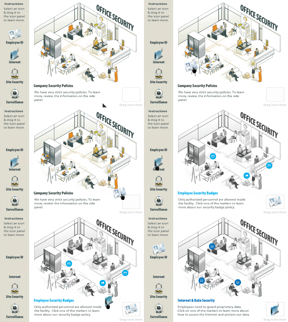
  • Provide just-in-time instructions. If you want the person to do something different or unique, then provide the instructions at the point when they’re needed. I like the way Rick added the instructions in his Hero Land module.
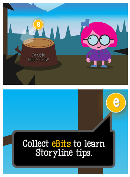
instructional design provides just-in-time contextual instructions

  • Replace instructions with exploration. Of course this works in context with the course’s objectives, but there are all sorts of mechanisms you can use to get the learner to pull in content, rather than you pushing it out.
  • Add activities where the person needs to collect information and then make decisions. That’s how you can leverage exploration.
  • Understand the learning happens. Just because we build a course doesn’t mean people learn. They’ll learn what they need. And often I suspect what we build interferes with their learning. This is usually the case when the branding folks and the legal department get involved with your projects.
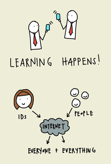
instructional design knows that learning happens

  • Most of the learning happens outside of the course. Find ways to connect what you’re doing to what they do once they’ve completed the course.
  • Communities of practice trumps cumbersome manuals. In today’s world, part of training should include getting the community of practice connected to share tips and tricks and offer support.

Those are a few thoughts on what we can do to move our training forward. What tips do you have for today’s course builders? Add them in the comments section.

Events

Free E-Learning Resources

Want to learn more? Check out these articles and free resources in the community.

Here’s a great job board for e-learning, instructional design, and training jobs

Participate in the weekly e-learning challenges to sharpen your skills

Get your free PowerPoint templates and free graphics & stock images.

Lots of cool e-learning examples to check out and find inspiration.

Getting Started? This e-learning 101 series and the free e-books will help.


instructional design tip

This instructional design tip focuses on how to simplify and chunk content in complex training courses. Essentially, instructional design is about crafting a viable learning experience. Based on our desired learning outcomes, we create a way for people to learn (and hopefully apply) the content in a relevant context.

Often we have to teach content that’s too complicated for new learners. The risk is that we dump too much on them and overwhelm them with a lot of new information. Or we over-simplify the course content (especially real-life decisions) and the result it the course is not complex enough. This can also make the courses less engaging because they’re less challenging.

Instructional Design Tip: Break Your Content into Chunks

One way to teach complex content is to break it into more manageable chunks and getting rid of a lot of extra content. Guide the learners to work through the chunks and as they acquire new skills (and comfort) they’re able to work through more complex content.

instructional design tip

I find that one major challenge for adult learners is the unease that comes from not understanding the appropriate context and how the learning fits into the bigger picture. Because of this I like to break the content into chunks and progressively assemble the chunks to build a broader context of the course content and objectives.

Below is an example from a previous project that may inspire some ideas for your own courses.

Instructional Design Tip: Get to Know Your Learners

A few years ago I had to design training for machine operators in a complex production environment. The machine was a linchpin in the production process because the work flow boomeranged and returned to the machine twice during production. A good operator kept things moving forward, but one less experienced could hold up the entire floor’s production and cost the organization time and money. Our task was to get all of the new operators at an acceptable level of production within 90 days.

instructional design tip

I met with managers and subject matter experts who gave me a lot of content to review. And then I spent some time on the floor. This is a key part of instructional design—get to know your learners, their work environment, and what they have to do. Don’t just review documentation or trust what the subject matter expert says. They often dismiss real world issues or present things from an ideal perspective based on years of experience.

By meeting with everyone including the learners and investigating the real world environment, I had a better understanding of how the environment impacted the learning experience for new people.

Instructional Design Tip: Identify the Discomfort

When I analyzed the workflow, one of the first things I learned was that the new operators were intimidated by the machine and the fast pace of the workflow. They had to constantly upload and unload material and then deal with machine-related issues. In addition, the work environment was really noisy so it was hard to hear instructions and get feedback. And to make matters worse, they were constantly reminded how expensive the machine was and to “not mess it up.”

These are things not covered in documentation manuals.

We designed some elearning modules around the parts of the machine. They were pulled from the production floor and took a few modules to learn about the machine, preventive maintenance, and the general workflow.

Then when they got back on the floor, all they focused on was daily maintenance of the machine. For most of the first week, they just touched the machine a lot without a lot of focus on production work. By the time they got into production, they were so familiar with the machine that they no longer were intimidated.

Instructional Design Tip: Peer Coaches Help Train

Another challenge was that all of the people were being trained by different machine operators—some better teachers than others. And most were not given an incentive to make the training stick. And they were doing the training in real time with real production in a loud facility.

A new learner benefits from having a go-to contact who provides guidance, answers questions, and provides feedback. The organization benefits from having a consistent message and a vehicle to mentor potential supervisors or managers.

instructional design tip

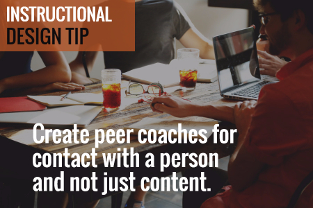
We trained some of the production staff to be “peer coaches.” This gave us quality control over how the content was delivered. The peer coaches became a consistent point of contact for the new learners.  And the new learners felt more comfortable when requiring help, as they didn’t feel like they were getting in the way.

The peer coach program also provided a way to train future supervisors by giving them elevated responsibilities.

Instructional Design Tip: Learning Journals

We created a learning journal. The journal served as a dynamic operator’s manual. It contained all of the core content the new learners required, all of their notes from the conversations, day’s work, and online training was captured in the journal.

instructional design tip

We also used it as the guide for the peer coaches to help them, especially when they were busy. They didn’t need to think through what to teach, they just had to follow the guide and review the learner’s progress.

Instructional Design Tip: Online Training Compresses Learning Time

One of the benefits of instructional design is being able to compress the time required to learn. For example, in a given work day, a person may do a specific task 2 times. Thus in the course of a week, they only get 10 repetitions of that task.

Instructional design allows us to pull that task out of the normal workflow and create a practice activity where they can repeat just that task many more times than what they’d do in the daily workflow. I also found that when a task only happens a few times, those are pushed out for more advanced learning and only experienced people get to do the task for fear that a new person messes it up.

Instructional Design Tip: Create a Working Lab

We created a working lab by slowing down the production on the training machine. Initially the organization didn’t want to slow down production. But we convinced them that slowing down production allowed the learners to get meaningful repetition and as they gained confidence we would increase the speed to match the real world.

instructional design tip

For this training, we created individual activities. Thus they didn’t focus on getting everything through the machine. Instead they only focused on that one part. As they became more comfortable, we added more speed and combined tasks.

Breaking your content into distinct chunks helps make the learning experience more manageable and it’s easier to develop and update. In the example above we were able to separate the tasks from the real world flow and chunk them into smaller learning activities. And as their skills improved we combined tasks to add complexity.

The result for us was that we had almost all people trained within 10 days. In fact, we did so well with the training that we under reported our success because we didn’t want people to think that we were fibbing on the numbers.

Events

Free E-Learning Resources

Want to learn more? Check out these articles and free resources in the community.

Here’s a great job board for e-learning, instructional design, and training jobs

Participate in the weekly e-learning challenges to sharpen your skills

Get your free PowerPoint templates and free graphics & stock images.

Lots of cool e-learning examples to check out and find inspiration.

Getting Started? This e-learning 101 series and the free e-books will help.


lorem ipsum

Adding placeholder text is one of those tasks that we do a lot when building our course screen layouts or templates. It helps us make sure things are looking right before we spent too much time building out the real content.

In today’s post I’ll share three easy ways to add placeholder text to your elearning courses.

Use the Built-in Lorem Ipsum Generator

PowerPoint, Articulate Studio, and Storyline offer built-in lorem ipsum generators so that it’s really easy to add some placeholder content. Here are the steps:

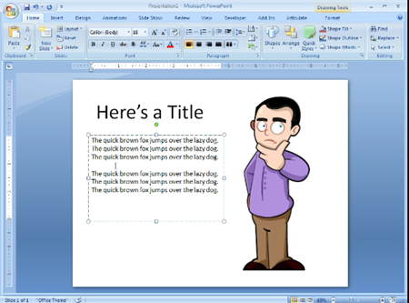
  • Add a text box
  • Type in =lorem() 
  • Hit enter

That will create a good amount of random placeholder text. However, it may be more than you need. That’s OK because you have some flexibility.

lorem ipsum

You can add numbers inside the parenthesis to control how many paragraphs and sentences are presented. For example, =lorem(2,1) will give you two paragraphs with one sentence each.

Here’s a tutorial that shows how to create random text in PowerPoint. The process is exactly the same in Storyline, but you use lorem instead of rand.

Use an Online Lorem Ipsum Generator

There are a lot of online lorem ipsum generators. Just do a search and you’ll find more than you need. I like the ones where you can generate placeholder text in other languages, too. This is another good one because you can set word count and choose Kafka text which is perfect for bureaucratic, compliance training. It may even be possible to use nothing but Kafka for your real training and have no one notice.

If all you need is lorem ipsum text, then the built-in tools are fine. Why go to a website to find something you already get in the elearning applications? However, some people don’t like the lorem ipsum text and want real readable text. Or they don’t like the fact that the lorem ipsum text doesn’t get past the spellchecker.

lorem ipsum

That’s OK, too, because there are sites that create random text that is also legible. And some of them are funny. Here are a few:

Use a Lorem Ipsum Browser Extension

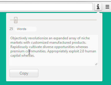
Why go to a website to get your placeholder text? Why not just grab some from right within your browser? There are a number of browser extensions that offer quick lorem ipsum text. Just click on the extension and copy and paste your placeholder text.

lorem ipsum

Here are a few that I’ve used in Chrome. I’m sure that the other browsers have something similar.

As you can see, there are more than enough ways to generate fake text and with the amount you need for your slides. And of course, make sure that you let your subject matter expert know it’s fake text so that they don’t ask why you localized the course before getting final approval.

Events

Free E-Learning Resources

Want to learn more? Check out these articles and free resources in the community.

Here’s a great job board for e-learning, instructional design, and training jobs

Participate in the weekly e-learning challenges to sharpen your skills

Get your free PowerPoint templates and free graphics & stock images.

Lots of cool e-learning examples to check out and find inspiration.

Getting Started? This e-learning 101 series and the free e-books will help.


learning interactions

Creating great interactive learning experiences requires a few core building blocks: relevant content, pull versus push, and real-world decisions. With those building blocks you’re able to structure effective learning scenarios that are meaningful to the learner and helps meet the objectives of the course.

One of those building blocks in creating relevant content or content that is placed in a meaningful context. Essentially, you want to recreate the types of scenarios that are similar to the ones the learner has in real life. This allows them to see the content in a meaningful context.

Learning Interactions: What is the Learner’s Real World Like?

Most courses have the right content, but that’s all it is–content. And the content is usually plastered over a series of bullet point screens. To make a great learning experience you need content in the right context. It needs to be relevant to the learner’s needs and world. They need to see how the content fits into their world, the interactions they have, and the decisions they need to make.

  • How is the course content used in the work environment of the user?
  • Why would they use it? And when they use it what happens?
  • Or if they don’t use it, what happens?

Learning Interactions: What Type of Environment Needs to be Built?

We make decisions all the time and they always produce some sort of consequence. These decisions happen in a real world and usually while interacting with other people like peers, managers, or customers.

When building relevant content that’s placed in the right context it’s important to understand the world of the learner.

  • Where are they located?
  • Do they need to use any equipment or machines?
  • And who are they interacting with? Peers, management, customers?

Learning Interactions: What Triggers the Need for Action?

When I build interactions in Storyline I always talk through the triggers. I ask, “What do I want to do and when do want to do it?”

In the same sense, when you build relevant scenarios for your courses where the learner has to make decisions, it’s important to know what the triggers are for those decisions.

  • What do they have to do and when do they have to do it?
  • And at what point are they going to need the course content to make the appropriate decision or take the right action?

Learning Interactions: How to Collect the Right Content?

A great way to get this information is to meet with those people who will take your courses. Ask them to give you scenarios where the course content is important or when they would need to know it to make good decisions.

  • Ask them what’s it like when things are going well? And then what it’s like when it not going so well. And what makes it go not some well? What types of things derail the day?
  • If they interact with equipment, what do they need to know? Where do they go to troubleshoot? What types of cheat sheets or job aids do they reference?
  • If they interact with people, what makes for good interactions? And what causes them to go sideways? How do they fix it?

The key in all of this is that instead of dumping a bunch of new content on your learners, find a way to put the content into a meaningful context–one that makes sense to their real world interactions. And when you do that you’ll be able to create great learning experiences.

Events

Free E-Learning Resources

Want to learn more? Check out these articles and free resources in the community.

Here’s a great job board for e-learning, instructional design, and training jobs

Participate in the weekly e-learning challenges to sharpen your skills

Get your free PowerPoint templates and free graphics & stock images.

Lots of cool e-learning examples to check out and find inspiration.

Getting Started? This e-learning 101 series and the free e-books will help.


drag and drop interactions

After last week’s post on the different drag & drop interaction examples, I had quite a few emails asking for tips on how to create drag and drop interactions for elearning. So now’s a good time to review some good general tips for building drag and drop interactions.

Why Are You Dragging?

There are a few reasons why we make onscreen objects draggable.

Drag and Drop Interactions Tips

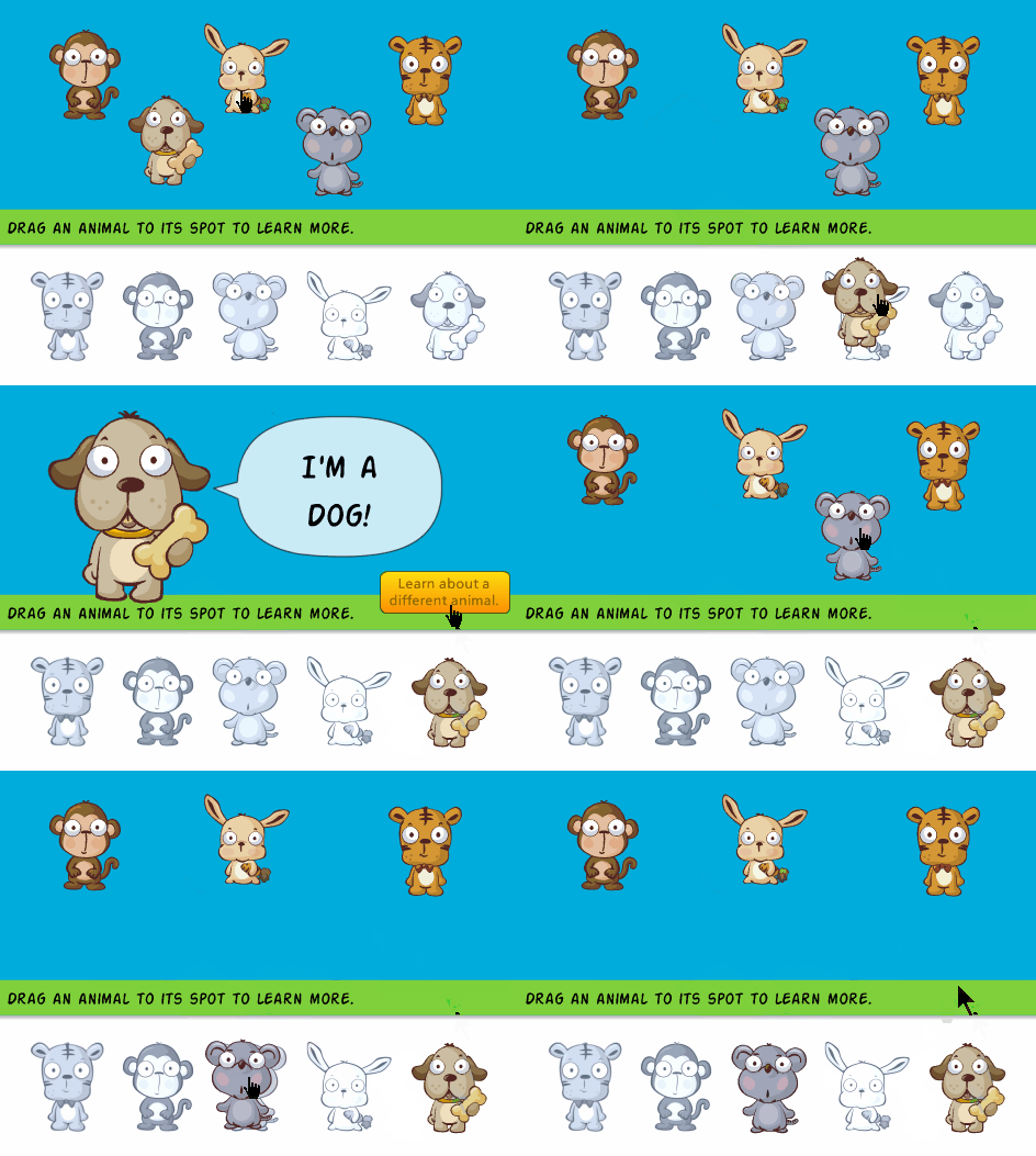
  • Where is the user supposed to drag and drop the object? In most cases, drag and drop interactions require a drop target. Drop targets can be an actual object, or it may be an invisible element (like a hotspot) that controls where the dropped objects lands.
  • Do you want the object to snap to the drop target? There are different ways to work with the drop target. Sometimes, things may not be quite as evident onscreen, snapping to the target helps when the user gets the object over the target.

drag and drop interactions snap to target

  • Do you want to make the target visible? This makes sense if there are a number of drag and drop options and you have a very clear target for each draggable object.

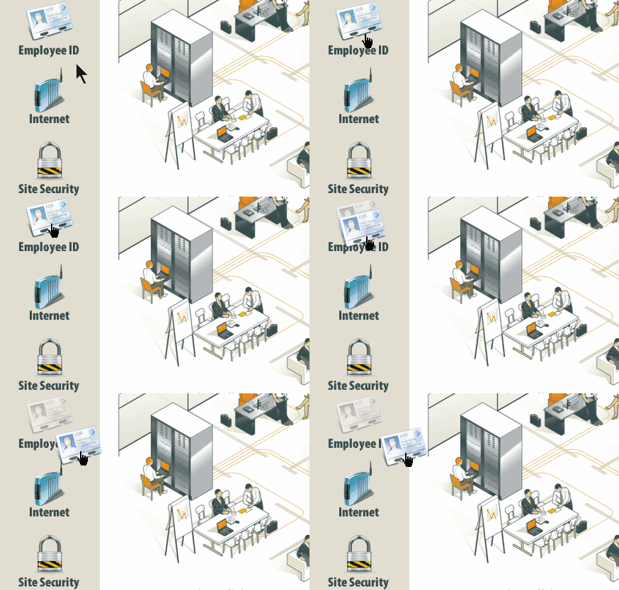
drag and drop interactions ghost image

  • What happens when the user drags an object out of position? I like to add a ghost image or something to show where the drag object originally came from. It’s also an easy way to indicate progress.

drag and drop interactions ghost image

  • Are the instructions clear? Sometimes developers forget to put instructions for the interaction and what the user is to do. If you expect them to interact with the screen in a new way, you should include clear instructions. I like to use gate screens that stop the user and provides instructions.

Drag and Drop Interactions: Providing Feedback for Correct and Incorrect Actions

There are a few way to provide feedback when the user drops the object on a target.

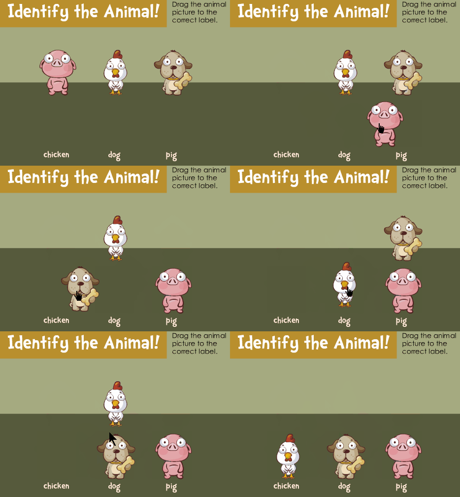
  • The easiest way is to allow the target to accept the object. Using a snap feature essentially pulls the dragged item to the target. That lets the user know that they’ve dropped the object on a target. And depending on how you structure the drag and drop interactions, it can also be the means to show feedback for a correct action.
  • Another way to provide feedback to the user is to reject incorrect choices and cause the dropped object to return to the starting position.

drag and drop interactions bounce feedback

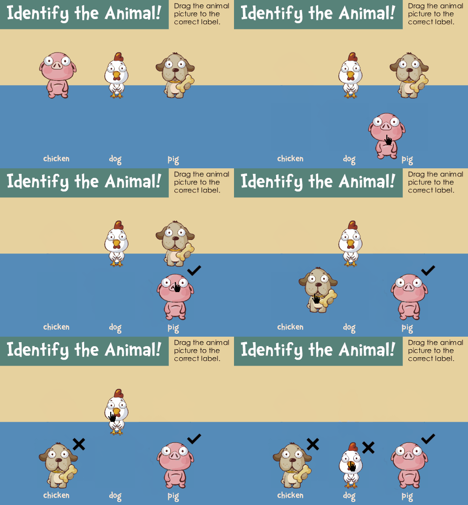
  • You can also provide immediate correct and incorrect feedback by changing the state of the object to reflect when it’s a right or wrong decision.

drag and drop interactions provide feedback

Here are some previous posts that cover drag and drop interactions in a bit more detail:

Drag and drop interactions can help make course more engaging and interactive. Too often we limit ourselves to standard click-based interactions and decision-making. Next time, try to convert one of those to a drag and drop and see how it goes. What tips do you have for those creating drag and drop interactions? Share them in the comments section.

Events

Free E-Learning Resources

Want to learn more? Check out these articles and free resources in the community.

Here’s a great job board for e-learning, instructional design, and training jobs

Participate in the weekly e-learning challenges to sharpen your skills

Get your free PowerPoint templates and free graphics & stock images.

Lots of cool e-learning examples to check out and find inspiration.

Getting Started? This e-learning 101 series and the free e-books will help.


select e-learning software

I get a lot of questions about buying elearning software. And with that I get to see some of the ridiculous checklists that some IT groups create to compare software. Usually they place more value on number of features (regardless of their real value) than on how those features are used to create the online courses.

When it comes to selecting software, it can be hard to know what to look for and what questions to ask. Here are some tips to help you find the right tools as you wade through reams of the vendor’s marketing information.

Select E-Learning Software by Understanding the Type of Tools

The first thing to know is what types of authoring tools exist and how they work. Generally speaking there are three types of authoring tools for online learning: form-based, freeform, and video.

Form-based authoring

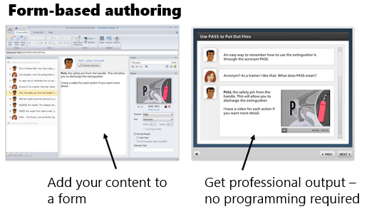
Form-based applications don’t require any programming because they use pre-built forms where you add your content. The software is designed to give you a very specific output. All you have to do is add your content. The software does the rest.

This is great because you don’t have to be a programmer or designer to use the tools. All you do is collect your content, choose your form, and hit publish. The programming and design is all done by the software.

Most quizzing applications are form-based. There are places where you add questions, choices, and answers. But you don’t have to make any design decisions.  Another good example of a form-based tool is Articulate Engage. You select an interaction type, add you content, and hit publish. Simple as that.

Form-based authoring is great because it’s easy and fast. The downside is that the form is a form and works as designed with limited customization. You’re kind of stuck with what you get. You usually have options in the number of forms, and some choices of colors and such, but for the most part the design is static.

Freeform authoring

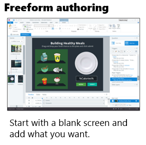
Freeform applications give you a lot more flexibility. Generally they start with a blank screen. You determine the layout, content placement, interactions, and visual design. While it’s not overly complicated to do this, it does require more expertise than just adding content to a form. You need to understand how to get something to look and work a certain way.

freeform authoring select e-learning software

Of course, the more you want to do with your course, the better you need to know the application. That means a greater time commitment and learning curve than just dropping content into a form and hitting publish.

A hybrid freeform solution is PowerPoint-based authoring. Essentially you use your PowerPoint skills to build your content and whatever you create in PowerPoint is converted to an elearning course. This is an easy entry point for the first time author, but because you’re starting with PowerPoint eventually you’ll hit a ceiling.

Personally, I love PowerPoint-based authoring, but if I had a choice, I’d just go with something like Storyline because it’s easy to learn and over the long haul it provides a lot more value. For example, you may not use variables when you first start creating courses, but it won’t be long before you’ll find the need. If you work with a PowerPoint-based solution, you can’t use variables. However, you can with Storyline.

Some authoring tools require additional programming skills like ActionScript, JavaScript, or HTML. Or they amend their offerings with widgets and add-ons. I have mixed feelings about this approach. It’s good for those who have the programming chops to extend what they can do with the software.

However, what I don’t like is that the widgets and extra programming required go outside of how the rest of the course is authored in the software and often you’re not able to effectively edit the widgets and add-ons. This creates a lot of extra work and can be frustrating. This is just something to keep in mind when you’re looking at tools.

In fact, this is one of the things I like best about Storyline. All of Storyline’s authoring centers around triggers which require no special programming. And they don’t require special add-ons for interactions. You can build what you need; and if you build an interaction, it’s going to be built like everything else in the software. And whatever you build can be saved as a template and shared (with all of the interactivity intact) which removes the need to have a bunch of add-on interactions in the first place.

When you’re reviewing tools, determine what type of tool it is and how the authoring process works. Form is easy and saves time. Freeform provides more flexibility but requires a little more to learn it. Don’t get enamored with features that look good on the surface, but frustrate the authoring process.

Video-based authoring

Video is the other type of authoring solution and it’s pretty straightforward. The videos can be simple lectures, but often are software tutorials or those new “explainer” style videos. Their production is relatively straightforward. You capture the video and process it.

When looking at video tools, you’ll want to understand what editing capabilities exist within the capturing tool. Probably the most important feature is splicing and being able to cut items out.

Select E-Learning Software by Avoiding the Feature Trap

Many organizations make the mistake of crafting feature lists and then comparing the different software based on the features. The ones with more features tend to get rated higher. This is a faulty approach because features aren’t equal and the lists are usually derived from marketing material anyway.

Here’s how I see it.

It’s less important to look at a list of features and more important to look at production workflow because it puts the features in perspective and in context. Each tool can probably build the course you want to build. It may just use different features to do so (which is why a list of features is less relevant). However, the difference in workflow may be substantial. And that’s what you want to discover.

To avoid the feature trap, I recommend that you test each application by building the same demo module. You’ll learn if the tool is easy to use and how long it takes to build what you need. The last thing you want to discover is that your feature-rich product has an inefficient workflow that actually costs you a lot more time.

Tabs interactions are a good test module. They’re usually quick to build and you get to test the general workflow of the software. You learn about layout, how to create the interactive tabs, and expose content.

Here’s a good starting checklist:

  • Create five tabs that when clicked exposed new content.
  • Make tabs interactive with hover and down states.
  • Add a visited state to indicate that the tab was clicked.
  • Make the tabs interdependent where one is on (selected) and the others are off (deselected).
  • Create conditional navigation where the screen can’t advance until all tabs are visited.
  • Change the type of interaction on the tabs from click to hover to see how easy it is to edit.

This simple tabs module lets you dig through the different software a bit and understand the general workflow. This is a better comparison than features that may or may not be important to your course authoring.

Select E-Learning Software by Testing What Happens After You Make the Purchase?

Buying software is easy. And sales people tend to be very accommodating. However, that all changes after the sale.

Keep in mind, once you install the software you’re probably mostly on your own, thus after-sales support is super important and may be worth more than the price of the software. You want to get a good feel for the software vendor and how they treat their customers because you’ll be leaning on them for help down the road.

During the trial phase connect with the vendors. Tell them what you want to build and ask how to go about it. You’ll learn how responsive the vendor is to your needs and what resources are available to help you succeed.

Here are the three things I recommend you research prior to choosing your course authoring software:

  • Support: what type of technical support exists? Does the vendor provide free resources to help you learn? What happens when you have an issue? How long does it take to get help?
  • Community: many online communities provide customer support and technical assistance. You typically find answers to questions, resources, and an assortment of tutorials. What does the vendor do to support your ongoing development? Many course authors are relatively new to online learning. Thus having an active and engaged community is important, especially one full of resources.
  • Connections: community resources are great. However, being connected to other users is key. Vendors build software with features. But users develop best practices and the types of tips and tricks you’ll need to be successful. Experienced community members also share a lot of what they do which is a source of inspiration for those just getting started.

The market is full of options for your online course authoring. So when you’re looking at them be sure to learn what types of tools they offer, what workflow is required, and how they’ll support your development after you’ve purchased the software. If you do those things, you’ll find the tools that provide the best solution to meet your needs.

And if you want to save time, just choose Articulate. We are committed to your success and will do everything we can do to help you build great elearning.

Events

Free E-Learning Resources

Want to learn more? Check out these articles and free resources in the community.

Here’s a great job board for e-learning, instructional design, and training jobs

Participate in the weekly e-learning challenges to sharpen your skills

Get your free PowerPoint templates and free graphics & stock images.

Lots of cool e-learning examples to check out and find inspiration.

Getting Started? This e-learning 101 series and the free e-books will help.


course design

Course design is a challenge as you try to balance the needs of the client, subject matter experts, learners, and your own course design sensibility. One of the biggest issues with many online courses is that the course is a single solution designed to accommodate multiple learners. And most of them are designed the same way: start, click, click, click, knowledge check, click, click, click, and final quiz.

course design simple

I suspect many courses are designed this way because they’re easy to build and, as we’ve noted before, many course designers are stretched thin with limited time and resources. I also know that many customers demand all of their information to be presented in the course, which makes it hard to move past a click-and-read model.

So what can you do to remedy this and not create too much extra work? Here’s a strategy I’ve used in the past.

Course Design: Separate Content from Activity

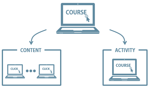
Create a two-pronged approach to the course design.

  • Content: this is similar to the way the course is designed now.
  • Activity: what should they do with the content? Create scenario-based activities so that they use the content.

course design strategy

This creates splits the process. Many clients want all of the content and won’t budge. That’s OK. You can present all of the content in the content track. In addition, there are many people who want or need the content. The content track gives them free access.

On the other side, build activities that require use of the content. And then let learners access the activities. A well-designed activity will present the appropriate level of content and provide the right types of decision-making to ensure the person learns and meets the course objectives. You can also provide access points to the content track and even create mechanisms that force people to pull certain types of content during the activities.

Or you scrap any focus on content, throw them in the pool and let them know where they can find life-saving information (the content track).  Some people will jump right into the activity and try to figure things out and some will refer to the content track when needed. An activities focused approach provides a lot of flexibility, especially when your learners range from beginner to experienced.

Course Design: Simple Example

course design

Click here to view elearning example.

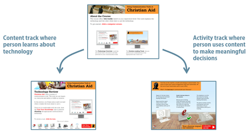
Here’s an example that David and I built for a LINGOs course a few years ago. The client gave us a number of Word docs full of content. All of the content needed to be in the course. However, we wanted to create interactions built around some real world decision-making.

So we created a two track course. One track featured all of the Word doc content. And the other track worked around the use of the content to make appropriate decisions. We also included ways for the person to go between the two tracks.

course design

Building the course didn’t take much more time than if we had just made it linear because we used a simple question structure for the activities and broke up the flow with some good-to-know information about the organization.

What I like about this approach is that it’s a single course yet meets the needs at a more individual level. One person can learn through the content, and another through the activities. Or they can learn through both. And it meets the client’s demand to have all of the content present. You can also make the course more complex and accommodate different skill and experience levels with an adaptive learning path.

Events

Free E-Learning Resources

Want to learn more? Check out these articles and free resources in the community.

Here’s a great job board for e-learning, instructional design, and training jobs

Participate in the weekly e-learning challenges to sharpen your skills

Get your free PowerPoint templates and free graphics & stock images.

Lots of cool e-learning examples to check out and find inspiration.

Getting Started? This e-learning 101 series and the free e-books will help.


e-learning pain points

The other day someone asked what I thought the three top pain points were for online training or elearning. I hear lots of complaints and I’m sure that there are many pain points, however if we keep them in perspective, they’re really not as painful as being stabbed or thrown down a flight of stairs. Here are some of the issues I find most challenging with elearning.

E-Learning Pain Point #1: Courses are Boring

I review a lot of courses during the year. Many of them are very basic–consisting of mostly slides, simple graphics, and bullet points. I’ll assume that the people who do take the courses probably don’t find then all that exciting. A slide with bullet point content isn’t necessarily a bad thing. However, slide after slide of this type of content isn’t the most effective way to engage and teach people.

The bigger issue isn’t usually the content as much as it is that the content isn’t relevant to the person’s needs. Here are a few tips to help.

E-Learning Pain Point #2: Developers Have Limited Skills & Resources

Many of the people I meet are the only elearning person on staff. And the majority of them didn’t start in elearning. They started as trainers who moved to elearning as the organization needed to put courses online. They end up having to do everything from instructional design, graphic design, and course authoring.

In addition to having limited experience building elearning courses, they usually lack a breadth of technical knowledge and programming skills. On top of that, they don’t get adequate support for other things such as media assets and IT help.

Many of them do a great job given their limited resources, but to build courses that are engaging, interactive, and meet learning objectives requires more than a basic understanding of PowerPoint and learning to find free clip art. This means that the developers need time to learn the skills to build more than basic courses and they need more support from their organizations.

Without organizations making a bigger commitment to their elearning teams, most courses will probably be stuck in pain point #1.

Here are some solutions for those who want to learn more and do more:

  • Check out all of the free getting started resources we have in the community. There’s a lot of good generic content, free ebooks, and of course tutorials to learn the software.
  • Participate in the weekly challenges to practice new things. Even if you don’t participate, make it a point to see what others do as a source of inspiration.
  • Take classes where you can. You can go for a formal degree or certificate at most of the universities. There are informal options like the video tutorials, lots of free webinars, and a number of opensource learning opportunities. And of course, participate in your local ATD, ISPI, and STC chapters.
  • Read a book and apply what you learn to your courses (or the weekly challenges). Here’s a good starting list. Or better yet, create a mini module on what you learned in the book and share it with others. It’s a great way to practice building courses–solidifying the content in your own brain and sharing what you learn with others.

E-Learning Pain Point #3: [Insert pain point here]

I can add an assortment of additional pain points such as courses are too long, high dropout rates, etc. But I’d like to open it up to you. What is the single biggest pain point for you when it comes to elearning and online training? Add your thoughts in the comments section.

Events

Free E-Learning Resources

Want to learn more? Check out these articles and free resources in the community.

Here’s a great job board for e-learning, instructional design, and training jobs

Participate in the weekly e-learning challenges to sharpen your skills

Get your free PowerPoint templates and free graphics & stock images.

Lots of cool e-learning examples to check out and find inspiration.

Getting Started? This e-learning 101 series and the free e-books will help.


variables for e-learning

Want to build better elearning experiences? Want to add game mechanics like achievements, levels, and points to your courses? If so, now’s the time to learn about variables and how they help build better elearning.

At a recent workshop on variables, I asked one attendee what she learned. She said, “I learned not to use variables.” While this produced a chuckle, she was speaking some truth for the beginner who’s never used variables: at first they may seem a bit confusing.

This makes sense if you haven’t used them before and don’t have a programming background. On the surface they can seem complex. But in reality they’re not. It’s just a matter of knowing the terms and gaining an understanding of how they work. And then practice, practice, practice.

Today we’ll start the process of simplifying variables.

What is a Variable?

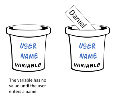
As I mentioned in a previous post, I learned to think of variables as an empty bucket. The bucket collects things. Once I have something collected, I can use it.

We use variables in elearning to collect values that we can use throughout the course. The values may be things like the user’s name, what they’ve clicked, their achievement, or an adaptive learning path. In either case, it’s a way to collect information that is used elsewhere in the course.

Types of Variables

Generally, there are three types of variables:

  • Numbers: used for counting actions or doing calculations
  • Text: input names or display text
  • True/False: often used to track progress or if items are selected or not

Variables are used for all sorts of things and often the type of variable is interchangeable. The thing to remember is that the value is key and what type of variable you use to hold that value is not as important.

A good example is the True/False variable. Instead of T/F you could use numbers like 1 or 2, or even the text “true” or “false.” As you can see, they’re interchangeable. Of course, there are times when one type makes more sense than another.

Common Uses of Variables

Before we get into the details, let’s look at two common uses of variables: user names and counting clicks.

Variable: Add Your Name

It’s a good thing to personalize the learning experience. One way to do this is by collecting the user’s name and using it throughout the course. In the example below, you enter your name on one screen and see it displayed on another.

variables for e-learning example one

Click here to view simple name variable.

Variable: Track Onscreen Actions

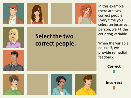
Another common use is to track onscreen actions. In the example below you can click any choice but only two are correct. We track your correct and incorrect choices by counting clicks. If you click on a third wrong choice, you get some feedback.

variables for e-learning example two

Click here to view counting variable.

The examples above are simple but common to many courses. Now let’s look at variables in a bit more detail.

 How to Use Variables

Working with variables is a three-step process: 1) create, 2) adjust value, and 3) use value.

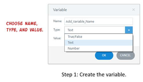
  • Create variable. The first step is to create a variable. You’ll need to select the type, give it a name, and then determine a starting value (if any).

create e-learning variable

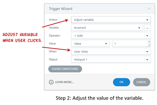
  • Adjust value: The second step is to adjust the value of the variable. Generally, the user does something onscreen that triggers a change to the value of the variable. In the example below, we increase the Incorrect variable every time the user clicks on the wrong person.

adjust e-learning variable

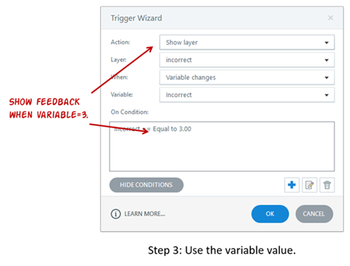
  • Use value: The third step is to use the value of the variable to do something. The value of the variable determines an action. For example, since we can track wrong selections by counting clicks, we can use the value we collect to trigger some feedback. In the example below, after selecting the incorrect choice three times we provide remedial feedback.

use e-learning variable

So that’s the essence of working with variables. You create them, an action changes their value, and then you can use that value to do something else in the course, whether that’s providing feedback or displaying a user’s name. Your only limit is your creativity.

Your Mission to Learn More about Variables

Years ago when I first started to learn to work with variables, the light didn’t come on until I actually knew what I wanted to do and then had to think through how to do it using variables. So to help you out, I’m assigning three common activities that will give you an opportunity to practice using variables.

To help you out, here are some recent articles in the elearning community:

The key is to practice. And if you have any questions, don’t hesitate to jump in the community and ask. We’re always there to help.

Events

Free E-Learning Resources

Want to learn more? Check out these articles and free resources in the community.

Here’s a great job board for e-learning, instructional design, and training jobs

Participate in the weekly e-learning challenges to sharpen your skills

Get your free PowerPoint templates and free graphics & stock images.

Lots of cool e-learning examples to check out and find inspiration.

Getting Started? This e-learning 101 series and the free e-books will help.


Variables in E-Learning

Why should one use variables in elearning, especially since the authoring tools are so easy to use?

Good question.

Many course authors transition from facilitated classroom training to elearning development. Their companies buy software and then they’re left on their own to build courses. If you’re using software like Storyline, producing courses is relatively simple. However, the tendency is to keep course design simple, as well.

Because of this, many courses are mostly linear, explainer-type content with generic navigation. This is fine for some courses, but what if you want more than linear content? What if you want training that can evaluate the learner’s responses and provide an experience unique to that person? You can build this type of course, but you need to use variables.

What are Variables in E-Learning?

A variable doesn’t have a fixed value. It can be changed or adapted as things happen. I learned to think of a variable as a bucket that holds something (a value). This value is dynamic and can change based on user input or actions.

Variables in E-Learning example

For example, if you want to acquire the learner’s name to display in the course, you create a bucket (variable) to collect the name (value). And then when you need to display the name, you reference the variable’s value. The user name value isn’t fixed until the user enters the name. That’s what makes it a variable—the value is dynamic.

In a simple sense, I like to think of the user as the variable. I don’t know what she’ll enter or what decisions she’ll make in the course. But I can program the course to collect and evaluate what she does and use it to create a more dynamic learning experience.

Why Use Variables in E-Learning

Variables allow course authors to create dynamic learning experiences. With variables, we can evaluate what’s happening in the course and tailor an experience unique to the learner. For example, to create a personalized learning experience we can display the learner’s name, allow them to customize avatars and color schemes, and even select a local language.

Here are some other common reasons to use variables:

  • Transform a simple course flow to something more complex and dynamic.
  • Evaluate the choices the learner is making and provide remedial and custom feedback.
  • Create an adaptive learning path and direct the learner based on results.
  • Allow a personalized learning experience.
  • Track progress and completed modules.
  • Gamify the learning process using variable-based game mechanics.
  • Accept numeric input and process calculations.

These are just a few common use cases for variables. There’s really a lot more you can do with variables in elearning.

If you’re just getting started, working with variables may seem a bit daunting. But it’s not. It just takes a little practice and application. Start with something simple and build from there. Here are some good tutorials to help you learn more and they include practice activities:

How are you using variables in your elearning courses?

Events

Free E-Learning Resources

Want to learn more? Check out these articles and free resources in the community.

Here’s a great job board for e-learning, instructional design, and training jobs

Participate in the weekly e-learning challenges to sharpen your skills

Get your free PowerPoint templates and free graphics & stock images.

Lots of cool e-learning examples to check out and find inspiration.

Getting Started? This e-learning 101 series and the free e-books will help.


interactive e-learning: why do we do it

What is interactive elearning?

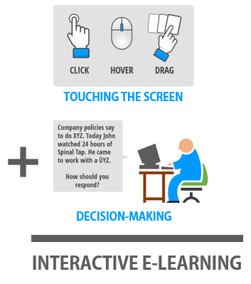
In previous posts we discussed different ways to interact with onscreen elements. Generally, interactions are limited to click, mouse over, or dragging interactions.

Then we explored two key points when building interactive elearning. The first point is to get the users to “touch” the screen. Find ways to have them interact with onscreen elements. The second point is to have them interact with the content to create a great learning experience.


Interactive e-learning comes from interacting with the screen and the e-learning content

Now let’s look at common reasons why people interact with the elearning courses and then we can use that to build better interactive elearning. To keep things simple, we’ll look at three common reasons why people interact with their courses.

Interactive E-Learning: Course Navigation

The most obvious reason why people interact with the elearning course is to navigate from one point to the next. The “next” button is the most common form of interaction. We click it to navigate from one screen to another.

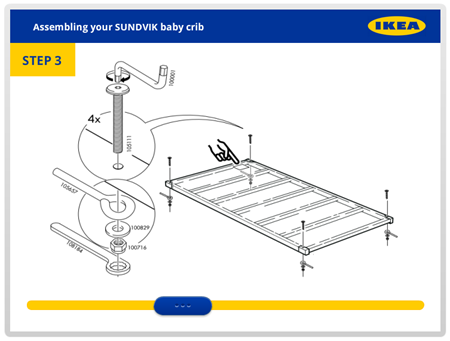
Of course, there are all sorts of others ways to navigate content. It could be an onscreen button, like a gate screen that we click to advance. Or perhaps it’s something like the example below that uses a slider instead of next buttons to navigate from one screen to the next.

What I like about the slider interaction is that we are able to replace a clickable button with a draggable slider. This novelty helps engage those viewing the course and gives them better control of the navigation.

interactive e-learning slider example

Click here to view the slider navigation.

When building your next interactive elearning course, think about ways that the user navigates the content. Play around with ideas that move beyond clicking and the next button. Perhaps there’s a way to include more mouseovers and dragging.

Interactive E-Learning: Exploration

Another common reason why people interact with the onscreen content is to explore and collect information. Most courses are linear and they require that a person click in a specific sequence. However, by allowing for non-linear interactivity, the user gets a bit more control and can access the content they need, when they need it—or at least start with the content that seems the most interesting to them.

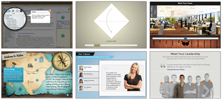
interactive e-learning examples

Here are a few common types of exploratory interactions to give you some ideas:

Couple exploratory interactions with decision-making and you have the foundation for solid interactive elearning and dynamic branched scenarios. They let users explore and collect information to make the decisions required to demonstrate their understanding of the course content.

Interactive E-Learning: Make Decisions

Outside of navigation, the most common reason we interact in our online courses is to make decisions. Usually, it’s a simple quiz question with a submit button. But interactive elearning could also include decision-making scenarios or other non-standard assessments.

Ideally, it’s designed to make decisions and then get feedback based on our decisions. Sometimes the feedback is immediate and sometimes it’s delayed and compounded.

interactive e-learning decision-making branched navigation

Here are a few simple decision-making interactions:

As you can see, assessments and decision-making interactions don’t have to rely on the out-of-the-box quiz questions. There are all sorts of ways to make the decision-making interactive to create a better learning experience. As you plan your next assessment, see if there’s a way to add some novelty or different ways to interact during the decision-making.

Interactive elearning means the learner interacts with the screen and course content. There are only a few ways to interact with the screen. In addition, there are specific reasons why they’re interacting. Do you want them to go from one piece of information to another? Are you giving them opportunities to explore? Or do you want them to collect some information and make decisions?

Understanding why they’re interacting with the course content will help you better determine how you want them to interact. And in turn, you’ll build better interactive elearning courses.

Events

Free E-Learning Resources

Want to learn more? Check out these articles and free resources in the community.

Here’s a great job board for e-learning, instructional design, and training jobs

Participate in the weekly e-learning challenges to sharpen your skills

Get your free PowerPoint templates and free graphics & stock images.

Lots of cool e-learning examples to check out and find inspiration.

Getting Started? This e-learning 101 series and the free e-books will help.


free closed captioning software for online training and elearning

In this post we’ll explore a few simple ways to create free closed captioning text for your online training courses. We’ll work off of the assumption that you want closed captioning to sync with your audio narration or an inserted video on your slides.

What is Closed Captioning Text?

Generally speaking, closed captioning text accompanies the audio or video narration in your online training courses. It’s used to help those who are deaf and can’t hear the audio follow along with the course’s narration. However, some people prefer to turn off all audio and read the text (or perhaps they don’t have speakers or headphones) so it’s not just an issue of accessibility.

Alternatives to Closed Captioning?

There are different ways to make the course transcript available to the end user. A common approach is to display a full transcript. It gets added to slide and allows the learner to disregard the audio and just read the transcript.

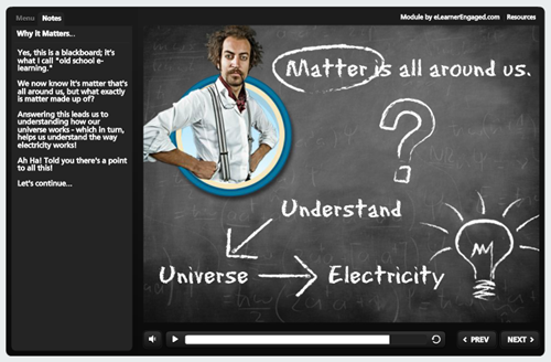
Many of the elearning applications like Articulate Storyline have a transcript or notes feature that allows for this. The transcript can be part of the player or the course designer could add a transcript feature to the actual slide. The image below shows the transcript on the side in the player.

closed captioning transcript in player

This approach works great since most people can read faster than the narrator talks. This is also a viable solution if the slide is mostly static and there isn’t a lot of synced animations or content going on and off the screen. However, it’s not ideal if you want the transcript to sync with the flow of the narration.

How to Create Free Closed Captioning

Let’s say you do want closed captioning in your online training and you want the text synchronized to the audio narration. There are two key components: the first is that you’ll need to create a closed captioning file that has timing and text notations; and the next is using that file to create the actual captions in your elearning software.

Today, I’ll show how to create the free closed captioning file and in a follow up post, I’ll show how to use it in Articulate Storyline. If you have a different authoring application, you’ll have to learn more from that vendor. But in a general sense the steps are probably similar.

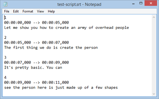
The image below shows a simple closed captioning file. You can see that each caption is indicated by a number and a time range.

closed captioning for online training and elearning .SRT file format

For example, line 2 runs from 5 seconds to 7 seconds with “The first thing we do is create the person…” text onscreen. At the 7 second mark, line 3 is displayed.

There are all sorts of file formats for closed captioning text. You can learn more in this article and at the YouTube site. I like to keep things simple, so we’ll focus on the .SRT files and how to get them. By the way, you can open .SRT files in notepad for easy viewing or editing.

Here are a few ways to create the free closed captioning for your online training courses.

YouTube for Free Closed Captioning

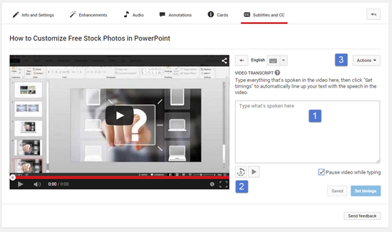
YouTube creates closed captioning when you upload a video. After it’s uploaded it will extract the text and create the timing of the captions. Here’s a great video tutorial that shows how to create free closed captioning in YouTube.

closed captioning for online training via youtube

Here’s a quick overview of creating free closed captioning of your own transcript:

  • Listen to the video and insert the text.
  • You can always rewind 5 seconds to repeat it.
  • Once complete, select “Actions” and download the file in .SRT format.

Microsoft’s Free Closed Captioning Text Maker

Note: No longer available.

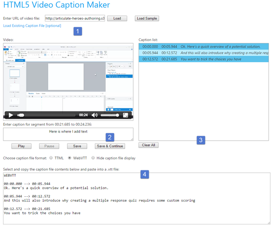
Microsoft offers a simple HTML5-based free closed captioning text maker. It’s on one of their experimental sites so I’m not sure how long it’ll be around; it may end up like Jimmy Hoffa and the screen beans. However, while it’s available, it’s easy enough to use and a good alternative if you have a video link and don’t want to upload your video to YouTube.

free HTML5 closed captioning text

Here are the basic steps to create free closed captioning text:

  • Add a video URL.
  • Play the video and add your text.
  • Caption list displays closed captioning details.
  • Select the WebVTT format. It’s not .SRT, but it’s the same info. You can copy and paste into a text document.

Aegisub Free Closed Captioning Creator

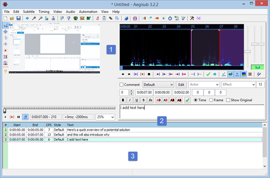
Aegisub is free software to create or modify subtitles and free closed captioning text. It’s a lot more feature-rich than the first two options. And because of that it has a little learning curve.

However, I’m no expert and I was able to insert a video and type in my text with no problems and without a lot of messing around. Most of those features are outside of what we want anyway. We just want a file that gives us the timing and text for the closed captioning so we can add it to our online training courses.

free closed captioning for online training

Adding your closed captioning text is generally straightforward:

  • Insert a video and play it.
  • Add text and press “Enter.”
  • The caption timing displays at the bottom. To export, go to “File” and export and save as .SRT which you can open in Notepad.

So there you have it—three solutions to get free closed captioning for your online training. All of the solutions will generate a file that includes the timing of the closed captions and the text that displays. Once you have those you can use them in your online training software to display the closed captions.

I’ll show how to add closed captions to an Articulate Storyline course in a follow up post.

Events

Free E-Learning Resources

Want to learn more? Check out these articles and free resources in the community.

Here’s a great job board for e-learning, instructional design, and training jobs

Participate in the weekly e-learning challenges to sharpen your skills

Get your free PowerPoint templates and free graphics & stock images.

Lots of cool e-learning examples to check out and find inspiration.

Getting Started? This e-learning 101 series and the free e-books will help.