The Rapid Elearning Blog

Archive for the ‘Uncategorized’ Category


The Rapid E-Learning Blog - how to create graphics using SimpleDiagram

Most people I talk to have limited graphic design skills and they don’t usually have access to a graphic designer.  This wouldn’t be a problem if they could hire a graphic designer, but they usually can’t do that either since they have no money.

Considering this, the goal is to find as many free or low cost graphic design solutions as possible.  In today’s post, we’ll look at a free application that can easily be used for your elearning design and lets you take advantage of some of the hand-drawn items I gave away a few weeks ago.

SimpleDiagrams is an application that lets you quickly create simple diagrams [funny how those names work]. There’s a free version and an inexpensive paid version ($19).  The paid version includes extra libraries, assets and more features.

Whether you use the free or pay versions of the application, it is a handy little tool.  Following are a few ideas to help you get started.  I also created a few quick tutorials and give you over 100 white hand-drawn objects to go with the chalkboard background.

Quickly Map Out the Flow of Your Project

SimpleDiagrams is a real easy way to map out a project or prototype the flow of your content.  This is great when working with a subject matter expert or client.

The Rapid E-Learning Blog - example of a process flow

Some may ask why you wouldn’t just use PowerPoint to do the same thing.  You have a similar freeform environment and it’s easy enough to do, especially if you’re already going to use PowerPoint for production.

That’s a good question.  Here are two reasons why I’d choose this application over PowerPoint:

  • Everything’s in one place.  It’s really simple to build the flow and diagrams with this tool.  You spend a little more time bringing objects into PowerPoint.  Besides, the default chalkboard look and hand-drawn graphics have a nice organic feel.
  • Don’t let you customers see what’s behind the curtain.  One of the biggest challenges with PowerPoint-based elearning is getting away from the stereotypical PowerPoint look.  Once a client knows that you’re working with PowerPoint, they tend to become more rigid in keeping a lot of the bad PowerPoint slides.  So the less they see you doing in PowerPoint the better.

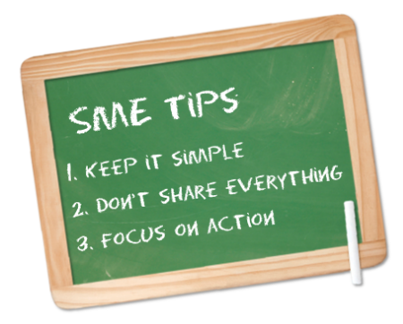
Chalkboards Are Like Charo: Hot! Hot! Hot!”

One of the most popular posts from this blog is the one where I gave away the chalkboard template with the hand-drawn assets.  I can see why.  Even though we don’t usually use chalkboards all that much in real life any more, there are few images that can speak to learning as much as a chalkboard can.

The Rapid E-Learning Blog - simple way to create chalkboard graphics with this free tool

In addition, there’s a lot to be said about the value of an organic look and feel of the hand-drawn graphics.  It seems to lighten the content a bit and add an air of informality.

If you want to add a chalkboard image to your course, but not sure how, here are a few ideas:

  • Prior to introducing the formal content, mock up a case study slide using the chalkboard.
  • Change up your knowledge checks.  People get intimidated when quizzed.  Lighten it up a bit, by making your quiz or knowledge check look less formal.
  • After going through some formal content, switch to a chalkboard screen and practice applying the content.  Kind of like a coach writing plays on the board.

Tips on Using SimpleDiagrams

I created a few tutorials to explain how SimpleDiagrams works and how to use it with your elearning courses.

In previous posts, I gave away some hand-drawn graphics and fonts that you can use with SimpleDiagrams.  The links are below.

I also converted some of the hand-drawn objects to white, so they work better with your chalkboard screens.  There are 132 objects from which to choose.

The Rapid E-Learning Blog - download your free hand-drawn graphics

You can download them here.

If you’re looking for a simple and cost effective way to build a chalkboard image for your elearning course, this application helps you do so.  It’s also an easy way to visually map out your ideas.  Combine this application with the visual communication ideas in Roam’s Back of the Napkin book and you have a pretty powerful tool.

If you use this application for elearning or presentations, I’d love to see what you do.  Feel free to share it with us via the comments link.

Events

Free E-Learning Resources

Want to learn more? Check out these articles and free resources in the community.

Here’s a great job board for e-learning, instructional design, and training jobs

Participate in the weekly e-learning challenges to sharpen your skills

Get your free PowerPoint templates and free graphics & stock images.

Lots of cool e-learning examples to check out and find inspiration.

Getting Started? This e-learning 101 series and the free e-books will help.


subject matter expert e-learning

Subject matter experts know their subject matter.  That’s why they’re called experts.  But they don’t always know how best to teach what they know, especially when it comes to elearning.

Subject matter experts offer a lot of value when it comes to building your elearning courses.  They have invested lots of time in developing their expertise so they’re able to touch on nuances that go beyond just information.  This can be critical in your course design.

However, there are some challenges when working with experts. Often they’re so far removed from the learning process and where a new person is that they lose perspective on what is most essential to learning new skills.  Trying to get the right information and structure for your course can prove difficult.

I find that many of them consider all of the information critical.  I’ve worked on projects where it was almost impossible to get the subject matter expert to concede anything.  This can be both frustrating and time-consuming.  There were times I wished I had an elearning mediator who could talk to the subject matter expert in a way I couldn’t.

Here Are Three Things Every Subject Matter Expert Should Know

The Rapid E-Learning Blog - subject matter expert tips

If I did have a mediator who could intercede, this is what I wish they could convey:

  • People don’t care about what you know as much as you do.  I know this sounds harsh but it’s just the way it is.  What people care about is learning what they need to learn to meet their goals.  If you have something to offer that’s good; but it’s really just part of a pool of information and experiences that they encounter.  So what you know has value, but only as it matters to them.
  • New learners don’t need to know everything you know.  Your expertise comes from years of experience.  You didn’t just read a manual and become an expert.  You had a lot of opportunity both formal and informal to develop your expertise.  Keep that in mind when working with new learners.
  • Your actions speak so loud I can hardly hear you. My boss used to say that to me all the time when I talked about what I knew.  She was less concerned about my talking and more on my doing.  This could also be applied to elearning and subject matter experts.  Instead of telling me what the new learners should know, tell me what actions they should be able to do.  Then we can set a plan around actionable goals.

Working with Your Subject Matter Experts

Sometimes my wife accuses me of giving her long answers to simple questions.  She always tells me, “I ask what time it is and you begin to tell me how to build a clock.”  I only do this because if something should ever happen to me, I’d like her to be able to build a clock so she’s always know what time it is.

There’s a lot of truth to what she says.  I find that I like to pad my answer around context.  So instead of giving a simple answer I ramble on offering all sorts of contextual nuance.  And that tends to be a problem common to working with subject matter experts.  Their experience isn’t based on black and white solutions.  Instead they’re nuanced based on variables that they’ve learned to master over the years.

Context is important to an expert.  But it’s not always relevant to a new learner.  Our job is to expose the critical information but work around some of the context that a new learner might not easily understand.

Here are a few tips when working with subject matter experts to build elearning courses.  I’ve also included links to previous posts that may help.

The Rapid E-Learning Blog - lots of information

Create courses that are learner-centric.  Instead of focusing on the information, focus on how the learner will use the information.  This helps build the context that is so critical to gaining expertise.

Focus on action.  Going with the point above, figure out how the learners will use the information.  Then frame the course around that.  There are simple ways to do so.  For example, create scenarios or case studies that are relevant and meaningful.  If you’re teaching a policy, instead of presenting the policy, create a real world situation where the policy applies.  Then walk them through a scenario where they get to make decisions and get feedback based on how they apply the policy.

I recommend pulling in recent learners—people who’ve just learned what you’re trying to teach. They can offer some insight and perspective that is meaningful.

Get the learners to pull the information.  Most elearning courses I see push the information out.  This isn’t bad or wrong.  In fact, I kind of view an elearning course like a text book.  So pushing information out isn’t a bad way to go it’s just not always the best way to go.

Some text books just present information (like a lot of elearning courses); however some included questions and case studies.  They pose questions that get you back into the text looking for information and then using it to solve problems.  In the same sense, build your courses in a way that the learner is compelled to pull information from the course to solve problems.

Your subject matter experts are key to the elearning course’s success.  The challenge is getting them to see what they know from the perspective of the new learner.  Help them learn more about packaging their content to meet the learner’s nee
ds and you’ll be off to a good start.

What tips do you have when it comes to working with subject matter experts?  Click here to share them.

Events

Free E-Learning Resources

Want to learn more? Check out these articles and free resources in the community.

Here’s a great job board for e-learning, instructional design, and training jobs

Participate in the weekly e-learning challenges to sharpen your skills

Get your free PowerPoint templates and free graphics & stock images.

Lots of cool e-learning examples to check out and find inspiration.

Getting Started? This e-learning 101 series and the free e-books will help.


The Rapid E-Learning Blog - favorite posts of 2011

2010 flashed by me so fast I was worried that if I stuck my arm out it would become fossilized.  Despite that it was a great year of traveling around and getting to meet many of you at conferences and informal jam sessions.  I also got to see parts of the country I hadn’t seen before.

2011 is going to be an exciting year.  We at Articulate have some cool things planned.  And as far as conferences, I’ll be at the usual ones like ASTD ICE and Devlearn.  But, I’m also making arrangements to get out to some new places.  You’ll hear more in the coming weeks.  And as usual, if I’m on the road, I’ll try to stay an extra day and do some informal Articulate jam sessions.

Top Ten Posts

As for the most popular posts of the year, I took our data to the top secret Articulate labs, ran a few tests, and produced the following results.

The Rapid E-Learning Blog - Dr. Werner Oppelbaumer analyzing popular blog posts

Bunch of Free Stuff

As you know, I like to give away the demos and mock ups that I build for the blog.  But I find that it’s even getting hard for me to find the stuff I’ve done in the past.  One of my goals for 2011 is to make it easier for you to find all of the free templates and assets we’ve made available over the years.  So stay tuned.

In the meantime, here are the posts that offered some free templates and elearning assets.  I’ve also included a bonus template.

The Rapid E-Learning Blog - stack of free PowerPoint files


Bonus Template:  Here’s a template based on the FTC demo I did a while back.  You can see the template in action here. There are six slide layout options.

The Rapid E-Learning Blog - free PowerPoint templateDownload the free PowerPoint template.

What elearning goals do you have for 2011?  Feel free to share them by clicking on the comments link.

Events

Free E-Learning Resources

Want to learn more? Check out these articles and free resources in the community.

Here’s a great job board for e-learning, instructional design, and training jobs

Participate in the weekly e-learning challenges to sharpen your skills

Get your free PowerPoint templates and free graphics & stock images.

Lots of cool e-learning examples to check out and find inspiration.

Getting Started? This e-learning 101 series and the free e-books will help.


The Rapid E-Learning Blog - free PowerPoint template and 100 free PowerPoint tutorials

With as many PowerPoint questions that I get, it’s a good thing that over the past year or so the elearning community has created about 300 PowerPoint tutorials.  For this post, I decided to pull a bunch of them together so that you have them in one easy list.

I also included a free PowerPoint elearning template to celebrate the holidays and a great 2010!

The Rapid E-Learning Blog - example of free PowerPoint template

Click to download the free PowerPoint template.

100+ PowerPoint Tutorials

If you want to learn more about using PowerPoint or building rapid elearning courses, this list is a good place to start.  Even if you can’t use a tutorial right now, going through one is still a good way to learn about PowerPoint.  The key is to do more than watch the tutorials.  Instead, practice what you learned and then try to apply it to a real project.

I loosely organized the tutorials by topic so they’re a little easier to scan.


PowerPoint for Rapid E-Learning


PowerPoint Tips for Graphic Design


Create Illustrations & Objects in PowerPoint


Animation Tips & Tricks in PowerPoint


How to Use PowerPoint Tutorials

PowerPoint Resources

As you can see, there are lots of free tutorials and resources to help you learn more about PowerPoint.  All it takes is a little bit practice and you’ll be a PowerPoint pro in no time.

I hope you have a Happy New Year!

Events

Free E-Learning Resources

Want to learn more? Check out these articles and free resources in the community.

Here’s a great job board for e-learning, instructional design, and training jobs

Participate in the weekly e-learning challenges to sharpen your skills

Get your free PowerPoint templates and free graphics & stock images.

Lots of cool e-learning examples to check out and find inspiration.

Getting Started? This e-learning 101 series and the free e-books will help.


The Rapid E-Learning Blog - coffee with that elearning course

The past few days I’ve been pulling some content together for a couple of workshops I’m doing at the ASTD TechKnowledge conference in San Jose.  The workshops are for those who are just getting started with the Articulate tools.

I only have about 75 minutes for each workshop, so I am pre-building most of the course that we’ll use for a few practice activities.  The participants will get all of the assets and some job aids to help them during the practice activities.  You can see how I’m designing the activity job aids below.

The Rapid E-Learning Blog - example job aid for software training

They’re pretty simple and work with what we’ll be doing live.  I also added links to Screenr videos and embedded some tutorials because it’s easy to get lost during the conference sessions.  This way the participants have access to some quick tips while they’re working on the files and can work at their own pace.

In case you’re interested in how it looks, you can download the PDF here.  The file is about 20 MB because of the embedded video.  If you want to use the template, feel free to download the basic PowerPoint file that I used to create the job aid.  Use it as you wish.

The Rapid E-Learning Blog - screenshots of elearning job aid free PowerPoint download

Working on the mini course reminded me of some of the challenges many who read this blog face.  The main challenge is working on one or two-person teams with a budget of $12.37.  So I thought I’d share a few ideas on how to squeeze as much as you can out of those twelve dollars.

How to Get a Nice Course Design If You’re Not a Graphics Artist

One of the biggest challenges we face is coming up with the right look for our courses.  It’s really hard when you work by yourself and you’re not a graphics designer (and you don’t have access to one).

So how do you get a course design idea?  The easiest thing is to work with what you have.

In the course I am designing for my workshop, I need something simple.  I’m not that concerned about the course content, but I do want something that makes sense and looks nice.  Many times I’ll look for practice content on government sites.  But not for this course.

One of my favorite gadgets is my Keurig coffee brewer.  When I unpacked the box, one of the things that impressed me is the “getting started” card (and the overall packaging of the documents) that they provide with the brewer.  It has the feel of being a high-end product.

  • Bonus tip!  There’s a lot to be said about the aesthetic of your course design and how people feel the first time they SEE it.  Is your course inviting? Or does it just look like a bunch of PowerPoint slides and clip art slopped together?
  • Another Bonus Tip!  Keep it simple.  You don’t need to dump everything you know on an unsuspecting learner.  Compare the brewer’s complete manual to the quick start manual they provide in the box.  Which is more inviting?

I decided to use the information on the “getting started” guide for my practice course.  The content is simple and the illustrations are very elegant.  They’ll look great on the slides.

The Rapid E-Learning Blog - example of inspiring elements for Keurig brewer manual

Look for Content That Already Exists in Your Organization

There’s probably a lot of existing content and assets available in your organization.  It’s just a matter of finding it.

In my case, I started with the Keurig documentation.  It comes with some basic content.  Essentially it’s a mini training document.  So there’s good content and a nice flow to how the information is structured.

An added bonus is that the documentation includes some really high quality images.  I can easily use them in my elearning course.  I also did some searching online and found all sorts of demonstration videos and images that I could use.

For your courses, look through manuals and other documentation to see if there’s anything of value.  There are probably other groups in your organization that have media resources and assets that you can use, as well.  Here are a few places to look:

  • Marketing
  • Public relations
  • Library (some organizations have them)
  • Communications
  • IT group
  • Web teams

Initially I was going to design my course to look like the getting started PDF.  The design is simple and the flow of information would have worked well with that type of design.  But I wanted something a little richer, so I used the Keurig web site for inspiration.

The Rapid E-Learning Blog - demo course for TechKnowledge 2011

Click to view the demo course.

If you preview the draft version of my course above, you can see that the web site provided a lot of inspiration on how to present the content.

The Rapid E-Learning Blog - how web site inspired elearning course design

What I like about this particular design is that it comes with a rich color scheme.  So I don’t have to think of that myself.  I’m not a graphics designer and my use of color isn’t always great.  Being able to start with someone else’s design is big plus and timesaver.

The Rapid E-Learning Blog - ideas I pulled from the Keurig site for my web design

Here are some things about the web site that I think apply to an elearning course design:

  • Company brand: branding in elearning courses is a big issue for many organizations.  I’ve written a little about that in the past.  Those that tend to make it an issue usually have some sort of branded identity.  Use what they have to inspire your design.
  • Screen layout: I really like the way the Keurig site looks.  It’s inviting and there are many elements in the web design that I can incorporate in my own.  For example, you’ll notice that I used the big, picture-circle in all of the screens.  It’s a nice visual element that ties all of the screens together.
  • Menus: I like to create visual menus that the learner can click to jump to specific parts of the course.  So when I look for inspiration, I try to find those areas that could be used as menus.  In my practice course, I used the light green boxes.  But I like the way the gray boxes at the bottom look.  Those would also make nice menus.

The company web site is an obvious place to look for design ideas.  Here are a few other places where you can find inspiring ideas:

  • Organization’s marketing material
  • Annual financial reports
  • Intranet
  • Television commercials
  • Brochures
  • Executive-level presentations (they tend to have the money to do some nice looking stuff)

Once you have the design and some assets it’s easy to pull the course elements together.  For example, I built the demo course in about a day.  I was able to do so because I had a good starting point.  I used the web site for inspiration and then I did some screen grabs of the images in the .PDF.  Then I cleaned the images up a bit to work with the course.

The Rapid E-Learning Blog - before and after use of illustrations in the elearning course

Another thing to consider is that you can pull things apart and use them in new ways.  For example, I pulled the hand image out of the PDF and used that as an animated pointer to highlight the brewing process.

The Rapid E-Learning Blog - before and after use of illustrations in the elearning course

As you can see, with a little sleuthing it’s easy to find inspiration inside your organization.  I know that there are some who will say that this won’t work for them because their company’s stuff isn’t very good.  That’s OK.

Just go out and find a site you like.  Use that for inspiration.  And then apply your organization’s brand and colors to the design.  Here’s a post I did a while back that shows how.  Plus, you can download a bunch of starter templates.

What do you do to find inspiration for your course design?  Share your thoughts by clicking on the comments link.

Events

Free E-Learning Resources

Want to learn more? Check out these articles and free resources in the community.

Here’s a great job board for e-learning, instructional design, and training jobs

Participate in the weekly e-learning challenges to sharpen your skills

Get your free PowerPoint templates and free graphics & stock images.

Lots of cool e-learning examples to check out and find inspiration.

Getting Started? This e-learning 101 series and the free e-books will help.


The Rapid E-Learning Blog - beats Jeopardy

Many of the rapid elearning courses I see use whiteboards or chalkboards.  You can buy stock images of these, but it’s easy enough to create them in PowerPoint.  So today, I’m going to share a few simple ways to create your own boards.  Even if you don’t need to use them, there are some good PowerPoint tips that you could apply to other projects.

Blackboards and whiteboards are made up of a few key elements.  There’s a frame, the board area, and the assets like erasers and markers.  If you do a search online you’ll see that whiteboards typically have metal, wood, or black plastic frames. And chalkboards usually have wood frames.

These are all easy enough to create in PowerPoint.  When creating these, the key is to not get too detailed.  Too much detail can get noisy; and means you have to spend a lot more time producing the graphics.

Here are a few tutorials on how to create some display boards with a few extra production tips.  I’ve also included everything for you to download.

Tutorials:

Free Downloads

The Rapid E-Learning Blog - free downloads

Fonts of interest: here are a couple of fonts that you can download for free from other sites.  They’ll work great with the display boards.  Be sure to check the license restrictions before using.

The Rapid E-Learning Blog - free whiteboard font

Whiteboard font

The Rapid E-Learning Blog - free chalkboard font

Squeaky Chalk Sound

Hopefully, these free assets come in handy.  If you do use them, let me know.  I’d like to see what you do.

Events

Free E-Learning Resources

Want to learn more? Check out these articles and free resources in the community.

Here’s a great job board for e-learning, instructional design, and training jobs

Participate in the weekly e-learning challenges to sharpen your skills

Get your free PowerPoint templates and free graphics & stock images.

Lots of cool e-learning examples to check out and find inspiration.

Getting Started? This e-learning 101 series and the free e-books will help.


The Rapid E-Learning Blog - here's a boatload of free graphics

I like to use hand-drawn elements in some of my conference presentations.  In the examples below, I combined hand-drawn shapes and characters with a hand-written font to give it more of an organic look.  What I like about this approach is that it is less formal than if all of the shapes and images were created in PowerPoint.  I think it makes the presentation seem less stuffy.

The Rapid E-Learning Blog - examples of hand-drawn graphics in elearning

Hand-drawn objects work well in elearning, too.  I discussed the value of hand-drawn elements in this post on adding personality to your elearning courses.  I like that it adds some novelty, feels personal, and creates good contrast.  We used them in the image below to draw attention to the navigation controls.

The Rapid E-Learning Blog - example of hand-drawn graphics in elearning

Simple Ways to Create Hand-Drawn Objects

I get a lot of questions about how to create them.  Here are a few ideas.

Take out a piece of paper and draw what you want.  Then put it in a scanner to make a digital copy.  At that point you can take the scanned image into a graphics editor and convert it to a usable image.  If you feel like you have no drawing skills then at least try tracing something.  Take pictures of people and then trace them on the paper.  You don’t need all of the details to create some simple line drawings.

Both Windows Vista and 7 are pen-capable so you can use your computer to create the drawings.  I happen to have a tablet pc, so I can draw right onto my PowerPoint slides.  When I’m done, I right click and save as a .PNG image file.  The example image below was created in PowerPoint using a hand-drawn frame and arrow.

The Rapid E-Learning Blog - hand-drawn frame and arrow on top of image

You can also use a Wacom tablet to do the same.  In fact, the Wacom tablets are coming down in price and might be worth looking at if you have some drawing skills and figure you’d use it regularly.  They definitely add a lot of value if you have to create your own graphics.  You can also get an older used tablet pc on eBay for a decent price.  That’s a good way to go and you get a larger screen than the Wacom’s.

You Don’t Need to Be a Professional Artist

Anyone can learn to communicate ideas with hand-drawn elements.  It’s less about the drawing and more about knowing how the drawing communicates.  If you look at the community characters, they’re not perfect.  But together they work.

The Rapid E-Learning Blog - hand-drawn characters

A great resource for learning about visual communication is Dan Roam’s Back of the Napkin book.  You’ll learn how to communicate your ideas.  Even if you don’t do any hand-drawing in your courses, many of the ideas that Roam shares are applicable to instructional design and elearning.

The Rapid E-Learning Blog - free hand-drawn frames and notebook

To help you get started, I created some hand-drawn shapes and elements that you can use in your elearning courses.  The example above comes from a few of the free hand-drawn objects.

The Rapid E-Learning Blog - examples of free hand-drawn shapes

Download the hand-drawn objects here.

Feel free to use them as you wish.  Many of you out there also have tablets and are better artists that I am.  If you’re interested in creating some hand-drawn shapes and images to share with the community, let me know.

Events

Free E-Learning Resources

Want to learn more? Check out these articles and free resources in the community.

Here’s a great job board for e-learning, instructional design, and training jobs

Participate in the weekly e-learning challenges to sharpen your skills

Get your free PowerPoint templates and free graphics & stock images.

Lots of cool e-learning examples to check out and find inspiration.

Getting Started? This e-learning 101 series and the free e-books will help.


The Rapid E-Learning Blog - free elearning workshop

It’s funny what you find when cleaning out your computer files.  In this case, it’s a tutorial that I created over two years ago after a rapid elearning workshop I had given.  For some reason, I never ended up posting it.  So here it is.

The output of the workshop is an interactive tabbed notebook.  But the focus is really on learning some core rapid elearning tips when working with PowerPoint.

The Rapid E-Learning Blog - free elearning workshop

Click here to view the rapid elearning workshop.

If you’re just getting started with rapid elearning, this is a good basic workshop that takes you through some of the essential techniques.  Plus, you end up a with a nice PowerPoint template.

Here’s what’s covered:

  • Building graphics in PowerPoint
  • Using two files per course—one for graphics and one for production
  • Learn to use PowerPoint hyperlinks
  • Leverage the master slides to decrease production time
  • Assembling the tabbed notebook

I built the workshop using the same notebook so you can see an example of the output as well.  I also included the files for PowerPoint 2003 and 2007.

The Rapid E-Learning Blog - 3 free tabbed templates using PowerPoint 2003 and PowerPoint 2007

All of the notebooks use the default color theme in PowerPoint 2007 so it’s easy to quickly apply a new theme with your own color scheme.

I hope you enjoy the quick workshop and notebook templates.  If you use them in a course, feel free to send me a link or screen grab.  I’d love to see what you do.  If you have any comments, please share them in the comments section.

Update:

Stephanie did a nice screencast to show how to get more out of the free PowerPoint templates and make them look richer.

Click here to play the tutorial.

Events

Free E-Learning Resources

Want to learn more? Check out these articles and free resources in the community.

Here’s a great job board for e-learning, instructional design, and training jobs

Participate in the weekly e-learning challenges to sharpen your skills

Get your free PowerPoint templates and free graphics & stock images.

Lots of cool e-learning examples to check out and find inspiration.

Getting Started? This e-learning 101 series and the free e-books will help.


The Rapid E-Learning Blog - travel

Recently, I’ve done quite a bit of traveling.  In the past few weeks I’ve been to Vermont, Louisiana, Pennsylvania (twice), California, and New York.  I’ve been able to meet quite a few rapid elearning developers and blog readers.

The Blog Readers Keep the Job Fun

By nature, I’m a bit introverted.  But I can tell you that getting to meet some of the blog readers around the country is really energizing.  I’m always overwhelmed by the enthusiasm and the kind and encouraging words that are shared about the blog.  In this world where we all wrestle with information overload, I’m flattered that the blog posts are so well received.

The Rapid E-Learning Blog - enthusiastic blog readers

Many of the people I meet are one or two-person teams.  They’re responsible for instructional design, graphic design, course authoring, and a lot of the IT support that goes with delivering elearning courses.  They’re also under a lot of pressure to create effective elearning with limited resources and virtually no budget.

So I’m thankful that I have the opportunity to help by offering a few of the tips and tricks I’ve learned along the way.

The E-Learning Community Makes the Job Easy

I’m also thankful for the many people in the elearning community who so freely share what they know and are willing to offer their expertise to others.

The Rapid E-Learning Blog - bedbug

Here’s a great example of the elearning community in action.  Joe Deegan was looking for some creative ideas on a bed bug course he’s creating.  I love the way everyone jumped in and offered a bunch of ideas.

The Rapid E-Learning Blog - elearning community

In fact, one of the best ideas was to look at the content from a different perspective.  This works whether you’re getting rid of bed bugs or trying to teach soft skills.

Free Stuff Makes Everyone’s Job Easy & Fun

In honor of the active elearning community and the upcoming holiday season, I’m going to include one free download through the end of the year.

The Rapid E-Learning Blog - demo of the free PowerPoint template

Click here to view the template demo.

Today, it’s a free PowerPoint template based on the Tripit smartphone app.  I’m not a big cell phone user (mostly because I’m trying to avoid texted honey-do lists). Over the years, I’ve been able to get by with one of those pay-as-you-go phones.  I’d buy 1,000 minutes and a year later still have 600 minutes left.

But with all of this travel, I recently switched to a simple smart phone for better access to email and information like my travel itinerary.  So far so good.  The phone works great and I’m not locked into a long-term contract.

Since I now have the phone, I’ve been playing with some of the travel apps and I really like Tripit for managing my itineraries.  What I also like is their screen layout and how it could be used in an elearning course.

The Rapid E-Learning Blog - Tripit smartphone app

When I create elearning templates and look for design ideas, I try think about these key elements since they’re usually part of most elearning courses.

  • Welcome
  • Menu choices
  • Objectives
  • Various layouts
  • Blank screen for inserted media or interactivity
  • Miscellaneous assets

The Tripit screenshot offers a few ideas.  I like the simple color theme.  I also think that the three numbered boxes could easily be used to list objectives or create a branched menu for sections in a course.

I also like the way the circles are used as callouts.  Combine that with some icons and you have a really interesting screen.  Notice how each box has elements that bleed or hang outside of the blue box?  It adds a bit more visual interest.

Below you can download the elearning template and some of the assets.

The Rapid E-Learning Blog - rapid elearning PowerPoint template

The Rapid E-Learning Blog - assets

If you want to use some icons in your template like they do in the original web site, do a search for icons.  I like the ones below because they’re simple flat icons.  Just ungroup them and pull the flag out.

The Rapid E-Learning Blog - good icons for the template

Download the template here.  I’d love to see what you do with it.  Feel free to send a link via the comments section.

Thanks to all who make my job a blast.  And special thanks to the team at UTI for sharing the fan photo.  You made me blush. : )

Events

Free E-Learning Resources

Want to learn more? Check out these articles and free resources in the community.

Here’s a great job board for e-learning, instructional design, and training jobs

Participate in the weekly e-learning challenges to sharpen your skills

Get your free PowerPoint templates and free graphics & stock images.

Lots of cool e-learning examples to check out and find inspiration.

Getting Started? This e-learning 101 series and the free e-books will help.


The Rapid E-Learning Blog - Are you building black squirrel or grey squirrel elearning?

Last week I took a stroll through New York City’s Central Park.  While walking along the paths, I saw a black squirrel digging for acorns.  I’m not sure how many black squirrels live in Central Park so they may be somewhat common.  But for me, they’re uncommon and that got my attention.

After seeing the first black squirrel I surveyed the park to look for more.  I didn’t see any others, but I did see a lot of grey squirrels.  In fact, there were grey squirrels everywhere.  I just hadn’t noticed them before.

This reminded me of Seth Godin’s book about purple cows.  He talks about how we don’t notice regular cows, but we’d certainly notice a purple cow.  The essence of his book is about doing something remarkable.  As he says, what you do should be “worth making a remark about.”   While he’s in the marketing industry, there’s no reason why his thoughts can’t be applied to elearning courses.

Of course, the odds are that people are already making remarks about the elearning courses, so I’d add that the remarks should be positive.  : )

Below is a video of Seth explaining how to stand out with remarkable products.  I also encourage reading his blog.  It’s not about elearning but it is about how to serve people and meet their needs.  And that is a large part of elearning.

Click here to view the Seth Godin video.

Grey Squirrel vs Black Squirrel E-Learning

With rapid authoring tools, it’s becoming easier to build and deliver elearning courses; and that means more and more organizations are building them.  So over time, we get a lot of courses that all start to blend together.

They’re like the grey squirrels in Central Park.  There were a lot of them around but they just didn’t stand out.  It’s easy to build grey squirrel elearning where one course seems to be exactly the same as the next course.  But that doesn’t have to be the case.  There’s a place to create black squirrel courses—those that stand out and make people take notice.  Here are a few ideas to help you get started.

Build Eye-Catching Courses

There’s a lot to be said about the aesthetic design of your course.  Some people discount the focus on looking good as mere “eye candy. “  But, the look and feel does matter.  The more polished your course is the more value the learner will assign.  They see the course before they do anything else with it.  So you want it to be inviting and visually interesting to start.  You definitely don’t want them starting the course thinking that it’s another boring elearning course and probably a waste of their time.

The challenge for many people is that they aren’t trained graphic designers and not sure how to design the right look and feel.  Fortunately there are some resources.  First, I’d invest in a graphics design book to learn some basic concepts.  The Non-Designer’s Design Book is a good start.  You’ll learn the basics with some good before and after examples.  Be sure to apply the concepts to your own course design.

The Rapid E-Learning Blog - visual mindmapping

David Anderson also has a great mind mapping exercise where he walks you through the process of building a unique look and feel for your elearning courses.  As an example, check out the before version of the art history quiz. It’s typical of what we see in many elearning courses.

The Rapid E-Learning Blog - art history before exampleClick here to view the before version.

By applying David’s mind map exercise, he was able to convert a somewhat generic-looking quiz to something much more rich and dynamic.  Instead of using the quiz form, he leveraged Quizmaker’s slide view to create a very compelling look that only enhances what you’re trying to teach.

The information’s the same in both quizzes.  But given the choice, which would you want to be part of your elearning course?

The Rapid E-Learning Blog - art museum after example

Click here to view the after version.

Keep in mind, the goal isn’t to create eye candy where you have a good looking course with no substance.  Instead, the goal is to combine the right look and feel with relevant and meaningful content.

Go From Push to Pull

Many elearning courses push information to the learners.  I discussed this a bit in the blog post, Are Your E-Learning Courses Pushed or Pulled?  The assumption is that people will learn because we make the information available to them.  While you do get the informat
ion out there, it doesn’t mean any of it is relevant or sticks.

The Rapid E-Learning Blog - are you pushing or pulling

Ideally, elearning courses have the learners pull information.  You do this by giving them a reason to look for it and use it. Find out how the course’s content is relevant to them and then build places in the course where they are challenged to make decisions.  Don’t push the information at them.  Instead, give them a means to find it and then pull what they need to make the right decisions that help them learn.

Free Up the Course Navigation

Personally, I think one of the worst parts of elearning is when the navigation controls are locked.  Typically, the rationale is that “we can’t guarantee that they get all of the information or view all of the screens.”  This is a bogus reason to lock navigation. Essentially, you’re already admitting that the course is lame and not important to the learner because if given the opportunity, they’re going to leave.  That’s not a navigation issue, that’s an instructional design issue.

The Rapid E-Learning Blog - learning happens online and when interacting with the content

If the content is relevant and meaningful to the learner, locking navigation is less an issue.  The push-pull approach above is one way to make the content meaningful.  You can explore some other ideas in this post on why course navigation is less important than you think.

For those who ask, “How do I know they learned what they needed?” I suggest that you look carefully at your course objectives.  There’s a reason that the course exists.  In some sense, you’re trying to persuade the learner to a point of view.  Considering this, you have to determine how to measure your success at persuading them.  When you look at it that way, locking navigation hardly seems a successful route of persuasion.

If the goal is to teach something, then having viewed a screen is probably not the best measure of success.  Figure out how the learners can demonstrate their understanding of the content, and then build scenarios, assessments, or other decision points in the process so they can demonstrate their understanding.  That’s more meaningful than screens viewed.

There are other ways to make your content remarkable.  You can get rid of a lot of content or come up with creative and unique ways of presenting the information.  The main point is to look at your courses and ask if they stand out.  Are you building grey squirrel courses that are ho-hum and easy to ignore? Or are you building courses that like the black squirrel make people take notice and desire to know more?

What are some tips you have for making elearning courses more remarkable?  Share them by clicking on the comments link.

Events

Free E-Learning Resources

Want to learn more? Check out these articles and free resources in the community.

Here’s a great job board for e-learning, instructional design, and training jobs

Participate in the weekly e-learning challenges to sharpen your skills

Get your free PowerPoint templates and free graphics & stock images.

Lots of cool e-learning examples to check out and find inspiration.

Getting Started? This e-learning 101 series and the free e-books will help.


The Rapid E-Learning Blog - 75 free rapid elearning resources

The other day this guy asked me how to develop color schemes for his rapid e-learning courses. Like a lot of guys, he has some issues with color perception so he wanted an easy way to match colors.

I have the same challenge.  In fact, my wife’s probably getting annoyed with me always asking which shirts and pants match when I pack for the conference trips.  It’s a good thing I can trust her.  Otherwise, I might show up at the conference looking like a doofus in a leisure suit.

I shared some of the tools that I use for color schemes in previous posts like this one on creating your own rapid e-learning PowerPoint template.  I start by picking a color from the image using Pixie.  And then I take that color information to a site like Color Schemer to create a color scheme.  That helps me have a consistent color scheme.

As I was searching previous posts to answer his question, I ran into a lot of the tools and sites that I’ve recommended in previous blog posts.  So I thought that it might be a good idea to make a single list of some of the tools and sites like Pixie and Color Schemer that I’ve referenced before.  So here’s a list of previously referenced tools and a brief explanation of what they do.

Also, here’s a link to the 200 free rapid e-learning tutorials I posted a while back.

Audio Resources

Creative Commons audio: good sites to get free audio for your courses. [original post]

Video Resources

Graphics Resources

Image editing software:

Font Resources

Stock Image Resources

The following sites were recommended by blog readers. [original post]

Writing & Reading Resources

  • Copyblogger: the site is focused on writing for blogs but the ideas work for e-learning courses, too; especially when it comes to creating learner-centric content. [original post]
  • Windows Live Writer: this is what I use to write my blog posts. It’s free and works great. [original post]
  • Making Change: Cathy Moore does a good job providing tips that will improve how you write for your courses and with your instructional design. [original post]

PowerPoint Resources

Community & Social Media Resources

Miscellaneous Resources

Hopefully you can use these applications when working on your courses.  If there are some free resources you think should be on the list, feel free to share them in the comments section.

Events

Free E-Learning Resources

Want to learn more? Check out these articles and free resources in the community.

Here’s a great job board for e-learning, instructional design, and training jobs

Participate in the weekly e-learning challenges to sharpen your skills

Get your free PowerPoint templates and free graphics & stock images.

Lots of cool e-learning examples to check out and find inspiration.

Getting Started? This e-learning 101 series and the free e-books will help.


The Rapid E-Learning Blog - 3 time-saving tips

The other day I was reviewing an old PowerPoint file that I used for the blog post on how to build simple interactive scenarios in PowerPoint-based elearning.  I wanted to make some tweaks to it for an upcoming presentation.

However, when I opened the file, I realized that in my haste to build the demo for the blog post, I took quite a few short cuts.  At the time, it was fine because it’s a simple demo for the blog.  But going back to make changes has forced me to break and rebuild much of the PowerPoint.  If it was a real elearning course, it could have cost me quite a bit of time.

This experience is a good reminder of many of the production tips and tricks I share in the blog.  There are things we can do during the initial course development that not only save time, but make maintaining the course easier down the road.

Today, I want to revisit some of those tips and show how they can help you on your next elearning course.  Here’s a quick rundown of what I ran into when I opened the original file.

Publishing time was slower.

If you look at the image below, you can see that there’s nothing on the master slides because I didn’t use any master slides.  Instead all of the persistent objects on the screen are copied over all of the slides.  This means that each slide takes a little longer to publish.  This simple demo only had thirteen slides which took about 2 minutes to publish.

The Rapid E-Learning Blog - no master slides means wasted time

Solution: Put as much redundant content on the slide master.  This decreases the publish time.  In this case, the publish time went from about 2 minutes to less than 30 seconds.  Saving 90 seconds for the blog demo’s not that big of a deal.  But a real elearning course with a lot more slides would see a significant improvement in the time to publish.

Didn’t take advantage of the master slides.

The scenario demo has three main scenes.  In the original, I took a shortcut and just created a new slide by copying the previous one (which is what many people do).  That means I didn’t use any slide masters.  I already showed how that slows down publishing time.  In addition, it makes editing much more challenging.  It’s easier to edit a single master once, than it is to make the same edits to each slide individually.

The Rapid E-Learning Blog - put as much as you can on the master slide

Solution: I created a layout in the slide master for each scene.  Place all of the persistent objects on master slides.  Don’t be afraid of multiple masters.  You can have as many masters as you like.  I usually recommend that if you have more than 2 slides with the same information, use a master.

Clip art and PowerPoint objects are less flexible.

Working with image files is easier than working with vector shapes in PowerPoint.  For example, the characters are clip art images.  If I want to re-use the slide and swap out characters, I can’t do that using the clip art without having to delete and rebuild the animations.  I also don’t get the same image editing capabilities with clip art and PowerPoint shapes that I get with bitmap images.

The Rapid E-Learning Blog - there are a lot more graphic tools in PowerPoint for bitmaps than objects

Solution: For each course, create two PowerPoint files.  One is for building graphics and the other is for building the course.   It’s an extra step, but doesn’t require a lot of extra work.  The tradeoff is that managing your courses will be easier, your publish time will be faster, and you’ll build a library of reusable elearning art.

Most of us are used to working with PowerPoint where some of these tips aren’t as intuitive.  Some of these tips require a change in behavior.  However, if you can make changes in how you work with PowerPoint when building elearning courses, you’ll save time and find that maintaining and editing the projects is a lot easier.

Here are a few quick tutorials that walk through some of these tips and production techniques.

The Rapid E-Learning Blog - click here to view the PowerPoint tutorial

Click here to view the tutorials.

You can also view each via Screenr:

What do you do to save time when working with PowerPoint?  Share your tips by clicking on the comments link.

Events

Free E-Learning Resources

Want to learn more? Check out these articles and free resources in the community.

Here’s a great job board for e-learning, instructional design, and training jobs

Participate in the weekly e-learning challenges to sharpen your skills

Get your free PowerPoint templates and free graphics & stock images.

Lots of cool e-learning examples to check out and find inspiration.

Getting Started? This e-learning 101 series and the free e-books will help.