The Rapid Elearning Blog

Archive for the ‘Uncategorized’ Category


Looks matter.

We all like to think we’re not prejudiced and won’t judge something based solely on its looks.  But the truth is it’s very difficult to ignore the way something looks.  Just go clothes shopping with your teenage daughter and you’ll have the proof.

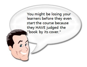
As I mentioned in an earlier post, I routinely ask people I meet what they think about the elearning courses they take in their organizations.  One of the most common complaints is that the courses look unprofessional and uninviting.  And that equates to a course not worth taking.
The Rapid E-Learning Blog - judging a book by the cover

You’re asking the learners to give up precious time and invest it in your elearning course and before they even start, they feel like it’s a waste of time just because of the way it looks.

Here are some tips that will help you design courses that look good.  Couple that with sound instructional design and you’ll have elearning courses that hook your learners from the start and never let them go. The book links to Amazon produce a small commission.

Understand How to Use Colors

Colors hook us emotionally so it’s important to use colors that look right together and fit the context of your course.  You don’t need to be a color scientist to know what looks good.  Generally, you can tell when you see it, even if you can’t really explain it.  The same goes with your learners.  However, it doesn’t hurt to know the basics about color.  This lets you be proactive and use colors to your advantage.

The Rapid E-Learning Blog - color theory

  • Learn a little about color theory.  If you want some good resources to have on hand, here are two books you might like, The Elements of Color & Understanding Color: An Introduction for Designers.  At a minimum, read through Janet Lynn Ford’s site.  She’s put together a pretty good overview of color theory.  And, it’s free.
  • Coordinate your color schemes. There are a lot of good online tools that help you build matching color schemes for your elearning courses.  I start by picking a color from an image or logo in my course.  Once I have a color, I build a theme around it.  Using the online tools helps me think through the options and build a color coordinated theme.  Check out Kuler and their tutorial for some ideas.  Color Schemer is also a good site and easy to use.

Create a Fresh and Contemporary Design

Each era has its own music and fashion style.  Unless there’s a retro movement, you typically stay away from outdated fashions and pop culture.  In the same way, there are graphic styles that are fresh and contemporary.  And then there are styles that look old and outdated.  In what era does your elearning course belong?  Is the look of your elearning course the equivalent to the leisure suit?
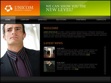
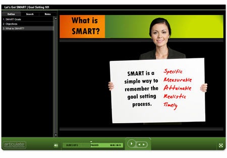
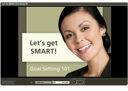
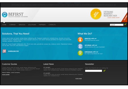
The Rapid E-Learning Blog - nice design ideas

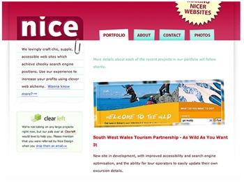
  • Be inspired by others.  The best way to know what designs are fresh and contemporary is to make a habit of looking at them.  I routinely visit ad agency and graphic design sites.  I’ll look at their project portfolios to get ideas about colors and design elements.  I shared some of this in my previous post on creating your own PowerPoint templates.   The more you look at other designs, the more you get a feel for what works and what doesn’t. Do what Patrick Haney and others do–create a collection of inspiring sites and images.  This way you’ll always have a resource for inspiration.
  • Have someone design the look for you.  Hire a freelance graphic designer to design a “look” for your course and then build some of the design elements for your elearning template.  An experienced designer can quickly build boxes, icons, and buttons for you to use in your courses, and it won’t cost you an arm and a leg.

Maintain a Consistent Look and Feel

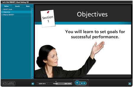
One of the biggest issues with rapidly authored elearning courses is that they look like they were slapped together in PowerPoint.  There are five different fonts used, the images don’t look like they belong together, and they are of varying quality.  Some are nice and crisp and other are pixilated.  This doesn’t have to be the case.  With some forethought and practice, you can design elearning courses that “look like a million bucks.”

 The Rapid E-Learning Blog - goodbye screen beans

  • Learn about fonts and how they should be usedThinking with Type is a good book if you want to learn more.  I’ve really enjoyed The Non-Designer’s Design Book.  It covers the basics and helps you understand ideas about layout and structuring your information visually.  It also has good before-and-after examples. Here’s a good resource on using too many fonts.
  • Use consistent graphics and design elements.  In the same way your colors are coordinated, you need to coordinate the graphics you use.  Boxes, buttons, and arrows should all look like they are made up of the same style.  Don’t mix and match clip art.  Use the same style of clip art to maintain consistency.  It will make your content look like it all belongs together.  Also, once and for all, throw away the screen beans (unless of course you’re doing an elearning course f
    or Ninjas).
  • Maintain image quality.  Always start with the best image you can and go from there.   To avoid pixelation, don’t scale up small images.  You’re better off not using the image then you are putting a sloppy image on your screen.  You want everything about your course to look top notch.

Not everyone will become a graphic design pro overnight.  In fact, the goal isn’t to be a graphic design pro.  Instead, the goal is to understand basic design principles and then apply them to your elearning courses.

While the course is still dependent on solid instructional design and relevant content, coupling that with good visual design will make your course that much more effective and engaging for your learners.

If you have any tips or tricks, feel free to share them with us via the comments section.

Events

Free E-Learning Resources

Want to learn more? Check out these articles and free resources in the community.

Here’s a great job board for e-learning, instructional design, and training jobs

Participate in the weekly e-learning challenges to sharpen your skills

Get your free PowerPoint templates and free graphics & stock images.

Lots of cool e-learning examples to check out and find inspiration.

Getting Started? This e-learning 101 series and the free e-books will help.


Ever wonder what your learners really think of the courses you build?  We all would like to know.  But are we afraid of the truth?  Can we handle it?

A while back, I was sitting in my second office enjoying a fine Puget Sound Porter and talking shop with some friends.  Not being in the elearning industry, their perspective is a little different than mine.  I was asking about ways to make elearning more meaningful and engaging, and they just kept sharing one example after the other of things they can’t stand about the elearning courses they have to endure at their jobs.

Since then, I’ve made it a habit to ask people what they think about the elearning in their organizations.  What I find interesting is that many of them start with complaints rather than praise.  Some of the issues have to do with the organization and there’s not much that can be done at this end.  However, many of the issues are things that we can address.

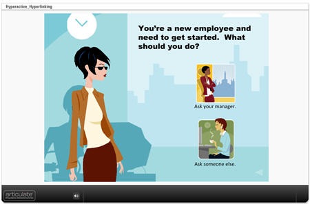
Take a look at this quick mock up.

 The Rapid E-Learning Blog - Hyperactive Hyperlinking Demo

Click here to see demo course.

The reality for many of learners is that they are taking the elearning course because they have to, and not necessarily because they want to.  For them, it’s a matter of getting in and out quickly and then back to work.  This is not a commentary on the quality of the course or its content.  It’s just that many elearning courses are compulsory and the person taking it isn’t motivated by learning the content.

Those people only want to see the essential information, take the required quiz, and get on with their lives.  They don’t want to be held hostage by a course that has them clicking all over the place.  Tell them what they need to know and let them go.

The same is true for the other group of learners who are taking the course because they want to.  While their motivation is different, they also want the course to be focused and a good use of their time.

In the demo above, I highlighted two sources of frustration for your learners.  The first is the continual hyperlinking to additional information which leaves the learners dazed and confused.  The other is using time-wasting branched interactions for obvious and simple information.

How to Avoid Wasting Your Learner’s Time

Don’t waste resources.  The first step is to realize the purpose of the course.  If it’s a compulsory course and really has no impact on the organization, why not just keep it a simple, click-and-read course?  While it’s not the most engaging approach, it probably meets the need and lets the course takers get back to work.

I know, there are some of you in sack cloth and ashes, mourning the demise of sound instructional design; but I’ve been in this industry long enough to know that there a some courses that don’t require a lot of development.  It’s a time and money game.  Spend your resources where you’re going to get the most value.

It’s all about focus.  Many courses tend to offer way too much information and this is what frustrates some learners.  Avoid an information dump.

Each course should have a specific objective.  Then the content you create for the course needs to focus on meeting that objective.  If the content doesn’t contribute to the objective, then it doesn’t need to be in the course.  It doesn’t mean that the content is bad.  It just means that to have the best course and engage your learners, you want to maintain focus on achieving the objectives.  There are other ways to share more detailed information outside of the course.

Is it a course or a reference guide?  A lot of elearning courses could be web pages, or maybe even simple job aids instead of courses.

If you find that you can’t teach your learners without sending them to all sorts of links, then perhaps an elearning course isn’t the right solution.  What might work best is some sort of resource site.  Instead of building a course, build a nice web page with links.

When the last learner leaves, please turn off the lights.  One of the key pitfalls of elearning is that many of the courses, once started, are not completed.  Considering that this is an issue, why create a course that encourages your learners to leave by inserting multiple hyperlinks?

When it comes to the Internet, you know the routine well.  You do a search for adult learning principles and find a link for one site.  Something on that site catches your eye so you click on another link.  Then from there it’s one link after another.  Next thing you know, it’s been an hour and you’ve gone from adult learning principles to the Iceshanty, where you’re looking up tips on ice fishing.

The same will happen with your learners.  If you insert a bunch of hyperlinks, expect them to leave and not return.  You might also want to get them a big freezer to hold all the fish they’ll catch ice fishing.

Leverage Your Rapid E-Learning Software

Here are a couple of ways that you can use your rapid elearning software to change up how you present the information.

Build a course that’s not a course.  Use a simple tool like Engage to share the information rather than using a traditional course framework with a menu and player.  The published file looks nice, they’re easy to build, and you can put them on a web site, embed them in your course, or do both.

I’ve done this a lot in the past with Human Resources training.  They’ll ask for a course, but they really just want to share information.  Using the rapid elearning software, I can quickly build the information module for them.  They’re happy and the learners are happy because that is one less mandated course for them to take.

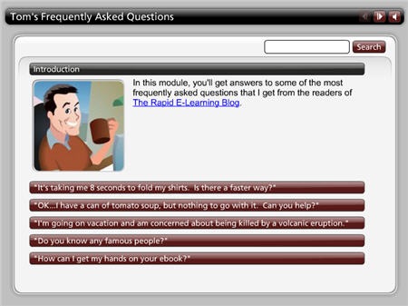
Here’s a simple FAQ interaction that provides some valuable information and could easily be used in lieu of an “official” course.

The Rapid E-Learning Blog - Tom's FAQ

Click here to see the FAQ Interaction.

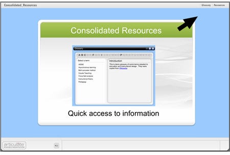
Consolidate your additional resources.  If you do find that you need to augment the information in the course, consolidate the links and put them all in one location.  This lets the learner know there’s a place in the course to access additional information, but the flow of the course doesn’t require that they leave the page to continue.

In the example below, I built a glossary as a drop down tab and added additional information via the attachments tab, which I renamed “Resources.”  Using the interaction as a tab rather than on the slide lets the learner have continual access to the information without having to leave the current screen. In addition, the resources section lets me add hyperlinks or files that the learner can access anytime during the course.

consolidated

Click here to see the demo course.

You’re asking the learners to take their precious time and commit it to your elearning course.  Is what you built a good use of their time?

Build courses that have clear objectives and help the learners reach them.  Also, build courses that are appropriate to the objectives.  Sometimes simple is all you need.  Don’t overbuild your course or add all of the latest bells and whistles because you can.

Take off your elearning hats and think about the courses you have to take.  What approach do you prefer?  What do you find to be frustrating?  Feel free to share your experiences with the rest of us in the comments section.

Events

Free E-Learning Resources

Want to learn more? Check out these articles and free resources in the community.

Here’s a great job board for e-learning, instructional design, and training jobs

Participate in the weekly e-learning challenges to sharpen your skills

Get your free PowerPoint templates and free graphics & stock images.

Lots of cool e-learning examples to check out and find inspiration.

Getting Started? This e-learning 101 series and the free e-books will help.


Tired of delivering boring, click-and-read elearning courses?  Do you want your courses to include engaging scenarios, branching, and real-world decision making?

This post features a presentation I gave at the recent ASTD TechKnowledge conference in San Antonio.  In it, I show you how to quickly create two types of branched scenarios with PowerPoint for use in your rapid elearning courses. 

Create Challenging Scenarios to Engage Your Learners     

Before we get to the how-to presentation, let’s first review the strategy and look at a few examples.

The secret for getting past the click-and-read type of elearning is to figure out how the course content is relevant to the learner.  Once you understand that, you can quickly create scenarios where the learner has to make real-life decisions. 

Once you map out a scenario and pull together your content, building the branching structure in PowerPoint will only take a few minutes.  Since you’re using a rapid elearning tool, you can quickly add all sorts of media to the screens to build dynamic and media-rich learning scenarios.

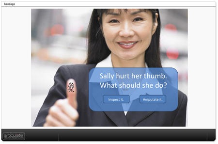
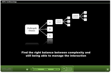
Here are three quick examples of the types of branched scenarios you’ll learn to build in PowerPoint. The first one allows the learner to review the course content and then make a choice.  Once a choice is selected, the learner is directed to another screen with additional choices.

bandage2

Click here to see branched scenario.

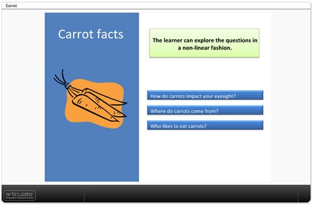
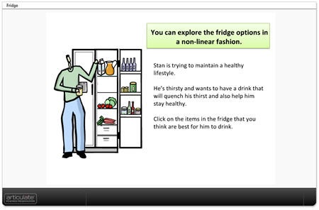
In the Carrot and Fridge scenarios below, the learner makes a choice and gets feedback.  But instead of branching to a different screen, the feedback appears to be on the same screen.  In essence, you create click-enabled hotspots in PowerPoint.  The first example shows how you can create a quick assessment or text-based choices.  The second example is an image with hotspots.

carrots

Click here to see demo.

fridge2

Click here to see the demo.

Click here to download the PowerPoint files to see how they were created.

ASTD TechKnowledge 2008 Presentation

The following is the conference presentation I recently gave live on this subject.  You’ll learn to quickly create simple branched scenarios.  Keep in mind that, while creating the scenarios is relatively easy, with some creativity and forethought they can be quite sophisticated and nuanced learning environments.

The presentation runs about 40 minutes in length so you may want to view it over a few sittings.  However, the bulk of the presentation is made of two how-to sections which can be accessed on slides 10 and 12.

  • Slide 10: How to create branched scenarios (16:17).
  • Slide 12: How to create hotspot scenarios (12:09).

techknow

Click here to view TechKnowledge presentation & tutorials.

Here are some additional tips and best practices.

  • Ideally the navigation is the result of the branches and the learner’s decision-making.  In that case, you can disable the player controls and create your own navigation in the PowerPoint slide using hyperlinks.  If you have a lot of branches, then it might be confusing to the learner to use the player navigation and the branching navigation.
  • On branched interactions, I like to give the learners the ability to go back and start over.  Just create a simple "start over" button on the top of each screen.
  • Simple usually is better.  Balance between immersive scenarios and rapid development.  The more complex you make the course, the more time it will take and the harder it becomes to manage.  If you’re using a rapid elearning tool, don’t lose the "rapid."
  • Pre-build your branches.  I have a number of pre-built branches with place holder boxes.  For example, I have a pre-built 3 decision branch that I saved as 3dec_branch.ppt.  When I want a 3 question branched scenario, I go to "insert slides from" and insert the pre-built slides from the .ppt file.  Then I set the hyperlinks and insert my content.

There was another part of the presentation where I specifically focused on Articulate Quizmaker and Engage.  I’ll do a more detailed overview of using Quizmaker to create branched scenarios in Articulate’s Word of Mouth blog. 

You can find how to create interactive decision-making instructions for Engage in this recent post by Helene Geiger of Prometheus Training Corporation.  There’s even a free graphics template to help you get started.

I look forward to your comments and examples of the scenarios you can create using these techniques.

Events

Free E-Learning Resources

Want to learn more? Check out these articles and free resources in the community.

Here’s a great job board for e-learning, instructional design, and training jobs

Participate in the weekly e-learning challenges to sharpen your skills

Get your free PowerPoint templates and free graphics & stock images.

Lots of cool e-learning examples to check out and find inspiration.

Getting Started? This e-learning 101 series and the free e-books will help.


The Rapid E-Learning Blog - curious child

In your elearning design, what word trumps all others and why should you care?

I begin this post reminded of an old Jack Handy line:

“The face of a child can say it all, especially the mouth part of the face.”

If you’ve ever spent time with a small child, you’re familiar with the constant bombardment of “Why?” questions.  “Why are trees green?” “Why does ice melt?” or “Why can’t I have it?”   You’d think you’re living with Detective Columbo.

As children learn, they’re in a continual process of drilling down to a root level of understanding.  They want to know why something happens and how it’s related to everything else.

In the same way children dig for understanding, we need to ask the questions that get to the root cause of an issue.  This is especially true if we want to bring real value to the elearning courses we produce.

Learn from History

I put together a little module inspired by a classic case study outlined in the book, Permission to Forget: And Nine Other Root Causes of America’s Frustration with Education.

The granite at the Jefferson Memorial was crumbling. However, none of the other memorials had the same problem.  So the question was, “Why?”

  • Why is the granite crumbling?  It is hosed off more than the other memorials.
  • Why is it hosed off more than the other memorials? It has more bird dung.
  • Why does it have more bird dung? It has more birds.
  • Why does it have more birds? There are more spiders to eat.
  • Why are there more spiders? It has more flying insects for spiders to eat.
  • Why are there more insects? The lights are turned on too soon at the Jefferson Memorial, thus attracting the insects.

Solution: The lights were turned on later and the granite stopped crumbling.


 The Rapid E-Learning Blog - Jefferson Memorial Demo

Click here to view the Jefferson Memorial Case Study

The Jefferson Memorial case study is an excellent example of how it’s important to drill down to the root cause of a problem.  The initial problem and source of complaints were not easily fixed with what appeared to be the most obvious solution.  The managers had to keep drilling down to get to the right answer.

I augmented the case study by adding the elearning angle.  While it’s a little exaggerated it’s not that far off from what tends to happen in our world.  We’re presented with a problem and we immediately jump to some solutions.  And because of this, many times we either build the wrong, or even unnecessary, elearning courses.

Step Away From the Solution

Elearning is a means to accomplish the client’s goal.  It’s a solution.  The first step in the process is to step away from the solution and try to find the root cause of the problem.  You want to make sure that when the client says, “We want an elearning course,” that an elearning course is the right solution.

Looking at the Jefferson Memorial example, the initial issue appeared to be a maintenance problem.  They asked, “Why?” a few times and were able to figure out that the timing of the lights was the cause of the problem.  The solution to the problem wasn’t apparent without the extra round of questions and digging for a root cause.

You don’t want to build an elearning course that doesn’t help solve real problems.  Part of your role as the “elearning expert” is to make sure that the elearning course you deliver is a value-added product.  Learn to ask, “Why?”

Ask the Right Questions

Asking questions can be bothersome and time-consuming.  You might be tempted to cut corners and get the elearning project out the door without digging a little deeper.  However, by learning to ask the right questions you can bring real value to the organization because you’ll deliver the right type of learning (or avoid it altogether).

To clarify your customer’s needs and find the right solutions, you’re always on the right track if you stick with the standard, “Who, what, where, and why?” questions.

Here’s an example of how asking questions might go.

“Our customers are complaining about our service.  We need an elearning course to reinforce our mission statement and keep our staff focused on good service.”

Some might be tempted to satisfy the customer’s desire and create an elearning course focused on the organization’s mission to deliver quality service.  However, by asking some questions, you can narrow down the areas of focus.  It might look something like this:

  • What type of complaints are you getting?  How many have you gotten?
  • What do you think we could be doing different that would address these issues?
  • Why do you think that approach would address the issues?

These types of questions are obvious, but many times the obvious questions are ignored.  Sometimes we ignore them because we don’t want to give the appearance of not knowing.  I’ve been there before, where I’m at a meeting and didn’t know what the heck the client was talking about, and I sure wasn’t going to let him know that.  Get over it.  Better to ask clarifying questions than to make the wrong assumptions and a mess of things down the road.

Look for Evidence

When you ask questions, you’re trying to find evidence that supports the need for an elearning course.  The good thing is that when successful, you also have a means to measure the impact of the elearning course.

If the client says that they need to focus on customer service, you want to ask questions that help clarify what the desired level of customer service is and how they measure that.

  • Do you have some examples of poor customer service?
  • What are you doing currently? And, what changes do you think will help? Why?
  • How will you know when you’ve improved customer service?

Again, these types of questions are obvious, but it’s important to get to real evidence and away from opinions or generic statements.

Once you collect the evidence, you can build the right type of course.  You also have some tangible measurement for your course’s success.  This becomes a good way to report the value of your elearning.  Of course, if nothing’s changed just tell them how many people took the course and the completion rate.  🙂

There are some who will say that all of this is outside the scope of designing elearning courses.  That it’s the client’s job to determine their real needs and after that commission the training.  There’s some truth to that.  However, here’s my perspective.

Success isn’t only measured by your success creating an elearning course.  Ultimately, your success is measu
red by delivering valuable solutions to the organization and helping it meet its objectives.  You’re a partner in that process.  That’s why I always advocate your need to be a performance consultant so that you not only deliver elearning courses, but you deliver the right elearning courses.

Think about it this way, the authoring tools are only going to become easier to use.  Just about anybody will be able to create an elearning course.  When that happens, what value will you bring to the table?

By learning to dig for the root cause of an issue and finding the appropriate solutions, you’ll bring value to your organization because the elearning courses you develop will meet real needs.

What questions do you ask?  What do you do when your client doesn’t respect your attempts to drill down to the root cause?  Feel free to share your ideas and experiences in the comments section.

Events

Free E-Learning Resources

Want to learn more? Check out these articles and free resources in the community.

Here’s a great job board for e-learning, instructional design, and training jobs

Participate in the weekly e-learning challenges to sharpen your skills

Get your free PowerPoint templates and free graphics & stock images.

Lots of cool e-learning examples to check out and find inspiration.

Getting Started? This e-learning 101 series and the free e-books will help.


The Rapid E-Learning Blog - Post-It Note sample  

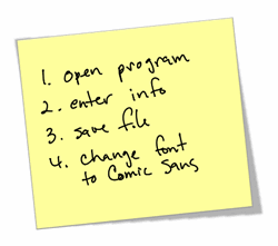
If you’re like me, your computer monitor and workspace is plastered with Post-it™ notes, quick reference cards, and other job aids filled with tips and reminders.

Last week, I posted on doing a simple needs analysis, Cathy Moore made an excellent point that looking at your learner’s Post-it™ notes and other self-made reference aids can help you decide what information should be included in a course.

Why do people use Post-it™ notes, cheat sheets, and other job-aids to help them do their jobs?  And, how does this relate to elearning?

Why Do We Create Cheat Sheets?

I think the widespread use of Post-it™ notes and cheat sheets reveals a lot about the way people learn and how they apply that knowledge to their jobs.

A few years ago, I worked on an IT elearning project that took months to build.  By the time we were ready to roll it out, we found that some of the machine operators had already created a bunch of "cheat sheets" and passed them out to everybody on the floor.

Sure enough, instead of our course’s "certificate of completion" beautifully framed and displayed at their workspaces, all of these people had crude looking cheat sheets taped to their monitors.  It really was quite shocking. 

Who do these people think they are?  None of these sheet cheaters knew a thing about adult learning principles and diverse learning styles.  I’m sure that they’d never heard of ADDIE or Bloom.  And to make matters worse, they used the nemesis font of all instructional designers, Comic Sans MS!

Yet, despite their obvious ignorance of things related to sound instructional design, they accomplished in a couple of hours what our team had spent months doing, albeit with much less detail.  And that, I believe, is the crux of our problem.  As instructional designers, sometimes it’s hard to step away from the detail.

Cheat sheets are a way for people to hone in on the key points that are relevant to what they do.  By creating cheat sheets, the learners are filtering a lot of the detail and bringing to focus what they find to be the most important information.  Plus, if they ever really do need more detail, they can always blow the dust off of one of their training manuals, look online, or call the training group.

How Do Cheat Sheets Relate to E-Learning?

If we wanted to, we could start all of our elearning at Genesis 1:1 and then move on from there.  However, we recognize that that level of detail is more than necessary.  So we decide to reel it in and instead start at the history of whatever it is we are teaching.  Let me give you an example how this might look.

The Rapid E-Learning Blog - how will these regulations help

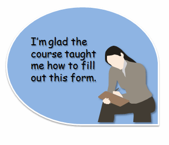
I’ve done a lot of elearning courses for financial institutions.  As you can imagine, they are heavily regulated and require a lot of training.  The employee needs to learn how to fill out a document.  If she asked her co-worker for help she’d get a quick walk-through of the process.  She’d make some notes and then paste them on her monitor.  This could be done in a few minutes.

On the other hand, an elearning course will start by teaching her the history of the lending profession and how the nation of Yap used stone money.  However, since we use paper and not stone, we need various regulations to manage our industry.  Then she gets to learn about every detail of the regulations: what instigated them, what year they were created, and how her organization is responding to the regulations. 

Somewhere near the end of this process, she’ll eventually see the form she needs to complete as part of her job.  The entire course will take 60 minutes to teach what her co-worker could have taught her in about five.  To make matters worse, she’ll be forced to play a Jeopardy-style game to reinforce her ability to answers questions about this or that lending regulation and yet never be assessed on her ability to actually complete the form.

While some of this is slightly exaggerated, the main point is that a lot of elearning tends to have more information than is necessary to learn the task.  As Cathy suggests in her comment, there’s something to be learned by reviewing the notes that the learners create for themselves.  And it is this information we can apply to how we design our courses.

Do You Want to Win at Trivial Pursuit or Do Your Job Well?

The ultimate goal of elearning is to change behaviors.  So, to be successful, focus on the behaviors you need to change.  Consider my example above.  I’m not saying that the regulations and contextual information isn’t important.  Instead, what I’m suggesting is that perhaps it isn’t important to be covered in the elearning course itself.

The Rapid E-Learning Blog - I'm glad I know how to fill out this form

Learners filter out a lot of the detail because it’s not critical to them getting the job done.  Take a close look at what the learner is writing on her notes.  Is she listing all of the "What do I need to know" information?  Or, is it more like, "What do I need to do?"  My guess is that the learner is making notes based on what has to be done rather than what needs to be known. 

In the same respect, you need to do this when designing your elearning courses.  As you go through the reams of paper and subject matter expertise, you’re job is to:

  • Determine the objectives
  • Select the information that will help meet them
  • Organize it in a manner that makes sense to the learner
  • Create a learning experience for the learner to practice using it
  • Provide feedback to the learner

Where does the contextual detail fit into that list?  An old mentor of mine used to say, "Imagine you only get one piece of paper for your course content.  Carefully decide what makes it on that page and still lets you meet your goals." 

This wasn’t a steadfast rule, but as an exercise, it forced us to carefully go through the information and think about how to present it in our elearning courses.  We learned to weed out the excess. 

The good thing with rapid elearning tools is that you can have the best of both worlds.  You can create elearning courses that are concise, media rich, and to the point while still adding links or attachments to more detailed information.  And, if you create job aids or "cheat sheets" for your courses, you can include those as well.

What do you do to create practical, relevant courses and avoid making them just information dumps?  Feel free to share in the comments section.

Events

Free E-Learning Resources

Want to learn more? Check out these articles and free resources in the community.

Here’s a great job board for e-learning, instructional design, and training jobs

Participate in the weekly e-learning challenges to sharpen your skills

Get your free PowerPoint templates and free graphics & stock images.

Lots of cool e-learning examples to check out and find inspiration.

Getting Started? This e-learning 101 series and the free e-books will help.


The Rapid E-Learning Blog - fuzzy thumb image

It’s a tricky balance working with customers.  They commission the elearning courses, pay the bills, and are the ultimate authority for their elearning projects.  So you have to listen to what they want.

On the other hand, a demanding customer can negatively impact the elearning course by making demands that don’t fit sound instructional design.

I once worked on a project for a group of CPAs.  They wanted to entice young people to consider a career as accounting paraprofessionals.  So we created a number of design treatments that attempted to make the world of accounting seem exciting to young people.

All of the treatments were rejected because of this or that reason.  Mostly, they were too out of the box for the client.  The person who headed the project said, “You know, Tom, I really like these ideas.  The problem is that all of the other people on the board are a little uptight so we should probably not get too wild with these ideas.”

Well sure enough, we didn’t.  We built the project exactly like the customer wanted.  I was inexperienced at the time and catered to our customer’s every demand and ended up with a subpar product.  After viewing the final project, the customer stated that it was kind of flat and boring and not really what he had envisioned.

Now it could have been the subject matter (I don’t know enough accountants to be sure), but my guess is that we spent too much time listening to the client and not enough trusting our expertise.  Had I been more proactive and assertive, we could have had better results.

The challenge is figuring out how to balance satisfying the client, who can sometimes be misinformed, and getting a good elearning course built.

Here’s how you do it.

1. Make a personal commitment to excellence.

The best way to manage your customer relationship is to earn a reputation for doing a good job.  In my wallet, I have a card that I’ve had since I first started working.  It is the essence of how I do my work.  The card states, “Always maintain a ‘service-first’ attitude.  Make it a rule in everything you do to give people more than they expect to get.”

You cannot control anything but yourself and what you do.  If you’re committed to a quality product and helping people, you’ll get through your work (and life) with much more joy and purpose.

2. Leverage your expertise.

Perception is reality.  Regardless of whether you’ve done one project or one hundred, the customer thinks you’re the elearning expert.  Act like it.  Without sounding like a know it all, be prepared to explain your ideas and why they will work for the course.  One of my favorite books is E-Learning and the Science of Instruction because it has some good research-based information that I can easily share with customers who ask to do something that I don’t think will work.

Going back to my CPA project, my problem was my lack of experience working with customers at a higher level.  I was intimidated and not prepared to offer my expertise.  I acted like a beginner and I’m sure that didn’t inspire the customer’s confidence.

3. Be a good listener.

You’re there to help solve a problem.  Listen to the customer’s needs and really focus on a solution that will help the customer.  Ask good questions.  The more you get the customers to talk, the more likely they’ll believe you’re the expert.

My wife once told me two things.  The first is that I should always ask three follow up questions when talking to people.  And the second was something else.  I wasn’t listening.

4. Establish clear milestones and timelines.

One of the biggest time wasters and causes of frustration is lack of communication about the project goals.  Work with the customer to set clear objectives and expectations.  This helps move the project forward.  It also helps keep things from going off track.

Project managers talk a lot about scope creep.  No, not the guy trying to cover halitosis in the cubicle next to you.  Instead, it’s when project demands start to creep outside the scope of the project.  This is common on elearning projects.  Having clear objectives and expectations helps solve this problem.

5. Earn the customer’s attention.

I once heard Dr. Phil tell someone that “the difference between winners and losers is that winners do the things that losers don’t.”  Be prepared.  Be on time.  And most importantly, be proactive.

This is a competitive world and there’s always someone who can do your job better for less money.  Earn a reputation for having all of your stuff in order.  Don’t waste time and don’t wait on the customer before you respond to needs.

I know so many elearning developers that will put work on hold until they get to meet with the customer or get more direction.  It’s almost as if they relish the times when they aren’t in touch so that they can relax.  Take Dr. Phil’s advice, and keep on moving.  Do the little extra things that tell the customers you’re paying attention and committed to their success.

6. Give the customer choices, but not too many.

If you come to the project with only one idea, you open the door to all types of issues.  If you come up with too many ideas, it becomes debilitating, because you’ll spend too much time going through all of the options.

Come prepared with at least three treatments of an idea.  I usually create a straight forward linear course, one focused on content sharing and some interactivity, and then one where I can craft a more real world environment for the learner.

I’ve seen designers build the course treatment they want to do and two others that were so obviously not the right course, that by default the customer always chose the “right” one.

7. Give them the fuzzy thumb.

This is an emergency trick and requires the utmost skill.  I don’t recommend it for amateurs.  In fact, I am a little leery to share it with the public.  Usually I reserve this advice for a quiet corner in a noisy pub…and only in the strictest confidence.  I’m assuming that you won’t share what I’m about to reveal.

People have a tendency to offer input because they want to feel like they contributed.  Many times this input is of no value.  In fact, sometimes it might even derail a project if the customer demands you implement it.

I have a photographer friend who came up with the “fuzzy thumb technique” to counteract this tendency. When he submitted photos to the customer for review, he’d always slip in one with a fuzzy thumb in the image (or some other obvious issue).  It never failed, the customer would focus on the thumb and he’d be able to steer them to the better photos and avoid the customer making demands that hurt the project.

Offer a document with typos, or face an object the wrong way.  Do whatever it takes to draw the attention to an obvious error.  The “fuzzy thumb” allows customers to give feedback and it usually makes them feel good (and sometimes superior) because they spotted an error.  In return, you get to do the project your way with little interference.

I built a quick demo to explain more about the fuzzy thumb technique.  I included some of the PowerPoint animation tips I provided in the previous post to give you some more ideas.

The Rapid E-Learning Blog - managing customer expectations for elearning

Click here to view “Fuzzy Thumb” tutorial.

Note: Be forewarned that this trick takes the skill of a magician and could backfire if not done properly.

These tips will help you do a good job and please your customer.  You’ll no longer have to kowtow to a misinformed or problem client who can put a damper on your desire to build excellent elearning courses.

Stock images from stock.xchng, a great site for free stock photos.

Events

Free E-Learning Resources

Want to learn more? Check out these articles and free resources in the community.

Here’s a great job board for e-learning, instructional design, and training jobs

Participate in the weekly e-learning challenges to sharpen your skills

Get your free PowerPoint templates and free graphics & stock images.

Lots of cool e-learning examples to check out and find inspiration.

Getting Started? This e-learning 101 series and the free e-books will help.


PowerPoint is a very capable animation program.  In fact, I’ve seen some animations that were so advanced I would have thought they were built with advanced animation tools.

In this post, I’ll share three impressive, yet easy-to-do animation techniques that you can use right away in your elearning courses.  Your courses will look nothing like ordinary PowerPoint slides and they’ll be more effective and engaging.

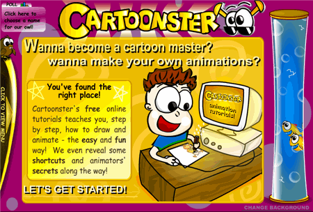
Before you learn to make your own animations in PowerPoint, it’s a good idea to understand some basic animation concepts.  I recommend visiting the Cartoonster site below since it does a nice job of introducing some basic animation concepts.  Most of the concepts that you learn at Cartoonster can be applied in PowerPoint.

The Rapid E-Learning Blog - Cartoonster animation effects

Click on link to visit the Cartoonster site.

Create Key Frames

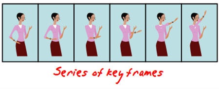
At the most basic level, animation is the cycling of key frames to give the illusion of movement.  Key frames are snapshots of an image at a single point in time. 

The Rapid E-Learning Blog - keyframe animation for PowerPoint

A simple way to see key frames in action is to create them in PowerPoint using the duplicate slides feature.  Here’s how you do it.

  1. Create a slide and add an object.
  2. Insert a duplicate slide by selecting the slide thumbnail and typing CTRL+D.
  3. On the new slide, slightly move the object to a new position.
  4. Repeat until you create the number of images you need.
  5. As you cycle through the slides you’ll see the animation effect.

Motion Path

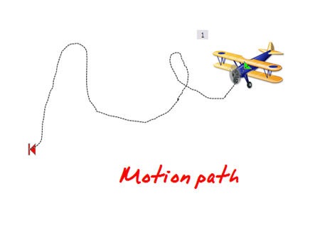
Motion paths allow you to create custom paths for your objects.  This means that you can have your objects go anywhere you want on a screen and follow the path you choose.

The Rapid E-Learning Blog - motion path animation for PowerPoint

Combine motion paths with some of the other animations and you can create a very nice animated sequence that could look like it was created in Flash.

  1. Select your object.
  2. Go to Custom Animation> Add effect.
  3. Select a desired motion path.
  4. Apply the motion path to the object and modify the timing and effect settings.

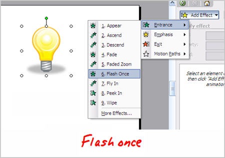
Flash Once Animation

Many people seem to gravitate towards PowerPoint’s wipe, fly-in, and fade animations.  Those seem to be the most popular.  The Flash Once animation is not that well known.  It’s kind of like the Cinderella of PowerPoint animation, only popular with local exhibitionists.

The Rapid E-Learning Blog - flash once animation

Flash Once does exactly what you think it would do, it flashes once and then it disappears.  What this lets you do is put a series of images together that can appear in sequence and give the illusion of motion.  Here are two ways you can use the Flash Once effect.

Apply Flash Once to your key frame objects.  This allows you to create an animated sequence on one slide.

  1. Create a series of key frame objects.
  2. On each slide, group the object together to make sure it is one object.
  3. Move all of the objects to one slide.
  4. Apply the Flash Once animation. 
  5. Select a custom time to speed up the effect.
  6. Layer the objects based on the desired sequence.
  7. Set to animate after the previous.

Tip:  to cycle through the layered objects, use the tab key.

Use Flash Once instead of the motion path.  Motion path is kind of stiff when you move an object around because the object does not rotate with the path.  With Flash Once, you can move the object over a desired path and have it rotate to follow a more natural movement.

  1. Create an object.
  2. Add Flash Once animation.
  3. Copy and paste the object on screen.
  4. Move the object along a desired path.
  5. Rotate the object as needed.

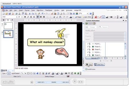
I made a quick demo with four tutorials to show you some of the ideas I shared in the post.

monkey

Click here to view the animation tutorial.

With some practice, you can create very sophisticated animations in PowerPoint.  I like to take clip art people and then break them apart to have separate body parts.  Then, like Dr. Frankenstein, I can assemble them the way I choose and use the body parts to quickly create animations.

I’ve got some more PowerPoint animation tips to share, but for now, I’ll let you practice these.  I’d love to see what you’re able to do.  If you’re up to the challenge, create some animations and send them my way.  Perhaps, they’ll make it to the blog.

Events

Free E-Learning Resources

Want to learn more? Check out these articles and free resources in the community.

Here’s a great job board for e-learning, instructional design, and training jobs

Participate in the weekly e-learning challenges to sharpen your skills

Get your free PowerPoint templates and free graphics & stock images.

Lots of cool e-learning examples to check out and find inspiration.

Getting Started? This e-learning 101 series and the free e-books will help.


2008rat

2007 has been a wild ride.  Five minutes after launching this blog, our servers crashed.  And then five minutes after that I got a few hundred emails telling me that the servers crashed. 

After a few hectic minutes, we got the servers back online.  I answered all of those emails (with the help of a Starbucks Venti Americano).  And, it’s been smooth sailing ever since.

Highlights for 2007

  • You are 14,000 strong.  In less than five months, over 14,000 of you have subscribed to this blog.  Thank you to all who subscribe and participate in the blog.  I appreciate the emails I get and all of the kind comments.  I even appreciate the critics…most of the time. 🙂
  • You have written close to 800 comments.  I enjoy the comments and the many great ideas and links that come from you.  In addition to the comments, each Tuesday after the post goes live, I get a few hundred emails.  This makes for an exciting and busy day, as I try to respond to all of the emails I get.
  • You are global.  My favorite part of the blog is communicating with people from all over the world.  I’ve connected with people from all of the continents, except Antarctica (they’re too cold to build elearning courses).  I’ve even gotten emails from countries that I didn’t know were countries.  Shhh!  Don’t tell my kids.  They still think I’m smart.

And Now for the Top 10…Drum Roll, Please

I assembled my crack team of blog researchers and analysts and we were able to pull together the top ten most popular blog posts of the year.

  1. What Steve Jobs Can Teach You About Designing E-Learning
  2. Warning: Using the Wrong Images Can Confuse Your Learners
  3. 5 Ways Web 2.0 Can Make You a Better E-Learning Designer
  4. What Everybody Ought to Know About Using PowerPoint for E-Learning 
  5. Little Known Ways to Create Your Own Graphics Using PowerPoint
  6. Go Beyond Information Sharing – 5 Ways Your E-Learning Courses Can Create Understanding
  7. Why Course Navigation is Less Important Than You Might Think
  8. Create Engaging E-Learning Courses You Can Be Proud Of
  9. How to Get Your Learners to Remember More
  10. The Secret to Creating Your Own PowerPoint Templates for E-Learning

Tip:  A good way to quickly scan the blog post titles is to click on the archives link on the bottom.

Final Thoughts

It’s no surprise that three of the top ten posts reference PowerPoint.  While it’s fashionable to criticize PowerPoint, many in our industry still use it to build their elearning.  It’s a good tool and easy to use.  In fact, I think it’s still one of the best tools to build elearning, period. 

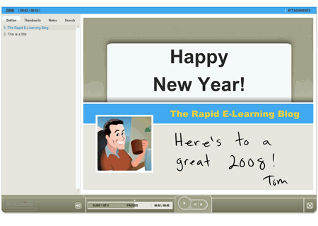
Speaking of PowerPoint, here’s a bonus template to bring in the new year.  The zip file includes the .pot, background images, and the color scheme for those who use Articulate Presenter.

The Rapid E-Learning Blog - demo elearning course

Click here to see the demo template.

Thank you for reading the blog posts, adding your comments, and sending emails.  I truly enjoy hearing from you. Keep the comments coming.  Also, if you have ideas for things you’d like to see me cover in the blog, send them my way.

2008 is going to be a great year! I look forward to what’s coming down the road.  Wait until you see the next generation elearning tools.  They’re pretty slick.

Have a great New Year!

Events

Free E-Learning Resources

Want to learn more? Check out these articles and free resources in the community.

Here’s a great job board for e-learning, instructional design, and training jobs

Participate in the weekly e-learning challenges to sharpen your skills

Get your free PowerPoint templates and free graphics & stock images.

Lots of cool e-learning examples to check out and find inspiration.

Getting Started? This e-learning 101 series and the free e-books will help.


Most PowerPoint templates are designed for standard bullet point presentations.  They’re not really designed for elearning courses.  This means that you’ll have to create your own templates that work better with the rapid elearning software.

This post will share with you my secrets for creating custom templates in PowerPoint.  And since we’re in this gift giving season, you can have the templates I designed for this demo.  Click the link below to see an explanation of how I get inspired by other web site designs.

The Rapid E-Learning Blog - PowerPoint elearning template demo

Click here to view demo.

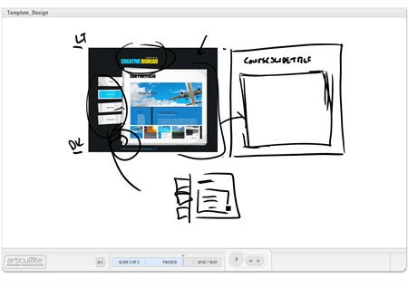
Here are three templates that I created for this blog post.  Take a look at the image that inspired it and then click the demo link to see my template applied to an elearning course.

The Rapid E-Learning Blog -  sample elearning image

The Rapid E-Learning Blog - PowerPoint elearning template demo

Click to see a demo of the template above.


The Rapid E-Learning Blog -  sample elearning image

The Rapid E-Learning Blog - PowerPoint elearning template demo

Click to see a demo of the template above.


The Rapid E-Learning Blog -  sample elearning image

 The Rapid E-Learning Blog - PowerPoint elearning template demo

 Click to see a demo of the template above.


Let’s quickly review the key points of this post.

Focus on white space.

Create a design that gives you as much real estate as possible.  You also need to make sure the design doesn’t conflict with your course content and images.  Try not to overcomplicate it with a bunch of background designs.

Make a few variations of the template

I don’t typically create a PowerPoint template.  Instead I create the background images to use in my PowerPoint slides so it’s easy to just swap out the background.  Of course, you can always pre-build a template and save it as template.pot.

I usually make four screens for my elearning courses.

  • Title or section screen
  • Main body screen
  • Wide open screen to maximize the real estate
  • Footer screen, in case I want to create my own navigation

Find layout and color scheme ideas from other sources

Look at best of breed web or graphic design sites to get ideas for the way you want your screen to look.  Do a search for CSS templates and you’ll find all types of sites that have unique ideas.

The idea’s not to steal a design.  Instead the idea is to look at new ways to structure the screen with different visual elements and color schemes.  Deconstructing what someone else does well will help you learn how they created their designs.  This will increase your ability to come up with your own.

Use graphics tools to help you build your templates

Many of you already use tools like Photoshop to create your graphics.  However, there are a lot of free resources available to help you fine tune your templates, as well.

  • Pixie: quickly pick colors from an image
  • Kuler: create custom color schemes.
  • GIMP: solid Photoshop alternative
  • Paint.net:  solid Gimp or Photoshop alternative:)

This should be enough to get you started.  Remember, don’t be afraid to play around.  Find some style ideas you like and then see what you can do.  If you feel brave, create some templates and send them my way.  Perhaps they’ll find their way onto the blog.

As promised, click on the link to download the templates I created for this demo.

Events

Free E-Learning Resources

Want to learn more? Check out these articles and free resources in the community.

Here’s a great job board for e-learning, instructional design, and training jobs

Participate in the weekly e-learning challenges to sharpen your skills

Get your free PowerPoint templates and free graphics & stock images.

Lots of cool e-learning examples to check out and find inspiration.

Getting Started? This e-learning 101 series and the free e-books will help.


started

Almost daily I get emails asking how to get started with developing elearning.  There’s no substitution for experience.  Here are five tips that will help you gain experience and develop the skills to build elearning courses that you can be proud of.

Don’t Go Crazy Trying to Create an Award Winning Course

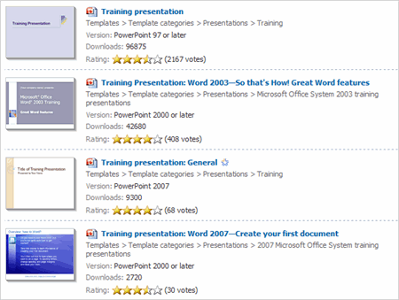
Start simple.  The main goal is to communicate information that will help someone do something better.  Microsoft has some really nice starter templates to help you organize your learning project.  They even have a generic needs assessment and roll out plan.

image of generic training templates

Click here to access Microsoft training templates

After you do a few projects, you’ll feel more comfortable branching out from the templates and applying your own unique approach.

Learn from the Experts

To be a successful elearning designer means you have to know something about multimedia, graphic design, instructional psychology, and perhaps a little about Web and Flash technologies.

There are a lot of great experts with books to get you pointed in the right direction.  Here are the ones I recommend for those just getting started.  They give you a broad overview of what you need to know and all have good visual examples of what to do. The links do go to Amazon and produce a small commission.

books

  • E-Learning by Design:  I like to recommend this one because it covers all of the basics well.
  • Performance Consulting:  This is a great resource to help you learn how to work with your clients and build a training course that will focus on real results.
  • The Non-Designer’s Design Book:  I like books that explain ideas and then give me good examples.  You’ll learn basic design principles and how to organize the content on your screen to create more visual impact.
  • Don’t Make Me Think: A Common Sense Approach to Web Usability:  I love this book because you don’t need to read it.  The author has good before and after examples.  While the book focuses on web usability, most of what he says about web pages applies to elearning, as well.

This isn’t an exhaustive list.  There are a lot of other good books I could recommend, but this is a good start and covers a lot of the basics.

Feel free to recommend other good books in the comments section.

Play Around with the Software

Compared to building courses in Flash or Authorware, the rapid elearning tools are easy to use.  It’s just a matter of getting in there and using them.  You really can’t break anything.  If you’re not sure where to start, just start with the first drop down item or feature.

For example, I get a lot of questions about the best way to get started with Articulate Presenter.  Here’s my answer.  Create a simple 10 slide PowerPoint file.  Then go to each feature in the drop down menu and use it.  The menus are easy to understand and for the most part are self-explanatory.  The key is to play around and see what happens.

In addition, try to connect with expert users of the software and show them what you’ve done and ask for opinions.  One of the most popular threads in the Articulate Community Forum is one where people share their projects.  It’s a great way get feedback and learn to use the software from expert users.

Don’t be Afraid to Experiment

As adults, we tend to inhibit our learning experience because we’re worried that what we do won’t be right.  Well, today’s your day of liberation.  You have permission to start an elearning project and play around with ideas.  Don’t worry about getting it right.

I’ve done enough of these to know that there’s no right or wrong way and you have a lot of latitude in how you design your course.  The secret is to practice experimenting with new things.

One of the ways I like to learn is by deconstructing what others have done.  I’ll review courses I like and try to replicate them.  Replicating good elearning courses helps me think through the project design, which in turn develops the skills I need.

For example, Michael Allen has some great books on building interactive elearning.  His book, Guide to E-Learning, comes with a demo CD that has some really good examples in it.

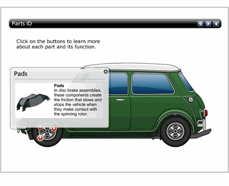
In the image below, you see a screen capture from an Allen course on brake parts.  The learner moves the mouse over the label to get information about a specific brake part.  This was developed by a Flash programmer.

ma_brakes

The good news for you just getting started is that you can get this level of quality with no programming skills and you can build something very similar to the course above in just minutes.  In fact, the example below was built in less than 15 minutes using Articulate Engage.

brakes2

Click here to view the demo.

To be engaged in your own learning, look for the types of elearning you’d like to do.  Deconstruct the projects and see if you can replicate them.  You might not always succeed, but you’ll learn a lot and you’ll really expand your skills.

Take Advantage of the Free Stuff

There are lots of good free resources available that will help you grow in your skills.  The key is to use them.

  • Stay on top of the industry.  In an earlier post, I shared how to leverage web 2.0 technology to increase your skills.  By reading blogs and connecting with experts, you will be continually reminded of what’s going on.  If you want a good place to start, Gabe, our Director of Customer Support, had a recent post on his favorite learning blogs.
  • Become part of the user community.  In addition to staying on top of the industry, tap into the community resources for the software you use.  As I mentioned earlier, the Articulate Community Forums are very valuable.   If you use other software, they probably have their own forums.  It’s other users who have figured out best practices to get the software to work for them.  Tap into that resource and you can save hours of production time and potential frustration.
  •  Collect free resources.  There are a lot of free resources to help you.  In fact, we offer a free ebook that is good for beginners.  You can also visit sites like Don Clark’s Performance, Learning, Leadership, & Knowledge.  His site is like having an instructional design library at your finger tips.Another site that I like is Making Change.  Cathy does a great job showing examples.  It’s a good balance to the text heavy, academic information from some of the other sites that are focused on instructional design theory.

These tips are just the beginning.  The key for you is to take that first step.  Don’t worry about whether what you do is right or wrong.  You’ll figure it out as you go.

Take advantage of all of the tips and tricks you get from your peers.  And don’t be afraid to ask for help.

Events

Free E-Learning Resources

Want to learn more? Check out these articles and free resources in the community.

Here’s a great job board for e-learning, instructional design, and training jobs

Participate in the weekly e-learning challenges to sharpen your skills

Get your free PowerPoint templates and free graphics & stock images.

Lots of cool e-learning examples to check out and find inspiration.

Getting Started? This e-learning 101 series and the free e-books will help.


Studies show that using images and text to represent your ideas is more effective than just using text.  The key is choosing the right images because those same studies show that images with no purpose can actually make learning harder.

To lessen the cognitive load and make your content more memorable, it’s important to use images that contribute to the learning experience rather than detract from it.

Here are three things to consider when using images in your elearning courses.

Use Images to Tell a Story

Images are effective because they can hook us emotionally or get us to see things in a new way.  Images can connect us to greater ideas and places in time. 

Look at the picture below.  Even though there’s no text, it tells a story.  What does this picture say to you?  What story does it tell? 

girl lamenting the bad elearning she has to endure  


The screens below demonstrate how you can easily convert bullet point text into something that is both visually interesting and memorable. 

jack loves his dog

As you can see, the second image is more interesting and whatever is missing by removing the text can be augmented with narration.  The second image is more effective because it is visually memorable, the information is concise, and you can never go wrong with a pug.

Petey is Jack's dog

These two images come from the "Meet Henry" presentation.  Spend some time studying how the designer of the slides used images and minimal text to convey key points of information. 

Tell the Learners Why the Image is Relevant

While images are good at sharing information, you do run the risk that what the learner sees is not what you are trying to convey.  Without guidance on your part, your learners could interpret the image differently than how you intend.

The image of the girl above is from the Great Depression.  You can imagine a detailed scenario to embellish the image and create a very moving story.  However, the image changes dramatically if I add the following information.

 Firesafety elearning demo slide

With appropriate guidance, the learner’s attention is focused on key areas and the purpose of the image is clear and contributes to the content.

Avoid Using Images Just for Decoration

A common problem with elearning courses is that we are tempted to put images on the screen to dress it up.  The image serves no real purpose other than decoration. 

Compare the images below.  The first is typical of what we see—bullet point text with a decorative image.

typical elearning slide 

The second is an example of how the image supports the content and helps the learner develop a visual model of the information.  If you notice, the text is almost identical.  I only made minor modifications by creating a more descriptive title and positioning the text close to its part on the image.

 example use of text and graphics in elearning course

Make your next elearning course more dynamic by using effective graphics.  Visualize your screens and use graphics that explain the content.  Avoid using graphics to make your screen pretty.

With some practice and intentional design of your graphics, you will create very effective elearning.  


*Demo content from Oregon State University and Shane Eubanks.

Events

Free E-Learning Resources

Want to learn more? Check out these articles and free resources in the community.

Here’s a great job board for e-learning, instructional design, and training jobs

Participate in the weekly e-learning challenges to sharpen your skills

Get your free PowerPoint templates and free graphics & stock images.

Lots of cool e-learning examples to check out and find inspiration.

Getting Started? This e-learning 101 series and the free e-books will help.


Here’s a challenge many of us face.  We want to create engaging and interactive elearning courses.  But because of customer requests or limited resources, we have to cut corners and end up with visually boring elearning courses filled with nothing but bullet points.

The good news is that even if you are in a crunch, there is a lot that you can do to enhance the visual presentation and actually make a better learning experience.

Make Your Course Content Visually Memorable

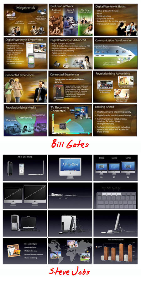
Garr Reynolds of Presentation Zen has a good post comparing a recent presentation by Bill Gates with that of Steve Jobs.  In the post, he discusses what makes a good presentation and offers lot of insight that you can apply to your elearning courses.

The Rapid E-Learning Blog - Compare Bill Gates to Steve Jobs

Reynolds argues that the Jobs presentation is more effective.  I agree, and think Jobs’ slides are better because they are:

  • visually interesting
  • less cluttered
  • formatted with smaller chunks of information

Considering what we discussed earlier about cognitive loads, you can already see how this approach is effective for elearning.  The learner is better able to understand and process the information, making it more memorable.

Compared to many other presentations, the Gates version is not bad.  We don’t want to be critical of the slides.  However, comparing the two presentations, it’s easy to see how a simplified screen with very specific points is more visually appealing and easier for the learner to digest.

Fine Tune Your Content

Remember, people can only retain so much information at one time.  So, it’s important to design your elearning courses (even simple ones) so that the learner can recall as much as possible.

Cliff Atkinson, the author of Beyond Bullet Points, has a good post on fine-tuning the content of your screens to create information that is more memorable.

For example, he compares the two images below.  The first is common to many of today’s screens.  By itself, the heading isn’t very clear and requires extra processing to figure out what it means and how it’s connected to the rest of the information.

Compare that to the second image which Cliff says, “…quickly signals what you’re talking about, intrigues people to listen to the words you’re saying and the visuals you’re showing, and frees them from the burden of excess information they don’t have the time to process…”

The Rapid E-Learning Blog - Beyond Bullet Points

For additional reading, Dennis Coxe has a good post on cognitive overload and even provides a link to Seth Godin’s, “Really Bad PowerPoint (and how to avoid it)” ebook.  While the focus of the ebook is on presentations, you’ll find that there are many parallels to information-based elearning courses.

E-Learning Courses Are Different Than Live Presentations

Personally, I prefer the Jobs approach.  I think that the screens are easier to digest and with good narration, the content is probably more memorable.  With that said, the Gates slides can also be effective.

The slides are not optimized for a live presentation.  There’s too much information and noise that distracts from the presentation.  However, in an elearning course there are things you can do to lessen the cognitive load.

While there are a lot of similarities between presentations and elearning courses, one key difference is that presentations are typically focused on live events, while elearning courses aren’t.  This means that the live audience doesn’t have the luxury of a rewind button and makes targeting the presentation content much more critical.

Elearning courses are asynchronous and the learners have the ability to stop and review critical pieces of information. They also have the advantage of retaking a course and getting additional exposure to the content, something that you can’t do in a live session.  In addition, you can create targeted questions and assessments in the elearning course to measure the learner’s understanding and provide remedial information and feedback.

Here’s a quick demo where I take the same narration and present it four different ways.  What you’ll notice is that to lessen the cognitive load you can:

  • progressively reveal information
  • condense the text on the screen
  • replace text with relevant images

The Rapid E-Learning Blog - 4 versions of same narration in different elearning approaches

Click here to see the demo (Flash version). Here’s an .MP4 recording of the demo.

Both the Jobs and Gates slides are primarily information-based and not very interactive.  While that’s the case, it doesn’t mean that the course can’t be effective.  The combination of nice visual design with text and narration that eases cognitive load makes your course much more memorable and effective.

In fact, if you embrace these ideas, your course can become more than an information dump.  Listen to what Cliff, Garr, and Seth have to say and you’ll really add some power to those points.

Events

Free E-Learning Resources

Want to learn more? Check out these articles and free resources in the community.

Here’s a great job board for e-learning, instructional design, and training jobs

Participate in the weekly e-learning challenges to sharpen your skills

Get your free PowerPoint templates and free graphics & stock images.

Lots of cool e-learning examples to check out and find inspiration.

Getting Started? This e-learning 101 series and the free e-books will help.