The Rapid Elearning Blog

Archive for the ‘Uncategorized’ Category


People ask me all the time how they can develop their elearning design skills.  Many of you work in one- or two-person departments and have to figure out elearning design for yourselves.  Even if you work for a larger training group or department, you don’t always have access to seasoned experts to mentor or guide you.

So this post offers some practical ideas on how to develop your elearning skills for little or no cost, other than your time.

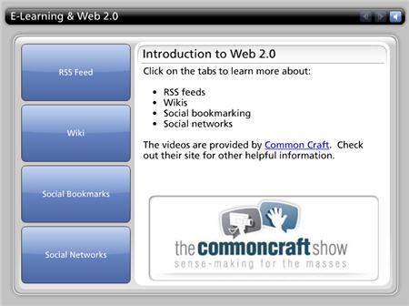
These tips are based on what a lot of people like to call Web 2.0 technologies.  Not everyone is up-to-speed on these terms so I assembled a simple module that explains them.  True to the spirit of this post, the information I am sharing is freely available to you courtesy of Common Craft.  I put the videos into a single module because I know that many of you don’t have access to them directly because of corporate firewalls.

The Rapid E-Learning Blog - E-learning and Web 2.0 course

Click here to see E-Learning & Web 2.0

(As a side note, the Common Craft videos are another good example of the passive engagement I discussed in an earlier post.  The approach they use is light and entertaining, yet very informative.  Something like that could be applied to some of your own elearning courses).

Now that you’re up-to-speed on some of the Web 2.0 technologies, you can review the tips on how to use them to enhance your own personal development.

  1. Use an RSS reader.  Your personal development depends on getting new information and understanding what’s happening in the industry.  There are a lot of good resources available to you for free.  The challenge is actually seeing the information.

    Using RSS allows you to pull the sites that interest you into one location so that you can easily scan the latest news or blog posts.  The good news is that almost all sites allow you to subscribe via RSS feed.  In fact, if you look in the right column of this blog, you’ll see an RSS link. 

    To use RSS feeds, you have to have a way to manage them.  I use Netvibes as my home page and use it to manage my most frequently read feeds.  I also use Google Reader.  With it, I can scan a couple of hundred blogs each day.  Those are two good options.  However, there are many from which to choose.  It’s just a matter of what you want to do. 

    The key point is that using RSS feeds will save you time and keep you on top of the latest news…and possibly improve your trivial pursuit skills.

  2. Connect with experts in the industry.  Once you have your RSS feeds intact, you can monitor and track the latest news from industry experts.  Many of them have blogs where they share ideas and actively invite conversation.  Read the blogs and share your ideas. 

    In the past, the only access you had with this level of expertise was via newsletters or magazine articles.  Not today.  Now you can actively engage them and get their insights.  It’s like having one sitting in the cubicle next to you, kind of like an elearning Neopet

  3. Connect with your peers.  You can connect with your peers in real life or online.  Where I live there are a number of user groups and a local chapter of the ASTD.  It’s a good way to connect with others who do the same type of work.  The more specific the group’s purpose, the more likely you’ll be engaged and get to meet others.  To get the most value out of this, plan on being active.

    To connect virtually, find the blogs of others like you and dialogue with them.  One of the nice things is that many people have blogrolls where they list links of other relevant blogs. That’s a good way to meet your peers online. Most bloggers love to share information and help others. 

  4. Support some industry activity.  If you frequent sites like the Elearning Guild, you’ll find plenty of opportunities to help.  They’re always looking for people.  In fact, the other day I saw a call out for writers.  A good way to learn is to write something based on your experience.

    Here’s another way to develop your skills and bring real value to you and your organization.  Clive Shepherd started the 30 Minute Master’s wiki.  The goal is to help subject-matter experts in the design of rapid e-learning courses.  Anyone can help and use the content.

  5. Start a blog.  Blogging allows you to grow as you learn and then reflect on your learning.  If you have your own blog, you can read the reflections of others, write your own thoughts, and have the blogs link back to each other.  It also allows you to tap into the expertise that is freely available to you via the Internet.

    A few weeks ago, Tony Karrer had a good article on blogging.  That post speaks to what I wrote about above because he mentions up and coming bloggers.  So here you have Tony, a recognized leader in the industry, dialoguing with an upstart blogger.  

    Blogging can be a very powerful exercise and provides a lot of opportunity.  In addition, there are so many tools available that you can create a very rich media experience.  For example, the videos I used above could easily be added to your own blog via some code from the Common Craft site.

The elearning world is rapidly changing.  The technology is getting easier to use and each upgrade adds increased functionality.  In addition, the social media available via the Internet will soon be integrated into your elearning design.

Learning to use these tools will help you understand the technology.  More important, though, is that you’ll grow and continue to develop your own skills.  As your skills grow, you’ll build even better elearning courses.

Events

Free E-Learning Resources

Want to learn more? Check out these articles and free resources in the community.

Here’s a great job board for e-learning, instructional design, and training jobs

Participate in the weekly e-learning challenges to sharpen your skills

Get your free PowerPoint templates and free graphics & stock images.

Lots of cool e-learning examples to check out and find inspiration.

Getting Started? This e-learning 101 series and the free e-books will help.


remember 

Everyone wants to build good elearning courses, whether for sharing new information or changing workplace behaviors.  While not all elearning objectives are the same, there are things you can do in your course design that help your learners recall the information and use it in the real world. 

To do this, you need to understand how the learner’s brain processes the elearning course content.  In this post, we’ll do a quick overview of cognitive learning theory and how it relates to your elearning courses.

Learning is the process of taking new information in your working memory and integrating it with existing knowledge in your long-term memory.  Once it’s in long-term memory you can recall it and transfer the knowledge to the real world. 

Here’s some basic information about working and long-term memory:

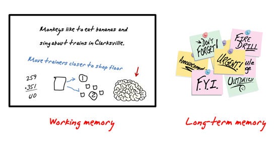
  • Working memory:  Your working memory is good at processing information, but it can only hold so much at one time.  All of your active thinking happens in the working memory. 
  • Long-term memory:  Your long-term memory is your storage center and holds your existing knowledge.  In the learning process, you are connecting the new information to prior knowledge.  As you actively process information, you are swapping it between working and long-term memory. 

Think of it this way.  Your working memory is like a white board where you can do a lot of calculations and diagramming on the fly.  On the white board, you need space to both write down information (temporary storage) and do your problem-solving (active processing). 

The problem is that you only have so much space.  As the white board gets cluttered with information, you run out of room to work.  That means you need to record the important information and free up space to do more work on the white board. 

One way to capture the information is to create post-it notes (long-term memory) to record the information on the white board.  Once you you have the notes, you are free to erase the white board and do more work.  And, if you needed to recall what you did earlier, all you have to do is look at one of your notes.

The Rapid E-Learning Blog: Working memory and long-term memory 

Design E-Learning for Working Memory

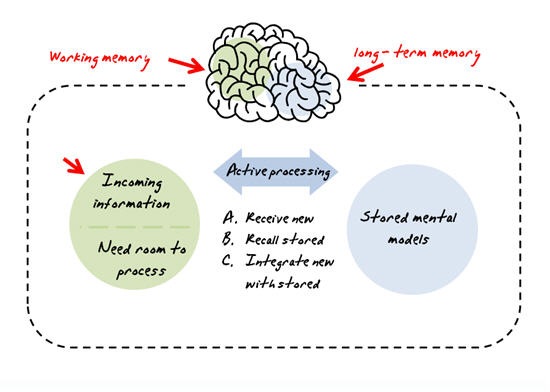
As you go through an elearning course, what you see and hear enters your working memory where it is temporarily stored.  Your brain actively processes the new information and integrates it with what you have stored in your long-term memory. 

So, your brain is doing these things:

  1. Receiving new information
  2. Actively processing the information
  3. Integrating the information with long-term memory

The Rapid E-Learning Blog - How learners process elearning content in working memory

Here’s your brain’s challenge.  Most of us can only hold and process so much data.  For example, it’s not easy solving a math calculation like 219 X 473 in our heads because we have to store information at the same time as we process it.

Your working memory has limited capacity and can only do so much.  This is called the cognitive load.  If you load your working memory with too much information, then there’s no room to process it, which makes it more difficult to recall the information later on. 

This is where your elearning design skills come in.  Instead of just dumping information on the learner, you have an opportunity to guide the learner by structuring your content by how our brains process information. 

Basically, these three things have to happen:

  1. Organize Content into Small Chunks.  Structure the new information in small, related chunks so that it is optimized for working memory.  Don’t overload the working memory with irrelevant content.  The brain is sorting and organizing the information.  If it’s not relevant, or there’s too much of it, it interferes with the learning process.
  2. Build Upon Prior Knowledge.  Create processes where the learner can practice using the information in a context that integrates it with prior experience.  Case studies and practices exercises are good because they can be structured to combine the new information with the learner’s current understanding.
  3. Provide Real-World Context.  The goal is to get the learner to pull information out of long-term memory and transfer it to a real world context.  Create exercises and real-world scenarios that help the learner apply the new information into a workplace context.   Problem-solving scenarios help develop thinking skills that can be transferred to the real world.

If you want your learners to learn and use the course content after they’re done with the course, make sure that you create the elearning courses to be memorable.  Consider how much information you share and how you present it to the learner.

Events

Free E-Learning Resources

Want to learn more? Check out these articles and free resources in the community.

Here’s a great job board for e-learning, instructional design, and training jobs

Participate in the weekly e-learning challenges to sharpen your skills

Get your free PowerPoint templates and free graphics & stock images.

Lots of cool e-learning examples to check out and find inspiration.

Getting Started? This e-learning 101 series and the free e-books will help.


Everyone wants to create e-learning courses that engage their learners. Yet there’s a lot of debate about what exactly engagement means. So I figured I’d boil down the different ways to engage learners and see how we can use them to make our elearning courses better.

rapid e-learning blog - passive and interactive navigation

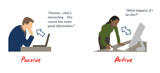
To keep things simple, there are basically two ways we engage our learners with elearning course content. Either it’s a process of providing information from the course or it’s about having the learners use that information to make decisions in the course. The first mode is passive engagement while the second is active engagement. Both types of engagement have their places in your elearning courses.

Passive vs. Active Engagement

Here are two quick examples that show the difference between passive and active engagement. The first is a typical example of passive engagement since it just shares information. The second one demonstrates active engagement because it requires that you actively use the information from the course.

The Rapid E-Learning Blog - example of passive learning interaction

Passive: Click here to see passive learner engagement.

The Rapid E-Learning Blog - example of acitve learning interaction

Active: Click here to see active learner engagement.


Passive Engagement Give Us Access to Information

We read books and newspapers. We watch TV. No one would suggest that these are ineffective as a means of learning. These are good examples of what I call passive engagement. We get information but we aren’t doing anything with it, at least not actively.

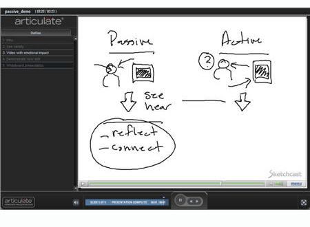
Keep in mind, passive doesn’t mean ineffective. It also doesn’t mean that you have to stick with bullet points or just text like my example above. Just because the learner doesn’t have to do anything with the information at that point in the course doesn’t mean that you can’t add variety in how it’s delivered. Here is an example of passive engagement that is more than just bullet points.

pass450.jpg

Click here to see engaging passive content.

Active Engagement Helps Us Process Information

Active elearning courses are decision-based. Learners are given information and then have to make decisions. The navigation is typically designed in a non-linear fashion. However, that’s not always the case.

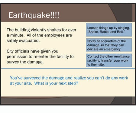
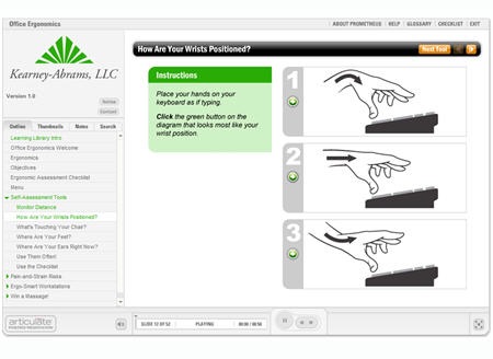
You can create active engagement using branched decisions like my earthquake example above, or you can even create a linear process like the Ergonomics demo below.

You’ll notice that in the "Self Assessment Tools" section you’re asked to make active decisions, yet it doesn’t require branched navigation. 

The Rapid E-Learning Blog - ergnomics elearning course example using active learner interaction

Click here to see ergonomics demo.

There’s a Time and Place for Passive and Active Engagement

Passive engagement is about delivering information. What makes it effective is when the information is timely and relevant. Think of your last successful Internet search. You needed some information and found it. In a similar sense, the elearning course is like the information online. It’s a resource available to help you at your time of need.

And as you can see, you’re not limited to boring screens of text and bullet points. With some creativity, you can construct very powerful pieces of information that motivate change. You just have to know how to touch the learner.

Active engagement is great because it allows the learner to immediately apply the information or understanding and get feedback.

The key to designing good active engagement is understanding the essence of the course content and purpose and then place the learner in an environment that replicates it.

For example, if you want to learn about knee replacement surgery, you can go through the National Library of Medicine’s elearning course with good information on knee replacement, or you can actively perform knee replacement surgery in the elearning course here at EdHeads.org.

What’s interesting is that both courses are effective in their own way. The EdHead course is definitely more memorable and engaging. However, the other one probably could serve better as an ongoing resource (with some tweaks to the navigation).

Regardless of the type of engagement you choose, the key is to create a way for the learner to get the information and training they need. As you can see, sometimes that means passive content and sometime it means active. It’s not an either-or decision; it’s all about what’s best for the learner and what will help you accomplish your goals in a timely and cost effective manner.

Events

Free E-Learning Resources

Want to learn more? Check out these articles and free resources in the community.

Here’s a great job board for e-learning, instructional design, and training jobs

Participate in the weekly e-learning challenges to sharpen your skills

Get your free PowerPoint templates and free graphics & stock images.

Lots of cool e-learning examples to check out and find inspiration.

Getting Started? This e-learning 101 series and the free e-books will help.


blinders.gif

I just got back from the Brandon Hall Innovations in Learning conference.

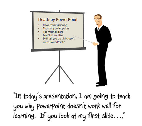
In one of the presentations, the presenter talked about how ineffective PowerPoint was for learning. The irony of course was that he was using PowerPoint to teach this. It’s not the first time I sat through a PowerPoint session where the presenter was telling me that PowerPoint is ineffective for training.

ppt1.jpg

PowerPoint is still the dominant tool of choice for many in our industry and for good reason. It’s accessible and easy to use. And since it is so widely used in most organizations, it’s easy to convert subject matter content into an effective elearning course.

PowerPoint gets a bad rap because there are a lot of bad PowerPoint presentations. Some of the blame rests on the default template settings, however more has to do with poor instructional design.

Here’s how I approach PowerPoint so I don’t fall into the bullet point trap.

Drop the Bullet Point Templates and Start with a Blank Screen

3images.jpg

Look at the images above. Do you notice any similarities? They all have a blank screen.

Once you step away from the bullet point look, you open up all types of possibilities that extend beyond the typical PowerPoint slide shows. For example, you can create branched scenarios, flash animations, and even nice graphics. Click on the links below to see some quick examples.

Here is the PowerPoint file for you to download and see how it looks before publishing.

PowerPoint for E-Learning is More Than Just Online Slide Shows

There are a lot of people who are confused about using PowerPoint for elearning. Many still think it just means straight PowerPoint to Flash slide show conversion that gives you elearning courses limited to click-and-read, bullet point slides.

What makes an elearning course effective isn’t the authoring tool as much as it is the person who designs the course. That means a creative instructional designer can use PowerPoint coupled with a rapid elearning tool to build very effective elearning courses.

Today, good rapid elearning software can handle most of the multimedia that you can put in a course. Thus, it’s easy to step away from basic PowerPoint to Flash slide show conversion and instead create a very compelling multimedia experience. And you can do so quickly and at a reduced cost.

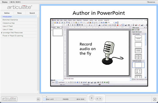
In fact, just to show you what you can do, I built this mini demonstration in just a couple of hours. I used PowerPoint as my authoring environment and included a variety of media. I was able to build this with no advanced programming skills.

blog_image_demo.jpg

Click here to launch the demo.

If this can be done in just a couple of hours, what could you do when given a project with clear objectives, the freedom to add more than just bullet points, and a dose of your own creativity?

Events

Free E-Learning Resources

Want to learn more? Check out these articles and free resources in the community.

Here’s a great job board for e-learning, instructional design, and training jobs

Participate in the weekly e-learning challenges to sharpen your skills

Get your free PowerPoint templates and free graphics & stock images.

Lots of cool e-learning examples to check out and find inspiration.

Getting Started? This e-learning 101 series and the free e-books will help.


PowerPoint 101

If you follow Sweller’s cognitive load theory, then you understand that the graphics in your elearning course are very important and play a large role in its effectiveness. However, not having the right graphics is a challenge.

If you’re like me, you’re on a limited budget and you just can’t go buy custom graphics whenever you like. That means you’re probably stuck using the standard clip art that comes with PowerPoint.

After just a few projects you cycle through all of the good clip art and you’re forced to use the clowns and puppies. While your five-year-old child might like your choice of images, you’ll find that many in your organization are not particularly fond of clowns or puppies. If only you had known that before you started.

rapid elearning site safety demo PowerPoint

How Do I Get the Graphics I Need?

If you want custom graphics, you can hire someone (although you might want to read this before working with a graphic designer) or you can make them yourself. For the moment, I am assuming that you have no money and you want to make the graphics yourself.

In this case, I recommend two options: 1) create your own drawings or 2) modify existing clip art.

[Note: Microsoft stopped providing clip art but you can still use the same ideas by ungrouping vector images in PowerPoint.]

Option 1: Stick with your skills and draw your own graphics

Here’s a generic image that is easy to create.

rapid elearning stick figure

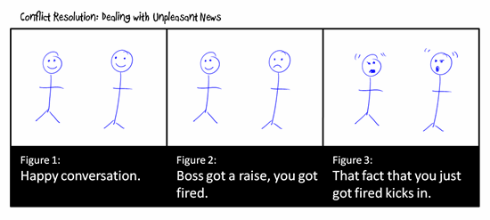
With minor tweaks, you can use the same image over and over again, each time telling a different story. As you can see below, it doesn’t take much to make the images mean different things.

rapid elearning conflict resolution demo

However, there is a very slight possibility that many in your organization will not appreciate your graphic art skills. In that case, I suggest trying the second option.

Option 2: Modify existing clip art

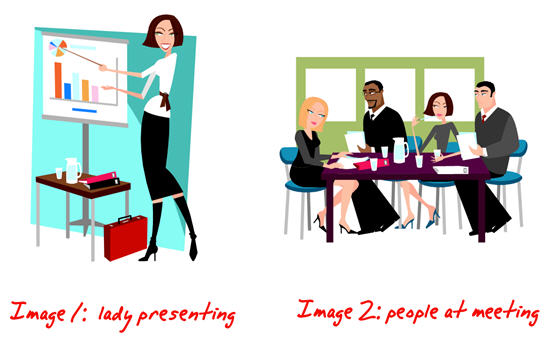
Here’s your challenge. You want an image of a lady presenting some information to her team. However, you cannot find the right image. In the following example, you’re going to learn to take two separate clip art images and combine them to make the image you need.

rapid elearning edit clip art demo PowerPoint

Become a clip art surgeon.
Without going into technical details, most clip art is a series of grouped images. That means you can ungroup the clip art and pull out or add the elements you need.

rapid elearning ungroup demo PowerPoint

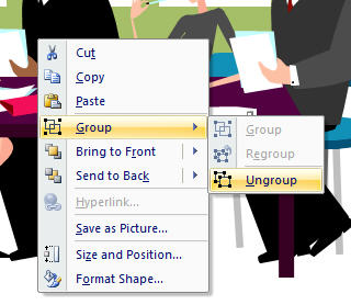
Just right-click on the image and select ungroup. Sometimes, you have to do it twice. You should see something like this.

rapid elearning ungroup demo PowerPoint

Once you ungroup, you can pull out the things you don’t need. You can also add items to change the clip art and make it something new. In this case, we’re going to combine the two images and make it look like the woman is presenting to the group at the table.

[Note: Microsoft stopped providing clip art but you can still use the same ideas by ungrouping vector images in PowerPoint.]

  1. Ungroup the images.
  2. Start with the first image. Take out the elements you don’t want.
  3. Select the entire image and regroup it.
  4. Do the same for the next image.
  5. Combine the elements from image 1 with image 2 to make the desired image.
  6. Select the entire image and regroup it to make a single image.
  7. If you want to use the image elsewhere, go ahead and save it by right clicking on it and selecting “save image as” and choose the format you prefer. I recommend .emf because you’ll retain the image transparency and vector. However, you’ll see that there are many formats from which to choose.

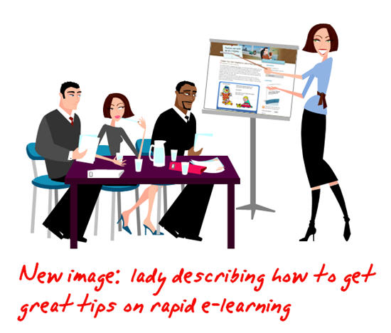
great tips on rapid elearning PowerPoint

If you look at the image you’ll notice that I did a few things.

  • I took one of the people out of the team image. She was facing the wrong direction.
  • I flipped the team image so that it looked like they were facing the presenter.
  • The presenter’s shirt was white, so I changed the color.
  • I got rid of the backgrounds and the presenter’s table to make the image less cluttered.
  • I layered the presenter behind the table to give the image a little depth.
  • I changed the content on her flip chart, taking her from boring corporate drone to brilliant elearning consultant.

Now it’s your turn to practice doing this. Remember, the only limitation is your creativity. If your people need hard hats, find a hard hat image and add it to the clip art. If you need multiple ethnicities, change the hair and skin color. The possibilities are endless.

Here are three quick tips.

  • Create a work slide. I build a lot of my elearning courses in PowerPoint and publish with Articulate Presenter. I tend to create the images I need on the fly. Because of this, I like to use a blank slide as a work area. I’ll move the clip art to the slide, make it big and then take it apart. Once I am done, I copy and paste the image to the real slide. This way I don’t accidentally, mess up my content slides.
  • Control the clutter. The ungrouped elements that make up the image are layered. Sometimes, it’s not easy to get to what you want. What I do is make a series of duplicate images and delete what I don’t want. Then I pull the individual pieces together and regroup the image.
  • Create mini groupings. I find it easier to grab a part of the image and create a mini group rather than work on the whole image. This way you only have to work with a few mini groups rather than hundreds of little pieces.

By ungrouping and modifying existing clip art, you have the ability to make custom images to fit the needs of your elearning course. It’s inexpensive and, once you get a handle on it, pretty quick to do. In fact, outside of the original stick figures, I built all of the graphics for this post in PowerPoint. It only took about 5 minutes to build the presenter image for this demo.

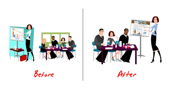
rapid elearning before and after demo PowerPoint

I’m interested in seeing some before and after images. Feel free to send them my way. When I get enough, I’ll post them for others to see what can be done.

In the next post, we’ll look at how to use image styles so that you have consistent graphics to use throughout your elearning course.

Events

Free E-Learning Resources

Want to learn more? Check out these articles and free resources in the community.

Here’s a great job board for e-learning, instructional design, and training jobs

Participate in the weekly e-learning challenges to sharpen your skills

Get your free PowerPoint templates and free graphics & stock images.

Lots of cool e-learning examples to check out and find inspiration.

Getting Started? This e-learning 101 series and the free e-books will help.