The Rapid Elearning Blog

When it came to buying a car, Henry Ford always promised that you "can buy it in any color, as long as it is black."  That might have worked for Henry Ford, but it doesn’t really work for elearning.  Or it shouldn’t.

However, every week I get emails from blog readers that basically read like this:

"My company uses a branded PowerPoint template for presentations.  Now that we’re building elearning courses, we’re forced to use that same template.  And, it just doesn’t work for elearning!  What should I do?"

I feel the pain.  I once worked for an organization that took the Henry Ford approach to PowerPoint.  We could use any template we wanted as long as it was the one they approved.  And of course, there was only one approved template for the organization.

This type of policy is ridiculous on many levels.  The policy makers (whoever they are) see no distinction between presentations and elearning.  They just ignorantly apply a rule across the entire organization that impacts the way people do their work.  In our case, they even went so far as to limit it us to one official font.  To make matters worse, the font looked like something Lorne Greene might have used at the Ponderosa.  It was horrible and dated.  Yet, we were forced to use it.
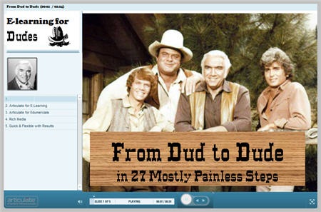
The Rapid E-Learning Blog - Bonanza elearning example

As instructional designers, the "one template rule" has a negative impact on how we approach our elearning design.  We’re forced into a box that contributes to a lesser quality elearning product.  In some cases, the template rules also dictate what can and can’t be on a slide.  Some will even explicitly state that you have to have bullet points and can’t use any graphics.

Reasons for the Rules 

I can see why many organizations have these rules.  There are some really bad presentations being delivered to the public and the organization is trying to protect its brand and quality.

While that makes sense, I challenge the idea that you have to have a branded PowerPoint file to effectively communicate with the public.  In fact, when it comes to presentations, my guess is that a branded, one-size-fits-all approach is more a hindrance to effective communication than it is a help.  It forces your content into a box and potentially strips away what’s unique about that encounter with the public.  

To learn more about effective communication using slide presentations, check out the Presentation Zen and Beyond Bullet Point sites.  As you go through these two sites you’ll immediately see how forcing a bullet point template on your audience shuts down effective communication.  And that’s just on the presentation side of things.  Let’s look at it from the elearning perspective.

Use PowerPoint as a Freeform Authoring Tool

Elearning courses and live presentations are different processes and have different objectives, even if you use the same tool to create the core content.  No one says to the Flash developer, "Here is my PowerPoint template, I want the course to look just like a slide show."

No, the Flash developer starts with a blank screen and then uses Flash’s freeform authoring environment to create the elearning course.  And this is how we need to view PowerPoint authoring for elearning.

Look at the image below.  On one side you have PowerPoint and on the other Flash.  They’re different tools in terms of how you create your content, but essentially they’re the same when it comes to a starting point.  They both start with blank screens and give you a freeform environment to manipulate your objects.

The Rapid E-Learning Blog - free form authoring

The rule makers need to step out of the "PowerPoint for presentations box."  They need to allow you to start in freeform with a blank screen, the same way you do in Flash or any other freeform authoring tool.

Remember your goal isn’t to produce a branded presentation.  Instead, your goal is to craft an online learning environment.  Branding is a secondary consideration.

There’s a Difference Between Internal & External Audiences

The case can be made that if you’re building content to be seen by those outside of your organization, you want to brand it with your organization’s identity.  That’s a valid point.

We typically think of the brand being a logo plastered on every slide.  However, a large part of branding is less the logo and color schemes and more the identity people attach to your organization.  And that’s why a cookie cutter approach could be more hindrance than help.  Whatever the case, branding for external customers makes sense at some level. 

Branding for internal employees is probably unnecessary or at least can be toned down quite a bit.  Basically, I know where I work.  I don’t need to be reminded on every slide of the elearning course.  You run the risk of diluting your brand or creating cynicism around it.  Plus, some of this corporate branding stuff can get a little creepy.  At one place I worked, I used to say "they put the cult in culture."

I like to start with a completely blank screen and want to get rid of the logo.  If I have to have the logo, then I prefer to take them out of the slide area and place them into the logo area in the player.  That frees up the screen real estate, quite a bit.

If you want to get rid of the logo, but your manager wants to keep it in, here’s a good compromise.  On every tenth slide, insert the slide below.

The Rapid E-Learning Blog - Wake up and read your badge

Working with Branded E-Learning Slides

There are a number of ways you can approach the branding issue in your courses.  I’ve taken screen shots of some courses that I have access to. They’re from different organizations and show you various ways to brand and maximize your screen space.

In this first image, you can see the approach Reuters took.  They still have a branded PowerPoint slide, but they moved the branded element up and created a smaller heading banner.  If you’re going to add a branded element to your slide, something like this works because you can satisfy the organization’s need, but you also maximize the real estate.
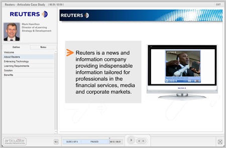
The Rapid E-Learning Blog - Reuters example

This next image is a demo from Ah-Ha! Media.  What they did is move all of the branding out of the PowerPoint template and onto the player.  So the only place you see a logo is in the logo area.  What this does is free up all of the space on the slide for elearning content.  That’s what you’re shooting for.  You want as much freedom to work on the slide as possible.
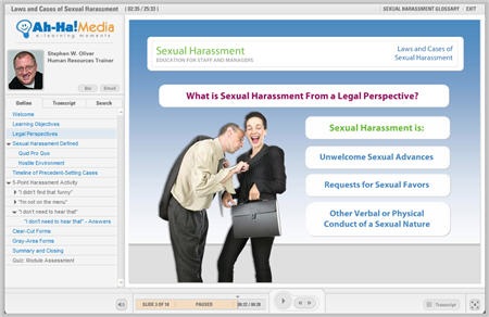
The Rapid E-Learning Blog - Ah-Ha Media! example

In the imag
e below, you can see how Ignite applied their branding.  They used the logo panel for a very prominent logo.  There’s also a small logo on the bottom right.  However, they did free up most of the slide area for elearning content.  The other thing you see is that they colorized the player template to match the organization’s colors.
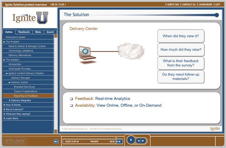
The Rapid E-Learning Blog - Ignite example

Here’s another nice approach.  CUNA Mutual used a branded PowerPoint template.  They have the logo in the top corner and the design element on the bottom.  This type of template is typical in a lot of organization.

It presents some challenges because you have to account for the right margins and spacing when adding content to the slides.  So the design elements consume space, and the margins between the elements and the course content takes up space.

CUNA’s approach works because they have a lot of white space and they went with really bold images and simple text.  They also colorized their player to match the organization’s color schemes.
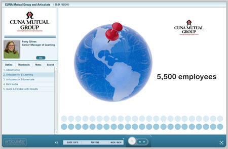
The Rapid E-Learning Blog - CUNA Mutual example

In an ideal world, you get a completely blank page to start.  So if there are any "rule makers" reading this post, my professional opinion is to dump the template altogether and start your slide from scratch.

However, for many that’s just not a reality.  And winning the branded PowerPoint template debate might not happen.  The images above reflect what is typical for many organizations and I think demonstrate some simple ways around the branding templates and still give you room on the slide to build your content.

Moving Towards 100% Freeform

The following images show why starting with a blank slide is ideal compared to starting with a branded PowerPoint template.

The image below is from a case study I did on compensation discussions.  It’s built entirely in PowerPoint.  As you can see, it doesn’t look like a PowerPoint slide.  And that’s the point.  I wanted to show the client that even though the course was authored in PowerPoint, it didn’t have to look like PowerPoint.  In this case, I completely disabled the player and created my own navigation using PowerPoint hyperlinks.

The Rapid E-Learning Blog - Compensation example

The SkyScan demo is one I created for a conference.  Again, it’s built entirely in PowerPoint, but doesn’t have that PowerPoint look.  Since it’s a fake company, I created the blue and green scheme as part of the company’s branded look.  So this demonstrates how you can build a brand identity in the colors and design elements and be less concerned with the logo plastered on the slides.
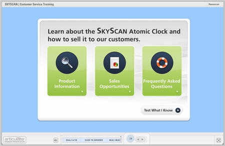
The Rapid E-Learning Blog - Skyscan example

Here’s a screen shot of a demo I’m working on for a future post.  It’s a copy of the popular frog dissection flash course that’s made its way around the Internet.  I was telling someone at a recent conference how that could easily be reproduced in PowerPoint.  The person didn’t believe me so I made the demo.  I’ll use it in an upcoming post.

The Rapid E-Learning Blog - frog dissection example

The point in all of this is to show you that when you start with a blank screen you can focus on adding just the content that’s critical to your course.  The rest of that stuff is just noise and distracting.  

While you’re using PowerPoint, you’re not creating a PowerPoint presentation.  Instead, you’re using PowerPoint’s freeform authoring environment to create a media rich, Flash-based elearning course.  It’s really no different than if you started with Flash or Authorware.

In a future post, I’ll do a makeover and show you how to create a company branded template in PowerPoint that’s built around your elearning needs.  This will help you meet your branding needs and build something that meets your elearning needs, as well.

I’d love to hear your take on all of this.  Feel free to send comments to the blog.

Events

Free E-Learning Resources

Want to learn more? Check out these articles and free resources in the community.

Here’s a great job board for e-learning, instructional design, and training jobs

Participate in the weekly e-learning challenges to sharpen your skills

Get your free PowerPoint templates and free graphics & stock images.

Lots of cool e-learning examples to check out and find inspiration.

Getting Started? This e-learning 101 series and the free e-books will help.


59 responses to “Change Your Presentation Template to an E-Learning Template”

Kia Ora Tom

It may amuse you to learn that the ‘company’ that I work for banned presentations given in Power Point, at least for any presentation delivered by a job applicant. As an elearning teacher for many years I have to admit that the idea of preparing a Power Point presentation now gives me the shudders, though I have sat pleasantly through many a presentation delivered by others who have used the same app.

I’ve used everything from 35mm projector slides (decades ago) to html for my presentations. I even admit to having used Power Point! What would you recommend as being universally acceptable for 21st C?

Ka kite

June 3rd, 2008

After fiddling with my client’s PowerPoint Template and trying to get it the whole interface “look right”, my opinion is that 100% free-form is the way to go.

This approach not only gives you the maximum screen real estate possible on a slide, but also allows you to easily re-brand/repackage your content.

Additionally, you can match the slide color with the “slide background” within the Color Scheme Colorizer. One of the few criticisms I have of Articulate is that the slide does not perfectly fit within the “content area” of the Articulate interface. Therefore, your PowerPoint can look a little “choppy” around the corners, and it literally looks like PowerPoint slapped into the interface. By using a blank white slide, for example, and then setting the “slide background” in the Colorizer to white as well, it all appears seamless. This way, nobody even knows that you are using PowerPoint because the slides blends with the background!

June 3rd, 2008

As an instructional designer, I find PowerPoint to be a robust tool with lots of cool functionality. Years ago, when PPt was my only instructional authoring tool, I used some of the ideas you’ve presented here. I’ve design PPt e-learning that looks like standard Flash user interface, with interactivity, quizzes, and excellent graphics. After some skeptics see the difference between PPt-the-presentation and PPt-the-Training Tool, they usually come around, but not always. Grrr. Thanks for bringing these topics to light — helps to see that others have the same problem.

June 3rd, 2008

Thank you! This is great!

I really like the concept of free form PowerPoint and will be trying it out. Can the same approach be used with Mac’s Keynote?

Tom,

I like what you say about slide composition. It’s been very helpful.

In a future post, would you consider talking a little about color schemes? I.e., how to create complimentary color schemes for the color-challenged, and how to use color to emphasize or create certain emotions or responses?

Thanks,
Brian

Amen, Tom, amen. Templates must die!

In my own organization, I shun the corporate-mandated template system and the horrible LCMS in which the template-based e-learning is authored and do most of my work with Articulate stuff.

They haven’t captured and tortured me yet.

Viva La Resistance!

P.S. what the heck is going on in the image in the sexual harassment course example?

Some good suggestions on finding ways to brand e-learning without following strict “acceptable” PPT templates. I recently finished an e-learning course for my org using Articulate. I got around the branding issue by incorporating company colors into the screen design (e.g., an acceptable light tan color for screen background, red and black for text and visual elements). I put the logo in the player, as well as on an intro splash screen and again at the very end of the course on a “thank you” kind of screen.

Oh…I was also able to use a bit of branding in the audio dialogue by mentioning the organization in the script occaisionally. So audio is another area where we can be a little creative.

End result is that I was able to use PPT as an empty canvass for elearning, while also maintaining a company-centric look.

I love the look and feel of the frog slide. How did you get the images to be so crisp? I don’t think the fault lies with PowerPoint – any tool can be ruined in the hands of an uninspired user!

June 3rd, 2008

I’m curious how well this concept works when creating e-learning modules for computer-related programs that people must learn. For example, we use PowerPoint to create screenshots of a new computer program people must learn how to use. I use circles, rectangles, arrowed lines, etc. to point out or emphasize the parts of the screen I’m talking about or that they’re learning about. How do you make this type of training “exciting” and interactive when they’re not using the real thing? That’s a challenge I face. We use Articulate to take our slide show into in order to use the e-learning on our LMS. Articulate kinda limits you to the size of the slide area, so that’s why I tend to make my screen shots the entire size of the slide area. That doesn’t leave me much room for creativity. Any pointers would be appreciated. THANKS.

June 3rd, 2008

Tom, thank you for the great information on your blog! You sound so knowledgeable about PowerPoint. Are you familiar with PowerPoint 7? We’re heard it is more feature rich, particularly for media elements. Would you recommend upgrading to V 7.0?

Nice post, but there’s nothing here about what to do if you are forced to use a standard template. I thought getting ideas about snazzing up the corporate template was the point of this post, not how to stick it to the man to start using freeform.

Technical and engineering companies like mine have standard formats for everything. I was hoping for ideas on how to make the standard template more interesting while maintaining the template in its original state.

Wow, impressive work! Can’t wait to read the follow-up template makeover post. It’s a shame that we have so many powerful tools available to us, but so few (including myself) know how to take the most advantage of them. I think your examples show what’s possible when we forget all the “rules” of PowerPoint and think more about the experience for the audience.

It seems using PowerPoint follows the same philosophy that just because you attended grad school you know how to teach. Like taking pedagogy courses in grad school, there’s a definite need for training in using the basic tools of teaching, including PowerPoint. But where to find the time, and how do we, as instructional tech folks, convince faculty that it’s worth spending the extra time creating something that’s visually compelling instead of just a textually dense basic template?

I’m curious though: How much time does it take you to put together these really cool slides? Also, can you give some insight as to the process you follow in making the jump from concept to what you’ve shown in this post?

Thanks, and keep up the great work!

June 3rd, 2008

Hey Tom

Another great post. You certainly have me looking harder at powerpoint as a development tool.

Love the frog.

Regards

Andrew

This post caught my attention. I have joined one of the Big 5s yesterday and learned how any and every presentation has to be in the company template, which is very cliched and stuffy. Coming from pure custom elearning background this is new to me. I would like to see your follow-up post with suggested approaches and options (if any) to work within these templates.

Starting on a blank slide and then applying the template is a sure option but I would like to know if you have others.

Thanks,
Pallavi

June 4th, 2008

Great blog, Tom! Good to see that you don’t need a ‘real’ authoring tool to produce ‘cool’ e-learning.

@Rita Rosenberg, asking: “How do you make this type of training “exciting” and interactive when they’re not using the real thing?”

In this type of e-learning, I try to make it look like the real environment as much as possible. So as little as possible logos, buttons etc. and many many screenshots from the real environment.

There are three things I use in these kinds of e-learning:

1. Tell about the things you see on screen and what they mean or do.
For this purpose, like you, I also use rectangles, arrows etc. to point out the parts of the screen the voice-over is talking about. I try to keep it as consistent as possible (maybe even in company style/colours).

2. Show how a task is carried out.
You could use mouse arrows/pointers and let them move on the screen with the audio. (Imitating authoring tools like Captivate). “If you want to save this document, you click on save(hear & see a click), (automatically start next slide/screen) in this field (coloured rectangle) you fill in the name of the document…”. etc.

3. Give directions, and let the learner carry out the task.
Here you have the learner do the task step by step. You will need screenshots of every tiny little step you take in the software application. In audio you tell the learner what to do, or where to click. You include hotspots to pages when they carry the task out correctly. If you want to be precize, you also include hotspots for when they click in the wrong area (of course, with feedback). E.g. the hotspot on the “save”-button links to the next screen you would see in the real life environment, and clicking somewhere else would give you a pop-up with “Incorrect. This is not where you click to save your document. Click on the Save-button in the top-right corner of the screen”.

Especially option 3 makes it more interactive. 3 can also be used for tests, if you’re working with authoring tools that can store/measure input.

O, and you can also use figures to give the instructions. It is handy to heve several images of the same character (pointing to different directions) so you can use them to point at areas of the screen and give instructions in small talking balloons. Sometimes you will need one pointing to the right (e.g. for something on the right edge of the screen) and sometimes to other directions.

I hope this helps improve your e-learning!

Best regards,
Jiska

I was so glad to read this post. I have been sitting on my hands wanting to say something about the yawn-inducing template I’m forced to use, and this post inspired me to speak up about it. I’m now working on redesigning the template (pending the next post with the “makeover”) and/or getting rid of it completely and then slyly making a course with it to see if anyone even notices.

It’s tough sometimes as a designer to show non-designers (who have the ultimate say on your courses) good design principles.

Thanks, Tom!

June 4th, 2008

Excellent post! Your Reuters example above really hit home since my company (Thomson) just purchased Reuters and now we’re all trying to find ways incorporate the new and “approved” logo and template. On the other hand, you have just given me ammunition to argue that our internal training needs are different than the corporate external needs.

I look forward to your upcoming post on how to create company branded template in PowerPoint.

Tom,

You are a dynamo when it comes down to this stuff. I really look forward to your posts. It is so true that you do not need an e-learning training tool to design examples like this. I’ve been discussing this with my client.

Keep up the good work.

Thanks!

June 4th, 2008

For the record – there really is a company called SkyScan and they do make atomic clocks. We have one of their clocks in our conference room.

June 5th, 2008

Wow!! Can’t wait to see how you convert the Frog Dissection Flash presentation to PowerPoint. I have several similar applications, but don’t know where to start. How soon will we see it?????

BTW, did you ever post the “Building a Sod House” application in PowerPoint? If so, I missed it. Would love to see that one too!!

Thanks for all your innovative ideas. I want to do many of those things, but don’t know how to get started.

Tom, as always an excellent and thought-provoking post. This time I have to say I disagree with you, though. The free-format approach is wonderful if you are a lone consultant doing individual projects, but it can be an absolute disaster if you are working as a part of a large team on a single curriculum.

A well-crafted template can ensure some measure of consistency across a series of modules, even if each one is created by a different person. Come to think of it, that’s the point of a template isn’t it? In a fast paced environment where delivering projects on-time is a priority, starting from scratch each time just isn’t realistic. Not everyone is a graphic design genius, and with a decent design template they don’t need to be.

It seems to me that a more practical approach would be to focus on improving the quality of templates used within your organization. Abandoning them all together is akin to curing a hangnail with a shoulder tourniquet.

June 5th, 2008

Tom – I really enjoy the Rapid E-learning posts. I usually drop everything to read new ones. Great stuff!! In this post, one of your examples disables the player altogether. I always wondered how to to this. Would really like to see how it is done – maybe a topic in a future post?

@ Barry:

I don’t disagree with you entirely, but the template-based design philosophy is clearly developer-centric and not learner-centric. It focuses on rapidity and cost-effectiveness while mostly ignoring learner impact. And I think the biggest problem with eLearning today is we focus far more on the development process than we do on the end product, resulting in consistently crummy eLearning that our learners hate.

As a learner, I’m smart enough to recognize a template when I see one. And when I see a template-based course, I subconsciously (or consciously) think “ugh, more learning from a can.” That affects my attitude about the learning I’m about to undertake and it affects my opinion about eLearning in general. The brain is easily bored, and templates, in my experience, are almost a guarantee of learner boredom.

Perhaps what eLearning needs is more “graphic design geniuses” and less plug-content-into-template style development? And perhaps we need to dial down our wild eLearning ROI promises a notch and focus on better products despite the higher costs.

Sorry if I taken this thread off track, but I just want to add another perspective to the discussion.

Chris, in a perfect world I would agree with you 100%. I simply don’t live in that world.

The very existence of tools such as Articulate argues for the “ROI-as-an-ugly-fact-of-life” perspective. If the world were filled with flash developers with an eye for intuitive design who will work for about half the going rate, we wouldn’t need rapid eLearning development tools. Unfortunately, it isn’t, they won’t, and we do.

Companies such as Articulate have filled a market need for tools which produce serviceable, attractive output in a fraction of the time required through traditional design methods. And how do they accomplish this? Through templates! Pick through the product information pages for thirty seconds and you’ll see what I mean – “Easy-to-use templates let you create interactivity in minutes.”

And if the evil PowerPoint template is the bane of good instructional design, what do we make of this?

http://www.articulate.com/products/pptkit.php

“And if the evil PowerPoint template is the bane of good instructional design, what do we make of this?”

What I make of it is this: I wouldn’t use it.

I won’t argue that eLearning development companies don’t push template-based content as a way to sell their products. But that doesn’t make the concept sound. After all, Tom (of Articulate) is arguing that the *ideal* solution would be to dump the template model entirely.

In my organization, our “mandated” eLearning development tool is a template-based LCMS application. The app is designed around the concepts of rapidity, reusability, metadata searchability. And the end products I see turned out using this tool are garbage (and the “rapidity” and “reusability” things aren’t living up to the hype either). Hence, I use Articulate for most of my development work. And I don’t use templates to do it. And I’ve become proficient enough that I can now develop faster than my colleagues who use templates in the LCMS.

I say we should look at the “rapid development” selling point of tools like Articulate as a way to justify a little more time (money) spent on the visual design. “Rapid” needn’t mean “crappy.” So I look at Articulate apps as a way to save money I’d have to spend on Flash programmers – I don’t look at Articulate as a way to save money on compelling design.

Unfortunately, as you rightly pointed out, none of us live in a perfect world, but at some point someone needs to stand up and say “how much are we *really* saving if the end product isn’t effective?” As eLearning professionals, I feel we’ve sabotaged the eLearning movement by promising bigger savings than we can realistically achieve while maintaining an acceptable level of quality.

It’s the old “Fast, Good, Cheap – Pick Two” conundrum. And far too often we’re choosing Fast & Cheap.

Just got back from the ASTD conference so I haven’t had a lot of time to review the comments, yet. However, I thought I’d chime in to the Barry & Chris debate.:)

I’m not against templates, especially for new users. I was talking to a guy at the conference and he told me about how some of his machine supervisors were using the software to quickly train new shifts. In those cases, a templated approach works.

The Articulate templates are designed for such people. And while I wouldn’t use them at this point in my career, I might have when I first got started. And besides they really aren’t the same as what I was talking about in the post.

I was addressing branded templates and how organizations will take a PowerPoint template designed for a presentation and force that on people who happen to be building elearning courses with PowerPoint. The point being that the branded template isn’t ideal for elearning development because it creates distracting images, consumes real estate needed for the course, and it forces all courses into the same box.

The Articulate templates are in a different mold because the template is less about branding and more about structuring your content for learning. So templates that help people organize their content is viable because the goal is to create better learning design. The templates help new users do that.

Templates that just force a branded design on the course oblivious to the learners needs aren’t the best option.

With all that said, sometimes you have to work within the guidelines of the organization. If they force a branded template on you, then you just have to deal with it the best you can. And that’s what I was trying to show in the examples. They were different organizations who branded but made it work with their content.

I think the ultimate goal is to help your organization see the difference between PowerPoint as a presentation tool and PowerPoint as a freeform authoring environment.

Based on the discussion here and some of the emails I’ve gotten, I’m going to add an additional post to my plans. So we’ll have one that explores this issue a little more and we’ll have one that show how to create a branded look for elearning that hopefully satisfies your organization and gives you the freedom to create the courses you need.

My last point. My position is that it’s not an either/or approach. You have to do what works best for you and your organization. So if you use a template and it works, that’s great.

A lot of people are getting a little upset about the whole not using a template thing, because the whole point of Articulate is the “rapid” part.

Here’s my two cents: The company I work for has some rigid training standards, and they are hard to change. One of these standards is the use of a really ugly, really distracting company template. The template reduces the real estate of workspace for me by about 25%. This leaves me with much less room to be creative. Graphics, text, etc. are all limited.

Getting rid of templates, or altering them to make them not horrible, isn’t going against everything that rapid e-Learning stands for. I personally feel like starting with a fresh white screen for each presentation, while my company’s logo is prominently displayed in the Presenter Panel is just fine. Or, if they insist on having the company logo on every…single…slide, then I should be able to adjust it so that it is neither a) distracting nor b) taking up a ton of space.

Maria, I guess the question I always ask is “of what benefit is the corporate-mandated template for eLearning?” Are we trying to remind our employees who they work for? (And if they don’t remember who they work for, perhaps training them isn’t our biggest problem.) Are we trying to reinforce the idea that “the XYZ Corp. color is purple!” or show them our spiffy logo, as they almost certainly don’t see it everywhere else they look while they’re in the office?

Perhaps as eLearning developers we need to take on the role of influencers vs. policy-toeing drones sometimes. I’ve had templates given to me in storyboards for my Articulate work. I simply say “we’re losing too much screen real estate with this and the learner does not benefit from it – how about I just include your logo in the player itself and not in the content area?”

I’ve yet to have anyone fight me on that.

Just because it’s policy doesn’t mean it’s smart. If no one ever questions, nothing ever changes.

After all, some *person* got that template instituted (perhaps an eLearning development wonk just like you). Some *person* (perhaps an eLearning development wonk just like you) can get that template un-instituted (de-instituted? anti-instituted?).

Like Steve Jobs said, sometimes your customers don’t know what they want until you show it to them.

Show them.

Chris,

The problem is, not all company’s are as loose with there policies as that. I wish I could march in, say that the template is not working, and have my bosses all say “Great, please change it!” But my reality is that I am a one-woman team being supervised by several non-designers who all want to put in their two cents. I am also by far (in most cases) the youngest person in the company, and one of the only females. I am relatively new to the team, and this is a business with an excellent, long-standing reputation in the community.

You are correct that change cannot occur without first speaking up, but sometimes it’s not as easy as that.

Marisa

Marisa (sorry I typo’ed your name earlier),

I understand your pain. And my organization really isn’t as “loose” with their policies as I made it sound. We have a mandated development application and a mandated template. Most of the other eLearning developers here simply shrug their shoulders, say “Oh well, I do what I have to do,” and crank out the crappy-by-mandate eLearning. The “easy” thing to do is always following the status quo.

Maybe I’m career suicidal, but I decided not to go that route. I just can’t do it. If my name is going to be attached to something, I want that something to be the best quality something I can muster. I can’t put my name on something horrible and then tell people “Sorry, it’s the way things have to be” like the other developers are content to do. Perhaps I’ll end up on the street for it, who knows. But ultimately I think it would be hard to drop-kick the developer who is giving the learners something they’re actually happy with (and increasingly demanding).

Though I’m not necessarily advocating you be so reckless with your corporate future too. My kids might end up going hungry for my sins. 🙂

Sorry, now I’ve deviated waaaay off course from the original post. My apologies. I’d just like to see us as eLearning developers take a stand for “better” and not be content with simply “cheaper,” “faster,” or “mandated.” As I said before, I think the terrible state of eLearning today (and I believe eLearning in general is in pretty terrible shape) is a result of making grandiose promises about eLearning (re: cost savings and “even a monkey can do it” garbage-in garbage-out development tools) and then being forced to churn out terrible products to live up to those unrealistic promises.

Something’s gotta change.

June 5th, 2008

You can brand the interface so there really is no need to brand the slides. You can have a solid color blank slide and it can still be a “template”.

Additionally, I seldom mention that I’m using PowerPoint. I don’t want my clients know that and I want it to be completely transparent – it’s a non-issue. I simply tell my clients “give me your PowerPoints”. This isn’t meant to be deceptive – I just care about their content. 8 times of of 10 their PowerPoints are either a) lousy or b) very instructionally poor. 9 times out of 10 they’re both :). So all I want is their content!!

If I tell a client “PowerPoint” they say “Oh, I’ve got a great template and some clip art too”. No thanks!

Hi Tom,
Nice post as always!
But…I think it should be more a case of using “good” templates than a case of not using templates at all. Where I work, templates are in fact one of our sales arguments because using the same template (navigation, positioning, title, text area, exercises, etc.) means the learners don’t come up against a ‘usability barrier’ for every course they use. (Although learning new interfaces can be engaging and fun it’s usually not the course’s main aim.) It also does give organizations a handle on the type of work which can be published using a given product. Much in the same way the Articulate suite does!
We also have a couple of templates for PPT presentations but they are thankfully miles away from our elearning templates!

Another winner, Tom. Thanks for the great reminder.

[…] week I told you to stop using templates for e-learning that were designed for presentations.  Presentation templates are designed for a different purpose.  Sure, you’re using […]

Thanks Tom,
How did you make the photo slides for the compensation discussion? Do you need software like Photoshop to manipulate the photo images? We’d love to do something like that, but don’t know where to start. I know you can’t give PowerPoint lessons on your blog, but for some of us there is a lot to learn before we are comfortable giving up templates and trusting our own style.

Powerpoint is a fact of life for us, and I have chosen to make the most of what we’ve got. I have the most success when I don’t actively fight any mandate, but gently demonstrate what is possible with my preferred options.
Imperfect contributions from others are still contributions. I’d rather have a sloppy ppt from one of my tech high-flyers than nothing at all. With the content available to me, I can adapt it as needed and as time allows, yet the content can be put out where I need it. This compromise serves the company best.
Additionally, when I have built the relationship with non-full-time content creators, they are more willing to listen to suggestions. They are therefore continually improving. They even request my templates on occasion.
Finally, a template is a template. It’s generally easier and less work to apply my template to an existing ppt than it is to create a module from scratch. Not always, but mostly.

templates – as usual in life, it all depends on the wider picture… and the payback for me re: havign to use templates and logos is that it helps me win the war against corporate “bullet-sh*t”.

The eLearning I design and produce is for an audience much wider than internal employees, therefore it’s important and somewhat in-evitable that our corporate (global) brand guidelines are followed – especially as our CEO personally vets the more strategically important courses before release.

So, I use the corporate ppt template, and I include the company logo in the “eLearning Player”, which also is designed to company brand colours.

Does this stop me trying to ensure that the audience is still learning and not bored stiff? No, as an Instructional Designer that part of my job.

If my audience was just internal employees then perhaps the CEO (et al) wouldn’t be involved and I could loose some logos and regain some screen-estate, but, it wouldn’t change my basic battle which ALWAYS persuading the subject matter experts that bullet points suck BIG time.

To summarise, in corporate land you can only fight so many battles – I think it’s best to pick the ones that you stand a chance of wining, and which have the highest level of positive impact on the learners experience.

Tom – you may have already covered it, but if not can we have a war against BULLETS, perhaps we could call it “Arrows are sharper than Bullets” 😉

June 11th, 2008

Hi Tom,

thanks a lot. Your tips always excite us!!!

Tony Palenzuela

Tom,

Your articles have already made an (impressive) impact on the e-learning programs that I create for our employees and managers. I’m a “one person” show for a very large company (almost 10,000 employees/learners) so I skim any resource I look at since I don’t have time to smell all the roses or read everyone’s blog, etc. and I never take time to post things like this, but… My only two cents about templates is: I use a different template for each program and I’m always looking for cool new ones… and free is good too. My company’s goals (as I’m sure most others are as well) are super cool looking and effective programs with fast turnaround with as close to a zero dollar expense as possible.

I loved the freebee templates you provided and I tweaked one for one of our programs! Pretty, pretty please keep the free cool templates and other stuff coming because I could really use them. After 6 years of developing e-learning programs and skimming reference materials… you are my favorite reference so far especially since you are clear, concise and provide extremely useful tips and tools with a creative, catchy look. So, don’t go away … I hope you keep sending all the good stuff!!!!!!

Ok, my real reason for writing: Do you have any other good looking templates available? 🙂

– Lisa Goldstein

P.s. I know there are tons of sites that offer free templates and I think I’ve surfed most of them……. but I don’t want thiers… I want yours because yours are better!

June 19th, 2008

G’day

You articles are great as i currently work for an eLearning company its great to the support out there to help rid us of the stigmata that has become so ingrained within our society. The view on template you presented is excellent and will be using these points with your permission later on this month in a slide show relating to eLearning change. Please inform me if you do not wish this to be so.

Regards
Mitch

[…] Im Rapid E-Learning Blog ging es vor kurzem um die Erstellung von E-Learning Kursen mit Power Point. Was man dabei beachten- und lieber vermeiden sollte, beschreibt Tom Kuhlmann in „Change Your Presentation Template to an E-Learning Template“. […]

September 16th, 2008

Oh my goodness i think this blog is speaking right to my heart. I am currently fighting the battle with our corporate branding police. They want our elearning courses to be created with the pp template, which is white background, and grey that’s correct GREY writing, with the logo in the bottom right. Help me please!!!! Well i am currently working on a proposal and I appreciate everything that you wrote. It validates everything I am saying. Additionally I have found many viable research documents that say the same.

I am going to do a follow up post on this with a solution that I think will help learning developers and those concerned with branding and consistency issues.

Hi! I was surfing and found your blog post… nice! I love your blog. 🙂 Cheers! Sandra. R.

I want chow template courese on line my cumpany working About E-learning

[…] example, I wrote a blog post about PowerPoint and rapid elearning.  When you use PowerPoint to build courses, you need as much room as possible.  Any […]

What’s the best toolbar or software for saving/recording websites visited and one that would be compatible with iPhone

@Sarah: I really enjoy using diigo. They have an iPhone app, but I haven’t used it so I can’t share my experiences with it. I’m sure others will chime in with their opinions and experience.

[…] Change Your Presentation Template to an E-Learning Template […]

[…] This post was mentioned on Twitter by Diane Evans. Diane Evans said: RT @tomkuhlmann » Change Your Presentation Template to an E-Learning Template The Rapid eLearning .. http://bit.ly/175ip7 […]

[…] E-learning templates and corporate branding is one of those issues where you can go round and round and never really end at a place where everyone’s happy.  I wrote a little bit about this a while back when I discussed how to change your presentation template to an elearning template. […]

I’m in dire need of basic help in how to create a template. And I’m talking about 3rd grade, start at the beginning help. Is there anyone out there willing to step in?

@Don: We have a bunch of tips. Jump into the user community and explain what you want and someone will be able to help you. I also have a number of tutorials for the many templates I’ve given away on the blog. Just do a search for templates.

[…] Change Your Presentation Template to an E-Learning Template […]

Do you have to use Power Point? I have a policy document in Word….I want to load it to my LMS but I heard we had to convert our Word document to PPT….which doesn’t seem to make sense. Any thoughts?

@Sandy: Each CMS/LMS is different. Some will let you upload and track documents. I’d convert the doc to a PDF and see if that works for you. If not, you’ll probably need to find a way to convert it to a format that works for your system.